
再見(jiàn),可視化!你好,Pandas!

用Python做數(shù)據(jù)分析離不開(kāi)pandas,pnadas更多的承載著處理和變換數(shù)據(jù)的角色,pands中也內(nèi)置了可視化的操作,但效果很糙。
因此,大家在用Python做數(shù)據(jù)分析時(shí),正常的做法是用先pandas先進(jìn)行數(shù)據(jù)處理,然后再用Matplotlib、Seaborn、Plotly、Bokeh等對(duì)dataframe或者series進(jìn)行可視化操作。
但是說(shuō)實(shí)話,每個(gè)可視化包都有自己獨(dú)特的方法和函數(shù),經(jīng)常忘,這是讓我一直很頭疼的地方。
好消息來(lái)了!從最新的pandas版本0.25.3開(kāi)始,不再需要上面的操作了,數(shù)據(jù)處理和可視化完全可以用pandas一個(gè)就全部搞定。
pandas現(xiàn)在可以使用Plotly、Bokeh作為可視化的backend,直接實(shí)現(xiàn)交互性操作,無(wú)需再單獨(dú)使用可視化包了。
下面我們一起看看如何使用。
1.?激活backend
在import了pandas之后,直接使用下面這段代碼激活backend,比如下面要激活plotly。
pd.options.plotting.backend?=?'plotly'
目前,pandas的backend支持以下幾個(gè)可視化包。
Plotly
Holoviews
Matplotlib
Pandas_bokeh
Hyplot
2.?Plotly backend
Plotly的好處是,它基于Javascript版本的庫(kù)寫(xiě)出來(lái)的,因此生成的Web可視化圖表,可以顯示為HTML文件或嵌入基于Python的Web應(yīng)用程序中。
下面看下如何用plotly作為pandas的backend進(jìn)行可視化。
如果還沒(méi)安裝Plotly,則需要安裝它pip intsall plotly。如果是在Jupyterlab中使用Plotly,那還需要執(zhí)行幾個(gè)額外的安裝步驟來(lái)顯示可視化效果。
首先,安裝IPywidgets。
pip?install?jupyterlab?"ipywidgets>=7.5"
然后運(yùn)行此命令以安裝Plotly擴(kuò)展。
jupyter?labextension?install?jupyterlab-plotly@4.8.1
示例選自openml.org的的數(shù)據(jù)集,鏈接如下:
數(shù)據(jù)鏈接:https://www.openml.org/d/187
這個(gè)數(shù)據(jù)也是Scikit-learn中的樣本數(shù)據(jù),所以也可以使用以下代碼將其直接導(dǎo)入。
import?pandas?as?pd
import?numpy?as?np
from?sklearn.datasets?import?fetch_openml
pd.options.plotting.backend?=?'plotly'
X,y?=?fetch_openml("wine",?version=1,?as_frame=True,?return_X_y=True)
data?=?pd.concat([X,y],?axis=1)
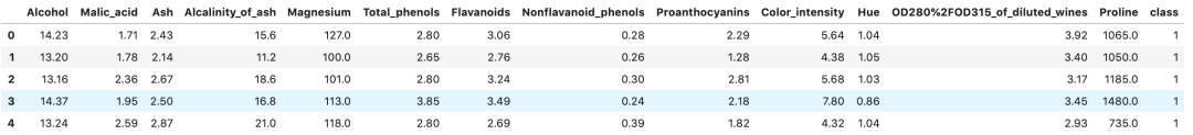
data.head()
該數(shù)據(jù)集是葡萄酒相關(guān)的,包含葡萄酒類型的許多功能和相應(yīng)的標(biāo)簽。數(shù)據(jù)集的前幾行如下所示。
下面使用Plotly backend探索一下數(shù)據(jù)集。
繪圖方式與正常使用Pandas內(nèi)置的繪圖操作幾乎相同,只是現(xiàn)在以豐富的Plotly顯示可視化效果。
下面的代碼繪制了數(shù)據(jù)集中兩個(gè)要素之間的關(guān)系。
fig?=?data[['Alcohol',?'Proline']].plot.scatter(y='Alcohol',?x='Proline')
fig.show()
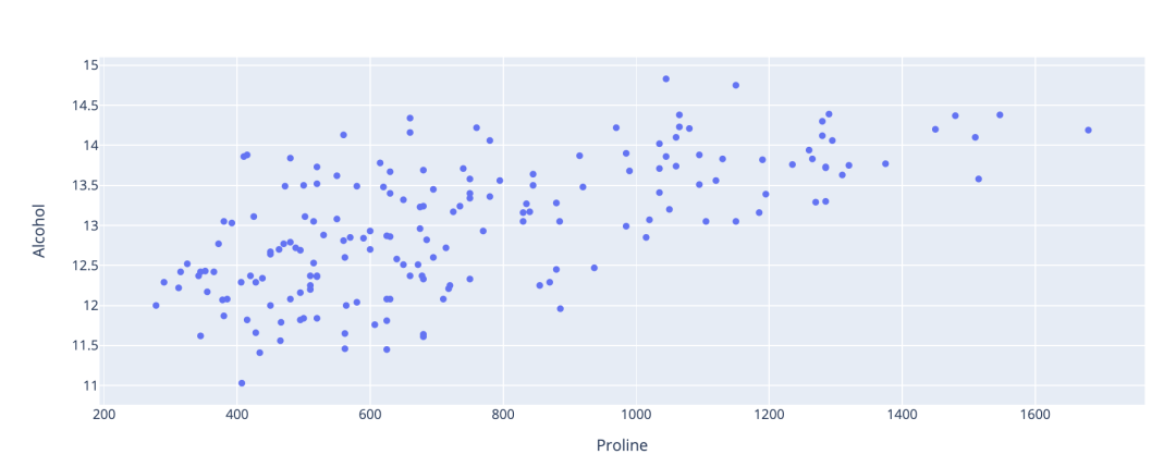
如果將鼠標(biāo)懸停在圖表上,可以選擇將圖表下載為高質(zhì)量的圖像文件。
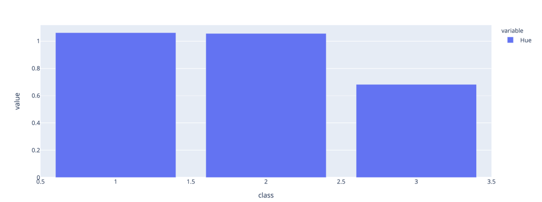
我們可以結(jié)合Pandas的groupby函數(shù)創(chuàng)建一個(gè)條形圖,總結(jié)各類之間Hue的均值差異。
data[['Hue','class']].groupby(['class']).mean().plot.bar()
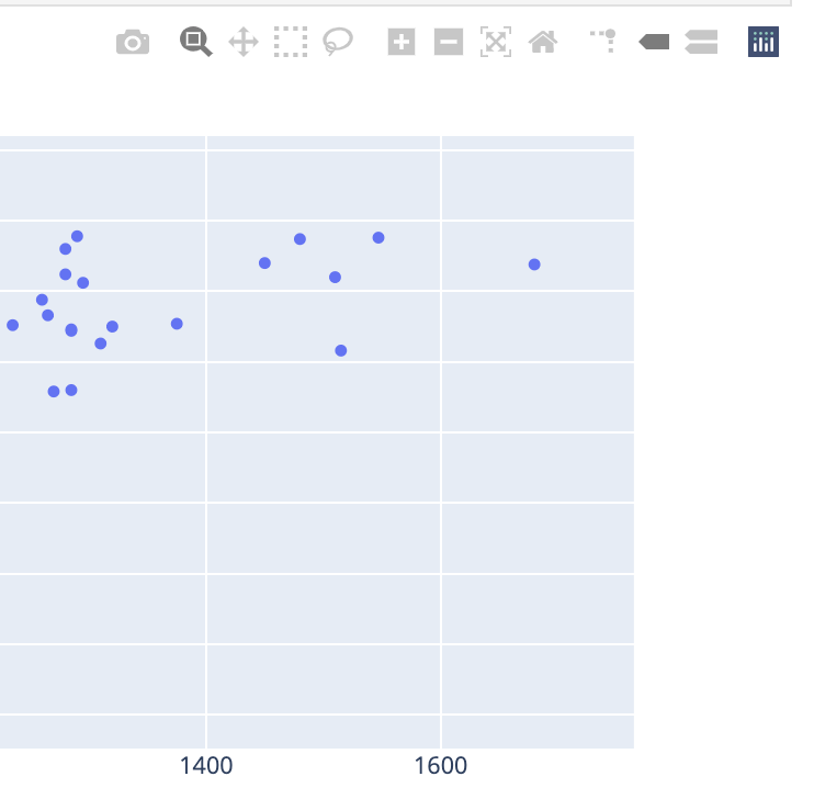
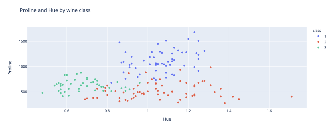
將class添加到我們剛才創(chuàng)建的散點(diǎn)圖中。通過(guò)Plotly可以輕松地為每個(gè)類應(yīng)用不同的顏色,以便直觀地看到分類。
fig?=?data[['Hue',?'Proline',?'class']].plot.scatter(x='Hue',?y='Proline',?color='class',?title='Proline?and?Hue?by?wine?class')
fig.show()
3.?Bokeh?backend
Bokeh是另一個(gè)Python可視化包,也可提供豐富的交互式可視化效果。Bokeh還具有streaming API,可以為比如金融市場(chǎng)等流數(shù)據(jù)創(chuàng)建實(shí)時(shí)可視化。
pandas-Bokeh的GitHub鏈接如下:
https://github.com/PatrikHlobil/Pandas-Bokeh
老樣子,用pip安裝即可,pip install pandas-bokeh。
為了在Jupyterlab中顯示Bokeh可視化效果,還需要安裝兩個(gè)新的擴(kuò)展。
jupyter?labextension?install?@jupyter-widgets/jupyterlab-manager
jupyter?labextension?install?@bokeh/jupyter_bokeh
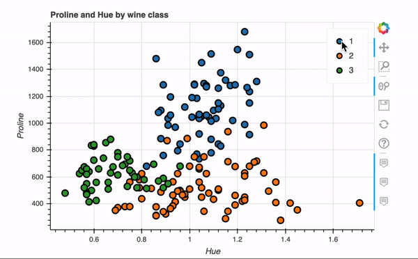
下面我們使用Bokeh backend重新創(chuàng)建剛剛plotly實(shí)現(xiàn)的的散點(diǎn)圖。
pd.options.plotting.backend?=?'pandas_bokeh'

import?pandas_bokeh
from?bokeh.io?import?output_notebook
from?bokeh.plotting?import?figure,?show

output_notebook()
p1?=?data.plot_bokeh.scatter(x='Hue',?
??????????????????????????????y='Proline',?
??????????????????????????????category='class',?
??????????????????????????????title='Proline?and?Hue?by?wine?class',
??????????????????????????????show_figure=False)
show(p1)
關(guān)鍵語(yǔ)句就一行代碼,非常快捷,交互式效果如下。
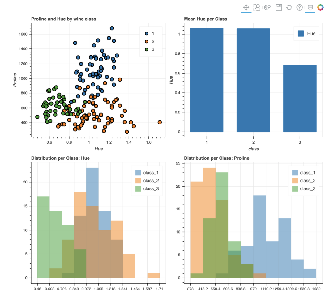
Bokeh還具有plot_grid函數(shù),可以為多個(gè)圖表創(chuàng)建類似于儀表板的布局,下面在網(wǎng)格布局中創(chuàng)建了四個(gè)圖表。
output_notebook()

p1?=?data.plot_bokeh.scatter(x='Hue',?
??????????????????????????????y='Proline',?
??????????????????????????????category='class',?
??????????????????????????????title='Proline?and?Hue?by?wine?class',
??????????????????????????????show_figure=False)

p2?=?data[['Hue','class']].groupby(['class']).mean().plot.bar(title='Mean?Hue?per?Class')

df_hue?=?pd.DataFrame({
????'class_1':?data[data['class']?==?'1']['Hue'],
????'class_2':?data[data['class']?==?'2']['Hue'],
????'class_3':?data[data['class']?==?'3']['Hue']},
????columns=['class_1',?'class_2',?'class_3'])

p3?=?df_hue.plot_bokeh.hist(title='Distribution?per?Class:?Hue')

df_proline?=?pd.DataFrame({
????'class_1':?data[data['class']?==?'1']['Proline'],
????'class_2':?data[data['class']?==?'2']['Proline'],
????'class_3':?data[data['class']?==?'3']['Proline']},
????columns=['class_1',?'class_2',?'class_3'])

p4?=?df_proline.plot_bokeh.hist(title='Distribution?per?Class:?Proline')

pandas_bokeh.plot_grid([[p1,?p2],?
????????????????????????[p3,?p4]],?plot_width=450)
4.?總結(jié)
在內(nèi)置的Pandas繪圖功能增加多個(gè)第三方可視化backend,大大增強(qiáng)了pandas用于數(shù)據(jù)可視化的功能,今后可能真的不需再去學(xué)習(xí)眾多可視化操作了,使用pandas也可以一擊入魂!
參考鏈接:https://towardsdatascience.com/plotting-in-pandas-just-got-prettier-289d0e0fe5c0