Python數(shù)據(jù)可視化,無(wú)法繞過(guò)的matplotlib基礎(chǔ)知識(shí)!!!

來(lái)源:逐夢(mèng)er
https://zhumenger.blog.csdn.net/article/details/106530281
【導(dǎo)語(yǔ)】:出色的數(shù)據(jù)可視化,會(huì)讓你的數(shù)據(jù)分析等工作錦上添花,讓人印(升)象(職)深(加)刻(薪)。matplotlib是python優(yōu)秀的數(shù)據(jù)可視化庫(kù),python數(shù)據(jù)分析必備利器,本文專(zhuān)門(mén)為你整理了matplotlib詳細(xì)使用方法,來(lái)學(xué)習(xí)吧!
--- 以下是正文 ---
數(shù)據(jù)可視化非常重要,因?yàn)殄e(cuò)誤或不充分的數(shù)據(jù)表示方法可能會(huì)毀掉原本很出色的數(shù)據(jù)分析工作。
matplotlib?庫(kù)是專(zhuān)門(mén)用于開(kāi)發(fā)2D圖表(包括3D圖表)的,突出優(yōu)點(diǎn):
使用起來(lái)極為簡(jiǎn)單。
以漸進(jìn)、交互式方式實(shí)現(xiàn)數(shù)據(jù)可視化。
表達(dá)式和文本使用LaTeX排版。
對(duì)圖像元素控制力強(qiáng)。
可輸出PNG、PDF、SVG和EPS等多種格式。
安裝
conda?install?matplotlib或者
pip?install?matplotlibmatplotlib 架構(gòu)
matplotlib 的主要任務(wù)之一,就是提供一套表示和操作圖形對(duì)象(主要對(duì)象)以及它的內(nèi)部對(duì)象的函數(shù)和工具。其不僅可以處理圖形,還提供事件處理工具,具有為圖形添加動(dòng)畫(huà)效果的能力。有了這些附加功能,matplotlib 就能生成以鍵盤(pán)按鍵或鼠標(biāo)移動(dòng)觸發(fā)的事件的交互式圖表。
從邏輯上來(lái)講,matplotlib 的整體架構(gòu)為3層,各層之間單向通信:
Scripting (腳本)層。
Artist (表現(xiàn))層。
Backend (后端)層。
一、matplotlib的基本用法
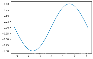
import numpy as npimport matplotlib.pyplot as pltx = np.linspace(-np.pi, np.pi, 30) # 在區(qū)間內(nèi)生成30個(gè)等差數(shù)y = np.sin(x)print('x = ', x)print('y = ', y)
輸出:
x = [-3.14159265 -2.92493109 -2.70826953 -2.49160797 -2.2749464 -2.05828484-1.84162328 -1.62496172 -1.40830016 -1.19163859 -0.97497703 -0.75831547-0.54165391 -0.32499234 -0.10833078 0.10833078 0.32499234 0.541653910.75831547 0.97497703 1.19163859 1.40830016 1.62496172 1.841623282.05828484 2.2749464 2.49160797 2.70826953 2.92493109 3.14159265]y = [-1.22464680e-16 -2.14970440e-01 -4.19889102e-01 -6.05174215e-01-7.62162055e-01 -8.83512044e-01 -9.63549993e-01 -9.98533414e-01-9.86826523e-01 -9.28976720e-01 -8.27688998e-01 -6.87699459e-01-5.15553857e-01 -3.19301530e-01 -1.08119018e-01 1.08119018e-013.19301530e-01 5.15553857e-01 6.87699459e-01 8.27688998e-019.28976720e-01 9.86826523e-01 9.98533414e-01 9.63549993e-018.83512044e-01 7.62162055e-01 6.05174215e-01 4.19889102e-01??2.14970440e-01??1.22464680e-16]
畫(huà)一條曲線(xiàn)
plt.figure() # 創(chuàng)建一個(gè)新的窗口plt.plot(x, y) # 畫(huà)一個(gè)x與y相關(guān)的曲線(xiàn)plt.show()# 顯示圖像
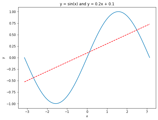
畫(huà)多條曲線(xiàn)以及添加坐標(biāo)軸和標(biāo)簽
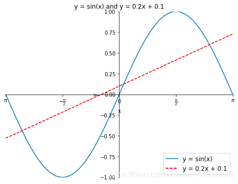
import numpy as npimport matplotlib.pyplot as pltx = np.linspace(-np.pi, np.pi, 100) # 在區(qū)間內(nèi)生成21個(gè)等差數(shù)y = np.sin(x)linear_y = 0.2 * x + 0.1plt.figure(figsize = (8, 6)) # 自定義窗口的大小plt.plot(x, y)plt.plot(x, linear_y, color = "red", linestyle = '--') # 自定義顏色和表示方式plt.title('y = sin(x) and y = 0.2x + 0.1') # 定義該曲線(xiàn)的標(biāo)題plt.xlabel('x') # 定義橫軸標(biāo)簽plt.ylabel('y') # 定義縱軸標(biāo)簽plt.show()
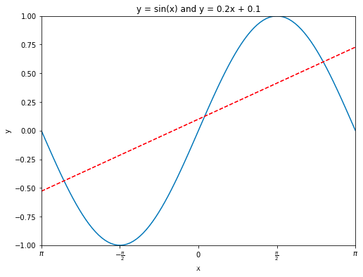
指定坐標(biāo)范圍 and 設(shè)置坐標(biāo)軸刻度
import numpy as npimport matplotlib.pyplot as pltx = np.linspace(-np.pi, np.pi, 100) # 在區(qū)間內(nèi)生成21個(gè)等差數(shù)y = np.sin(x)linear_y = 0.2 * x + 0.1plt.figure(figsize = (8, 6)) # 自定義窗口的大小plt.plot(x, y)plt.plot(x, linear_y, color = "red", linestyle = '--') # 自定義顏色和表示方式plt.title('y = sin(x) and y = 0.2x + 0.1') # 定義該曲線(xiàn)的標(biāo)題plt.xlabel('x') # 定義橫軸標(biāo)簽plt.ylabel('y') # 定義縱軸標(biāo)簽plt.xlim(-np.pi, np.pi)plt.ylim(-1, 1)# 重新設(shè)置x軸的刻度# plt.xticks(np.linspace(-np.pi, np.pi, 5))x_value_range = np.linspace(-np.pi, np.pi, 5)x_value_strs = [r'$\pi$', r'$-\frac{\pi}{2}$', r'$0$', r'$\frac{\pi}{2}$', r'$\pi$']plt.xticks(x_value_range, x_value_strs)plt.show()?#?顯示圖像
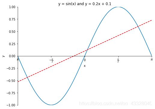
定義原點(diǎn)在中心的坐標(biāo)軸
import numpy as npimport matplotlib.pyplot as pltx = np.linspace(-np.pi, np.pi, 100)y = np.sin(x)linear_y = 0.2 * x + 0.1plt.figure(figsize = (8, 6))plt.plot(x, y)plt.plot(x, linear_y, color = "red", linestyle = '--')plt.title('y = sin(x) and y = 0.2x + 0.1')plt.xlabel('x')plt.ylabel('y')plt.xlim(-np.pi, np.pi)plt.ylim(-1, 1)# plt.xticks(np.linspace(-np.pi, np.pi, 5))x_value_range = np.linspace(-np.pi, np.pi, 5)x_value_strs = [r'$\pi$', r'$-\frac{\pi}{2}$', r'$0$', r'$\frac{\pi}{2}$', r'$\pi$']plt.xticks(x_value_range, x_value_strs)ax = plt.gca() # 獲取坐標(biāo)軸ax.spines['right'].set_color('none') # 隱藏上方和右方的坐標(biāo)軸ax.spines['top'].set_color('none')# 設(shè)置左方和下方坐標(biāo)軸的位置ax.spines['bottom'].set_position(('data', 0)) # 將下方的坐標(biāo)軸設(shè)置到y(tǒng) = 0的位置ax.spines['left'].set_position(('data', 0)) # 將左方的坐標(biāo)軸設(shè)置到 x = 0 的位置plt.show() # 顯示圖像
legend圖例
使用xticks()和yticks()函數(shù)替換軸標(biāo)簽,分別為每個(gè)函數(shù)傳入兩列數(shù)值。第一個(gè)列表存儲(chǔ)刻度的位置,第二個(gè)列表存儲(chǔ)刻度的標(biāo)簽。
import numpy as npimport matplotlib.pyplot as pltx = np.linspace(-np.pi, np.pi, 100)y = np.sin(x)linear_y = 0.2 * x + 0.1plt.figure(figsize = (8, 6))# 為曲線(xiàn)加上標(biāo)簽plt.plot(x, y, label = "y = sin(x)")plt.plot(x, linear_y, color = "red", linestyle = '--', label = 'y = 0.2x + 0.1')plt.title('y = sin(x) and y = 0.2x + 0.1')plt.xlabel('x')plt.ylabel('y')plt.xlim(-np.pi, np.pi)plt.ylim(-1, 1)# plt.xticks(np.linspace(-np.pi, np.pi, 5))x_value_range = np.linspace(-np.pi, np.pi, 5)x_value_strs = [r'$\pi$', r'$-\frac{\pi}{2}$', r'$0$', r'$\frac{\pi}{2}$', r'$\pi$']plt.xticks(x_value_range, x_value_strs)ax = plt.gca()ax.spines['right'].set_color('none')ax.spines['top'].set_color('none')ax.spines['bottom'].set_position(('data', 0))ax.spines['left'].set_position(('data', 0))# 將曲線(xiàn)的信息標(biāo)識(shí)出來(lái)plt.legend(loc = 'lower right', fontsize = 12)plt.show()?
legend方法中的loc?參數(shù)可選設(shè)置
| 位置字符串 | 位置編號(hào) | 位置表述 |
|---|---|---|
| ‘best’ | 0 | 最佳位置 |
| ‘upper right’ | 1 | 右上角 |
| ‘upper left’ | 2 | 左上角 |
| ‘lower left’ | 3 | 左下角 |
| ‘lower right’ | 4 | 右下角 |
| ‘right’ | 5 | 右側(cè) |
| ‘center left’ | 6 | 左側(cè)垂直居中 |
| ‘center right’ | 7 | 右側(cè)垂直居中 |
| ‘lower center’ | 8 | 下方水平居中 |
| ‘upper center’ | 9 | 上方水平居中 |
| ‘center’ | 10 | 正中間 |
二、柱狀圖
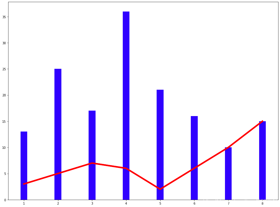
使用的方法:plt.bar
import numpy as npimport matplotlib.pyplot as pltplt.figure(figsize = (16, 12))x = np.array([1, 2, 3, 4, 5, 6, 7, 8])y = np.array([3, 5, 7, 6, 2, 6, 10, 15])plt.plot(x, y, 'r', lw = 5) # 指定線(xiàn)的顏色和寬度x = np.array([1, 2, 3, 4, 5, 6, 7, 8])y = np.array([13, 25, 17, 36, 21, 16, 10, 15])plt.bar(x, y, 0.2, alpha = 1, color='b') # 生成柱狀圖,指明圖的寬度,透明度和顏色plt.show()
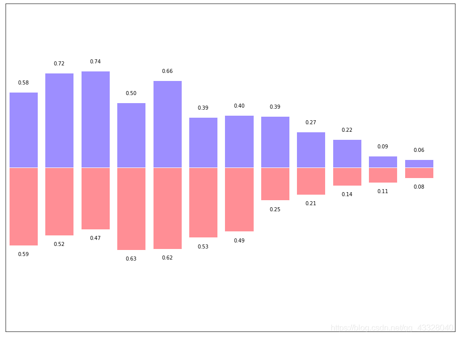
有的時(shí)候柱狀圖會(huì)出現(xiàn)在x軸的倆側(cè),方便進(jìn)行比較,代碼實(shí)現(xiàn)如下:
import numpy as npimport matplotlib.pyplot as pltplt.figure(figsize = (16, 12))n = 12x = np.arange(n)y1 = (1 - x / float(n)) * np.random.uniform(0.5, 1.0, n)y2 = (1 - x / float(n)) * np.random.uniform(0.5, 1.0, n)plt.bar(x, +y1, facecolor = '#9999ff', edgecolor = 'white')plt.bar(x, -y2, facecolor = '#ff9999', edgecolor = 'white')plt.xlim(-0.5, n)plt.xticks(())plt.ylim(-1.25, 1.25)plt.yticks(())for x1, y in zip(x, y2):plt.text(x1, -y - 0.05, '%.2f' % y, ha = 'center', va = 'top')for x1, y in zip(x, y1):plt.text(x1, y + 0.05, '%.2f' % y, ha = 'center', va = 'bottom')plt.show()
三、散點(diǎn)圖
import numpy as npimport matplotlib.pyplot as pltN = 50x = np.random.rand(N)y = np.random.rand(N)colors = np.random.rand(N)area = np.pi * (15 * np.random.rand(N))**2plt.scatter(x, y, s = area,c = colors, alpha = 0.8)plt.show()

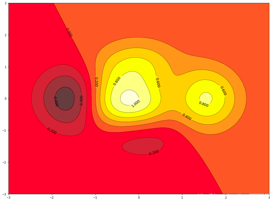
四、等高線(xiàn)圖
import matplotlib.pyplot as pltimport numpy as npdef f(x, y):return (1 - x / 2 + x ** 5 + y ** 3) * np.exp(-x ** 2 - y ** 2)n = 256x = np.linspace(-3, 3, n)y = np.linspace(-3, 3, n)X, Y = np.meshgrid(x, y) # 生成網(wǎng)格坐標(biāo) 將x軸與y軸正方形區(qū)域的點(diǎn)全部獲取line_num = 10 # 等高線(xiàn)的數(shù)量plt.figure(figsize = (16, 12))#contour 生成等高線(xiàn)的函數(shù)#前倆個(gè)參數(shù)表示點(diǎn)的坐標(biāo),第三個(gè)參數(shù)表示等成等高線(xiàn)的函數(shù),第四個(gè)參數(shù)表示生成多少個(gè)等高線(xiàn)C = plt.contour(X, Y, f(X, Y), line_num, colors = 'black', linewidths = 0.5) # 設(shè)置顏色和線(xiàn)段的寬度plt.clabel(C, inline = True, fontsize = 12) # 得到每條等高線(xiàn)確切的值# 填充顏色, cmap 表示以什么方式填充,hot表示填充熱量的顏色plt.contourf(X, Y, f(X, Y), line_num, alpha = 0.75, cmap = plt.cm.hot)plt.show()
五、處理圖片
import matplotlib.pyplot as pltimport matplotlib.image as mpimg # 導(dǎo)入處理圖片的庫(kù)import matplotlib.cm as cm # 導(dǎo)入處理顏色的庫(kù)colormapplt.figure(figsize = (16, 12))img?=?mpimg.imread('image/fuli.jpg')#?讀取圖片print(img) # numpy數(shù)據(jù)print(img.shape) #plt.imshow(img, cmap = 'hot')plt.colorbar() # 得到顏色多對(duì)應(yīng)的數(shù)值plt.show()
[][][]...[][][]][][][]...[][][]][][][]...[][][]]...[][][]...[][][]][][][]...[][][]][][][]...[][][]]](728,?516,?3)

利用numpy矩陣得到圖片
import matplotlib.pyplot as pltimport matplotlib.cm as cm # 導(dǎo)入處理顏色的庫(kù)colormapimport numpy as npsize = 8# 得到一個(gè)8*8數(shù)值在(0, 1)之間的矩陣a = np.linspace(0, 1, size ** 2).reshape(size, size)plt.figure(figsize = (16, 12))plt.imshow(a)plt.show()

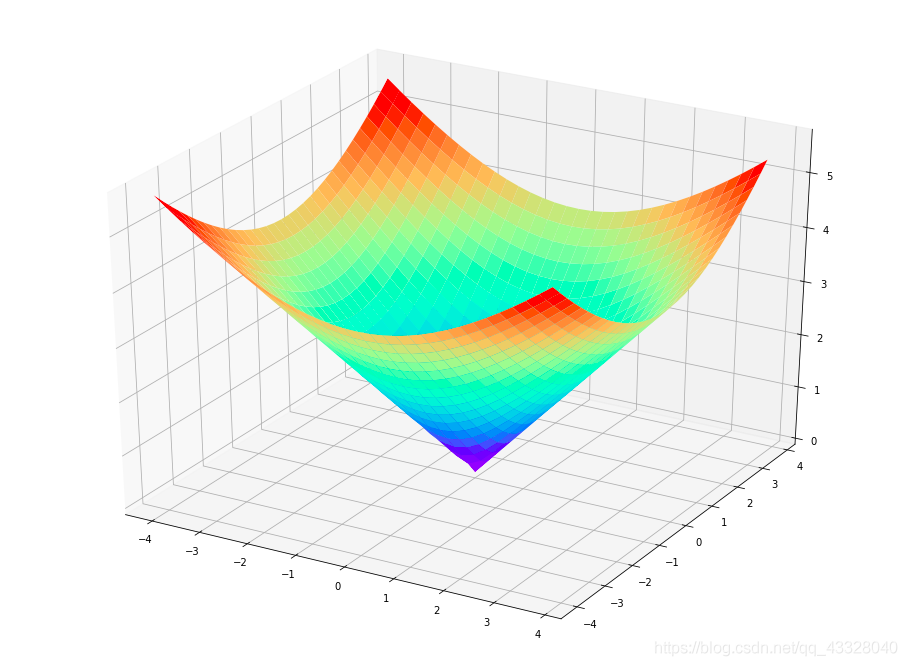
六、3D圖
import numpy as npimport matplotlib.pyplot as pltfrom mpl_toolkits.mplot3d import Axes3D # 導(dǎo)入Axes3D對(duì)象fig = plt.figure(figsize = (16, 12))ax = fig.add_subplot(111, projection = '3d') # 得到3d圖像x = np.arange(-4, 4, 0.25)y = np.arange(-4, 4, 0.25)X, Y = np.meshgrid(x, y) # 生成網(wǎng)格Z = np.sqrt(X ** 2 + Y ** 2)# 畫(huà)曲面圖 # 行和列對(duì)應(yīng)的跨度 # 設(shè)置顏色ax.plot_surface(X, Y, Z, rstride = 1, cstride = 1, cmap = plt.get_cmap('rainbow'))plt.show()
以上是matplotlib基于測(cè)試數(shù)據(jù)的數(shù)據(jù)可視化,結(jié)合實(shí)際項(xiàng)目中數(shù)據(jù),代碼稍加修改,即可有讓人印象深刻的效果。