
如何用 Python 快速揭示數(shù)據(jù)之間的各種關(guān)系
探索性數(shù)據(jù)分析(EDA)涉及兩個基本步驟
數(shù)據(jù)分析(數(shù)據(jù)預處理、清洗以及處理)。 數(shù)據(jù)可視化(使用不同類型的圖來展示數(shù)據(jù)中的關(guān)系)。
Pandas 是 Python 中最常用的數(shù)據(jù)分析庫。Python 提供了大量用于數(shù)據(jù)可視化的庫,Matplotlib 是最常用的,它提供了對繪圖的完全控制,并使得繪圖自定義變得容易。
但是,Matplotlib 缺少了對 Pandas 的支持。而 Seaborn 彌補了這一缺陷,它是建立在 Matplotlib 之上并與 Pandas 緊密集成的數(shù)據(jù)可視化庫。
然而,Seaborn 雖然活干得漂亮,但是函數(shù)眾多,讓人不知道到底該怎么使用它們?不要慫,本文就是為了理清這點,讓你快速掌握這款利器。
這篇文章主要涵蓋如下內(nèi)容,
Seaborn 中提供的不同的繪圖類型。 Pandas 與 Seaborn 的集成如何實現(xiàn)以最少的代碼繪制復雜的多維圖? 如何在 Matplotlib 的輔助下自定義 Seaborn 繪圖設置?
誰適合閱讀這篇文章?
如果你具備 Matplotlib 和 Pandas 的基本知識,并且想探索一下 Seaborn,那么這篇文章正是不錯的起點。
如果目前只掌握 Python,建議翻閱文末相關(guān)文章,特別是在掌握?Pandas 的基本使用之后再回到這里來或許會更好一些。
1Matplotlib
盡管僅使用最簡單的功能就可以完成許多任務,但是了解 Matplotlib 的基礎(chǔ)非常重要,其原因有兩個,
Seaborn 在底層使用 Matplotlib 繪圖。 一些自定義項需要直接使用 Matplotlib。
這里對 Matplotlib 的基礎(chǔ)作個簡單概述。下圖顯示了 Matplotlib 窗口的各個要素。
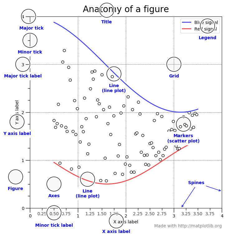
需要了解的三個主要的類是圖形(Figure),圖軸(Axes)以及坐標軸(Axis)。
圖形(Figure)
它指的就是你看到的整個圖形窗口。同一圖形中可能有多個子圖(圖軸)。在上面的示例中,在一個圖形中有四個子圖(圖軸)。
圖軸(Axes)
圖軸就是指圖形中實際繪制的圖。一個圖形可以有多個圖軸,但是給定的圖軸只是整個圖形的一部分。在上面的示例中,我們在一個圖形中有四個圖軸。
坐標軸(Axis)
坐標軸是指特定圖軸中的實際的 x-軸和 y-軸。
本帖子中的每個示例均假設已經(jīng)加載所需的模塊以及數(shù)據(jù)集,如下所示,
import?pandas?as?pd
import?numpy?as?np
from?matplotlib?import?pyplot?as?plt
import?seaborn?as?sns

tips?=?sns.load_dataset('tips')
iris?=?sns.load_dataset('iris')
import?matplotlib
matplotlib.style.use('ggplot')
tips.head()
| total_bill | tip | sex | smoker | day | time | size | |
|---|---|---|---|---|---|---|---|
| 0 | 16.99 | 1.01 | Female | No | Sun | Dinner | 2 |
| 1 | 10.34 | 1.66 | Male | No | Sun | Dinner | 3 |
| 2 | 21.01 | 3.50 | Male | No | Sun | Dinner | 3 |
| 3 | 23.68 | 3.31 | Male | No | Sun | Dinner | 2 |
| 4 | 24.59 | 3.61 | Female | No | Sun | Dinner | 4 |
iris.head()
| sepal_length | sepal_width | petal_length | petal_width | species | |
|---|---|---|---|---|---|
| 0 | 5.1 | 3.5 | 1.4 | 0.2 | setosa |
| 1 | 4.9 | 3.0 | 1.4 | 0.2 | setosa |
| 2 | 4.7 | 3.2 | 1.3 | 0.2 | setosa |
| 3 | 4.6 | 3.1 | 1.5 | 0.2 | setosa |
| 4 | 5.0 | 3.6 | 1.4 | 0.2 | setosa |
讓我們通過一個例子來理解一下 Figure 和 Axes 這兩個類。
dates?=?['1981-01-01',?'1981-01-02',?'1981-01-03',?'1981-01-04',?'1981-01-05',
?????????'1981-01-06',?'1981-01-07',?'1981-01-08',?'1981-01-09',?'1981-01-10']

min_temperature?=?[20.7,?17.9,?18.8,?14.6,?15.8,?15.8,?15.8,?17.4,?21.8,?20.0]
max_temperature?=?[34.7,?28.9,?31.8,?25.6,?28.8,?21.8,?22.8,?28.4,?30.8,?32.0]

fig,?axes?=?plt.subplots(nrows=1,?ncols=1,?figsize=(10,5));
axes.plot(dates,?min_temperature,?label='Min?Temperature');
axes.plot(dates,?max_temperature,?label?=?'Max?Temperature');
axes.legend();
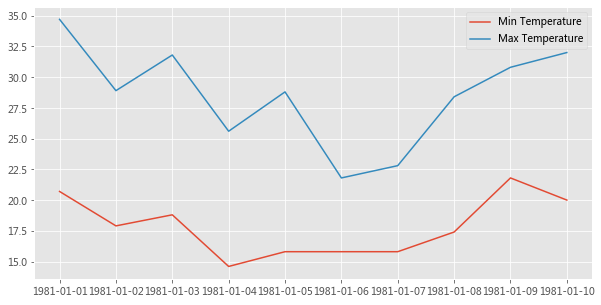
plt.subplots() 創(chuàng)建一個 Figure 對象實例,以及 nrows x ncols 個 Axes 實例,并返回創(chuàng)建的 Figure 對象和 Axes 實例。在上面的示例中,由于我們傳遞了 nrows = 1 和 ncols = 1,因此它僅創(chuàng)建一個 Axes 實例。如果 nrows > 1 或 ncols > 1,則將創(chuàng)建一個 Axes 網(wǎng)格并將其返回為 nrows 行 ncols 列的 numpy 數(shù)組。
Axes 類最常用的自定義方法有,
Axes.set_xlabel()?????????Axes.set_ylabel()
Axes.set_xlim()???????????Axes.set_ylim()
Axes.set_xticks()?????????Axes.set_yticks()
Axes.set_xticklabels()????Axes.set_yticklabels()
Axes.set_title()
Axes.tick_params()
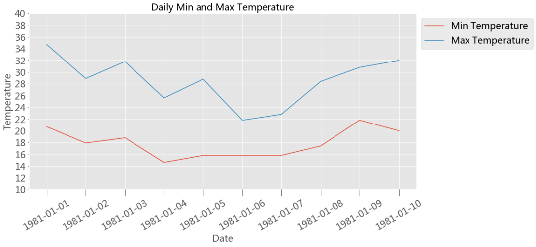
下面是一個使用上述某些方法進行自定義的例子,
fontsize?=20
fig,?axes?=?plt.subplots(nrows=1,?ncols=1,?figsize=(15,7))
axes.plot(dates,?min_temperature,?label='Min?Temperature')
axes.plot(dates,?max_temperature,?label='Max?Temperature')

axes.set_xlabel('Date',?fontsize=fontsize)
axes.set_ylabel('Temperature',?fontsize=fontsize)

axes.set_title('Daily?Min?and?Max?Temperature',?fontsize=fontsize)

axes.set_xticks(dates)
axes.set_xticklabels(dates)
axes.tick_params('x',?labelsize=fontsize,?labelrotation=30,?size=15)


axes.set_ylim(10,40)
axes.set_yticks(np.arange(10,41,2))
axes.tick_params('y',labelsize=fontsize)

axes.legend(fontsize=fontsize,loc='upper?left',?bbox_to_anchor=(1,1));
上面我們快速了解了下 Matplotlib 的基礎(chǔ)知識,現(xiàn)在讓我們進入 Seaborn。
2Seaborn
Seaborn 中的每個繪圖函數(shù)既是圖形級函數(shù)又是圖軸級函數(shù),因此有必要了解這兩者之間的區(qū)別。
如前所述,圖形指的是你看到的整個繪圖窗口上的圖,而圖軸指的是圖形中的一個特定子圖。 圖軸級函數(shù)只繪制到單個 Matplotlib 圖軸上,并不影響圖形的其余部分。 而圖形級函數(shù)則可以控制整個圖形。
我們可以這么來理解這一點,圖形級函數(shù)可以調(diào)用不同的圖軸級函數(shù)在不同的圖軸上繪制不同類型的子圖。
sns.set_style('darkgrid')
2.1 圖軸級函數(shù)
下面羅列的是 Seaborn 中所有圖軸級函數(shù)的詳細列表。
關(guān)系圖 Relational Plots
scatterplot( ) lineplot( )
類別圖 Categorical Plots
striplot( )、swarmplot( ) boxplot( )、boxenplot( ) violinplot( )、countplot( ) pointplot( )、barplot( )
分布圖 Distribution Plots
distplot( ) kdeplot( ) rugplot( )
回歸圖 Regression Plots
regplot( ) residplot( )
矩陣圖 MatrixPlots( )
heatmap( )
使用任何圖軸級函數(shù)需要了解的兩點,
將輸入數(shù)據(jù)提供給圖軸級函數(shù)的不同方法。
指定用于繪圖的圖軸。
2.1.1 將輸入數(shù)據(jù)提供給圖軸級函數(shù)的不同方法
1、列表、數(shù)組或系列
將數(shù)據(jù)傳遞到圖軸級函數(shù)的最常用方法是使用迭代器,例如列表 list,數(shù)組 array 或序列 series
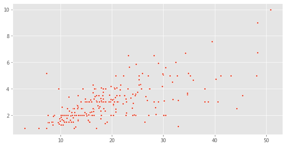
total_bill?=?tips['total_bill'].values
tip?=?tips['tip'].values

fig?=?plt.figure(figsize=(10,?5))
sns.scatterplot(total_bill,?tip,?s=15);
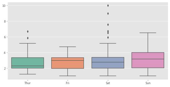
tip?=?tips['tip'].values
day?=?tips['day'].values

fig?=?plt.figure(figsize=(10,?5))
sns.boxplot(day,?tip,?palette="Set2");
2、使用 Pandas 的 Dataframe 類型以及列名。
Seaborn 受歡迎的主要原因之一是它可以直接可以與 Pandas 的 Dataframes 配合使用。在這種數(shù)據(jù)傳遞方法中,列名應傳遞給 x 和 y 參數(shù),而 Dataframe 應傳遞給 data 參數(shù)。
fig?=?plt.figure(figsize=(10,?5))
sns.scatterplot(x='total_bill',?y='tip',?data=tips,?s=50);

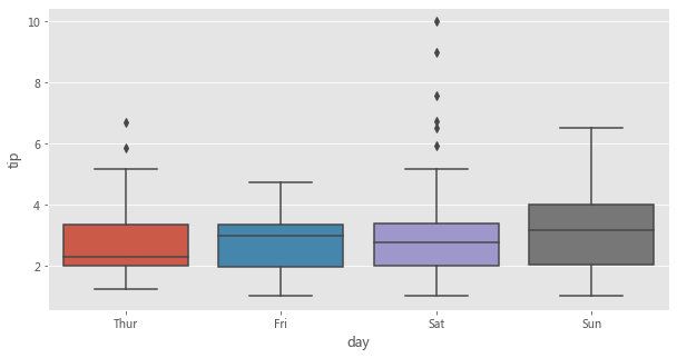
fig?=?plt.figure(figsize=(10,?5))
sns.boxplot(x='day',?y='tip',?data=tips);
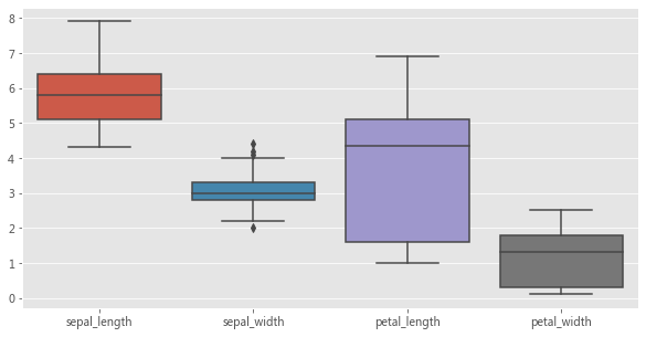
3、僅傳遞 Dataframe
在這種數(shù)據(jù)傳遞方式中,僅將 Dataframe 傳遞給 data 參數(shù)。數(shù)據(jù)集中的每個數(shù)字列都將使用此方法繪制。此方法只能與以下軸級函數(shù)一起使用,
stripplot( )、swarmplot( )
boxplot( )、boxenplot( )、violinplot( )、pointplot( ) barplot( )、countplot( )
使用上述圖軸級函數(shù)來展示某個數(shù)據(jù)集中的多個數(shù)值型變量的分布,是這種數(shù)據(jù)傳遞方式的常見用例。
fig?=?plt.figure(figsize=(10,?5))
sns.boxplot(data=iris);
2.1.2 指定用于繪圖的圖軸
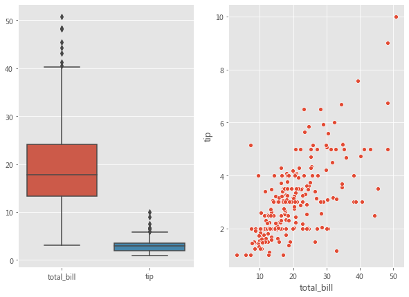
Seaborn 中的每個圖軸級函數(shù)都帶有一個 ax 參數(shù)。傳遞給 ax 參數(shù)的 Axes 將負責具體繪圖。這為控制使用具體圖軸進行繪圖提供了極大的靈活性。例如,假設要查看總賬單 bill 和小費 tip 之間的關(guān)系(使用散點圖)以及它們的分布(使用箱形圖),我們希望在同一個圖形但在不同圖軸上展示它們。
fig,?axes?=?plt.subplots(1,?2,?figsize=(10,?7))
sns.scatterplot(x='total_bill',?y='tip',?data=tips,?ax=axes[1]);
sns.boxplot(data?=?tips[['total_bill','tip']],?ax=axes[0]);
每個圖軸級函數(shù)還會返回實際在其上進行繪圖的圖軸。如果將圖軸傳遞給了 ax 參數(shù),則將返回該圖軸對象。然后可以使用不同的方法(如Axes.set_xlabel( ),Axes.set_ylabel( ) 等)對返回的圖軸對象進行進一步自定義設置。
如果沒有圖軸傳遞給 ax 參數(shù),則 Seaborn 將使用當前(活動)圖軸來進行繪制。
fig,?curr_axes?=?plt.subplots()
scatter_plot_axes?=?sns.scatterplot(x='total_bill',?y='tip',?data=tips)
id(curr_axes)?==?id(scatter_plot_axes)
True
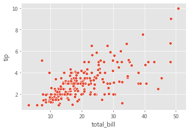
在上面的示例中,即使我們沒有將 curr_axes(當前活動圖軸)顯式傳遞給 ax 參數(shù),但 Seaborn 仍然使用它進行了繪制,因為它是當前的活動圖軸。id(curr_axes) == id(scatter_plot_axes) 返回 True,表示它們是相同的軸。
如果沒有將圖軸傳遞給 ax 參數(shù)并且沒有當前活動圖軸對象,那么 Seaborn 將創(chuàng)建一個新的圖軸對象以進行繪制,然后返回該圖軸對象。
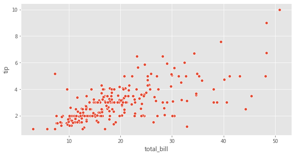
Seaborn 中的圖軸級函數(shù)并沒有參數(shù)用來控制圖形的尺寸。但是,由于我們可以指定要使用哪個圖軸進行繪圖,因此可以通過為 ax 參數(shù)傳遞圖軸來控制圖形尺寸,如下所示。
fig,?axes?=?plt.subplots(1,?1,?figsize=(10,?5))
sns.scatterplot(x='total_bill',?y='tip',?data=tips,?ax=axes);
2.2 圖形級函數(shù)
在瀏覽多維數(shù)據(jù)集時,數(shù)據(jù)可視化的最常見用例之一就是針對各個數(shù)據(jù)子集繪制同一類圖的多個實例。
Seaborn 中的圖形級函數(shù)就是為這種情形量身定制的。
圖形級函數(shù)可以完全控制整個圖形,并且每次調(diào)用圖形級函數(shù)時,它都會創(chuàng)建一個包含多個圖軸的新圖形。 Seaborn 中三個最通用的圖形級函數(shù)是 FacetGrid、PairGrid 以及 JointGrid。
2.2.1 FacetGrid
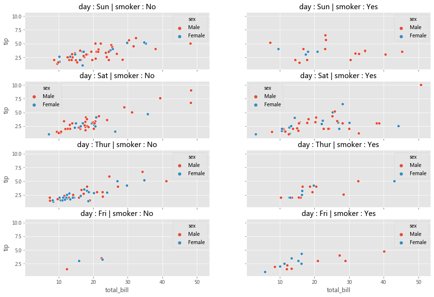
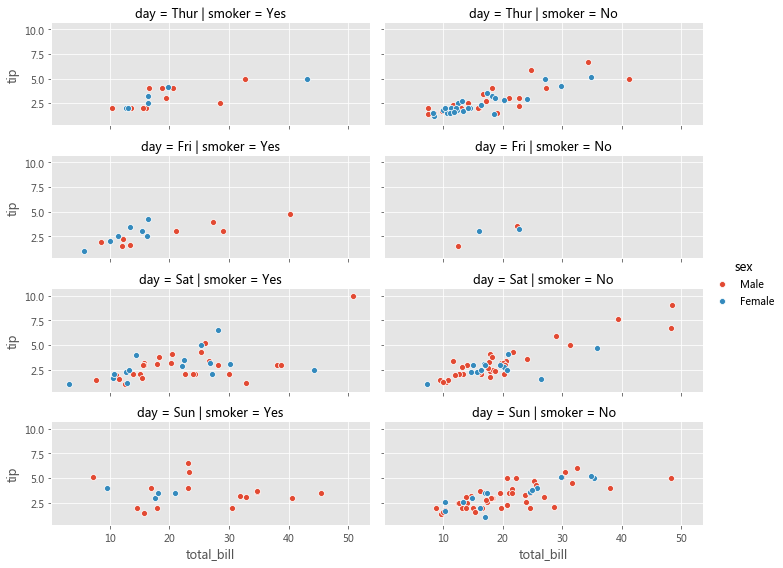
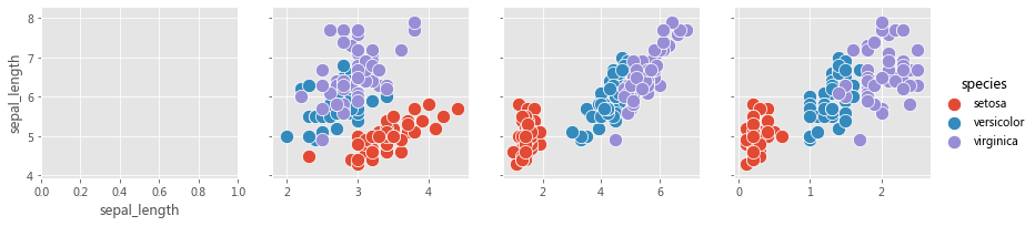
考慮下面的用例,我們想可視化不同數(shù)據(jù)子集上的總賬單和小費之間的關(guān)系(通過散點圖)。數(shù)據(jù)的每個子集均按以下變量的值的唯一組合進行分類,
1、星期幾(星期四、五、六、日) 2、是否吸煙(是或否)
3、性別(男性或女性)
如下所示,我們可以用 Matplotlib 和 Seaborn 輕松完成這個操作,
row_variable?=?'day'
col_variable?=?'smoker'
hue_variable?=?'sex'
row_variables?=?tips[row_variable].unique()
col_variables?=?tips[col_variable].unique()
num_rows?=?row_variables.shape[0]
num_cols?=?col_variables.shape[0]

fig,axes?=?plt.subplots(num_rows,?num_cols,?sharex=True,?sharey=True,?figsize=(15,10))
subset?=?tips.groupby([row_variable,col_variable])
for?row?in?range(num_rows):
????for?col?in?range(num_cols):
????????ax?=?axes[row][col]
????????row_id?=?row_variables[row]
????????col_id?=?col_variables[col]
????????ax_data?=?subset.get_group((row_id,?col_id))
????????sns.scatterplot(x='total_bill',?y='tip',?data=ax_data,?hue=hue_variable,ax=ax);
????????title?=?row_variable?+?'?:?'??+?row_id?+?'?|?'?+?col_variable?+?'?:?'?+?col_id
????????ax.set_title(title);
分析一下,上面的代碼可以分為三個步驟,
1、為每個數(shù)據(jù)子集創(chuàng)建一個圖軸(子圖) 2、將數(shù)據(jù)集劃分為子集 3、在每個圖軸上,使用對應于該圖軸的數(shù)據(jù)子集來繪制散點圖
在 Seaborn 中,可以將上面三部曲進一步簡化為兩部曲。
步驟 1 可以在 Seaborn 中可以使用
FacetGrid( )完成步驟 2 和步驟 3 可以使用
FacetGrid.map( )完成
使用 FacetGrid,我們可以創(chuàng)建圖軸并結(jié)合 row,col 和 hue 參數(shù)將數(shù)據(jù)集劃分為三個維度。一旦創(chuàng)建好 FacetGrid 后,可以將具體的繪圖函數(shù)作為參數(shù)傳遞給 FacetGrid.map( ) 以在所有圖軸上繪制相同類型的圖。在繪圖時,我們還需要傳遞用于繪圖的 Dataframe 中的具體列名。
facet_grid?=?sns.FacetGrid(row='day',?col='smoker',?hue='sex',?data=tips,?height=2,?aspect=2.5)
facet_grid.map(sns.scatterplot,?'total_bill',?'tip')
facet_grid.add_legend();
Matplotlib 為使用多個圖軸繪圖提供了良好的支持,而 Seaborn 在它基礎(chǔ)上將圖的結(jié)構(gòu)與數(shù)據(jù)集的結(jié)構(gòu)直接連接起來了。
使用 FacetGrid,我們既不必為每個數(shù)據(jù)子集顯式地創(chuàng)建圖軸,也不必顯式地將數(shù)據(jù)劃分為子集。這些任務由 FacetGrid( ) 和 FacetGrid.map( ) 分別在內(nèi)部完成了。
我們可以將不同的圖軸級函數(shù)傳遞給 FacetGrid.map( )。
另外,Seaborn 提供了三個圖形級函數(shù)(高級接口),這些函數(shù)在底層使用 FacetGrid( ) 和 FacetGrid.map( )。
1、relplot( ) 2、catplot( )
3、lmplot( )
上面的圖形級函數(shù)都使用 FacetGrid( ) 創(chuàng)建多個圖軸 Axes,并用參數(shù) kind 記錄一個圖軸級函數(shù),然后在內(nèi)部將該參數(shù)傳遞給 FacetGrid.map( )。上述三個函數(shù)分別使用不同的圖軸級函數(shù)來實現(xiàn)不同的繪制。
relplot()?-?FacetGrid()?+?lineplot()???/?scatterplot()?
catplot()?-?FacetGrid()?+?stripplot()??/?swarmplot()???/?boxplot()?
??????????????????????????boxenplot()??/?violinplot()??/?pointplot()?
??????????????????????????barplot()????/?countplot()?
lmplot()??-?FacetGrid()?+?regplot()
與直接使用諸如 relplot( )、catplot( ) 或 lmplot( ) 之類的高級接口相比,顯式地使用 FacetGrid 提供了更大的靈活性。例如,使用 FacetGrid( ),我們還可以將自定義函數(shù)傳遞給 FacetGrid.map( ),但是對于高級接口,我們只能使用內(nèi)置的圖軸級函數(shù)指定給參數(shù) kind。如果你不需要這種靈活性,則可以直接使用這些高級接口函數(shù)。
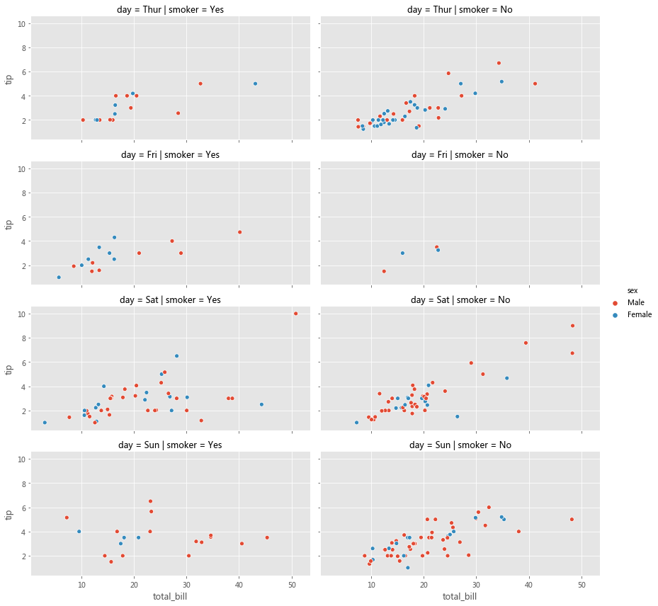
grid?=?sns.relplot(x='total_bill',?y='tip',?row='day',?col='smoker',?hue='sex',?data=tips,?kind='scatter',?height=3,?aspect=2.0)
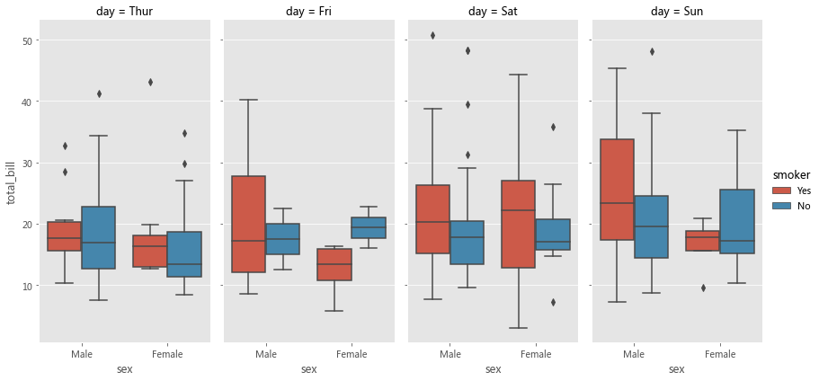
sns.catplot(col='day',?kind='box',?data=tips,?x='sex',?y='total_bill',?hue='smoker',?height=6,?aspect=0.5)
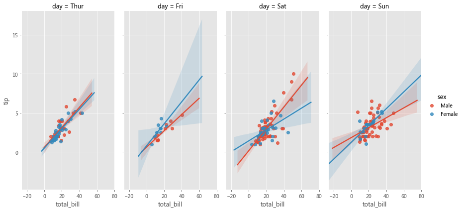
sns.lmplot(col='day',?data=tips,?x='total_bill',?y='tip',?hue='sex',?height=6,?aspect=0.5)
2.2.2 PairGrid
PairGrid 用于繪制數(shù)據(jù)集中變量之間的成對關(guān)系。每個子圖顯示一對變量之間的關(guān)系。考慮以下用例,我們希望可視化每對變量之間的關(guān)系(通過散點圖)。雖然可以在 Matplotlib 中也能完成此操作,但如果用 Seaborn 就會變得更加便捷。
iris?=?sns.load_dataset('iris')
g?=?sns.PairGrid(iris)
此處的實現(xiàn)主要分為兩步,
1、為每對變量創(chuàng)建一個圖軸 2、在每個圖軸上,使用與該對變量對應的數(shù)據(jù)繪制散點圖
第 1 步可以使用 PairGrid( ) 來完成。第 2 步可以使用 PairGrid.map( ) 來完成。
因此,PairGrid( ) 為每對變量創(chuàng)建圖軸,而 PairGrid.map( ) 使用與該對變量相對應的數(shù)據(jù)在每個圖軸上繪制曲線。我們可以將不同的圖軸級函數(shù)傳遞給 PairGrid.map( )。
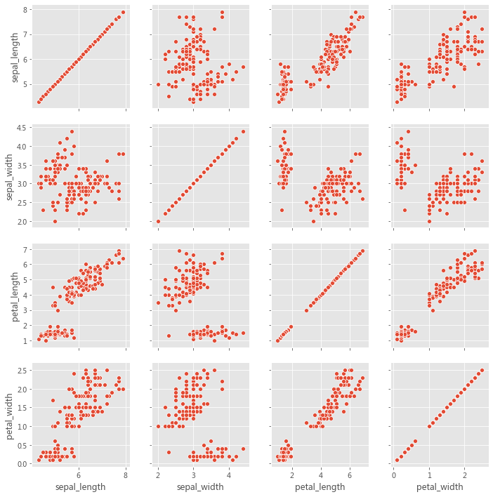
grid?=?sns.PairGrid(iris)
grid.map(sns.scatterplot)
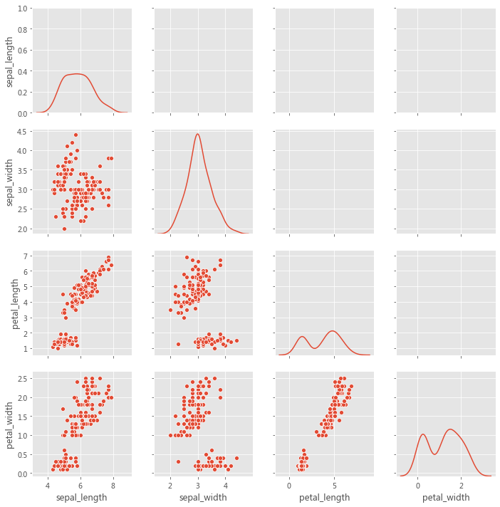
grid?=?sns.PairGrid(iris,?diag_sharey=True,?despine=False)
grid.map_lower(sns.scatterplot)
grid.map_diag(sns.kdeplot)
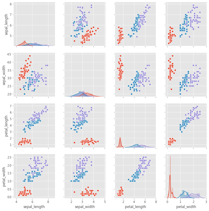
grid?=?sns.PairGrid(iris,?hue='species')
grid.map_diag(sns.distplot)
grid.map_offdiag(sns.scatterplot)
該圖不必是正方形的:可以使用單獨的變量來定義行和列,
x_vars?=?['sepal_length',?'sepal_width',?'petal_length',?'petal_width']
y_vars?=?['sepal_length']
grid?=?sns.PairGrid(iris,?hue='species',?x_vars=x_vars,?y_vars=y_vars,?height=3)
grid.map_offdiag(sns.scatterplot,?s=150)
#?grid.map_diag(sns.kdeplot)
grid.add_legend()
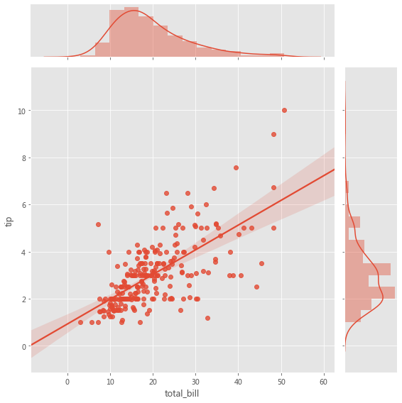
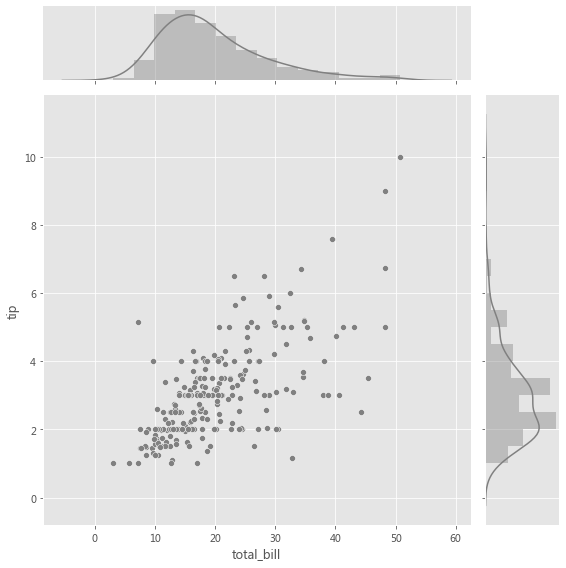
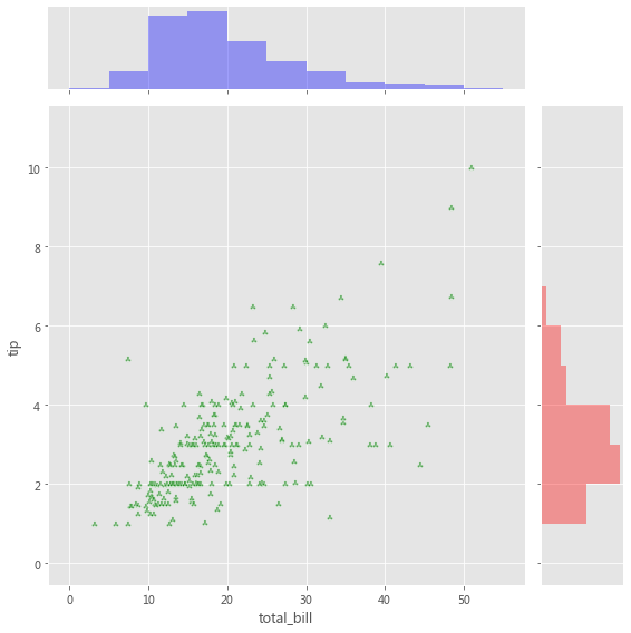
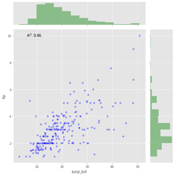
2.2.3 JointGrid
當我們要在同一圖中繪制雙變量聯(lián)合分布和邊際分布時,使用 JointGrid。可以使用 scatter plot、regplot 或 kdeplot 可視化兩個變量的聯(lián)合分布。變量的邊際分布可以通過直方圖和/或 kde 圖可視化。
用于聯(lián)合分布的圖軸級函數(shù)必須傳遞給 JointGrid.plot_joint( )。用于邊際分布的軸級函數(shù)必須傳遞給 JointGrid.plot_marginals( )。
grid?=?sns.JointGrid(x="total_bill",?y="tip",?data=tips,?height=8)
grid.plot(sns.regplot,?sns.distplot);
grid?=?sns.JointGrid(x="total_bill",?y="tip",?data=tips,?height=8)
grid?=?grid.plot_joint(plt.scatter,?color=".5",?edgecolor="white")
grid?=?grid.plot_marginals(sns.distplot,?kde=True,?color=".5")
g?=?sns.JointGrid(x="total_bill",?y="tip",?data=tips,?height=8)
g?=?g.plot_joint(plt.scatter,?color="g",?marker='$\clubsuit$',?edgecolor="white",?alpha=.6)
_?=?g.ax_marg_x.hist(tips["total_bill"],?color="b",?alpha=.36,
??????????????????????bins=np.arange(0,?60,?5))
_?=?g.ax_marg_y.hist(tips["tip"],?color="r",?alpha=.36,
?????????????????????orientation="horizontal",
?????????????????????bins=np.arange(0,?12,?1))
添加帶有統(tǒng)計信息的注釋(Annotation),該注釋匯總了雙變量關(guān)系,
from?scipy?import?stats
g?=?sns.JointGrid(x="total_bill",?y="tip",?data=tips,?height=8)
g?=?g.plot_joint(plt.scatter,?color="b",?alpha=0.36,?s=40,?edgecolor="white")
g?=?g.plot_marginals(sns.distplot,?kde=False,?color="g")

rsquare?=?lambda?a,?b:?stats.pearsonr(a,?b)[0]?**?2
g?=?g.annotate(rsquare,?template="{stat}:?{val:.2f}",?stat="$R^2$",?loc="upper?left",?fontsize=12)
3小結(jié)
探索性數(shù)據(jù)分析(EDA)涉及兩個基本步驟,
數(shù)據(jù)分析(數(shù)據(jù)預處理、清洗以及處理)。 數(shù)據(jù)可視化(使用不同類型的圖來展示數(shù)據(jù)中的關(guān)系)。
Seaborn 與 Pandas 的集成有助于以最少的代碼制作復雜的多維圖,
Seaborn 中的每個繪圖函數(shù)都是圖軸級函數(shù)或圖形級函數(shù)。 圖軸級函數(shù)繪制到單個 Matplotlib 圖軸上,并且不影響圖形的其余部分。 圖形級函數(shù)控制整個圖形。
?參考資料?
Meet Desai : https://towardsdatascience.com/matplotlib-seaborn-pandas-an-ideal-amalgamation-for-statistical-data-visualisation-f619c8e8baa3
相關(guān)閱讀