
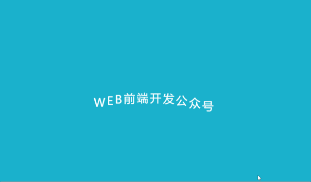
【開發(fā)小技巧】029—用CSS如何制作一個波浪形文本動畫效果

<div class="wavy">????????<span?style="--i:1">Wspan>?????????<span?style="--i:2">Espan>?????????<span?style="--i:3">Bspan>?<span style="--i:4">前span><span style="--i:5">端span><span style="--i:6">開 span><span style="--i:7">發(fā)span><span style="--i:8">公span><span style="--i:9">眾span><span style="--i:10">號span>div>
<style type="text/css">body {display: flex;justify-content: center;align-items: center;min-height: 100vh;background-color: #1ab1cc;}.wavy {position: relative;}.wavy span {position: relative;display: inline-block;color: #fff;font-size: 2em;text-transform: uppercase;animation: animate 2s ease-in-out infinite;animation-delay: calc(0.1s * var(--i));}@keyframes animate {0% {transform: translateY(0px);}40% {transform: translateY(-40px);}80% transform: translateY(-80px);}100% {transform: translateY(0px);}}style>
<html><head><meta charset="utf-8"><style type="text/css">body {display: flex;justify-content: center;align-items: center;min-height: 100vh;background-color: #1ab1cc;}.wavy {position: relative;}.wavy span {position: relative;display: inline-block;color: #fff;font-size: 2em;text-transform: uppercase;animation: animate 2s ease-in-out infinite;animation-delay: calc(0.1s * var(--i));}@keyframes animate {0% {transform: translateY(0px);}40% {transform: translateY(-40px);}80% transform: translateY(-80px);}100% {transform: translateY(0px);}}style>head><body><div class="wavy">????????<span?style="--i:1">Wspan>?????????<span?style="--i:2">Espan>?????????<span?style="--i:3">Bspan>?<span style="--i:4">前span><span style="--i:5">端span><span style="--i:6">開 span><span style="--i:7">發(fā)span><span style="--i:8">公span><span style="--i:9">眾span><span style="--i:10">號span>div>body>html>
通過運行此代碼,我們看到最終效果:
本文完~

評論
圖片
表情