
一篇文章帶你搞定Pandas繪圖API
回復(fù)“資源”即可獲贈Python學習資料

對于從網(wǎng)頁上爬取下來的數(shù)據(jù)很多很雜亂,我們需要進行數(shù)據(jù)可視化,pandas除了數(shù)據(jù)處理還可以進行數(shù)據(jù)可視化展示,這里我們簡單說明一下pandas繪制常見圖形的一些API:由于現(xiàn)在針對數(shù)據(jù)可視化有很多庫,matplotlib、seaborn、pyecharts等等,使用pandas繪圖其實并不多,這里做一個簡單展示。
目錄:
柱狀圖
餅圖
折線圖
散點圖
直方圖
柱狀圖
普通柱圖
首先我們打開excel數(shù)據(jù)文件,如下圖所示:
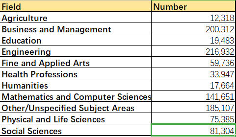
Field:專業(yè);Number:對應(yīng)專業(yè)學生數(shù)量,根據(jù)兩列數(shù)據(jù)繪制簡單柱圖:
import?pandas?as?pd
import?matplotlib.pyplot?as?plt
data?=?pd.read_excel('Students.xlsx')?
#?pd繪圖
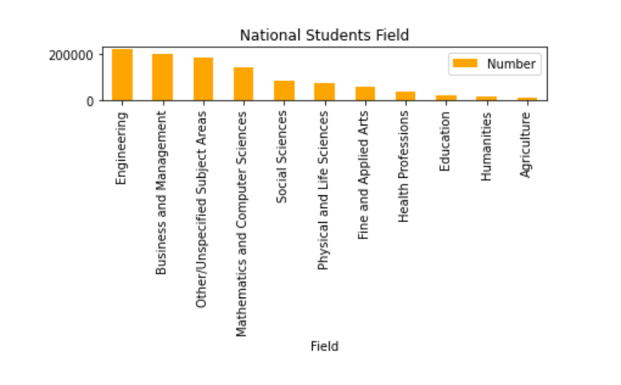
data.sort_values(by='Number',inplace=True,ascending=False)
data.plot.bar(x='Field',y='Number',title='National?Students?Field')
plt.tight_layout()
plt.show()
解釋說明:
Students.xlsx:對應(yīng)的數(shù)據(jù)文件; data.sort_values(by='Number',inplace=True,ascending=False):按照Number數(shù)量大小排序,inplace = True:在當前數(shù)據(jù)文件上修改,不生成新的數(shù)據(jù)文件,ascending = False:降序排序; bar() 繪制柱圖的函數(shù),x、y分別指定下,x、y軸的序列; tight_layout() 使得整個圖緊湊顯示,不然x軸的文字由于太長會被擋住;
結(jié)果如下所示:
分組柱圖
首先我們還是查看數(shù)據(jù)文件:students02.xlsx
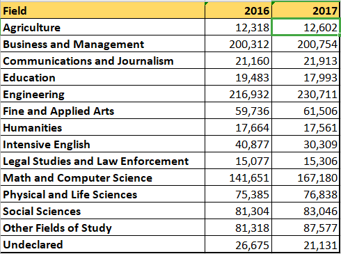
給出了2016、2017兩年的學生數(shù)量,由此考慮繪制分組柱狀圖:
import??pandas?as?pd
import??matplotlib.pyplot?as?plt
data?=?pd.read_excel('Students02.xlsx')
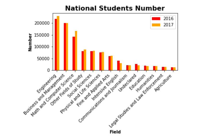
data.sort_values(by='2017',inplace=True,ascending=False)
data.plot.bar(x='Field',y=['2016','2017'],color=['red','orange'])
plt.title('National?Students?Number',fontsize=16,fontweight='bold')
plt.xlabel('Field',fontweight='bold')
plt.ylabel('Number',fontweight='bold')
#?x軸刻度偏轉(zhuǎn)
ax?=?plt.gca()
ax.set_xticklabels(data['Field'],rotation=45,ha='right')
print(data)
f?=?plt.gcf()
f.subplots_adjust(left=0.2,bottom=0.4)
#?plt.tight_layout()
plt.show()
解釋說明:
bar() 繪制柱圖的函數(shù),x、y分別指定下,x、y軸的序列,但是由于分組柱圖y軸不再是一個序列,而是由兩個(或多個)序列組成的列表; plt.title() 設(shè)置標題,當然也可以在bar() 函數(shù)里面設(shè)置; plt.gca() 獲得x軸的文字,下一列重新設(shè)置x軸的文字,并且把文字旋轉(zhuǎn)45°,ha='right':依照右點為中心進行水平對齊; plt.gcf() 拿到繪制的圖形對象,設(shè)置留白區(qū)域,left=0.2(左側(cè)留白20%),bottom=0.4,底部留白40%;
結(jié)果如下:
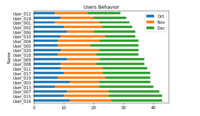
疊加柱圖
有的時候可能不只有兩組數(shù)據(jù),要觀察多組數(shù)據(jù)的數(shù)量占比,可以采用疊加柱圖:
import?matplotlib.pyplot?as?plt?
import?pandas?as?pd?
data?=?pd.read_excel('./excel文件/Users.xlsx')?#?這里數(shù)據(jù)文件就不再展示
data['total']?=?data['Oct']?+?data['Nov']?+?data['Dec']
data.sort_values(by='total',inplace=True,ascending=False)
#?data.plot.bar(x='Name',y=['Oct','Nov','Dec'],stacked=True,title='Users?Behavior')?豎直
data.plot.barh(x='Name',y=['Oct','Nov','Dec'],stacked=True,title='Users?Behavior')?#水平??如果需要改變順序,將ascending=true
plt.tight_layout()
plt.show()
結(jié)果如下圖所示:
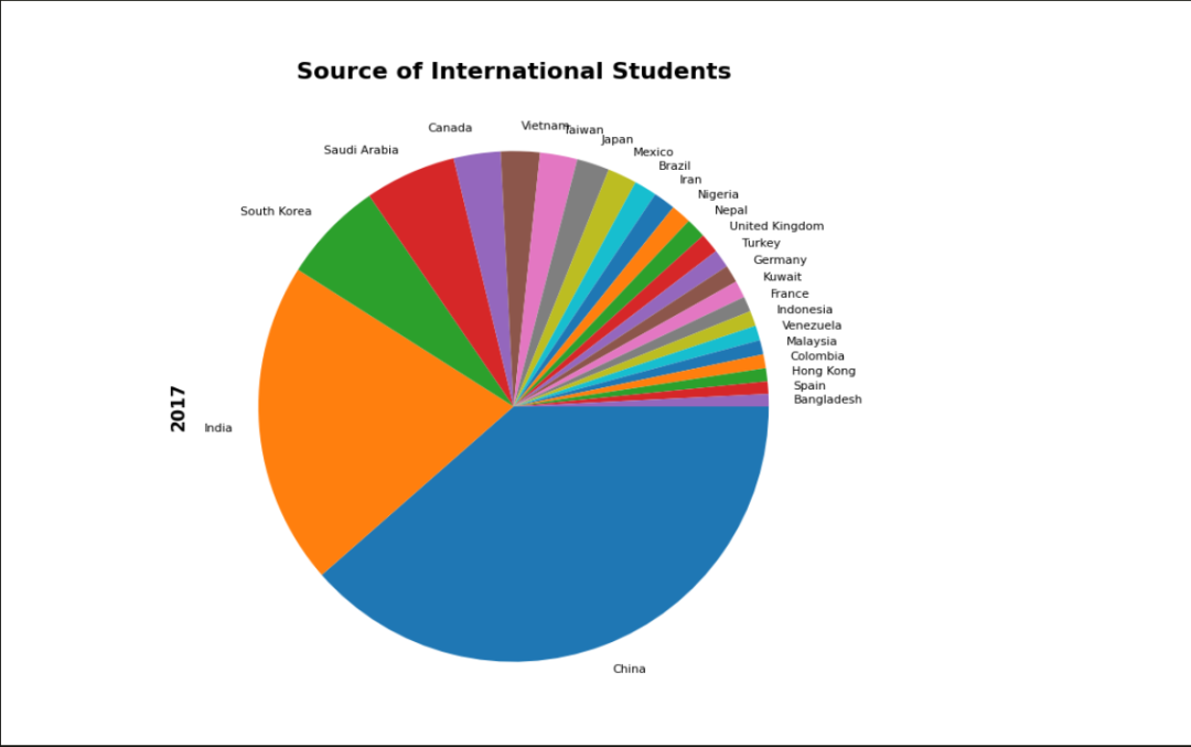
餅圖
首先我們先查看一下數(shù)據(jù)文件,如下所示:
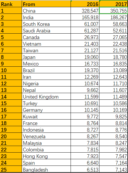
給出了2016,2017年來自不同國家的學生數(shù)量排名(rank);
由此繪制餅圖:
import?pandas?as?pd
import?matplotlib.pyplot?as?plt
plt.figure(figsize=(12,8),dpi=100)

students?=?pd.read_excel('./bin_Students.xlsx',?index_col='From')

students['2017'].plot.pie(fontsize=8,counterclock=False)
plt.title('Source?of?International?Students',?fontsize=16,?fontweight='bold')
plt.ylabel('2017',?fontsize=12,?fontweight='bold')
plt.show()
解釋說明:
figsize:設(shè)置圖片大小,dpi:設(shè)置圖片分辨率; pie()函數(shù)繪制餅圖的的api函數(shù),counterclock=False:這個參數(shù)設(shè)置餅圖占比元素的環(huán)繞方向,false變送逆時針;
結(jié)果如下圖所示:
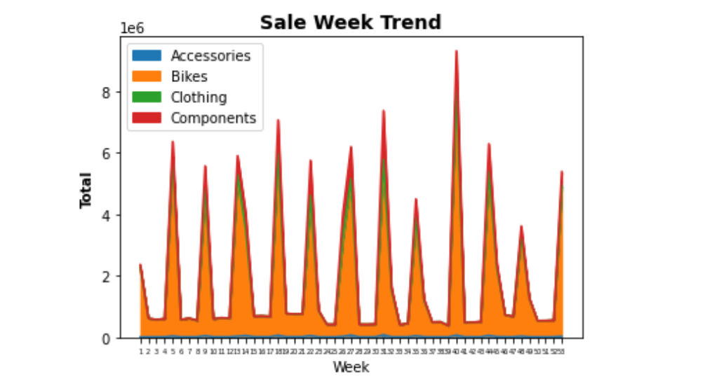
折線圖
由于文件數(shù)據(jù)過多,這里不做展示;簡言之就是四個區(qū)域的不同周期的銷售狀況
繪圖代碼:
import?pandas?as?pd?
import?matplotlib.pyplot?as?plt?
data?=?pd.read_excel('./excel文件/Orders.xlsx',index_col='Week')
data.plot.area(y=['Accessories','Bikes','Clothing','Components'])?#疊加區(qū)域圖
plt.title('Sale?Week?Trend',fontsize=14,fontweight='bold')
plt.ylabel('Total',fontsize=10,fontweight='bold')
plt.xticks(data.index,fontsize=5)
plt.show()
結(jié)果如下:
由于后面集中圖形使用較少,這里不再展示數(shù)據(jù)文件,直接上代碼:
散點圖
import?matplotlib.pyplot?as?plt?
import?pandas?as?pd?
data?=?pd.read_excel('./excel文件/home_data.xlsx',index_col='id')
data.plot.scatter(x='sqft_living',y='price')?#?房子面積??價位
plt.show()
結(jié)果如下:
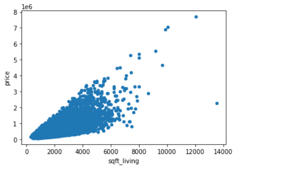
該圖形繪制的是在某地區(qū)房子價位與房子面積的分布關(guān)系;
直方圖
import?matplotlib.pyplot?as?plt?
import?pandas?as?pd?
data?=?pd.read_excel('./excel文件/home_data.xlsx')
data['sqft_living'].plot.hist(bins=60)?#?bins?表示柱子的數(shù)量
plt.xticks(range(0,max(data['sqft_living']),500),rotation=90,fontsize=6)
plt.show()
結(jié)果如下:
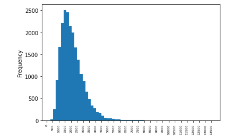
該圖表示某地區(qū)房子的價位的分布情況。
總結(jié)
以上就是使用pandas結(jié)合matplotlib繪制一些基本常用圖形的例子,當然了例子是固定的,圖形是靈活的,我們還是要根據(jù)不同的數(shù)據(jù)表,結(jié)合不同的現(xiàn)實狀況,繪制不同的圖形達到我們的目的。
小伙伴們,快快用實踐一下吧!如果在學習過程中,有遇到任何問題,歡迎加我好友,我拉你進Python學習交流群共同探討學習。
-------------------?End?-------------------
往期精彩文章推薦:

歡迎大家點贊,留言,轉(zhuǎn)發(fā),轉(zhuǎn)載,感謝大家的相伴與支持
想加入Python學習群請在后臺回復(fù)【入群】
萬水千山總是情,點個【在看】行不行