
Element 系列組件之 EDropdown 組件
介紹
「EDropdown」 組件是 「Flutter Element」 組件系列中的下拉選擇組件。
用法
效果:
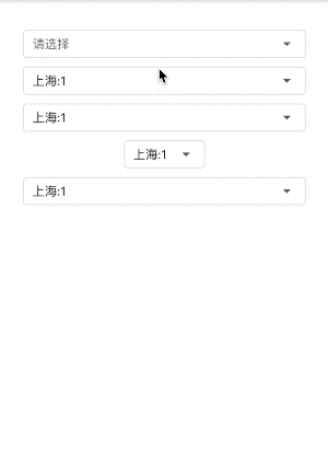
創(chuàng)建item數(shù)據(jù),下面的例子均使用此item,
var?items?=?List.generate(
????100,
????(index)?=>?EDropdownMenuItem(
??????????child:?Text('上海:$index'),
??????????value:?'$index',
????????)).toList();
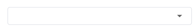
基礎(chǔ)用法
EDropdown<String>(
??items:?items,
)
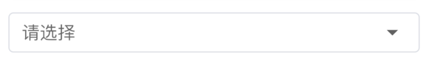
「hint」:未選中選項(xiàng)時(shí)顯示此提示。
EDropdown<String>(
??hint:?Text('請(qǐng)選擇'),
??items:?items,
)
「value」:默認(rèn)選中的選項(xiàng),和 item 中的 value 對(duì)應(yīng)。
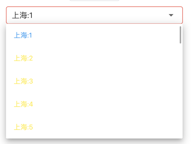
EDropdown(
??value:?'1',
??items:?items,
)

「isExpanded」:是否鋪滿父組件,默認(rèn) true。
EDropdown<String>(
??value:?'1',
??isExpanded:?false,
??items:?items,
),
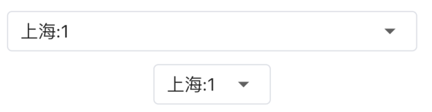
上面的是 「isExpanded: true」 的效果,下面是 「isExpanded: false」 的效果
「onChanged」 :是選項(xiàng)發(fā)生變化時(shí)回調(diào)。
EDropdown<String>(
??onChanged:?(value)?{
????print('$value');
??},
??items:?items,
),
「dropdownStyle」:樣式
「dropdownBorderColor」:邊框顏色。 「dropdownFocusBorderColor」:獲取焦點(diǎn)時(shí)邊框顏色。 「fontColor」:字體顏色。 「selectFontColor」:選中字體顏色。
EDropdown<String>(
??items:?items,
??dropdownStyle:?EDropdownStyle(
????dropdownBorderColor:?Colors.green,
????dropdownFocusBorderColor:?Colors.red,
????fontColor:?Colors.yellow,
????selectFontColor:?Colors.blue,
??),
)
其他屬性同原生「DropdownButton」 一樣。
評(píng)論
圖片
表情