
啥?Python竟然也可以制作萌萌的手繪圖表

點擊上方藍字關注我們


$ pip install cutecharts
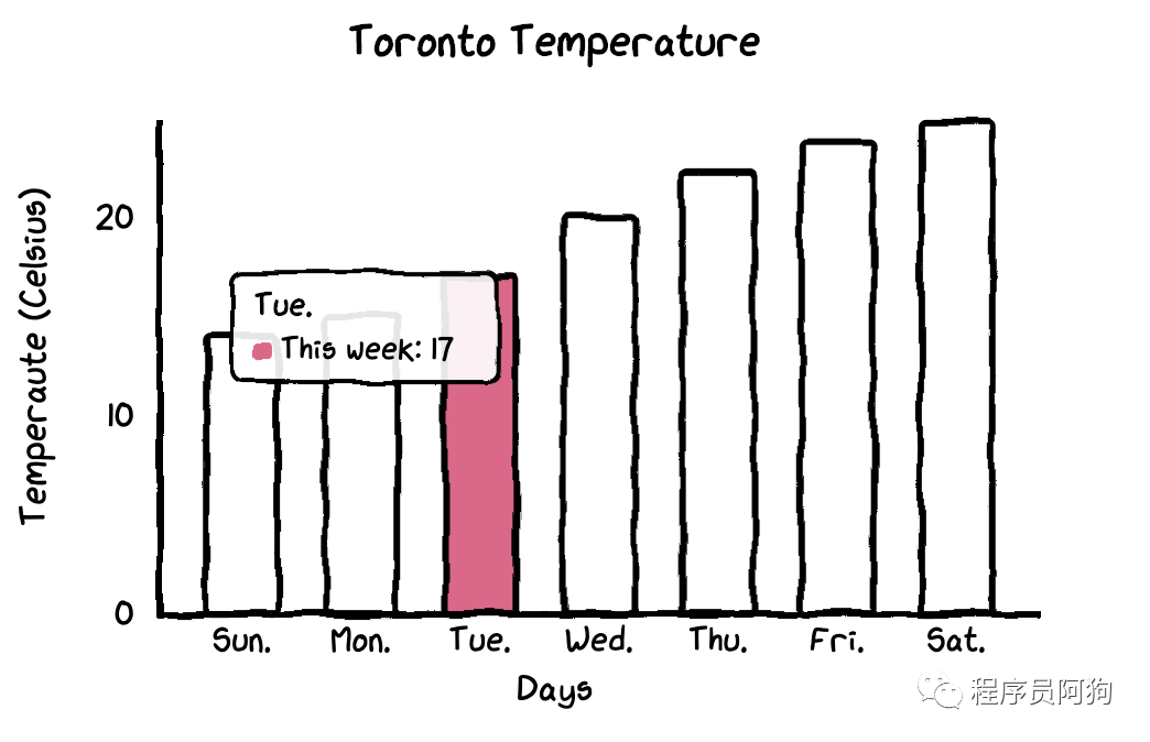
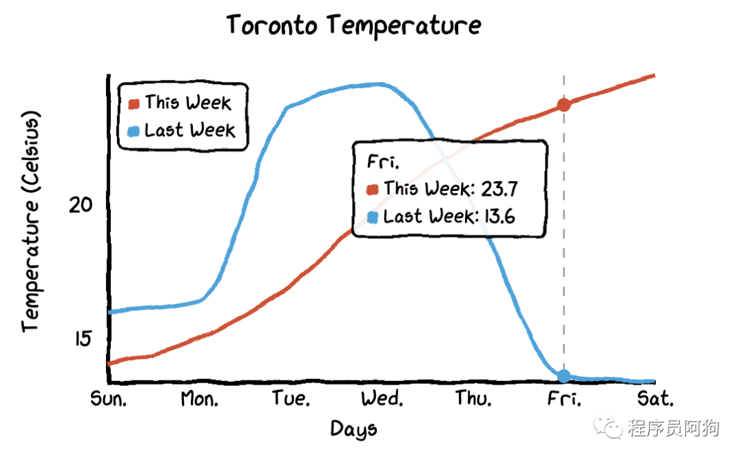
#import library and dataimport cutecharts.charts as ctcdf=pd.DataFrame({‘x’:[‘Sun.’,’Mon.’,’Tue.’,’Wed.’,’Thu.’,’Fri.’,’Sat.’],‘y’:[14,15,17,20,22.3,23.7,24.8],‘z’:[16,16.4,23.6,24.5,19.9,13.6,13.4]})
條形圖? ?
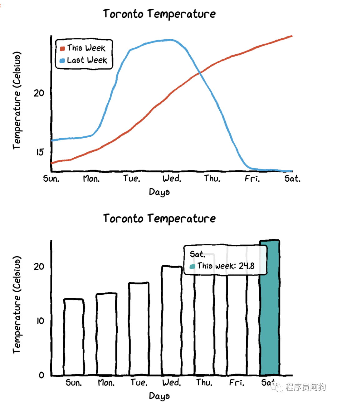
chart = ctc.Bar(‘Toronto Temperature’,width=’500px’,height=’400px’)chart.set_options(labels=list(df[‘x’]),x_label='Days',y_label='Temperature (Celsius)' ,colors=[‘#1EAFAE’ for i in range(len(df))])chart.add_series('This week',list(df[‘y’]))chart.render_notebook()
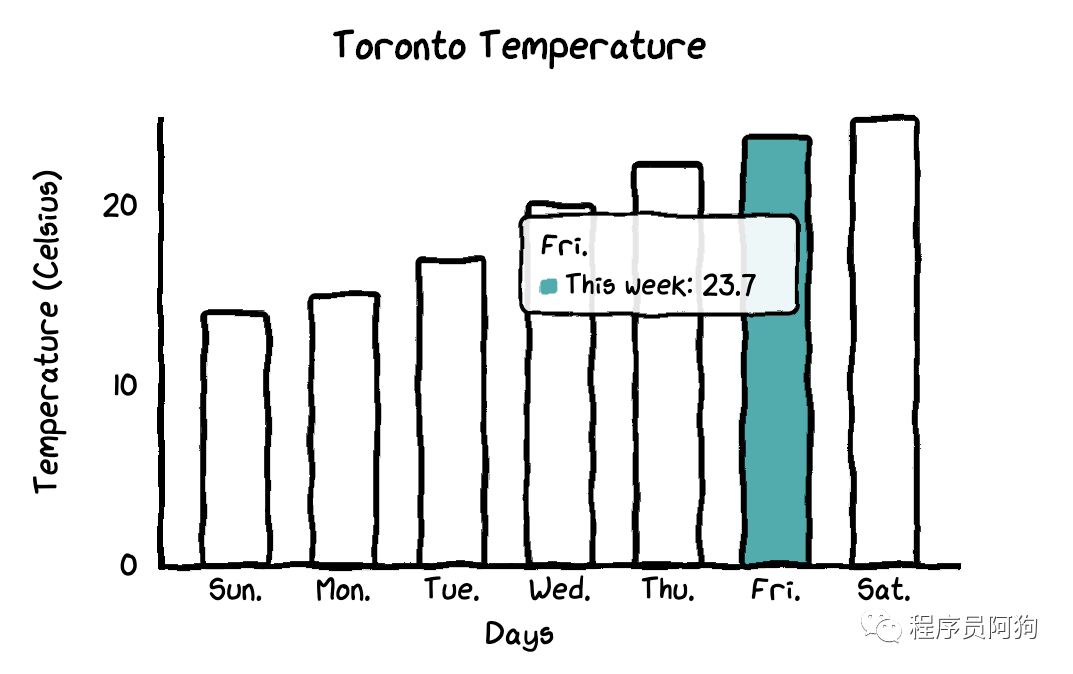
chart = ctc.Bar(‘title’,width=’500px’,height=’400px’)chart.set_options(labels=list(df[‘x’]),x_label=”Days”,y_label=”Temperature (Celsius)” ,colors=[‘#FFF1C9’,’#F7B7A3',’#EA5F89',’#9B3192',’#57167E’,’#47B39C’,’#00529B’])chart.add_series(“This week”,list(df[‘y’]))chart.render_notebook()
線圖? ?
chart = ctc.Line(“Toronto Temperature”,width=’500px’,height=’400px’)chart.set_options(labels=list(df[‘x’]),x_label=”Days”,y_label=”Temperature (Celsius)” )chart.add_series(“This Week”, list(df[‘y’]))chart.add_series(“Last Week”, list(df[‘z’]))chart.render_notebook()
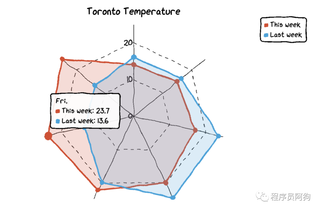
雷達圖? ?
chart = ctc.Radar(‘Toronto Temperature’,width=’700px’,height=’600px’)chart.set_options(labels=list(df[‘x’]),is_show_legend=True, #by default, it is true. You can turn it off.legend_pos=’upRight’ #location of the legend)chart.add_series(‘This week’,list(df[‘y’]))chart.add_series(“Last week”,list(df[‘z’]))chart.render_notebook()
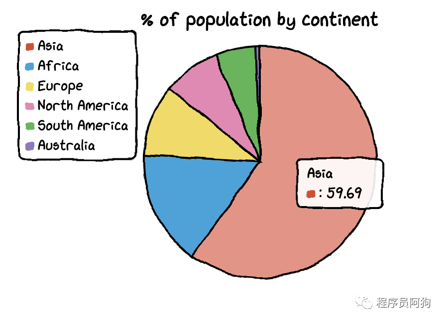
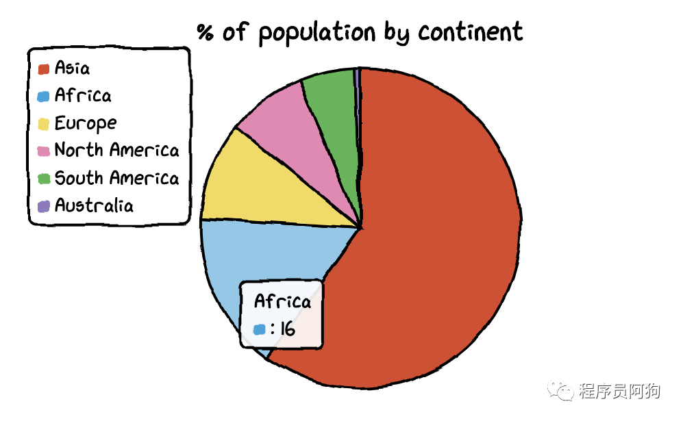
餅圖 ?
df=pd.DataFrame({‘x’:[‘Asia’, ‘Africa’, ‘Europe’, ‘North America’, ‘South America’, ‘Australia’],‘y’:[59.69, 16, 9.94, 7.79, 5.68, 0.54]})
chart = ctc.Pie(‘% of population by continent’,width=’500px’,height=’400px’)chart.set_options(labels=list(df[‘x’]),inner_radius=0)chart.add_series(list(df[‘y’]))chart.render_notebook()
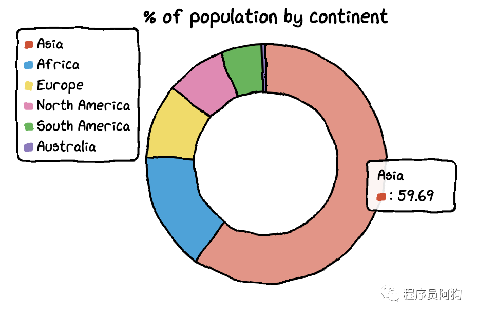
df=pd.DataFrame({‘x’:[‘Asia’, ‘Africa’, ‘Europe’, ‘North America’, ‘South America’, ‘Australia’],‘y’:[59.69, 16, 9.94, 7.79, 5.68, 0.54]})chart = ctc.Pie(‘% of population by continent’,width=’500px’,height=’400px’)chart.set_options(labels=list(df[‘x’]),inner_radius=0.6)chart.add_series(list(df[‘y’]))chart.render_notebook()
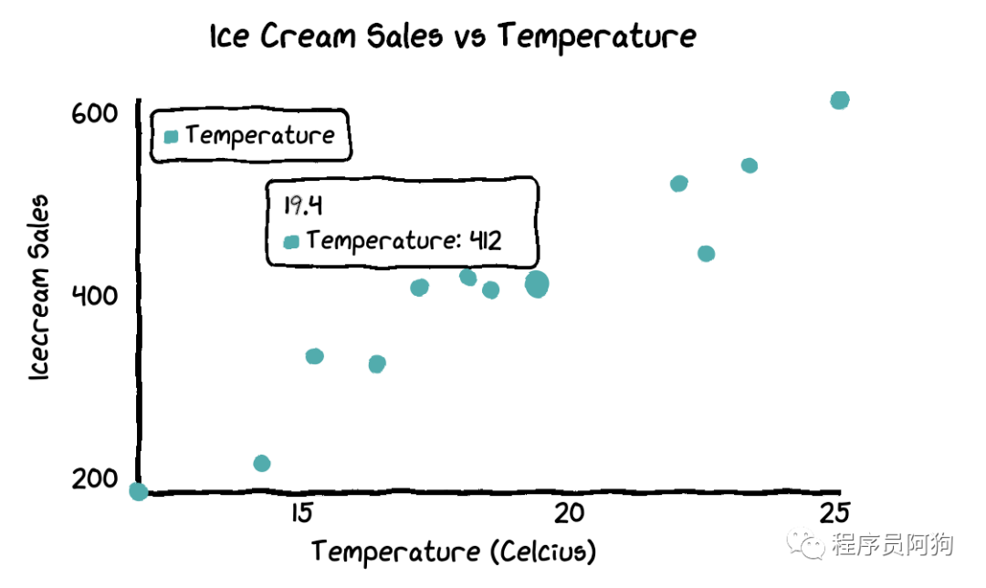
散點圖? ?
Temperature = [14.2,16.4,11.9,15.2,18.5,22.1,19.4,25.1,23.4,18.1,22.6,17.2]Sales = [215,325,185,332,406,522,412,614,544,421,445,408]
chart = ctc.Scatter(‘Ice Cream Sales vs Temperature’,width=’500px’,height=’600px’)chart.set_options(x_label=”Temperature (Celcius)”,y_label=”Icecream Sales” ,colors=[‘#1EAFAE’],is_show_line = False,dot_size=1)chart.add_series(“Temperature”, [(z[0], z[1]) for z in zip(Temperature, Sales)])chart.render_notebook()
組合圖? ?
chart1 = ctc.Line(“Toronto Temperature”,width=’500px’,height=’400px’)chart1.set_options(labels=list(df[‘x’]),x_label=”Days”,y_label=”Temperature (Celsius)” )chart1.add_series(“This Week”, list(df[‘y’]))chart1.add_series(“Last Week”, list(df[‘z’]))chart2 = ctc.Bar(‘Toronto Temperature’,width=’500px’,height=’400px’)chart2.set_options(labels=list(df[‘x’]),x_label=”Days”,y_label=”Temperature (Celsius)” ,colors=[‘#1EAFAE’ for i in range(len(df))])chart2.add_series(“This week”,list(df[‘y’]))chart2.add_series(“Last week”,list(df[‘z’]))page = Page()page.add(chart1, chart2)page.render_notebook()
回復下方 「關鍵詞」,獲取優(yōu)質資源

回復關鍵詞 「linux」,即可獲取 185 頁 Linux 工具快速教程手冊和154頁的Linux筆記。
回復關鍵詞 「Python進階」,即可獲取 106 頁 Python 進階文檔 PDF
回復關鍵詞 「Python面試題」,即可獲取最新?100道?面試題 PDF
回復關鍵詞 「python數(shù)據(jù)分析」,即可獲取47頁python數(shù)據(jù)分析與自然語言處理的 PDF
回復關鍵詞 「python爬蟲」,滿滿五份PPT爬蟲教程和70多個案例
回復關鍵詞 「Python最強基礎學習文檔」,即可獲取 168 頁 Python 最強基礎學習文檔 PDF,讓你快速入門Python
回復關鍵詞 「linux」,即可獲取 185 頁 Linux 工具快速教程手冊和154頁的Linux筆記。
回復關鍵詞 「Python進階」,即可獲取 106 頁 Python 進階文檔 PDF
回復關鍵詞 「Python面試題」,即可獲取最新?100道?面試題 PDF
回復關鍵詞 「python數(shù)據(jù)分析」,即可獲取47頁python數(shù)據(jù)分析與自然語言處理的 PDF
回復關鍵詞 「python爬蟲」,滿滿五份PPT爬蟲教程和70多個案例

推薦我的微信號
來圍觀我的朋友圈,我的經(jīng)驗分享,技術更新,不定期送書,坑位有限,速速掃碼添加!
備注:開發(fā)方向_昵稱_城市,另送你10本Python電子書。

點個在看你最好看

評論
圖片
表情