
5種CSS實(shí)現(xiàn)垂直對(duì)齊的方法

英文 | https://betterprogramming.pub/5-different-ways-to-vertically-align-your-css-content-6ac864af7f2c
翻譯 | web前端開發(fā)
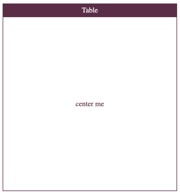
1、Table
div {display: table;display: table-cell;display: table-column;display: table-colgroup;display: table-header-group;display: table-row-group;display: table-footer-group;display: table-row;display: table-caption;}
讓我們使用上面的值編寫第一個(gè)解決方案的代碼:
<!DOCTYPE html><html><head><title>Align Playground</title><meta charset="UTF-8" /></head><body><style type="text/css">body {color: white;box-sizing: content-box;font-size: 25px;text-align: center;}*, *::before, *::after {box-sizing: border-box;}.title {padding: 8px;background-color: #5B2E48;width: 600px;margin: 40px 20px 0px 20px;}.container {width: 600px;height: 600px;border: 2px solid #5B2E48;margin: 0px 20px 20px 20px;color: #5B2E48;}.container-center {display: table;}.container-center div {display: table-cell;vertical-align: middle;}</style><div class="title">Table</div><div class="container container-center"><div>center me</div></div></script></body></html>
為了進(jìn)行垂直對(duì)齊,我們使用vertical-alignCSS Table的屬性。
“ vertical-align屬性可以在兩種情況下使用。
-將內(nèi)聯(lián)元素的框在其包含的線框內(nèi)垂直對(duì)齊。例如,它可以用于<img>在一行文本中垂直放置一個(gè)。
-垂直對(duì)齊表格中單元格的內(nèi)容。” — MDN Web文檔
請(qǐng)注意,vertical-align在元素block和table元素上的行為確實(shí)有所不同。這就是為什么如果你嘗試使用它將元素放在上居中的原因div,那么它什么也不會(huì)做。
在我們的示例中,代碼中最重要的部分是:
.container-center {display: table;}.container-center div {display: table-cell;vertical-align: middle;}
使用上面的方法與制作布局表基本相同:
<div class="title">Table</div><table class="container"><tr><td>center me</td></tr></table>
看一下最終效果:
讓我們更好地了解:
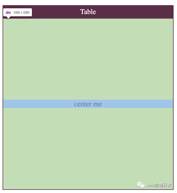
請(qǐng)注意,HTML表應(yīng)用于表格數(shù)據(jù)。那是他們唯一的目的,許多人濫用它們。
2、絕對(duì)定位
多年來,絕對(duì)定位是首選解決方案。在某些特定的復(fù)雜情況下,它仍然很有用。
該技術(shù)很簡(jiǎn)單:
position: relative 定義一個(gè)居中的容器。
position: absolute 定義居中的元素。
使用top: 50%粗略移動(dòng)元素在屏幕的中間。
transateY(-50%) 最終將項(xiàng)目調(diào)整到中心。
讓我們?cè)谝粋€(gè)示例中使用它:
<!DOCTYPE html><html><head><title>Align Playground</title><meta charset="UTF-8" /></head><body><style type="text/css">body {box-sizing: content-box;font-size: 25px;text-align: center;color: #5B2E48;}*, *::before, *::after {box-sizing: border-box;}.title {color: white;padding: 8px;background-color: #5B2E48;width: 600px;margin: 40px 20px 0px 20px;}.container {width: 600px;height: 600px;border: 2px solid #5B2E48;margin: 0px 20px 20px 20px;}.container-center {position: relative;}.container-center div {position: absolute;width: 100%;top: 50%;transform: translateY(-50%);}</style><div class="title">Absolute Positioning</div><div class="container container-center"><div>center me</div></div></script></body></html>
和以前一樣,讓我們從上面的代碼中查看重要的CSS邏輯:
.container-center {position: relative;}.container-center div {position: absolute;width: 100%;top: 50%;transform: translateY(-50%);}
讓我們看一下結(jié)果:
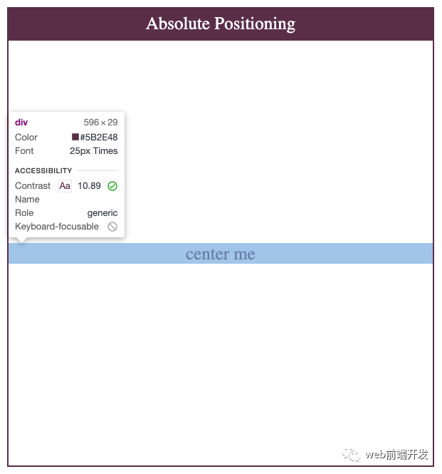
結(jié)果與上一個(gè)非常相似:center me div占據(jù)整個(gè)水平空間,并且與容器分離。
3、 Flexbox
Flexbox受流行的UI框架(如Bootstrap)的啟發(fā)。它的第一份工作草案于2009年7月23日發(fā)布。十一年后,令人驚訝的是,它的支持猛增:約99.2%的瀏覽器支持它的使用。
FlexBox帶有內(nèi)容對(duì)齊功能。讓我們介紹一下用例中最相關(guān)的兩個(gè):
屬性:align-items
“ CSS 的align-items屬性,將align-self所有直接子級(jí)的值都設(shè)置為一個(gè)組。在Flexbox中,它控制交叉軸上項(xiàng)目的對(duì)齊方式。在“網(wǎng)格布局”中,它控制“塊軸”上項(xiàng)目在其網(wǎng)格區(qū)域內(nèi)的對(duì)齊。” — MDN Web文檔
屬性:justify-content
“CSS的 justify-content屬性,定義了瀏覽器之間,沿著周圍的內(nèi)容項(xiàng)目分配的空間主軸用柔性的容器,和網(wǎng)格容器的字形軸”。— MDN Web文檔
我們可以將兩者結(jié)合起來,以使我們的商品在容器的中心對(duì)齊Flexbox。這是迄今為止最常用的方法。它是非常簡(jiǎn)單,有效的CSS元素之一。
<!DOCTYPE html><html><head><title>Align Playground</title><meta charset="UTF-8" /></head><body><style type="text/css">body {box-sizing: content-box;font-size: 25px;text-align: center;color: #5B2E48;}*, *::before, *::after {box-sizing: border-box;}.title {color: white;padding: 8px;background-color: #5B2E48;width: 600px;margin: 40px 20px 0px 20px;}.container {width: 600px;height: 600px;border: 2px solid #5B2E48;margin: 0px 20px 20px 20px;}.container-center {display: flex;align-items: center;justify-content: center;}</style><div class="title">Flex</div><div class="container container-center"><div>center me</div></div></script></body></html>
讓我們看一下結(jié)果:
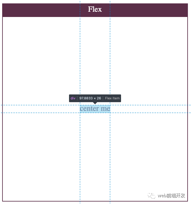
在這里,我們看到了一種更清潔,更自然的方法。該center me div只是服用它需要的空間,因?yàn)槲覀兪褂玫恼{(diào)心性能。這是因?yàn)镕lexbox是在考慮這種用例的情況下構(gòu)建的。我們可以期待更好的元素。
4、Grid
Grid由Microsoft團(tuán)隊(duì)起草,并于2011年交付到Internet Explorer10。像Flex一樣,Grid的功能齊全,并按對(duì)齊方式打包。
我們可以像在Flex中那樣使用align-items和使用它justify-content。但是Grid具有用于配置這兩者的簡(jiǎn)寫屬性:place-items。
讓我們看一下定義:
“ CSS place-items 速記屬性允許您在相關(guān)布局系統(tǒng)(例如Grid或Flexbox)中同時(shí)沿塊方向和內(nèi)嵌方向(即align-items和justify-items屬性)對(duì)齊項(xiàng)目。如果未設(shè)置第二個(gè)值,則第一個(gè)值也將被使用。” — MDN Web文檔
這種方法不如Flexbox流行,因?yàn)闉g覽器對(duì)Grid的支持較少。如果您想將某項(xiàng)居中,則使用Grid可能會(huì)過大。
<!DOCTYPE html><html><head><title>Align Playground</title><meta charset="UTF-8" /></head><body><style type="text/css">body {box-sizing: content-box;font-size: 25px;text-align: center;color: #5B2E48;}*, *::before, *::after {box-sizing: border-box;}.title {color: white;padding: 8px;background-color: #5B2E48;width: 600px;margin: 40px 20px 0px 20px;}.container {width: 600px;height: 600px;border: 2px solid #5B2E48;margin: 0px 20px 20px 20px;}.container-center {display: grid;place-items: center;}</style><div class="title">Grid</div><div class="container container-center"><div>center me</div></div></script></body></html>
該代碼與Flex代碼非常相似。通過使用該place-items屬性,實(shí)現(xiàn)此行為的代碼極少:
.container-center {display: grid;place-items: center;}
如前所述,下面的代碼與上面的代碼等效:
.container-center {display: grid;align-items: center;justify-content: center;}
讓我們檢查結(jié)果:
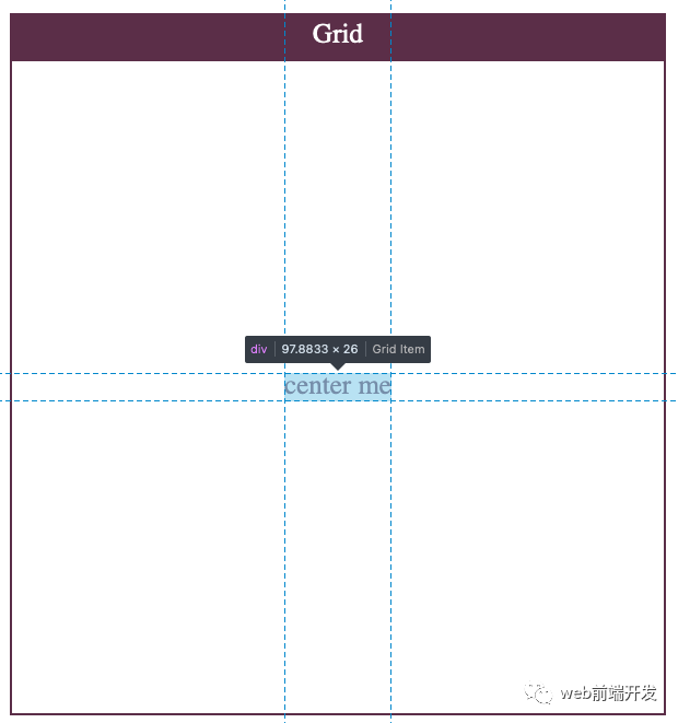
最終結(jié)果與Flexbox超級(jí)相似。
5、帶有邊距的Flexbox /Grid
與對(duì)齊在margin: auto將對(duì)象水平居中時(shí)仍然很流行。沿會(huì)應(yīng)用均勻的邊距x,從而導(dǎo)致項(xiàng)目水平對(duì)齊。
這是一種非常簡(jiǎn)單但有效的方法。但是,margin: auto不能在display: block元素上垂直居中。
但是,Grid和Flexbox現(xiàn)在支持margin: auto將項(xiàng)目垂直和水平居中。
讓我們看一個(gè)例子:
<!DOCTYPE html><html><head><title>Align Playground</title><meta charset="UTF-8" /></head><body><style type="text/css">body {box-sizing: content-box;font-size: 25px;text-align: center;color: #5B2E48;}*, *::before, *::after {box-sizing: border-box;}.title {color: white;padding: 8px;background-color: #5B2E48;width: 600px;margin: 40px 20px 0px 20px;}.container {width: 600px;height: 600px;border: 2px solid #5B2E48;margin: 0px 20px 20px 20px;}.container-center {display: flex;}.container-center div {margin: auto;}</style><div class="title">Flex with margin-auto</div><div class="container container-center"><div>center me</div></div></script></body></html>
這是所有魔術(shù)發(fā)生的地方:
// using Flex layout.container-center {display: flex;}.container-center div {margin: auto;}// using Grid layout.container-center {display: grid;}.container-center div {margin: auto;}
讓我們檢查結(jié)果:
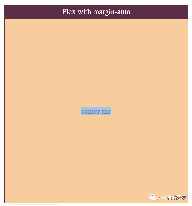
這與以前的結(jié)果非常相似。由于該元素本身支持,因此瀏覽器在定位該元素方面做得很好。但是,這次我們沒有很好的定位線。
在本文中,我們已經(jīng)看到了將您的內(nèi)容與CSS垂直對(duì)齊的所有主要方法。如前所述,最常用的是Flexbox,因?yàn)樗?jí)簡(jiǎn)單且具有聲明性。它只需要最少的代碼,所有代碼都放在父容器中。對(duì)Flexbox的支持非常棒,因此你不必?fù)?dān)心用戶的瀏覽器將不支持它。
你圖如果還知道其他垂直居中的好方法,歡迎留言交流。
