怎樣設(shè)計一個可擴展、通用的、健壯性組件?
點擊上方關(guān)注 前端桃園,一起學(xué)習(xí),天天進步

前言
組件是頁面不可或缺的部分,而設(shè)計組件就成為了前端同學(xué)每日工作。
所以
一位程序員的職業(yè)生涯大約十年,只有人壽命的十分之一。前端項目只是你生活工作的一部分,而你卻是它的全部,你是他的靈魂。請放下長時間的游戲、工作時的摸魚。多學(xué)習(xí)來以最完美的狀態(tài)好好陪你項目!
正文
這篇文章將會以本人所認知的角度去對組件的封裝設(shè)計展開思考。如果你對我的觀點,方式,又或者你有更好的方式,更優(yōu)的設(shè)計模式,不妨在評論區(qū)一起討論 思考, 交流是進步的必經(jīng)之路。
知識點
組件是如何分類的 Vue 和 React 封裝組件模式 怎樣才是一個好的可擴展、通用的、健壯性組件 思考討論,提出問題
組件是如何分類的
業(yè)務(wù)組件 通用組件(非業(yè)務(wù)組件) UI組件
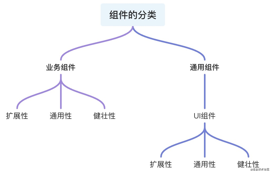
無論是 業(yè)務(wù)組件 或者 通用組件都具備組件本質(zhì)所包含的三個性質(zhì)擴展、通用、健壯
擴展性:在原有組件基礎(chǔ)上可 二次封裝 擴展成新的組件符合設(shè)計的
開閉原則通用性:根據(jù)組件接受的
參數(shù)和組件中與業(yè)務(wù)的解耦比來衡量組件的通用性,并不是通用性占比100%的組件就是最好的組件,需要根據(jù) 不同的場景 分析健壯性:避免組件中
參數(shù)處理和函數(shù)執(zhí)行過程可能出現(xiàn)的奔潰和錯誤導(dǎo)致程序的直接掛斷,單測以對組件內(nèi)部 做好邊界處理,異常錯誤的捕獲來衡量這一標準
業(yè)務(wù)組件
服務(wù)與業(yè)務(wù)的組件稱為業(yè)務(wù)組件,項目中組件的劃分是分頁面級組件、全局級別組件
    --- componentes
    --- pages
復(fù)制代碼
而結(jié)構(gòu)一般是這樣
componentes 中存放的組件往往 具有當(dāng)前項目 中的多個 場景 復(fù)用 才會進行設(shè)計與封裝
Vue中的組件
<template>
    ....
</template>
<script>
export default {
  props: {
    ...
  },
  data () {
    ....
  },
  methods: {
    ....
  }
}
</script>
復(fù)制代碼
React中的組件
import React, { Component } from 'react';
export default class Demo extends Component {
    state = {
    };

    componentDidMount() {
      ...
    }

    render() {
      const { .... } = this.props;
      return (
        <div>
          ....
        </div>
      );
    }
}
復(fù)制代碼
這是目前兩個 兩個框架最基本的組件封裝 模板。
而你在封裝組件的時候是否考慮過一些問題
組件的可維護性? 組件的可讀性? 擴展性、健壯性、通用性? 這個組件是否需要封裝抽離? 組件是否和業(yè)務(wù)強關(guān)聯(lián)?
這些問題在組件封裝開始編碼之前你是否都考慮過了
凡是組件不斷擴展,使其通用性提升,必然就會降低組件的 易用性質(zhì)
而不斷豐富一個組件,也會導(dǎo)致其組件代碼過長,組件使命不單一,不易讀,不易維護
像Vue 和 React 推薦 一個組件代碼長度在 200 - 500 行最佳
業(yè)務(wù)中的組件往往區(qū)分
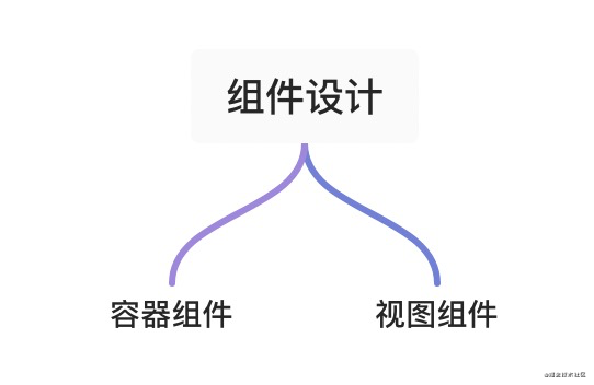
容器組件負責(zé)處理 業(yè)務(wù)相關(guān)邏輯,注冊業(yè)務(wù)相關(guān)鉤子,傳入相應(yīng)的熟悉和插槽等視圖組件則負責(zé) 數(shù)據(jù)的呈現(xiàn),交互的實現(xiàn)
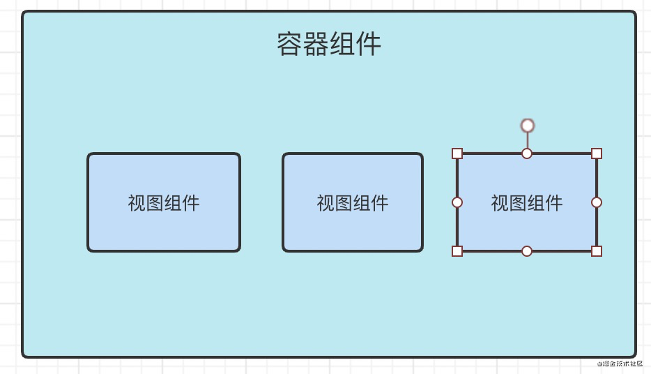
容器組件往往不可復(fù)用
視圖組件則根據(jù)組件的樣式 和 交互 判斷組件在項目中的 頻率 來抉擇是否封裝
視圖 和 數(shù)據(jù) 解耦 又能搭配 可以很好的提升組件的 可讀,易維護性
這個組件是否需要封裝抽離?
這可能是新前端同學(xué)容易遇到的問題
不是所以 DOM 結(jié)構(gòu) 都需要 抽離
你需要對你所負責(zé)的項目 UI走向 有著全局的洞察力,如果不確認的是否需要封裝,建議不封裝
下次業(yè)務(wù)中存在與原來視圖 UI 相同的需求 再進行封裝設(shè)計,而不是快速 Copy
組件是否和業(yè)務(wù)強關(guān)聯(lián)?
通常情況,組件中的大量數(shù)據(jù)來源 當(dāng)前組件的接口請求。沒有依賴或者幾乎不依賴外部傳入的props等,稱為業(yè)務(wù)強關(guān)聯(lián)組件,放棄組件封裝的想法。
怎樣才是一個好的可擴展、通用的、健壯性組件?
我們可以參考一下star高的 Ant design 和 Element 來學(xué)習(xí)
Ant design 中 rc-switch
import * as React from 'react';
import classNames from 'classnames';
import useMergedState from 'rc-util/lib/hooks/useMergedState';
import KeyCode from 'rc-util/lib/KeyCode';

const Switch = React.forwardRef(
  (
    {
      prefixCls = 'rc-switch',
      className,
      checked,
      defaultChecked,
      disabled,
      loadingIcon,
      checkedChildren,
      unCheckedChildren,
      onClick,
      onChange,
      onKeyDown,
      ...restProps
    },
    ref,
  ) => {
    const [innerChecked, setInnerChecked] = useMergedState<boolean>(false, {
      value: checked,
      defaultValue: defaultChecked,
    });

    function triggerChange(
      newChecked: boolean,
      event: React.MouseEvent<HTMLButtonElement> | React.KeyboardEvent<HTMLButtonElement>,
    ) {
      let mergedChecked = innerChecked;

      if (!disabled) {
        mergedChecked = newChecked;
        setInnerChecked(mergedChecked);
        onChange?.(mergedChecked, event);
      }

      return mergedChecked;
    }

    function onInternalKeyDown(e) {
      if (e.which === KeyCode.LEFT) {
        triggerChange(false, e);
      } else if (e.which === KeyCode.RIGHT) {
        triggerChange(true, e);
      }
      onKeyDown?.(e);
    }

    function onInternalClick(e) {
      const ret = triggerChange(!innerChecked, e);
      // [Legacy] trigger onClick with value
      onClick?.(ret, e);
    }

    const switchClassName = classNames(prefixCls, className, {
      [`${prefixCls}-checked`]: innerChecked,
      [`${prefixCls}-disabled`]: disabled,
    });

    return (
      <button
        {...restProps}
        type="button"
        role="switch"
        aria-checked={innerChecked}
        disabled={disabled}
        className={switchClassName}
        ref={ref}
        onKeyDown={onInternalKeyDown}
        onClick={onInternalClick}
      >
        {loadingIcon}
        <span className={`${prefixCls}-inner`}>
          {innerChecked ? checkedChildren : unCheckedChildren}
        </span>
      </button>
    );
  },
);

Switch.displayName = 'Switch';

export default Switch;
復(fù)制代碼
直接脫離 UI接受參數(shù),處理鉤子
而 Ant design 則是對API 和 UI 的二次封裝
進而體現(xiàn)了 React Components[1] 的組件的 可擴展性
再看看
Element UI 的 Switch
<template>
  <div
    class="el-switch"
    :class="{ 'is-disabled': switchDisabled, 'is-checked': checked }"
    role="switch"
    :aria-checked="checked"
    :aria-disabled="switchDisabled"
    @click.prevent="switchValue"
  >
    <input
      class="el-switch__input"
      type="checkbox"
      @change="handleChange"
      ref="input"
      :id="id"
      :name="name"
      :true-value="activeValue"
      :false-value="inactiveValue"
      :disabled="switchDisabled"
      @keydown.enter="switchValue"
    >
    <span
      :class="['el-switch__label', 'el-switch__label--left', !checked ? 'is-active' : '']"
      v-if="inactiveIconClass || inactiveText">
      <i :class="[inactiveIconClass]" v-if="inactiveIconClass"></i>
      <span v-if="!inactiveIconClass && inactiveText" :aria-hidden="checked">{{ inactiveText }}</span>
    </span>
    <span class="el-switch__core" ref="core" :style="{ 'width': coreWidth + 'px' }">
    </span>
    <span
      :class="['el-switch__label', 'el-switch__label--right', checked ? 'is-active' : '']"
      v-if="activeIconClass || activeText">
      <i :class="[activeIconClass]" v-if="activeIconClass"></i>
      <span v-if="!activeIconClass && activeText" :aria-hidden="!checked">{{ activeText }}</span>
    </span>
  </div>
</template>
<script>
  import emitter from 'element-ui/src/mixins/emitter';
  import Focus from 'element-ui/src/mixins/focus';
  import Migrating from 'element-ui/src/mixins/migrating';
  export default {
    name: 'ElSwitch',
    mixins: [Focus('input'), Migrating, emitter],
    inject: {
      elForm: {
        default: ''
      }
    },
    props: {
      value: {
        type: [Boolean, String, Number],
        default: false
      },
      disabled: {
        type: Boolean,
        default: false
      },
      width: {
        type: Number,
        default: 40
      },
      activeIconClass: {
        type: String,
        default: ''
      },
      inactiveIconClass: {
        type: String,
        default: ''
      },
      activeText: String,
      inactiveText: String,
      activeColor: {
        type: String,
        default: ''
      },
      inactiveColor: {
        type: String,
        default: ''
      },
      activeValue: {
        type: [Boolean, String, Number],
        default: true
      },
      inactiveValue: {
        type: [Boolean, String, Number],
        default: false
      },
      name: {
        type: String,
        default: ''
      },
      validateEvent: {
        type: Boolean,
        default: true
      },
      id: String
    },
    data() {
      return {
        coreWidth: this.width
      };
    },
    created() {
      if (!~[this.activeValue, this.inactiveValue].indexOf(this.value)) {
        this.$emit('input', this.inactiveValue);
      }
    },
    computed: {
      checked() {
        return this.value === this.activeValue;
      },
      switchDisabled() {
        return this.disabled || (this.elForm || {}).disabled;
      }
    },
    watch: {
      checked() {
        this.$refs.input.checked = this.checked;
        if (this.activeColor || this.inactiveColor) {
          this.setBackgroundColor();
        }
        if (this.validateEvent) {
          this.dispatch('ElFormItem', 'el.form.change', [this.value]);
        }
      }
    },
    methods: {
      handleChange(event) {
        const val = this.checked ? this.inactiveValue : this.activeValue;
        this.$emit('input', val);
        this.$emit('change', val);
        this.$nextTick(() => {
          // set input's checked property
          // in case parent refuses to change component's value
          this.$refs.input.checked = this.checked;
        });
      },
      setBackgroundColor() {
        let newColor = this.checked ? this.activeColor : this.inactiveColor;
        this.$refs.core.style.borderColor = newColor;
        this.$refs.core.style.backgroundColor = newColor;
      },
      switchValue() {
        !this.switchDisabled && this.handleChange();
      },
      getMigratingConfig() {
        return {
          props: {
            'on-color': 'on-color is renamed to active-color.',
            'off-color': 'off-color is renamed to inactive-color.',
            'on-text': 'on-text is renamed to active-text.',
            'off-text': 'off-text is renamed to inactive-text.',
            'on-value': 'on-value is renamed to active-value.',
            'off-value': 'off-value is renamed to inactive-value.',
            'on-icon-class': 'on-icon-class is renamed to active-icon-class.',
            'off-icon-class': 'off-icon-class is renamed to inactive-icon-class.'
          }
        };
      }
    },
    mounted() {
      /* istanbul ignore if */
      this.coreWidth = this.width || 40;
      if (this.activeColor || this.inactiveColor) {
        this.setBackgroundColor();
      }
      this.$refs.input.checked = this.checked;
    }
  };
</script>
復(fù)制代碼
很直觀的看出, 除了語法 方面 封裝設(shè)計組件UI的最佳方式
零業(yè)務(wù)代碼 優(yōu)秀的 UI和API設(shè)計易學(xué)和易用
我們再看看另外一種封裝組件的方式
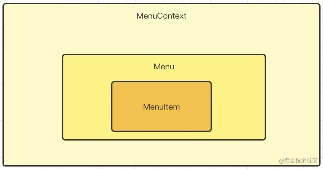
React For Menu
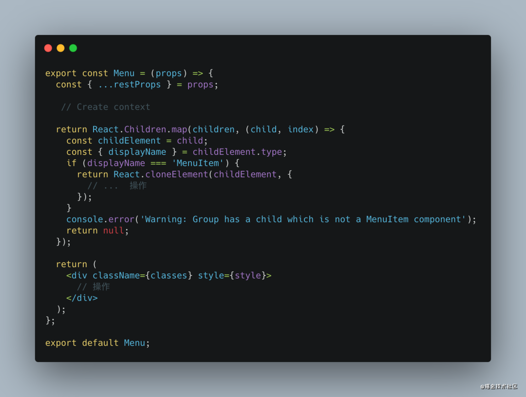
這是 React 配套組件的封裝 的一種思路
創(chuàng)建 context管理 組件組 的數(shù)據(jù)流父組件中存在判斷 子組件的類型 增加健壯性 在 index掛載 分別導(dǎo)出組件
Vue For Menu
<template>
    <div
    class="menu"
    // 事件綁定
    >
      // menuItem
      <slot></slot>
    </div>
</template>

<script>
export default {
    mixins: [...],
    name: 'Menu',
    componentName: 'Menu',
    inject: {
      menu: {
        default: ''
      },
    },
    provide() {
      return {
        'menu': this
      };
  }
}
</script>
復(fù)制代碼
在 Vue \- UI 組件的設(shè)計封裝中 , 經(jīng)常使用 provide,inject來組件通信.
Vue 除了使用 slot 還可以使用 jsx & function component 來實現(xiàn)如此效果,其設(shè)計思想和 React 大同小異
在 Vue3 中 Ant design for Vue 中大量使用 jsx 來 封裝 組件
下面簡單總結(jié)一下
組件中的 UI和數(shù)據(jù)業(yè)務(wù)盡量 分離UI視圖組件中 不該包含業(yè)務(wù)代碼組件設(shè)計之初考慮 通用、易用、擴展、健壯穩(wěn)定以及良好的代碼結(jié)構(gòu)、Api設(shè)計使用
思考討論,提出問題
你有不同的或者更好的設(shè)計封裝組件的 技巧和Demo嗎你是如何判斷組件是否封裝的?如何設(shè)計組件的? 回想一下你設(shè)計的組件 代碼、Api、命名是否給其他同學(xué)帶來不便等等.....
根據(jù)以上的問題、思考 或者 你有不同的想法 不妨在評論區(qū)中我們一起探討,學(xué)習(xí)!
關(guān)于本文
來源:遇見同學(xué)
https://juejin.cn/post/6991261103141421092
點個『在看』支持下