20 個(gè)超級(jí)實(shí)用的 CSS 技巧,幫助你成為更好的開發(fā)者
點(diǎn)擊上方 前端Q,關(guān)注公眾號(hào)
回復(fù)加群,加入前端Q技術(shù)交流群
英文 | https://javascript.plainenglish.io/20-css-tips-and-tricks-to-make-you-a-better-developer-43aa5b9d0c34
翻譯 | 楊小愛
在開發(fā)項(xiàng)目中,修改輸入占位符樣式,多行文本溢出,隱藏滾動(dòng)條,修改光標(biāo)顏色,水平和垂直居中等等,這些都是我們非常熟悉的開發(fā)場(chǎng)景!前端開發(fā)者幾乎每天都會(huì)和它們打交道,因此,我在這里給大家總結(jié)了20個(gè)超級(jí)實(shí)用的CSS技巧,一起來看看吧。
1.解決圖片5px間距問題
你是否經(jīng)常遇到圖片底部多出5px間距的問題?不著急,這里有4種方法可以幫助你解決此問題。
解決方案 1:將 font-size: 0 設(shè)置為父元素
演示地址:https://codepen.io/qianlong/pen/VwrzoyE
具體實(shí)現(xiàn)代碼如下:
HTML
<html lang="en"><head><meta charset="UTF-8"><meta http-equiv="X-UA-Compatible" content="IE=edge"><meta name="viewport" content="width=device-width, initial-scale=1.0"><title>image 5px spacing</title></head><body><div class="img-container"><img src="https://cdn-images-1.medium.com/max/1600/0*MU3iBxNwssZWt6Tj" alt=""></div></body></html>
CSS
html,body{margin: 0;padding: 0;}.img-container{background-color: lightblue;/* Key Style */font-size: 0;}img{width: 100%;}
具體實(shí)現(xiàn)代碼如下:
HTML
<html lang="en"><head><meta charset="UTF-8"><meta http-equiv="X-UA-Compatible" content="IE=edge"><meta name="viewport" content="width=device-width, initial-scale=1.0"><title>image 5px spacing</title></head><body><div class="img-container"><img src="https://cdn-images-1.medium.com/max/1600/0*MU3iBxNwssZWt6Tj" alt=""></div></body></html>
html,body{margin: 0;padding: 0;}.img-container{background-color: lightblue;}img{width: 100%;/* Key Style */display: block;}
解決方案 3:將 vertical-align: bottom 設(shè)置為 img
演示地址:https://codepen.io/qianlong/pen/jOaGNWw
具體實(shí)現(xiàn)代碼如下:
HTML
<html lang="en"><head><meta charset="UTF-8"><meta http-equiv="X-UA-Compatible" content="IE=edge"><meta name="viewport" content="width=device-width, initial-scale=1.0"><title>image 5px spacing</title></head><body><div class="img-container"><img src="https://cdn-images-1.medium.com/max/1600/0*MU3iBxNwssZWt6Tj" alt=""></div></body></html>
CSS
html,body{margin: 0;padding: 0;}.img-container{background-color: lightblue;}img{width: 100%;/* Key Style */vertical-align: bottom;}
方案四:給父元素設(shè)置line-height: 5px
演示地址:https://codepen.io/qianlong/pen/PoOJYzN
具體實(shí)現(xiàn)代碼如下:
HTML
<html lang="en"><head><meta charset="UTF-8"><meta http-equiv="X-UA-Compatible" content="IE=edge"><meta name="viewport" content="width=device-width, initial-scale=1.0"><title>image 5px spacing</title></head><body><div class="img-container"><img src="https://cdn-images-1.medium.com/max/1600/0*MU3iBxNwssZWt6Tj" alt=""></div></body></html>
CSS
html,body{margin: 0;padding: 0;}.img-container{background-color: lightblue;/* Key Style */line-height: 5px;}img{width: 100%;}
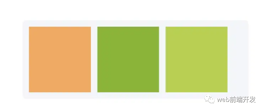
2.元素高度與窗口相同
演示地址:https://codepen.io/qianlong/pen/xxPXKXe
如何讓元素和窗口一樣高?示例代碼如下:
<div class="app"><div class="child"></div></div>
* {margin: 0;padding: 0;}.child {width: 100%;/* Key Style */height: 100vh;background-image: linear-gradient(180deg, #2af598 0%, #009efd 100%);}
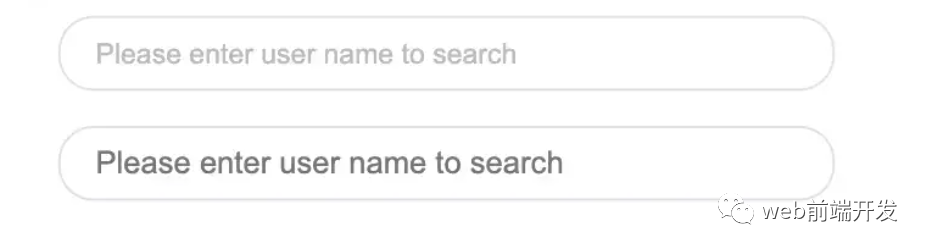
3.修改輸入占位符樣式
演示地址:https://codepen.io/qianlong/pen/JjOrPOq
第一個(gè)修改了,第二個(gè)沒有修改。
<input type="text" class="placehoder-custom" placeholder="Please enter user name to search"><input type="text" placeholder="Please enter user name to search">
* {margin: 0;padding: 0;}input {width: 300px;height: 30px;border: none;outline: none;display: block;margin: 15px;border: solid 1px #dee0e9;padding: 0 15px;border-radius: 15px;}/* Key Style */.placehoder-custom::-webkit-input-placeholder {color: #babbc1;font-size: 12px;}
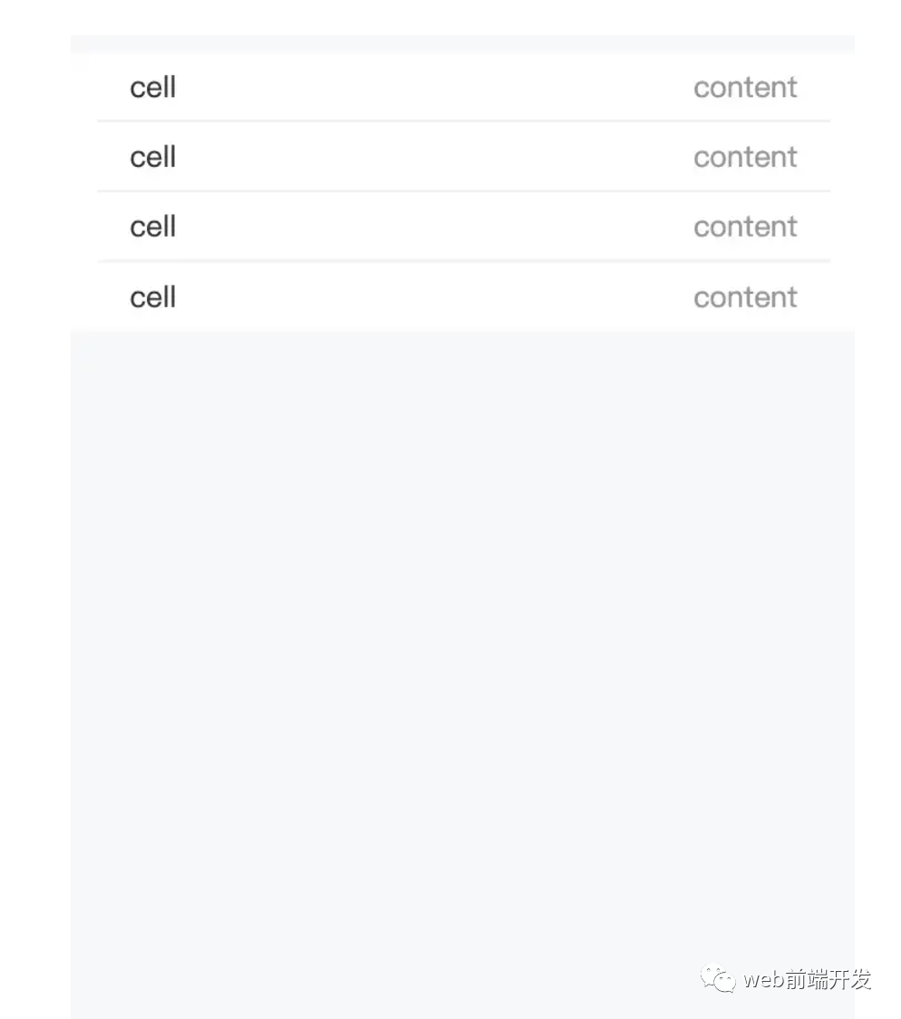
4. 使用“:not”選擇器
演示地址:https://codepen.io/qianlong/pen/QWOqLQO
除了最后一個(gè)元素之外的所有元素都需要一些樣式,使用 not 選擇器會(huì)非常容易。
如下圖:最后一個(gè)元素沒有底邊框。
<ul><li><span>cell</span><span>content</span></li><li><span>cell</span><span>content</span></li><li><span>cell</span><span>content</span></li><li><span>cell</span><span>content</span></li></ul>
* {margin: 0;padding: 0;}html,body {background-color: #f7f8fa;height: 100%;}ul,li {list-style: none;padding: 0 15px;font-size: 14px;}ul {margin-top: 10px;background-color: #fff;}li {height: 32px;display: flex;align-items: center;justify-content: space-between;}/* Key Style */li:not(:last-child) {border-bottom: 1px solid #ebedf0;}li span:first-child {color: #323233;}li span:last-child {color: #969799;}
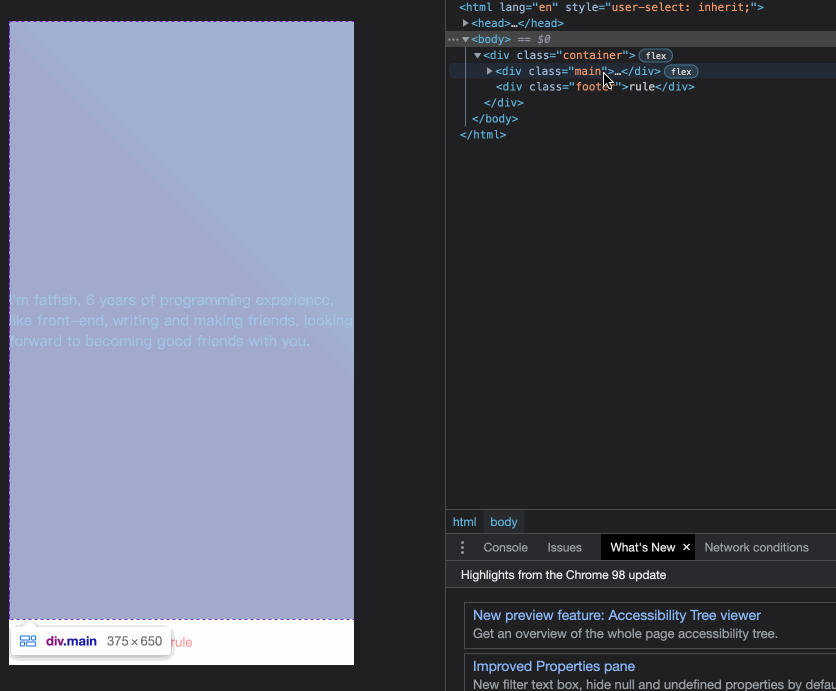
5.使用flex布局智能固定一個(gè)元素在底部
演示地址:https://codepen.io/qianlong/pen/ZEaXzxM
當(dāng)內(nèi)容不夠時(shí),按鈕應(yīng)該在頁面底部。當(dāng)有足夠的內(nèi)容時(shí),按鈕應(yīng)該跟隨內(nèi)容。當(dāng)你遇到類似問題時(shí),使用flex實(shí)現(xiàn)智能布局!
代碼如下:
<div class="container"><div class="main">I'm fatfish, 6 years of programming experience, like front-end, writingand making friends,looking forward to becoming good friends with you.</div><div class="footer">rule</div></div>
* {margin: 0;padding: 0;}.container {height: 100vh;/* Key Style */display: flex;flex-direction: column;justify-content: space-between;}.main {/* Key Style */flex: 1;background-image: linear-gradient(45deg,#ff9a9e 0%,#fad0c4 99%,#fad0c4 100%);display: flex;align-items: center;justify-content: center;color: #fff;}.footer {padding: 15px 0;text-align: center;color: #ff9a9e;font-size: 14px;}
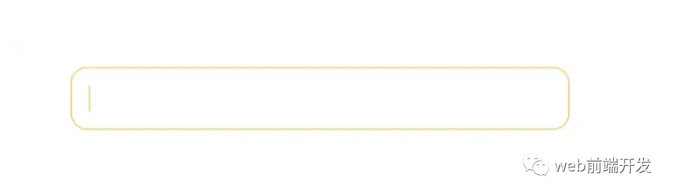
6.使用“caret-color”修改光標(biāo)顏色
演示地址:https://codepen.io/qianlong/pen/YzErKvy
有時(shí)需要修改光標(biāo)的顏色。現(xiàn)在是插入符號(hào)顏色顯示時(shí)間。
<input type="text" class="caret-color" />* {margin: 0;padding: 0;}body {display: flex;justify-content: center;}.caret-color {width: 300px;padding: 10px;margin-top: 20px;border-radius: 10px;border: solid 1px #ffd476;box-sizing: border-box;background-color: transparent;outline: none;color: #ffd476;font-size: 14px;/* Key Style */caret-color: #ffd476;}.caret-color::-webkit-input-placeholder {color: #4f4c5f;font-size: 14px;}
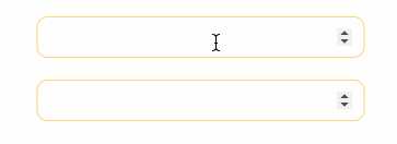
7.去掉type=”number”末尾的箭頭
演示地址:https://codepen.io/qianlong/pen/OJOxLrg
默認(rèn)情況下,input type = “number”的末尾會(huì)出現(xiàn)一個(gè)小箭頭,但有時(shí)我們需要將其去掉。我們應(yīng)該做什么?
如下圖:第二個(gè)去掉了,第一個(gè)沒有。
<input type="number" /><input type="number" class="no-arrow" />
* {margin: 0;padding: 0;}body {display: flex;justify-content: center;align-items: center;flex-direction: column;}input {width: 300px;padding: 10px;margin-top: 20px;border-radius: 10px;border: solid 1px #ffd476;box-sizing: border-box;background-color: transparent;outline: none;color: #ffd476;font-size: 14px;caret-color: #ffd476;display: block;}input::-webkit-input-placeholder {color: #4f4c5f;font-size: 14px;}/* Key Style */.no-arrow::-webkit-outer-spin-button,.no-arrow::-webkit-inner-spin-button {-webkit-appearance: none;}
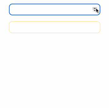
8.“outline:none”去掉輸入狀態(tài)行
演示地址:https://codepen.io/qianlong/pen/YzErzKG
當(dāng)輸入框被選中時(shí),默認(rèn)會(huì)有一個(gè)藍(lán)色的狀態(tài)行,可以使用 outline: none 去掉。
如下圖:第二個(gè)輸入框去掉了,第一個(gè)沒有。
<input type="number" /><input type="number" class="no-outline" />
* {margin: 0;padding: 0;}body {display: flex;justify-content: center;align-items: center;flex-direction: column;}input {width: 300px;padding: 10px;margin-top: 20px;border-radius: 10px;border: solid 1px #ffd476;box-sizing: border-box;background-color: transparent;color: #ffd476;font-size: 14px;caret-color: #ffd476;display: block;}/* Key Style */.no-outline {outline: none;}
9.解決iOS滾動(dòng)條卡住的問題
在蘋果手機(jī)上,經(jīng)常會(huì)出現(xiàn)滾動(dòng)時(shí)元素卡住的情況。這個(gè)時(shí)候只有一行CSS會(huì)支持彈性滾動(dòng)。
body,html{-webkit-overflow-scrolling: touch;}
10.畫三角形
演示地址:https://codepen.io/qianlong/pen/rNYGNRe
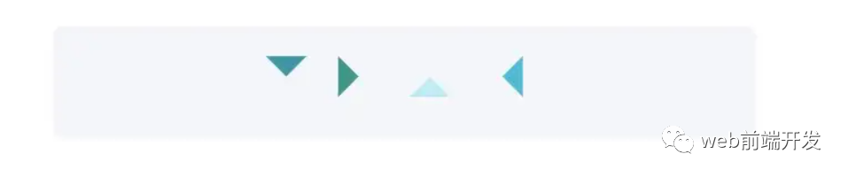
<div class="box"><div class="box-inner"><div class="triangle bottom"></div><div class="triangle right"></div><div class="triangle top"></div><div class="triangle left"></div></div></div>
* {margin: 0;padding: 0;}body {padding: 15px;}.box {padding: 15px;background-color: #f5f6f9;border-radius: 6px;display: flex;align-items: center;justify-content: center;}.triangle {display: inline-block;margin-right: 10px;/* Base Style */border: solid 10px transparent;}/*bottom*/.triangle.bottom {border-top-color: #0097a7;}/*top*/.triangle.top {border-bottom-color: #b2ebf2;}/*left*/.triangle.left {border-right-color: #00bcd4;}/*right*/.triangle.right {border-left-color: #009688;}
11.畫小箭頭
演示地址:https://codepen.io/qianlong/pen/ZEaXEEP

<div class="box"><div class="box-inner"><div class="arrow bottom"></div><div class="arrow top"></div><div class="arrow right"></div><div class="arrow left"></div></div></div>
* {margin: 0;padding: 0;}body {padding: 15px;}.box {padding: 15px;background-color: #ffffff;border-radius: 6px;display: flex;align-items: center;justify-content: center;}.arrow {display: inline-block;margin-right: 10px;width: 0;height: 0;/* Base Style */border: 16px solid;border-color: transparent #cddc39 transparent transparent;position: relative;}.arrow::after {content: "";position: absolute;right: -20px;top: -16px;border: 16px solid;border-color: transparent #fff transparent transparent;}/*bottom*/.arrow.bottom {transform: rotate(270deg);}/*top*/.arrow.top {transform: rotate(90deg);}/*left*/.arrow.left {transform: rotate(180deg);}/*right*/.arrow.right {transform: rotate(0deg);}
12.圖像適合窗口大小
演示地址:https://codepen.io/qianlong/pen/PoOJoPO
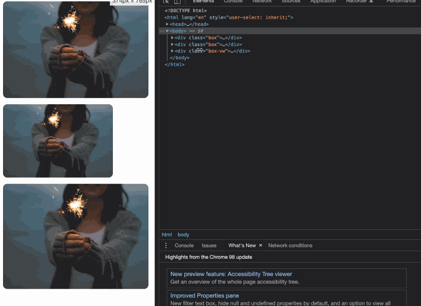
vw vs padding
<div class="box"><div class="img-container"><img src="https://cdn-images-1.medium.com/max/1600/0*tuDPftoIhupd-qx-.jpg" alt=""></div></div><div class="box"><div class="img-container"><img src="https://cdn-images-1.medium.com/max/1600/0*tuDPftoIhupd-qx-.jpg" alt=""></div></div><div class="box-vw"><div class="img-container"><img src="https://cdn-images-1.medium.com/max/1600/0*tuDPftoIhupd-qx-.jpg" alt=""></div></div>
* {margin: 0;padding: 0;}body {padding: 15px;}.box,.box-vw {background-color: #010102;border-radius: 10px;overflow: hidden;margin-bottom: 15px;}.box:nth-of-type(2) {width: 260px;}/* vw */.box-vw .img-container {width: 100vw;height: 66.620879vw;padding-bottom: inherit;}/* padding */.img-container {width: 100%;height: 0;/* Aspect ratio of picture*/padding-bottom: 66.620879%;}img {width: 100%;}
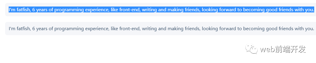
13.隱藏滾動(dòng)條
演示地址:https://codepen.io/qianlong/pen/yLPzLeZ
第一個(gè)滾動(dòng)條可見,第二個(gè)隱藏。
這意味著容器可以滾動(dòng),但是滾動(dòng)條是隱藏的,就好像它是透明的一樣。
<div class="box"><div>I'm fatfish, 6 years of programming experience, like front-end, writingand making friends, looking forward to becoming good friends with you.</div></div><div class="box box-hide-scrollbar"><div>I'm fatfish, 6 years of programming experience, like front-end, writingand making friends, looking forward to becoming good friends with you.</div></div>
* {margin: 0;padding: 0;}body {padding: 15px;color: #324b64;}.box {width: 375px;overflow: scroll;}/* Key Style */.box-hide-scrollbar::-webkit-scrollbar {display: none; /* Chrome Safari */}.box > div {margin-bottom: 15px;padding: 10px;background-color: #f5f6f9;border-radius: 6px;font-size: 12px;width: 750px;}
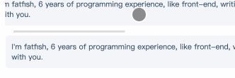
14.自定義選中的文字樣式
演示地址:https://codepen.io/qianlong/pen/jOaGOVQ
<div class="box"><p class="box-default">I'm fatfish, 6 years of programming experience, like front-end, writingand making friends, looking forward to becoming good friends with you.</p><p class="box-custom">I'm fatfish, 6 years of programming experience, like front-end, writingand making friends, looking forward to becoming good friends with you.</p></div>
* {margin: 0;padding: 0;}body {padding: 15px;color: #324b64;}.box > p {padding: 10px;background-color: #f5f6f9;border-radius: 6px;font-size: 12px;margin-bottom: 15px;}/* Key Style */.box-custom::selection {color: #ffffff;background-color: #ff4c9f;}
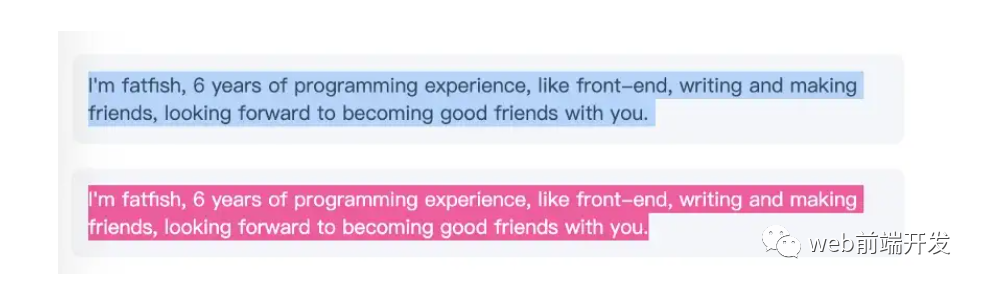
15.不允許選擇文本
演示地址:https://codepen.io/qianlong/pen/rNYGNyB
第一個(gè)內(nèi)容可以選,第二個(gè)不可以選中了。
<div class="box"><p> I'm fatfish, 6 years of programming experience, like front-end, writingand making friends, looking forward to becoming good friends with you.</p><p> I'm fatfish, 6 years of programming experience, like front-end, writingand making friends, looking forward to becoming good friends with you.</p></div>
* {margin: 0;padding: 0;}body {padding: 15px;color: #324b64;}.box p {margin-bottom: 15px;padding: 10px;background-color: #f5f6f9;border-radius: 6px;font-size: 12px;}/* Key Style */.box p:last-child {user-select: none;}
16. 水平和垂直居中元素
演示地址:https://codepen.io/qianlong/pen/VwrMwWb
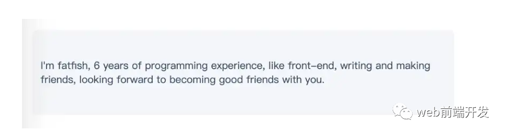
<div class="parent"><p class="child">I'm fatfish, 6 years of programming experience, like front-end, writingand making friends, looking forward to becoming good friends with you.</p></div>
* {margin: 0;padding: 0;}body {padding: 15px;color: #324b64;}.parent {padding: 0 10px;background-color: #f5f6f9;height: 100px;border-radius: 6px;font-size: 12px;/* Key Style */display: flex;align-items: center;justify-content: center;}
17.單行文字溢出時(shí)顯示省略號(hào)
演示地址:https://codepen.io/qianlong/pen/vYWeYJJ
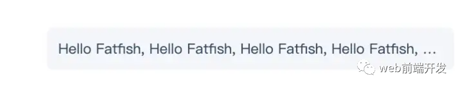
<div class="box"><p class="one-line-ellipsis">Hello Fatfish, Hello Fatfish, Hello Fatfish, Hello Fatfish, Hello Fatfish, Hello Fatfish,Hello Fatfish, Hello Fatfish, Hello Fatfish, Hello Fatfish, Hello Fatfish, Hello Fatfish</p></div>
* {margin: 0;padding: 0;}body {padding: 15px;color: #324b64;}.box {padding: 10px;background-color: #f5f6f9;border-radius: 6px;font-size: 12px;}.one-line-ellipsis {/* Key Style */overflow: hidden;white-space: nowrap;text-overflow: ellipsis;max-width: 375px;}
18.多行文字溢出時(shí)顯示省略號(hào)
演示地址:https://codepen.io/qianlong/pen/ZEaXEJg

<div class="box"><p class="more-line-ellipsis">Hello Fatfish, Hello Fatfish, Hello Fatfish, Hello Fatfish, Hello Fatfish, Hello Fatfish,Hello Fatfish, Hello Fatfish, Hello Fatfish, Hello Fatfish, Hello Fatfish, Hello Fatfish</p></div>
* {margin: 0;padding: 0;}body {padding: 15px;color: #324b64;}.box {max-width: 375px;padding: 10px;background-color: #f5f6f9;border-radius: 6px;font-size: 13px;}.more-line-ellipsis {overflow: hidden;text-overflow: ellipsis;display: -webkit-box;/* set n lines, including 1 */-webkit-line-clamp: 2;-webkit-box-orient: vertical;}
19.清除浮動(dòng)
演示地址:https://codepen.io/qianlong/pen/dyZVyZW
這是一種老式的布局方式,現(xiàn)在大部分移動(dòng)端都不用了。
如下圖,外層的高度沒有塌陷,這就是為什么要使用clearfix類。
<div class="box"><p class="more-line-ellipsis">Hello Fatfish, Hello Fatfish, Hello Fatfish, Hello Fatfish, Hello Fatfish, Hello Fatfish,Hello Fatfish, Hello Fatfish, Hello Fatfish, Hello Fatfish, Hello Fatfish, Hello Fatfish</p></div>
* {margin: 0;padding: 0;}body {padding: 15px;color: #324b64;}.box {max-width: 375px;padding: 10px;background-color: #f5f6f9;border-radius: 6px;font-size: 13px;}.more-line-ellipsis {overflow: hidden;text-overflow: ellipsis;display: -webkit-box;/* set n lines, including 1 */-webkit-line-clamp: 2;-webkit-box-orient: vertical;}
20.使用“filter:grayscale(1)”使頁面處于灰色模式
body{filter: grayscale(1);}
一行代碼將使頁面處于灰色模式,這功能也很實(shí)用的,國內(nèi)最近一周的各大平臺(tái),基本都是這個(gè)灰色模式,至于原因嘛,大家都知道了,這里就不說了。
這些都是灰色模式,后期如果我們想要恢復(fù)到原來的正常模式,我們只需要在CSS里將filter: grayscale(1);這行代碼注釋掉即可。
寫在最后
到這里,我今天所要與你分享的20個(gè)關(guān)于CSS的實(shí)用技巧就結(jié)束了,希望這些技巧能幫助到你,如果你覺得有用的話,請(qǐng)記得點(diǎn)贊我,關(guān)注我,并將這篇文章分享給你的朋友,也許能夠幫助到他。
最后,感謝你的閱讀,同時(shí),也期待您的關(guān)注,從而閱讀更多優(yōu)質(zhì)內(nèi)容。

往期推薦


最后
歡迎加我微信,拉你進(jìn)技術(shù)群,長期交流學(xué)習(xí)...
歡迎關(guān)注「前端Q」,認(rèn)真學(xué)前端,做個(gè)專業(yè)的技術(shù)人...