
手寫原生代碼專題 | 三角板 Loading 效果和骨架屏圖片卡片預(yù)加載效果(三)

大家好,本篇文章小編將和大家一起完成兩個(gè)案例效果:三角板 Loading 效果和骨架屏圖片卡片預(yù)加載效果,一起動(dòng)手實(shí)踐吧!
一、三角板 Loading 效果
如下動(dòng)圖所示,兩個(gè)三角板相差90度依次交替順時(shí)針旋轉(zhuǎn),是不是很酷呢?

基于以上動(dòng)圖效果,如何實(shí)現(xiàn)呢?
-
基于 CSS 的方式通過 DIV 的 border 屬性繪制兩個(gè)頂角向上圖形重合的正三角形 -
然后順時(shí)針旋轉(zhuǎn)其中一個(gè)三角形,讓其相差90度(旋轉(zhuǎn)的中心,在 DIV 的中心即三角形的頂點(diǎn)) -
然后定義動(dòng)畫屬性,讓兩個(gè)三角形相差90度的進(jìn)行無限循環(huán)旋轉(zhuǎn)。
做這個(gè)動(dòng)畫的思路就這些,是不是很簡單呢,接下來我們動(dòng)手實(shí)踐吧
1.1、 創(chuàng)建 HTML 結(jié)構(gòu)
HTML文件結(jié)構(gòu)很簡單,就是一個(gè) div ,用來實(shí)現(xiàn)三角形。
<!DOCTYPE html>
<html lang="en">
  <head>
    <meta charset="UTF-8" />
    <meta name="viewport" content="width=device-width, initial-scale=1.0" />
    <link rel="stylesheet" href="style.css" />
    <title>Kinetic Loader</title>
  </head>
  <body>
    <div class="kinetic"></div>
  </body>
</html>
1.2、編寫CSS代碼
編寫CSS的思路如下,最重要的是要理解如何用 Div 實(shí)現(xiàn)三角形,具體的實(shí)現(xiàn)思路如下:
-
首先定義動(dòng)畫容器 kinetic 的寬和高 80px,讓其垂直水平居中 -
然后使用 before 和 after 偽類,繪制兩個(gè)三角形(寬高為0,定義邊框?qū)挾葹?0px,底邊背景顏色為白色,其他邊框顏色透明,就繪制出兩個(gè)頂角朝上的背景色為白色正三角形) -
順時(shí)針旋轉(zhuǎn)其中一個(gè)三角形90度,然后分別定義旋轉(zhuǎn)動(dòng)畫,讓其對應(yīng)的動(dòng)畫在時(shí)間線上相差90度。
思路就聊到這里,具體的 CSS 代碼如下所示:
* {
  box-sizing: border-box;
}

body {
  background-color: #2c3e50;
  display: flex;
  align-items: center;
  justify-content: center;
  height: 100vh;
  overflow: hidden;
  margin: 0;
}

.kinetic {
  position: relative;
  height: 80px;
  width: 80px;
}

.kinetic::after,
.kinetic::before {
  content: '';
  position: absolute;
  top: 0;
  left: 0;
  width: 0;
  height: 0;
  border: 50px solid transparent;
  border-bottom-color: #fff;
  animation: rotateA 2s linear infinite 0.5s;
}

.kinetic::before {
  transform: rotate(90deg);
  animation: rotateB 2s linear infinite;
}

@keyframes rotateA {
  0%,
  25% {
    transform: rotate(0deg);
  }

  50%,
  75% {
    transform: rotate(180deg);
  }

  100% {
    transform: rotate(360deg);
  }
}

@keyframes rotateB {
  0%,
  25% {
    transform: rotate(90deg);
  }

  50%,
  75% {
    transform: rotate(270deg);
  }

  100% {
    transform: rotate(450deg);
  }
}
到這里本案例就介紹完了,大家可以點(diǎn)擊文末的閱讀原文進(jìn)行體驗(yàn),如果你想獲取源碼,請查看文末獲取源碼的方式進(jìn)行獲取。
二、骨架屏圖片卡片預(yù)加載效果
首先我們先了解下什么是骨架屏,骨架屏(Skeleton Screen)是指在頁面數(shù)據(jù)加載完成前,先給用戶展示出頁面的大致結(jié)構(gòu)(灰色占位圖),在拿到接口數(shù)據(jù)后渲染出實(shí)際頁面內(nèi)容然后替換掉。Skeleton Screen 是近兩年開始流行的加載控件,本質(zhì)上是界面加載過程中的過渡效果。假如能在加載前把網(wǎng)頁的大概輪廓預(yù)先顯示,接著再逐漸加載真正內(nèi)容,這樣既降低了用戶的焦灼情緒,又能使界面加載過程變得自然通暢,不會(huì)造成網(wǎng)頁長時(shí)間白屏或者閃爍。這就是 Skeleton Screen !
了解完骨架屏后,我們先實(shí)現(xiàn)一個(gè)圖片卡片預(yù)加載的輪廓效果,先通過這個(gè)簡單示例,簡單的了解下是如何實(shí)現(xiàn)的,原理理解后,我們就明白如何實(shí)現(xiàn)一個(gè)骨架屏了,具體的效果展示如下:
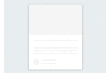
基于這個(gè)示例效果,你會(huì)如何實(shí)現(xiàn)呢?
-
首先我們先用 HTML和CSS 創(chuàng)建卡片的基礎(chǔ)輪廓 -
然后通過 JS 獲取卡片的對應(yīng)的圖片、標(biāo)題、用戶頭像、信息對應(yīng)的DOM元素 -
數(shù)據(jù)請求完成后,然后將數(shù)據(jù)填充至對應(yīng)的DOM元素
思路就聊到這里,是不是很簡單,我們一起動(dòng)手實(shí)踐吧!
2.1、 創(chuàng)建 HTML 結(jié)構(gòu)
首先我們先創(chuàng)建卡片的基本結(jié)構(gòu),卡片包含圖片、標(biāo)題、介紹、作者相關(guān)信息元素,然后基于這些元素,通過CSS初始化默認(rèn)的輪廓效果。HTML的結(jié)構(gòu)比較簡單,示例代碼如下:
<!DOCTYPE html>
<html lang="en">
<head>
<meta charset="UTF-8" />
<meta name="viewport" content="width=device-width, initial-scale=1.0" />
<link rel="stylesheet" href="style.css" />
<title>Content Placeholder</title>
</head>
<body>
<div class="card">
<div class="card-header animated-bg" id="header"> </div>
<div class="card-content">
<h3 class="card-title animated-bg animated-bg-text" id="title">
</h3>
<p class="card-excerpt" id="excerpt">
<span class="animated-bg animated-bg-text"> </span>
<span class="animated-bg animated-bg-text"> </span>
<span class="animated-bg animated-bg-text"> </span>
</p>
<div class="author">
<div class="profile-img animated-bg" id="profile_img"> </div>
<div class="author-info">
<strong class="animated-bg animated-bg-text" id="name"
> </strong
>
<small class="animated-bg animated-bg-text" id="date"> </small>
</div>
</div>
</div>
</div>
<script src="script.js"></script>
</body>
</html>
在需要顯示輪廓的地方,我們定義 animated-bg、animated-bg-text 樣式,需要填充的內(nèi)容我們現(xiàn)用 符號進(jìn)行占位,等JS拿到數(shù)據(jù)內(nèi)容后,然后動(dòng)過DOM 相關(guān)的API進(jìn)行內(nèi)容的填充。
2.2、編寫CSS代碼
要實(shí)現(xiàn)輪廓預(yù)加載的背景漸變效果,animated-bg 的定義比較關(guān)鍵,這里我們使用顏色漸變創(chuàng)建灰色線性漸變的背景,然后 CSS 幀動(dòng)畫屬性動(dòng)態(tài)更改 background-position 的位置, 就有了線條的動(dòng)畫效果,具體的代碼內(nèi)容如下:
* {
  box-sizing: border-box;
}

body {
  background-color: #ecf0f1;
  font-family: 'Roboto', sans-serif;
  display: flex;
  align-items: center;
  justify-content: center;
  height: 100vh;
  overflow: hidden;
  margin: 0;
}

img {
  max-width: 100%;
}

.card {
  box-shadow: 0 2px 10px rgba(0, 0, 0, 0.2);
  border-radius: 10px;
  overflow: hidden;
  width: 350px;
}

.card-header {
  height: 200px;
}

.card-header img {
  object-fit: cover;
  height: 100%;
  width: 100%;
}

.card-content {
  background-color: #fff;
  padding: 30px;
}

.card-title {
  height: 20px;
  margin: 0;
}

.card-excerpt {
  color: #777;
  margin: 10px 0 20px;
}

.author {
  display: flex;
}

.profile-img {
  border-radius: 50%;
  overflow: hidden;
  height: 40px;
  width: 40px;
}

.author-info {
  display: flex;
  flex-direction: column;
  justify-content: space-around;
  margin-left: 10px;
  width: 100px;
}

.author-info small {
  color: #aaa;
  margin-top: 5px;
}

.animated-bg {
  background-image: linear-gradient(
    to right,
    #f6f7f8 0%,
    #edeef1 10%,
    #f6f7f8 20%,
    #f6f7f8 100%
  );
  background-size: 200% 100%;
  animation: bgPos 1s linear infinite;
}

.animated-bg-text {
  border-radius: 50px;
  display: inline-block;
  margin: 0;
  height: 10px;
  width: 100%;
}

@keyframesbgPos {
  0% {
    background-position: 50% 0;
  }

  100% {
    background-position: -150% 0;
  }
}
2.3、編寫 JS 代碼
最后我們來編寫 JS 代碼,我們先定義數(shù)據(jù)填充方法 getData(),我們一般通過請求接口的方式進(jìn)行數(shù)據(jù)填充,為了方便演示,這里我們直接定義數(shù)據(jù)變量替換 DOM 相關(guān)的內(nèi)容,替換完后,移除背景的樣式。定義完成后,最后我們通過 setTimeout 方法模擬接口的數(shù)據(jù)請求,調(diào)用我們剛才的 getData() 方法替換預(yù)加載的輪廓效果。思路就聊到這里,示例代碼如下所示:
const header = document.getElementById('header')
const title = document.getElementById('title')
const excerpt = document.getElementById('excerpt')
const profile_img = document.getElementById('profile_img')
const name = document.getElementById('name')
const date = document.getElementById('date')

const animated_bgs = document.querySelectorAll('.animated-bg')
const animated_bg_texts = document.querySelectorAll('.animated-bg-text')

setTimeout(getData, 2500)

function getData() {
  header.innerHTML =
    '<img src="https://images.unsplash.com/photo-1496181133206-80ce9b88a853?ixlib=rb-1.2.1&ixid=eyJhcHBfaWQiOjEyMDd9&auto=format&fit=crop&w=2102&q=80" alt="" />'
  title.innerHTML = 'Lorem ipsum dolor sit amet'
  excerpt.innerHTML =
    'Lorem ipsum dolor sit amet consectetur adipisicing elit. Dolore perferendis'
  profile_img.innerHTML =
    '<img src="https://randomuser.me/api/portraits/men/45.jpg" alt="" />'
  name.innerHTML = 'John Doe'
  date.innerHTML = 'Oct 08, 2020'

  animated_bgs.forEach((bg) => bg.classList.remove('animated-bg'))
  animated_bg_texts.forEach((bg) => bg.classList.remove('animated-bg-text'))
}
骨架屏圖片卡片的預(yù)加載效果到這里就完成了,是不是很簡單呢,基于這個(gè)思路,你可以嘗試做一下完整的骨架屏加載效果。
三、結(jié)束語
到這里,這兩個(gè)案例就完成了,如果你想體驗(yàn)本案例的效果,可以點(diǎn)擊閱讀原文體驗(yàn),如果你想獲取本案例源碼,請關(guān)注“前端達(dá)人”公眾號,回復(fù)“a3”。感謝你的閱讀。