UI技巧:優(yōu)雅實現(xiàn)紅點效果!
大家好,我是皇叔,最近開了一個安卓進階漲薪訓(xùn)練營,可以幫助大家突破技術(shù)&職場瓶頸,從而度過難關(guān),進入心儀的公司。
詳情見文章:皇叔的最新作來啦!
作者:yechaoa
https://blog.csdn.net/yechaoa/article/details/117339632
前言
今天介紹一種特別的方式優(yōu)雅實現(xiàn)小紅點效果:「BadgeDrawable」,保證讓你眼前一亮!
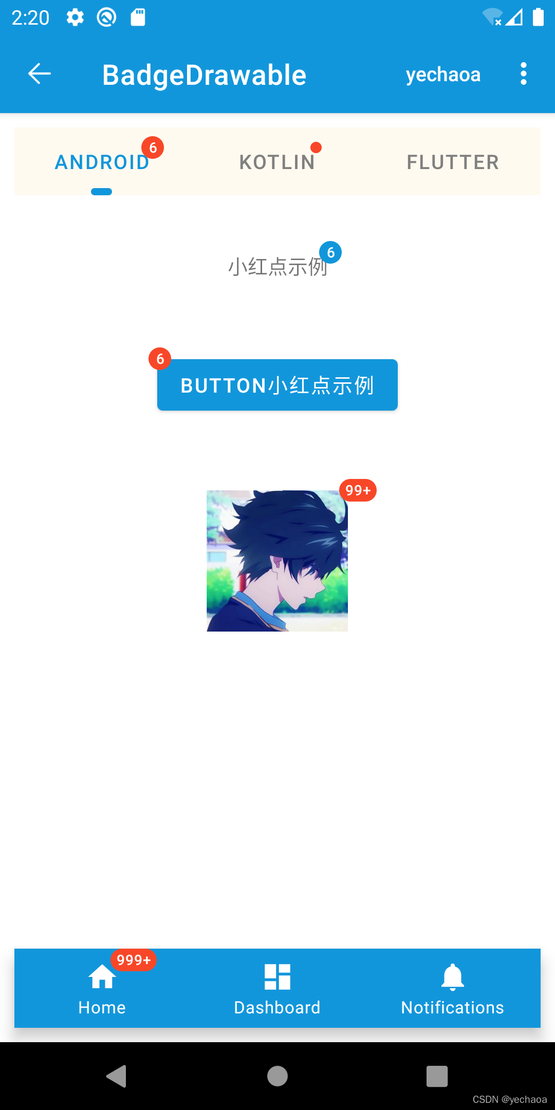
效果展示
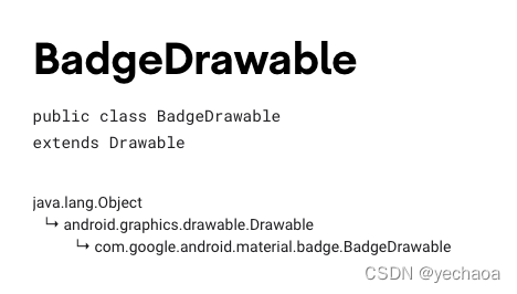
BadgeDrawable簡介
用途:給View添加動態(tài)顯示信息(小紅點提示效果) app主題需使用 Theme.MaterialComponents.*api 要求 18+也就Android 4.3以上(api等級對應(yīng)關(guān)系)
API使用說明
| API | 描述 |
|---|---|
| backgroundColor | 背景色 |
| badgeTextColor | 文本顏色 |
| alpha | 透明度 |
| number | 顯示的提示數(shù)字 |
| maxCharacterCount | 最多顯示字符數(shù)量(99+包括‘+’號) |
| badgeGravity | 顯示位置 |
| horizontalOffset | 水平方向偏移量 |
| verticalOffset | 垂直方向偏移量 |
| isVisible | 是否顯示 |
實例說明
主要包括多個場景下的紅點顯示,如Textview、Button、TabLayout等上的紅點。
實例1:TextView

//?布局文件XML
????????android:id="@+id/tv_badge"
????????android:layout_width="wrap_content"
????????android:layout_height="wrap_content"
????????android:layout_marginTop="30dp"
????????android:text="小紅點示例"
????????android:textAllCaps="false"
????????app:layout_constraintLeft_toLeftOf="parent"
????????app:layout_constraintRight_toRightOf="parent"
????????app:layout_constraintTop_toBottomOf="@+id/tab_layout"?/>

//?邏輯代碼
private?fun?initTextView()?{
????//?在視圖樹變化
????mBinding.tvBadge.viewTreeObserver.addOnGlobalLayoutListener(object?:?ViewTreeObserver.OnGlobalLayoutListener?{
????????override?fun?onGlobalLayout()?{
????????????BadgeDrawable.create(this@BadgeDrawableActivity).apply?{
????????????????badgeGravity?=?BadgeDrawable.TOP_END
????????????????number?=?6
????????????????backgroundColor?=?ContextCompat.getColor(this@BadgeDrawableActivity,?R.color.colorPrimary)
????????????????isVisible?=?true
????????????????BadgeUtils.attachBadgeDrawable(this,?mBinding.tvBadge)
????????????}
????????????mBinding.tvBadge.viewTreeObserver.removeOnGlobalLayoutListener(this)
????????}
????})
}
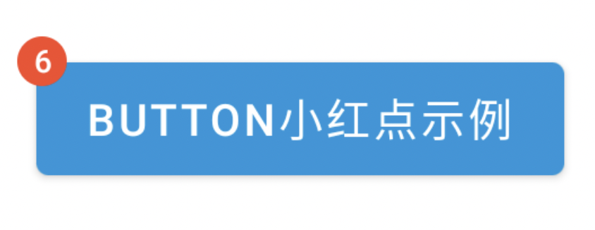
實例2:Button
//?布局文件XML
????android:id="@+id/fl_btn"
????android:layout_width="wrap_content"
????android:layout_height="wrap_content"
????android:layout_marginTop="30dp"
????android:padding="10dp"
????app:layout_constraintLeft_toLeftOf="parent"
????app:layout_constraintRight_toRightOf="parent"
????app:layout_constraintTop_toBottomOf="@+id/tv_badge">

????????????android:id="@+id/mb_badge"
????????android:layout_width="wrap_content"
????????android:layout_height="wrap_content"
????????android:text="Button小紅點示例"?/>


//?邏輯代碼
private?fun?initButton()?{
????mBinding.mbBadge.viewTreeObserver.addOnGlobalLayoutListener(object?:?ViewTreeObserver.OnGlobalLayoutListener?{
????????@SuppressLint("UnsafeOptInUsageError")
????????override?fun?onGlobalLayout()?{
????????????BadgeDrawable.create(this@BadgeDrawableActivity).apply?{
????????????????badgeGravity?=?BadgeDrawable.TOP_START
????????????????number?=?6
????????????????backgroundColor?=?ContextCompat.getColor(this@BadgeDrawableActivity,?R.color.red)
????????????????//?MaterialButton本身有間距,不設(shè)置為0dp的話,可以設(shè)置badge的偏移量
????????????????verticalOffset?=?15
????????????????horizontalOffset?=?10
????????????????BadgeUtils.attachBadgeDrawable(this,?mBinding.mbBadge,?mBinding.flBtn)
????????????}
????????????mBinding.mbBadge.viewTreeObserver.removeOnGlobalLayoutListener(this)
????????}
????})
}
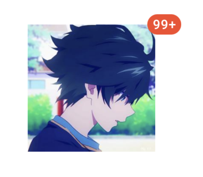
實例3:ImageView
//?布局文件XML
????android:id="@+id/fl_img"
????android:layout_width="match_parent"
????android:layout_height="wrap_content"
????android:layout_marginTop="30dp"
????android:padding="10dp"
????app:layout_constraintLeft_toLeftOf="parent"
????app:layout_constraintRight_toRightOf="parent"
????app:layout_constraintTop_toBottomOf="@+id/fl_btn">

????????????android:id="@+id/siv_badge"
????????android:layout_width="wrap_content"
????????android:layout_height="wrap_content"
????????android:layout_gravity="center"
????????android:contentDescription="Image小紅點示例"
????????android:src="@mipmap/ic_avatar"?/>


//?邏輯代碼
private?fun?initImageView()?{
????mBinding.sivBadge.viewTreeObserver.addOnGlobalLayoutListener(object?:?ViewTreeObserver.OnGlobalLayoutListener?{
????????@SuppressLint("UnsafeOptInUsageError")
????????override?fun?onGlobalLayout()?{
????????????BadgeDrawable.create(this@BadgeDrawableActivity).apply?{
????????????????badgeGravity?=?BadgeDrawable.TOP_END
????????????????number?=?99999
????????????????//?badge最多顯示字符,默認(rèn)999+?是4個字符(帶'+'號)
????????????????maxCharacterCount?=?3
????????????????backgroundColor?=?ContextCompat.getColor(this@BadgeDrawableActivity,?R.color.red)
????????????????BadgeUtils.attachBadgeDrawable(this,?mBinding.sivBadge,?mBinding.flImg)
????????????}
????????????mBinding.sivBadge.viewTreeObserver.removeOnGlobalLayoutListener(this)
????????}
????})
}
實例4:TabLayout
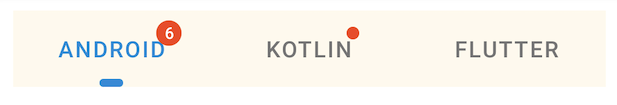
//?布局文件XML
????????android:id="@+id/tab_layout"
????????android:layout_width="0dp"
????????android:layout_height="wrap_content"
????????android:layout_margin="10dp"
????????android:background="#FFFAF0"
????????android:textAllCaps="false"
????????app:layout_constraintLeft_toLeftOf="parent"
????????app:layout_constraintRight_toRightOf="parent"
????????app:layout_constraintTop_toBottomOf="@+id/include"
????????app:tabIndicator="@drawable/shape_tab_indicator"
????????app:tabIndicatorColor="@color/colorPrimary"
????????app:tabIndicatorFullWidth="false"
????????app:tabMaxWidth="200dp"
????????app:tabMinWidth="100dp"
????????app:tabMode="fixed"
????????app:tabSelectedTextColor="@color/colorPrimary"
????????app:tabTextColor="@color/gray">

????????????????????android:layout_width="wrap_content"
????????????android:layout_height="wrap_content"
????????????android:text="Android"?/>

????????????????????android:layout_width="wrap_content"
????????????android:layout_height="wrap_content"
????????????android:text="Kotlin"?/>

????????????????????android:layout_width="wrap_content"
????????????android:layout_height="wrap_content"
????????????android:text="Flutter"?/>

????

//?邏輯代碼
private?fun?initTabLayout()?{
????????//?帶數(shù)字小紅點
????????mBinding.tabLayout.getTabAt(0)?.let?{
????????????it.orCreateBadge.apply?{
????????????????backgroundColor?=?ContextCompat.getColor(this@BadgeDrawableActivity,?R.color.red)
????????????????badgeTextColor?=?ContextCompat.getColor(this@BadgeDrawableActivity,?R.color.white)
????????????????number?=?6
????????????}
????????}

????????//?不帶數(shù)字小紅點
????????mBinding.tabLayout.getTabAt(1)?.let?{
????????????it.orCreateBadge.apply?{
????????????????backgroundColor?=?ContextCompat.getColor(this@BadgeDrawableActivity,?R.color.red)
????????????????badgeTextColor?=?ContextCompat.getColor(this@BadgeDrawableActivity,?R.color.white)
????????????}
????????}
????}
實例5:BottomNavigationView
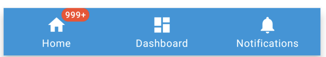
?//?布局文件XML
????android:id="@+id/navigation_view"
????android:layout_width="0dp"
????android:layout_height="wrap_content"
????android:layout_margin="10dp"
????android:layout_marginStart="0dp"
????android:layout_marginEnd="0dp"
????android:background="?android:attr/windowBackground"
????app:itemBackground="@color/colorPrimary"
????app:itemIconTint="@color/white"
????app:itemTextColor="@color/white"
????app:layout_constraintBottom_toBottomOf="parent"
????app:layout_constraintLeft_toLeftOf="parent"
????app:layout_constraintRight_toRightOf="parent"
????app:menu="@menu/navigation"?/>

//?邏輯代碼
private?fun?initNavigationView()?{
????mBinding.navigationView.getOrCreateBadge(R.id.navigation_home).apply?{
????????backgroundColor?=?ContextCompat.getColor(this@BadgeDrawableActivity,?R.color.red)
????????badgeTextColor?=?ContextCompat.getColor(this@BadgeDrawableActivity,?R.color.white)
????????number?=?9999
????}
}
?TabLayout和BottomNavigationView源碼中直接提供了創(chuàng)建
?BadgeDrawable的api,未提供的使用BadgeUtils。
源碼解析
來一段最簡單的代碼示例看看:
BadgeDrawable.create(this@BadgeDrawableActivity).apply?{
????//?...
????BadgeUtils.attachBadgeDrawable(this,?mBinding.mbBadge,?mBinding.flBtn)
}
不難發(fā)現(xiàn),有兩個關(guān)鍵點:
BadgeDrawable.create BadgeUtils.attachBadgeDrawable
源碼分析1:BadgeDrawable.create
create實際調(diào)用的是構(gòu)造方法:
??private?BadgeDrawable(@NonNull?Context?context)?{
????this.contextRef?=?new?WeakReference<>(context);
????ThemeEnforcement.checkMaterialTheme(context);
????Resources?res?=?context.getResources();
????badgeBounds?=?new?Rect();
????shapeDrawable?=?new?MaterialShapeDrawable();

????badgeRadius?=?res.getDimensionPixelSize(R.dimen.mtrl_badge_radius);
????badgeWidePadding?=?res.getDimensionPixelSize(R.dimen.mtrl_badge_long_text_horizontal_padding);
????badgeWithTextRadius?=?res.getDimensionPixelSize(R.dimen.mtrl_badge_with_text_radius);

????textDrawableHelper?=?new?TextDrawableHelper(/*?delegate=?*/?this);
????textDrawableHelper.getTextPaint().setTextAlign(Paint.Align.CENTER);
????this.savedState?=?new?SavedState(context);
????setTextAppearanceResource(R.style.TextAppearance_MaterialComponents_Badge);
??}
構(gòu)造方法里有這么一行:ThemeEnforcement.checkMaterialTheme(context); 檢測Material主題,如果不是會直接拋出異常
??private?static?void?checkTheme(
??????@NonNull?Context?context,?@NonNull?int[]?themeAttributes,?String?themeName)?{
????if?(!isTheme(context,?themeAttributes))?{
??????throw?new?IllegalArgumentException(
??????????"The?style?on?this?component?requires?your?app?theme?to?be?"
??????????????+?themeName
??????????????+?"?(or?a?descendant).");
????}
??}
這也是上面為什么說主題要使用Theme.MaterialComponents.*
然后創(chuàng)建了一個文本繪制幫助類,TextDrawableHelper,比如設(shè)置文本居中:textDrawableHelper.getTextPaint().setTextAlign(Paint.Align.CENTER);,其他的就是text屬性的獲取和設(shè)置,跟我們平時設(shè)置一毛一樣,比較好理解。
繪制文本之后怎么顯示出來呢?繼續(xù)跟attachBadgeDrawable。
源碼分析2:BadgeUtils.attachBadgeDrawable
????public?static?void?attachBadgeDrawable(@NonNull?BadgeDrawable?badgeDrawable,?@NonNull?View?anchor,?@Nullable?FrameLayout?customBadgeParent)?{
????????setBadgeDrawableBounds(badgeDrawable,?anchor,?customBadgeParent);
????????if?(badgeDrawable.getCustomBadgeParent()?!=?null)?{
????????????badgeDrawable.getCustomBadgeParent().setForeground(badgeDrawable);
????????}?else?{
????????????if?(USE_COMPAT_PARENT)?{
????????????????throw?new?IllegalArgumentException("Trying?to?reference?null?customBadgeParent");
????????????}
????????????anchor.getOverlay().add(badgeDrawable);
????????}
????}
這里先是判斷badgeDrawable.getCustomBadgeParent() != null,這個parent view的類型就是FrameLayout,不為空的情況下,層級前置。
為空的情況下先是判斷了if (USE_COMPAT_PARENT),這里其實是對api level的判斷
????static?{
????????USE_COMPAT_PARENT?=?VERSION.SDK_INT?18;
????}
核心代碼:
anchor.getOverlay().add(badgeDrawable);
如果有同學(xué)做過類似全局添加View的需求,這行代碼就看著比較熟悉了。
ViewOverlay,視圖疊加,也可以理解為浮層,在不影響子view的情況下,可以添加、刪除View,這個api就是android 4.3加的,這也是為什么前面說api 要求18+。
至此,關(guān)于BadgeDrawable的使用和源碼解析介紹完畢。
為了失聯(lián),歡迎關(guān)注我防備的小號