分享前端動畫制作的 12 個原則(含代碼)
點擊上方 前端Q,關(guān)注公眾號
回復(fù)加群,加入前端Q技術(shù)交流群
大家好,我是winty!
作為前端的設(shè)計師和工程師,我們用 CSS 去做樣式、定位并創(chuàng)建出好看的網(wǎng)站。我們經(jīng)常用 CSS 去添加頁面的運動過渡效果甚至動畫,但我們經(jīng)常做的東西不會超過這些。
動效是一個有助于訪客和消費者理解我們設(shè)計的強有力工具。這里有些原則能最大限度地應(yīng)用在我們的工作中。
迪士尼經(jīng)過基礎(chǔ)工作練習(xí)的長時間累積,在 1981 年出版的 The Illusion of Life: Disney Animation 一書中發(fā)表了動畫的十二個原則 (12 Principles of Animation) 。這些原則描述了動畫能怎樣用于讓觀眾相信自己沉浸在現(xiàn)實世界中。
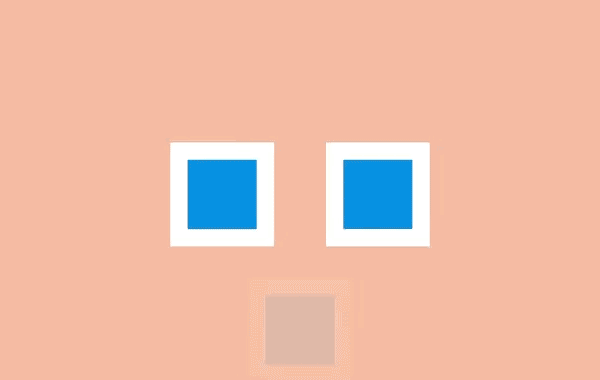
一、擠壓和拉伸 (Squash and stretch)
這是物體存在質(zhì)量且運動時質(zhì)量保持不變的概念。當一個球在彈跳時,碰擊到地面會變扁,恢復(fù)的時間會越來越短。
創(chuàng)建對象的時候最有用的方法是參照實物,比如人、時鐘和彈性球。
當它和網(wǎng)頁元件一起工作時可能會忽略這個原則。DOM 對象不一定和實物相關(guān),它會按需要在屏幕上縮放。例如,一個按鈕會變大并變成一個信息框,或者錯誤信息會出現(xiàn)和消失。
盡管如此,擠壓和伸縮效果可以為一個對象增加實物的感覺。甚至一些形狀上的小變化就可以創(chuàng)造出細微但搶眼的效果。
<article class="principle one">
    <div class="shape"></div>
    <div class="surface"></div>
  </article>
.one .shape {
  animation: one 4s infinite ease-out;
}

.one .surface {
  background: #000;
  height: 10em;
  width: 1em;
  position: absolute;
  top: calc(50% - 4em);
  left: calc(50% + 10em);
}

@keyframes one {
  0%, 15% {
    opacity: 0;
  }
  15%, 25% {
    transform: none;
    animation-timing-function: cubic-bezier(1,-1.92,.95,.89);
    width: 4em;
    height: 4em;
    top: calc(50% - 2em);
    left: calc(50% - 2em);
    opacity: 1;
  }
  35%, 45% {
    transform: translateX(8em);
    height: 6em;
    width: 2em;
    top: calc(50% - 3em);
    animation-timing-function: linear;
    opacity: 1;
  }
  70%, 100% {
    transform: translateX(8em) translateY(5em);
    height: 6em;
    width: 2em;
    top: calc(50% - 3em);
    opacity: 0;
  }
}

body {
  margin: 0;
  background: #e9b59f;
  font-family: HelveticaNeue, Arial, Sans-serif;
  color: #fff;
}

.principle {
  width: 100%;
  height: 100vh;
  position: relative;
}

.shape {
  background: #2d97db;
  border: 1em solid #fff;
  width: 4em;
  height: 4em;
  position: absolute;
  top: calc(50% - 2em);
  left: calc(50% - 2em);
}
二、預(yù)備動作 (Anticipation)
運動不傾向于突然發(fā)生。在現(xiàn)實生活中,無論是一個球在掉到桌子前就開始滾動,或是一個人屈膝準備起跳,運動通常有著某種事先的累積。
我們能用它去讓我們的過渡動畫顯得更逼真。預(yù)備動作可以是一個細微的反彈,幫人們理解什么對象將在屏幕中發(fā)生變化并留下痕跡。
例如,懸停在一個元件上時可以在它變大前稍微縮小,在初始列表中添加額外的條目來介紹其它條目的移除方法。
<article class="principle two">
    <div class="shape"></div>
    <div class="surface"></div>
  </article>
.two .shape {
animation: two 5s infinite ease-out;
transform-origin: 50% 7em;
}
.two .surface {
background: #000;
width: 8em;
height: 1em;
position: absolute;
top: calc(50% + 4em);
left: calc(50% - 3em);
}
@keyframes two {
0%, 15% {
opacity: 0;
transform: none;
}
15%, 25% {
opacity: 1;
transform: none;
animation-timing-function: cubic-bezier(.5,.05,.91,.47);
}
28%, 38% {
transform: translateX(-2em);
}
40%, 45% {
transform: translateX(-4em);
}
50%, 52% {
transform: translateX(-4em) rotateZ(-20deg);
}
70%, 75% {
transform: translateX(-4em) rotateZ(-10deg);
}
78% {
transform: translateX(-4em) rotateZ(-24deg);
opacity: 1;
}
86%, 100% {
transform: translateX(-6em) translateY(4em) rotateZ(-90deg);
opacity: 0;
}
}
.principle {
width: 100%;
height: 100vh;
position: relative;
}
.shape {
background: #2d97db;
border: 1em solid #fff;
width: 4em;
height: 4em;
position: absolute;
top: calc(50% - 2em);
left: calc(50% - 2em);
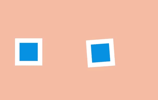
}三、演出布局 (Staging)
演出布局是確保對象在場景中得以聚焦,讓場景中的其它對象和視覺在主動畫發(fā)生的地方讓位。這意味著要么把主動畫放到突出的位置,要么模糊其它元件來讓用戶專注于看他們需要看的東西。
在網(wǎng)頁方面,一種方法是用 model 覆蓋在某些內(nèi)容上。在現(xiàn)有頁面添加一個遮罩并把那些主要關(guān)注的內(nèi)容前置展示。
另一種方法是用動作。當很多對象在運動,你很難知道哪些值得關(guān)注。如果其它所有的動作停止,只留一個在運動,即使動得很微弱,這都可以讓對象更容易被察覺。
還有一種方法是做一個晃動和閃爍的按鈕來簡單地建議用戶比如他們可能要保存文檔。屏幕保持靜態(tài),所以再細微的動作也會突顯出來。
<article class="principle three">
    <div class="shape a"></div>
    <div class="shape b"></div>
    <div class="shape c"></div>
  </article>
.three .shape.a {
  transform: translateX(-12em);
}

.three .shape.c {
  transform: translateX(12em);
}

.three .shape.b {
  animation: three 5s infinite ease-out;
  transform-origin: 0 6em;
}

.three .shape.a, .three .shape.c {
  animation: threeb 5s infinite linear;
}

@keyframes three {
  0%, 10% {
    transform: none;
    animation-timing-function: cubic-bezier(.57,-0.5,.43,1.53);
  }
  26%, 30% {
    transform: rotateZ(-40deg);
  }
  32.5% {
    transform: rotateZ(-38deg);
  }
  35% {
    transform: rotateZ(-42deg);
  }
  37.5% {
    transform: rotateZ(-38deg);
  }
  40% {
    transform: rotateZ(-40deg);
  }
  42.5% {
    transform: rotateZ(-38deg);
  }
  45% {
    transform: rotateZ(-42deg);
  }
  47.5% {
    transform: rotateZ(-38deg);
    animation-timing-function: cubic-bezier(.57,-0.5,.43,1.53);
  }
  58%, 100% {
    transform: none;
  }
}

@keyframes threeb {
  0%, 20% {
    filter: none;
  }
  40%, 50% {
    filter: blur(5px);
  }
  65%, 100% {
    filter: none;
  }
}

.principle {
  width: 100%;
  height: 100vh;
  position: relative;
}

.shape {
  background: #2d97db;
  border: 1em solid #fff;
  width: 4em;
  height: 4em;
  position: absolute;
  top: calc(50% - 2em);
  left: calc(50% - 2em);
}
四、連續(xù)運動和姿態(tài)對應(yīng) (Straight-Ahead Action and Pose-to-Pose)

連續(xù)運動是繪制動畫的每一幀,姿態(tài)對應(yīng)是通常由一個 assistant 在定義一系列關(guān)鍵幀后填充間隔。
大多數(shù)網(wǎng)頁動畫用的是姿態(tài)對應(yīng):關(guān)鍵幀之間的過渡可以通過瀏覽器在每個關(guān)鍵幀之間的插入盡可能多的幀使動畫流暢。
有一個例外是定時功能 step。通過這個功能,瀏覽器 “steps” 可以把盡可能多的無序幀串清晰。你可以用這種方式繪制一系列圖片并讓瀏覽器按順序顯示出來,這開創(chuàng)了一種逐幀動畫的風格。
<article class="principle four">
    <div class="shape a"></div>
    <div class="shape b"></div>
  </article>
.four .shape.a {
    left: calc(50% - 8em);
    animation: four 6s infinite cubic-bezier(.57,-0.5,.43,1.53);
}

.four .shape.b {
  left: calc(50% + 8em);
  animation: four 6s infinite steps(1);
}

@keyframes four {
  0%, 10% {
    transform: none;
  }
  26%, 30% {
    transform: rotateZ(-45deg) scale(1.25);
  }
  40% {
    transform: rotateZ(-45deg) translate(2em, -2em) scale(1.8);
  }
  50%, 75% {
    transform: rotateZ(-45deg) scale(1.1);
  }
  90%, 100% {
    transform: none;
  }
}

.principle {
  width: 100%;
  height: 100vh;
  position: relative;
}

.shape {
  background: #2d97db;
  border: 1em solid #fff;
  width: 4em;
  height: 4em;
  position: absolute;
  top: calc(50% - 2em);
  left: calc(50% - 2em);
}
五、跟隨和重疊動作 (Follow Through and Overlapping Action)

事情并不總在同一時間發(fā)生。當一輛車從急剎到停下,車子會向前傾、有煙從輪胎冒出來、車里的司機繼續(xù)向前沖。
這些細節(jié)是跟隨和重疊動作的例子。它們在網(wǎng)頁中能被用作幫助強調(diào)什么東西被停止,并不會被遺忘。例如一個條目可能在滑動時稍滑微遠了些,但它自己會糾正到正確位置。
要創(chuàng)造一個重疊動作的感覺,我們可以讓元件以稍微不同的速度移動到每處。這是一種在 iOS 系統(tǒng)的視窗 過渡中被運用得很好的方法。一些按鈕和元件以不同速率運動,整體效果會比全部東西以相同速率運動要更逼真,并留出時間讓訪客去適當理解變化。
在網(wǎng)頁方面,這可能意味著讓過渡或動畫的效果以不同速度來運行。
<article class="principle five">
    <div class="shape-container">
      <div class="shape"></div>
    </div>
  </article>
.five .shape {
  animation: five 4s infinite cubic-bezier(.64,-0.36,.1,1);
  position: relative;
  left: auto;
  top: auto;
}

.five .shape-container {
  animation: five-container 4s infinite cubic-bezier(.64,-0.36,.1,2);
  position: absolute;
  left: calc(50% - 4em);
  top: calc(50% - 4em);
}

@keyframes five {
  0%, 15% {
    opacity: 0;
    transform: translateX(-12em);
  }
  15%, 25% {
    transform: translateX(-12em);
    opacity: 1;
  }
  85%, 90% {
    transform: translateX(12em);
    opacity: 1;
  }
  100% {
    transform: translateX(12em);
    opacity: 0;
  }
}

@keyframes five-container {
  0%, 35% {
    transform: none;
  }
  50%, 60% {
    transform: skewX(20deg);
  }
  90%, 100% {
    transform: none;
  }
}
.principle {
  width: 100%;
  height: 100vh;
  position: relative;
}

.shape {
  background: #2d97db;
  border: 1em solid #fff;
  width: 4em;
  height: 4em;
  position: absolute;
  top: calc(50% - 2em);
  left: calc(50% - 2em);
}
六、緩入緩出 (Slow In and Slow Out)
對象很少從靜止狀態(tài)一下子加速到最大速度,它們往往是逐步加速并在停止前變慢。沒有加速和減速,動畫感覺就像機器人。
在 CSS 方面,緩入緩出很容易被理解,在一個動畫過程中計時功能是一種描述變化速率的方式。
使用計時功能,動畫可以由慢加速 (ease-in)、由快減速 (ease-out),或者用貝塞爾曲線做出更復(fù)雜的效果。
<article class="principle six">
    <div class="shape a"></div>
  </article>
.six .shape {
animation: six 3s infinite cubic-bezier(0.5,0,0.5,1);
}

@keyframes six {
0%, 5% {
  transform: translate(-12em);
}
45%, 55% {
  transform: translate(12em);
}
95%, 100% {
  transform: translate(-12em);
}
}

.principle {
width: 100%;
height: 100vh;
position: relative;
}

.shape {
background: #2d97db;
border: 1em solid #fff;
width: 4em;
height: 4em;
position: absolute;
top: calc(50% - 2em);
left: calc(50% - 2em);
}
七、弧線運動 (Arc)

雖然對象是更逼真了,當它們遵循「緩入緩出」的時候它們很少沿直線運動——它們傾向于沿弧線運動。
我們有幾種 CSS 的方式來實現(xiàn)弧線運動。一種是結(jié)合多個動畫,比如在彈力球動畫里,可以讓球上下移動的同時讓它右移,這時候球的顯示效果就是沿弧線運動
另外一種是旋轉(zhuǎn)元件,我們可以設(shè)置一個在對象之外的原點來作為它的旋轉(zhuǎn)中心。當我們旋轉(zhuǎn)這個對象,它看上去就是沿著弧線運動。
<article class="principle sevenb">
    <div class="shape a"></div>
    <div class="shape b"></div>
  </article>
.sevenb .shape.a {
animation: sevenb 3s infinite linear;
top: calc(50% - 2em);
left: calc(50% - 9em);
transform-origin: 10em 50%;
}
.sevenb .shape.b {
animation: sevenb 6s infinite linear reverse;
background-color: yellow;
width: 2em;
height: 2em;
left: calc(50% - 1em);
top: calc(50% - 1em);
}

@keyframes sevenb {
100% {
  transform: rotateZ(360deg);
}
}

.principle {
width: 100%;
height: 100vh;
position: relative;
}

.shape {
background: #2d97db;
border: 1em solid #fff;
width: 4em;
height: 4em;
position: absolute;
top: calc(50% - 2em);
left: calc(50% - 2em);
}
八、次要動作 (Secondary Action)
雖然主動畫正在發(fā)生,次要動作可以增強它的效果。這就好比某人在走路的時候擺動手臂和傾斜腦袋,或者彈性球彈起的時候揚起一些灰塵。
在網(wǎng)頁方面,當主要焦點出現(xiàn)的時候就可以開始執(zhí)行次要動作,比如拖拽一個條目到列表中間。
<article class="principle eight">
    <div class="shape a"></div>
    <div class="shape b"></div>
    <div class="shape c"></div>
  </article>
.eight .shape.a {
transform: translateX(-6em);
animation: eight-shape-a 4s cubic-bezier(.57,-0.5,.43,1.53) infinite;
}
.eight .shape.b {
top: calc(50% + 6em);
opacity: 0;
animation: eight-shape-b 4s linear infinite;
}
.eight .shape.c {
transform: translateX(6em);
animation: eight-shape-c 4s cubic-bezier(.57,-0.5,.43,1.53) infinite;
}

@keyframes eight-shape-a {
0%, 50% {
  transform: translateX(-5.5em);
}
70%, 100% {
  transform: translateX(-10em);
}
}

@keyframes eight-shape-b {
0% {
  transform: none;
}
20%, 30% {
  transform: translateY(-1.5em);
  opacity: 1;
  animation-timing-function: cubic-bezier(.57,-0.5,.43,1.53);
}
32% {
  transform: translateY(-1.25em);
  opacity: 1;
}
34% {
  transform: translateY(-1.75em);
  opacity: 1;
}
36%, 38% {
  transform: translateY(-1.25em);
  opacity: 1;
}
42%, 60% {
  transform: translateY(-1.5em);
  opacity: 1;
}
75%, 100% {
  transform: translateY(-8em);
  opacity: 1;
}
}

@keyframes eight-shape-c {
0%, 50% {
  transform: translateX(5.5em);
}
70%, 100% {
  transform: translateX(10em);
}
}

.principle {
width: 100%;
height: 100vh;
position: relative;
}

.shape {
background: #2d97db;
border: 1em solid #fff;
width: 4em;
height: 4em;
position: absolute;
top: calc(50% - 2em);
left: calc(50% - 2em);
}
九、時間節(jié)奏 (Timing)
動畫的時間節(jié)奏是需要多久去完成,它可以被用來讓看起來很重的對象做很重的動畫,或者用在添加字符的動畫中。
這在網(wǎng)頁上可能只要簡單調(diào)整 animation-duration 或 transition-duration 值。
這很容易讓動畫消耗更多時間,但調(diào)整時間節(jié)奏可以幫動畫的內(nèi)容和交互方式變得更出眾。
<article class="principle nine">
    <div class="shape a"></div>
    <div class="shape b"></div>
</article>
.nine .shape.a {
  animation: nine 4s infinite cubic-bezier(.93,0,.67,1.21);
  left: calc(50% - 12em);
  transform-origin: 100% 6em;
}
.nine .shape.b {
  animation: nine 2s infinite cubic-bezier(1,-0.97,.23,1.84);
  left: calc(50% + 2em);
  transform-origin: 100% 100%;
}

@keyframes nine {
  0%, 10% {
    transform: translateX(0);
  }
  40%, 60% {
    transform: rotateZ(90deg);
  }
  90%, 100% {
    transform: translateX(0);
  }
}
.principle {
  width: 100%;
  height: 100vh;
  position: relative;
}

.shape {
  background: #2d97db;
  border: 1em solid #fff;
  width: 4em;
  height: 4em;
  position: absolute;
  top: calc(50% - 2em);
  left: calc(50% - 2em);}
十、夸張手法 (Exaggeration)

夸張手法在漫畫中是最常用來為某些動作刻畫吸引力和增加戲劇性的,比如一只狼試圖把自己的喉嚨張得更開地去咬東西可能會表現(xiàn)出更恐怖或者幽默的效果。
在網(wǎng)頁中,對象可以通過上下滑動去強調(diào)和刻畫吸引力,比如在填充表單的時候生動部分會比收縮和變淡的部分更突出。
<article class="principle ten">
    <div class="shape"></div>
  </article>
.ten .shape {
  animation: ten 4s infinite linear;
  transform-origin: 50% 8em;
  top: calc(50% - 6em);
}

@keyframes ten {
  0%, 10% {
    transform: none;
    animation-timing-function: cubic-bezier(.87,-1.05,.66,1.31);
  }
  40% {
    transform: rotateZ(-45deg) scale(2);
    animation-timing-function: cubic-bezier(.16,.54,0,1.38);
  }
  70%, 100% {
    transform: rotateZ(360deg) scale(1);
  }
}

.principle {
  width: 100%;
  height: 100vh;
  position: relative;
}

.shape {
  background: #2d97db;
  border: 1em solid #fff;
  width: 4em;
  height: 4em;
  position: absolute;
  top: calc(50% - 2em);
  left: calc(50% - 2em);
}
十一、扎實的描繪 (Solid drawing)

當動畫對象在三維中應(yīng)該加倍注意確保它們遵循透視原則。因為人們習(xí)慣了生活在三維世界里,如果對象表現(xiàn)得與實際不符,會讓它看起來很糟糕。
如今瀏覽器對三維變換的支持已經(jīng)不錯,這意味著我們可以在場景里旋轉(zhuǎn)和放置三維對象,瀏覽器能自動控制它們的轉(zhuǎn)換。
<article class="principle eleven">
    <div class="shape">
      <div class="container">
        <span class="front"></span>
        <span class="back"></span>
        <span class="left"></span>
        <span class="right"></span>
        <span class="top"></span>
        <span class="bottom"></span>
      </div>
    </div>
  </article>
.eleven .shape {
  background: none;
  border: none;
  perspective: 400px;
  perspective-origin: center;
}
.eleven .shape .container {
  animation: eleven 4s infinite cubic-bezier(.6,-0.44,.37,1.44);
  transform-style: preserve-3d;
}
.eleven .shape span {
    display: block;
    position: absolute;
    opacity: 1;
    width: 4em;
    height: 4em;
    border: 1em solid #fff;
    background: #2d97db;
}
.eleven .shape span.front {
  transform: translateZ(3em);
}
.eleven .shape span.back {
  transform: translateZ(-3em);
}
.eleven .shape span.left {
  transform: rotateY(-90deg) translateZ(-3em);
}
.eleven .shape span.right {
  transform: rotateY(-90deg) translateZ(3em);
}
.eleven .shape span.top {
  transform: rotateX(-90deg) translateZ(-3em);
}
.eleven .shape span.bottom {
  transform: rotateX(-90deg) translateZ(3em);
}

@keyframes eleven {
  0% {
    opacity: 0;
  }
  10%, 40% {
    transform: none;
    opacity: 1;
  }
  60%, 75% {
    transform: rotateX(-20deg) rotateY(-45deg) translateY(4em);
    animation-timing-function: cubic-bezier(1,-0.05,.43,-0.16);
    opacity: 1;
  }
  100% {
    transform: translateZ(-180em) translateX(20em);
    opacity: 0;
  }
}

.principle {
  width: 100%;
  height: 100vh;
  position: relative;
}

.shape {
  background: #2d97db;
  border: 1em solid #fff;
  width: 4em;
  height: 4em;
  position: absolute;
  top: calc(50% - 2em);
  left: calc(50% - 2em);
}
十二、吸引力 (Appeal)

吸引力是藝術(shù)作品的特質(zhì),讓我們與藝術(shù)家的想法連接起來。就像一個演員身上的魅力,是注重細節(jié)和動作相結(jié)合而打造吸引性的結(jié)果。
精心制作網(wǎng)頁上的動畫可以打造出吸引力,例如 Stripe 這樣的公司用了大量的動畫去增加它們結(jié)賬流程的可靠性。
<article class="principle twelve">
    <div class="shape">
      <div class="container">
        <span class="item one"></span>
        <span class="item two"></span>
        <span class="item three"></span>
        <span class="item four"></span>
      </div>
    </div>
  </article>
.twelve .shape {
background: none;
border: none;
perspective: 400px;
perspective-origin: center;
}

.twelve .shape .container {
animation: show-container 8s infinite cubic-bezier(.6,-0.44,.37,1.44);
transform-style: preserve-3d;
width: 4em;
height: 4em;
border: 1em solid #fff;
background: #2d97db;
position: relative;
}

.twelve .item {
background-color: #1f7bb6;
position: absolute;
}

.twelve .item.one {
animation: show-text 8s 0.1s infinite ease-out;
height: 6%;
width: 30%;
top: 15%;
left: 25%;
}

.twelve .item.two {
animation: show-text 8s 0.2s infinite ease-out;
height: 6%;
width: 20%;
top: 30%;
left: 25%;
}

.twelve .item.three {
animation: show-text 8s 0.3s infinite ease-out;
height: 6%;
width: 50%;
top: 45%;
left: 25%;
}

.twelve .item.four {
animation: show-button 8s infinite cubic-bezier(.64,-0.36,.1,1.43);
height: 20%;
width: 40%;
top: 65%;
left: 30%;
}

@keyframes show-container {
0% {
  opacity: 0;
  transform: rotateX(-90deg);
}
10% {
  opacity: 1;
  transform: none;
  width: 4em;
  height: 4em;
}
15%, 90% {
  width: 12em;
  height: 12em;
  transform: translate(-4em, -4em);
  opacity: 1;
}
100% {
  opacity: 0;
  transform: rotateX(-90deg);
  width: 4em;
  height: 4em;
}
}

@keyframes show-text {
0%, 15% {
  transform: translateY(1em);
  opacity: 0;
}
20%, 85% {
  opacity: 1;
  transform: none;
}
88%, 100% {
  opacity: 0;
  transform: translateY(-1em);
  animation-timing-function: cubic-bezier(.64,-0.36,.1,1.43);
}
}

@keyframes show-button {
0%, 25% {
  transform: scale(0);
  opacity: 0;
}
35%, 80% {
  transform: none;
  opacity: 1;
}
90%, 100% {
  opacity: 0;
  transform: scale(0);
}
}

.principle {
width: 100%;
height: 100vh;
position: relative;
}

.shape {
background: #2d97db;
border: 1em solid #fff;
width: 4em;
height: 4em;
position: absolute;
top: calc(50% - 2em);
left: calc(50% - 2em);
}
譯者:@Ethon Lau
譯文:https://cssanimation.rocks/cn/principles/
作者:@donovanh
原文:https://cssanimation.rocks/principles/

往期推薦


最后
歡迎加我微信,拉你進技術(shù)群,長期交流學(xué)習(xí)...
歡迎關(guān)注「前端Q」,認真學(xué)前端,做個專業(yè)的技術(shù)人...