
Flutter 中自定義動畫底部導航欄
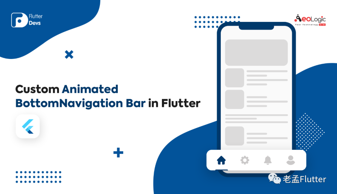
在這個博客中,我們將探索Flutter中的自定義動畫底部導航欄。我們將看到如何實現(xiàn)自定義動畫底部導航欄的演示程序以及如何在您的 Flutter 應用程序中使用它。
介紹:
顯示在應用程序底部的Material小部件,用于在幾個視角中進行選擇,通常在 3 到 5 范圍內(nèi)的某個位置。底部導航欄包含各種選項,如文本標簽、圖標或兩者。它提供了應用程序的高級視角之間的快速導航。對于更大的屏幕,側(cè)面導航可能更合適。
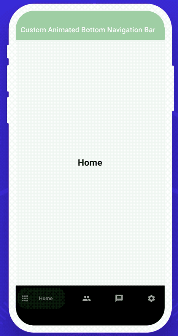
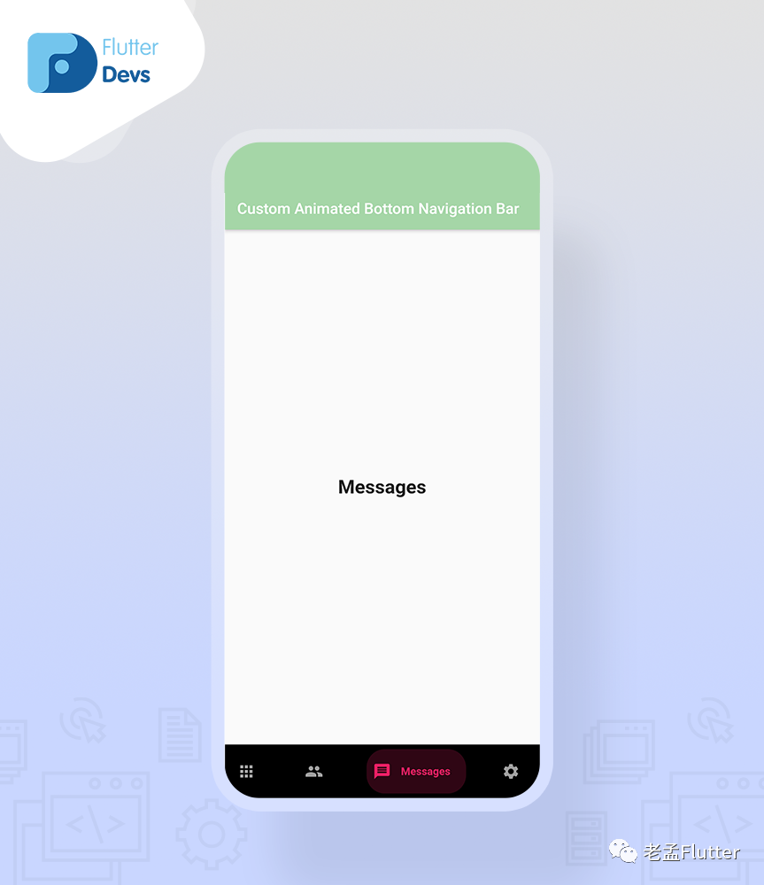
這個演示視頻展示了如何在 flutter 中使用自定義的底部導航欄。它展示了自定義底部導航欄將如何在您的 Flutter 應用程序中工作。它顯示當用戶點擊底部導航欄圖標時,它們將被動畫化并顯示標簽文本。當用戶點擊任何圖標時,顏色也會發(fā)生變化和動畫。它將顯示在您的設備上。
特性
自定義動畫底部導航欄的一些屬性是:
selectedIndex:這個屬性用于被選中的項是一個索引。更改此屬性將更改所選項目并為其設置動畫。默認為零。 backgroundColor:該屬性用于導航欄的背景顏色。如果未提供,則默認為 Theme.bottomAppBarColor。 showElevation:此屬性用于此導航欄是否應顯示高程。默認為真。 List items :該屬性用于定義底部導航欄中顯示的按鈕的外觀。這應該至少有兩個項目,最多五個。onItemSelected:該屬性用于在按下項目時調(diào)用的回調(diào)。 **curve:**該屬性用于配置動畫曲線。 itemCornerRadius:該屬性用于物品的角半徑,如果不設置,默認為50。
如何在 dart 文件中實現(xiàn)代碼
創(chuàng)建一個新的 dart 文件*my_home_page.dart*。
在構(gòu)建方法中,我們將返回一個 scaffold()。在里面我們將添加一個 appBar。在 appBar 中,我們將添加 title 和 backgroundColor。我們將添加 body 并添加到**getBody()小部件中。下面我們將深入定義代碼。現(xiàn)在,我們將添加 bottomNavigationBar 并將其添加到_buildBottomBar()**小部件中。我們還將深入定義下面的代碼。
return Scaffold(
    appBar: AppBar(
      automaticallyImplyLeading: false,
      title: Text("Custom Animated Bottom Navigation Bar"),
      backgroundColor: Colors.green[200],
    ),
    body: getBody(),
    bottomNavigationBar: _buildBottomBar()
);
我們將深入定義**getBody()**小部件
首先,我們將創(chuàng)建一個整數(shù)變量 _currentIndex 等于零。
int_currentIndex = 0;
我們將創(chuàng)建 getBody() 小部件。在這個小部件中,我們將添加 List
Widget getBody() {
  List<Widget> pages = [
    Container(
      alignment: Alignment.center,
      child: Text("Home",style: TextStyle(fontSize: 25,fontWeight: FontWeight.bold),),
    ),
    Container(
      alignment: Alignment.center,
      child: Text("Users",style: TextStyle(fontSize: 25,fontWeight: FontWeight.bold),),
    ),
    Container(
      alignment: Alignment.center,
      child: Text("Messages",style: TextStyle(fontSize: 25,fontWeight: FontWeight.bold),),
    ),
    Container(
      alignment: Alignment.center,
      child: Text("Settings",style: TextStyle(fontSize: 25,fontWeight: FontWeight.bold),),
    ),
  ];
  return IndexedStack(
    index: _currentIndex,
    children: pages,
  );
}
我們將創(chuàng)建一個 _buildBottomBar() 小部件。在這個小部件中,我們將返回一個CustomAnimatedBottomBar()。在里面,我們將添加一個容器高度、backgroundColor、selectedIndex、變量_currentIndex、showElevation、動畫曲線、onItemSelected和items。在 items 中, e 將添加四個BottomNavyBarItem()。在里面,我們將添加四個不同的圖標、標題、activeColors,并且所有的 text-align 都應該居中。
Widget _buildBottomBar(){
  return CustomAnimatedBottomBar(
    containerHeight: 70,
    backgroundColor: Colors.black,
    selectedIndex: _currentIndex,
    showElevation: true,
    itemCornerRadius: 24,
    curve: Curves.easeIn,
    onItemSelected: (index) => setState(() => _currentIndex = index),
    items: <BottomNavyBarItem>[
      BottomNavyBarItem(
        icon: Icon(Icons.apps),
        title: Text('Home'),
        activeColor: Colors.green,
        inactiveColor: _inactiveColor,
        textAlign: TextAlign.center,
      ),
      BottomNavyBarItem(
        icon: Icon(Icons.people),
        title: Text('Users'),
        activeColor: Colors.purpleAccent,
        inactiveColor: _inactiveColor,
        textAlign: TextAlign.center,
      ),
      BottomNavyBarItem(
        icon: Icon(Icons.message),
        title: Text(
          'Messages ',
        ),
        activeColor: Colors.pink,
        inactiveColor: _inactiveColor,
        textAlign: TextAlign.center,
      ),
      BottomNavyBarItem(
        icon: Icon(Icons.settings),
        title: Text('Settings'),
        activeColor: Colors.blue,
        inactiveColor: _inactiveColor,
        textAlign: TextAlign.center,
      ),
    ],
  );
}
創(chuàng)建custom_animated_bottom_bar.dart文件
import 'package:flutter/material.dart';
import 'package:flutter/widgets.dart';

class CustomAnimatedBottomBar extends StatelessWidget {

  CustomAnimatedBottomBar({
    Key? key,
    this.selectedIndex = 0,
    this.showElevation = true,
    this.iconSize = 24,
    this.backgroundColor,
    this.itemCornerRadius = 50,
    this.containerHeight = 56,
    this.animationDuration = const Duration(milliseconds: 270),
    this.mainAxisAlignment = MainAxisAlignment.spaceBetween,
    required this.items,
    required this.onItemSelected,
    this.curve = Curves.linear,
  }) : assert(items.length >= 2 && items.length <= 5),
        super(key: key);

  final int selectedIndex;
  final double iconSize;
  final Color? backgroundColor;
  final bool showElevation;
  final Duration animationDuration;
  final List<BottomNavyBarItem> items;
  final ValueChanged<int> onItemSelected;
  final MainAxisAlignment mainAxisAlignment;
  final double itemCornerRadius;
  final double containerHeight;
  final Curve curve;

  @override
  Widget build(BuildContext context) {
    final bgColor = backgroundColor ?? Theme.of(context).bottomAppBarColor;

    return Container(
      decoration: BoxDecoration(
        color: bgColor,
        boxShadow: [
          if (showElevation)
            const BoxShadow(
              color: Colors.black12,
              blurRadius: 2,
            ),
        ],
      ),
      child: SafeArea(
        child: Container(
          width: double.infinity,
          height: containerHeight,
          padding: const EdgeInsets.symmetric(vertical: 6, horizontal: 8),
          child: Row(
            mainAxisAlignment: mainAxisAlignment,
            children: items.map((item) {
              var index = items.indexOf(item);
              return GestureDetector(
                onTap: () => onItemSelected(index),
                child: _ItemWidget(
                  item: item,
                  iconSize: iconSize,
                  isSelected: index == selectedIndex,
                  backgroundColor: bgColor,
                  itemCornerRadius: itemCornerRadius,
                  animationDuration: animationDuration,
                  curve: curve,
                ),
              );
            }).toList(),
          ),
        ),
      ),
    );
  }
}

class _ItemWidget extends StatelessWidget {
  final double iconSize;
  final bool isSelected;
  final BottomNavyBarItem item;
  final Color backgroundColor;
  final double itemCornerRadius;
  final Duration animationDuration;
  final Curve curve;

  const _ItemWidget({
    Key? key,
    required this.item,
    required this.isSelected,
    required this.backgroundColor,
    required this.animationDuration,
    required this.itemCornerRadius,
    required this.iconSize,
    this.curve = Curves.linear,
  })  : super(key: key);

  @override
  Widget build(BuildContext context) {
    return Semantics(
      container: true,
      selected: isSelected,
      child: AnimatedContainer(
        width: isSelected ? 130 : 50,
        height: double.maxFinite,
        duration: animationDuration,
        curve: curve,
        decoration: BoxDecoration(
          color:
          isSelected ? item.activeColor.withOpacity(0.2) : backgroundColor,
          borderRadius: BorderRadius.circular(itemCornerRadius),
        ),
        child: SingleChildScrollView(
          scrollDirection: Axis.horizontal,
          physics: NeverScrollableScrollPhysics(),
          child: Container(
            width: isSelected ? 130 : 50,
            padding: EdgeInsets.symmetric(horizontal: 8),
            child: Row(
              mainAxisSize: MainAxisSize.max,
              mainAxisAlignment: MainAxisAlignment.start,
              crossAxisAlignment: CrossAxisAlignment.center,
              children: <Widget>[
                IconTheme(
                  data: IconThemeData(
                    size: iconSize,
                    color: isSelected
                        ? item.activeColor.withOpacity(1)
                        : item.inactiveColor == null
                        ? item.activeColor
                        : item.inactiveColor,
                  ),
                  child: item.icon,
                ),
                if (isSelected)
                  Expanded(
                    child: Container(
                      padding: EdgeInsets.symmetric(horizontal: 4),
                      child: DefaultTextStyle.merge(
                        style: TextStyle(
                          color: item.activeColor,
                          fontWeight: FontWeight.bold,
                        ),
                        maxLines: 1,
                        textAlign: item.textAlign,
                        child: item.title,
                      ),
                    ),
                  ),
              ],
            ),
          ),
        ),
      ),
    );
  }
}
class BottomNavyBarItem {

  BottomNavyBarItem({
    required this.icon,
    required this.title,
    this.activeColor = Colors.blue,
    this.textAlign,
    this.inactiveColor,
  });

  final Widget icon;
  final Widget title;
  final Color activeColor;
  final Color? inactiveColor;
  final TextAlign? textAlign;

}
代碼文件
import 'package:flutter/material.dart';
import 'package:flutter_animated_bottom/custom_animated_bottom_bar.dart';

class MyHomePage extends StatefulWidget {

  @override
  _MyHomePageState createState() => _MyHomePageState();
}

class _MyHomePageState extends State<MyHomePage> {
  int _currentIndex = 0;

  final _inactiveColor = Colors.grey;
  @override
  Widget build(BuildContext context) {
    return Scaffold(
        appBar: AppBar(
          automaticallyImplyLeading: false,
          title: Text("Custom Animated Bottom Navigation Bar"),
          backgroundColor: Colors.green[200],
        ),
        body: getBody(),
        bottomNavigationBar: _buildBottomBar()
    );
  }

  Widget _buildBottomBar(){
    return CustomAnimatedBottomBar(
      containerHeight: 70,
      backgroundColor: Colors.black,
      selectedIndex: _currentIndex,
      showElevation: true,
      itemCornerRadius: 24,
      curve: Curves.easeIn,
      onItemSelected: (index) => setState(() => _currentIndex = index),
      items: <BottomNavyBarItem>[
        BottomNavyBarItem(
          icon: Icon(Icons.apps),
          title: Text('Home'),
          activeColor: Colors.green,
          inactiveColor: _inactiveColor,
          textAlign: TextAlign.center,
        ),
        BottomNavyBarItem(
          icon: Icon(Icons.people),
          title: Text('Users'),
          activeColor: Colors.purpleAccent,
          inactiveColor: _inactiveColor,
          textAlign: TextAlign.center,
        ),
        BottomNavyBarItem(
          icon: Icon(Icons.message),
          title: Text(
            'Messages ',
          ),
          activeColor: Colors.pink,
          inactiveColor: _inactiveColor,
          textAlign: TextAlign.center,
        ),
        BottomNavyBarItem(
          icon: Icon(Icons.settings),
          title: Text('Settings'),
          activeColor: Colors.blue,
          inactiveColor: _inactiveColor,
          textAlign: TextAlign.center,
        ),
      ],
    );
  }


  Widget getBody() {
    List<Widget> pages = [
      Container(
        alignment: Alignment.center,
        child: Text("Home",style: TextStyle(fontSize: 25,fontWeight: FontWeight.bold),),
      ),
      Container(
        alignment: Alignment.center,
        child: Text("Users",style: TextStyle(fontSize: 25,fontWeight: FontWeight.bold),),
      ),
      Container(
        alignment: Alignment.center,
        child: Text("Messages",style: TextStyle(fontSize: 25,fontWeight: FontWeight.bold),),
      ),
      Container(
        alignment: Alignment.center,
        child: Text("Settings",style: TextStyle(fontSize: 25,fontWeight: FontWeight.bold),),
      ),
    ];
    return IndexedStack(
      index: _currentIndex,
      children: pages,
    );
  }


}
結(jié)論:
在文章中,我已經(jīng) 在flutter中講解了自定義動畫BottomNavigation Bar的基本結(jié)構(gòu);您可以根據(jù)自己的選擇修改此代碼。這是我對用戶交互自定義動畫底部導航欄的一個小介紹。
原文鏈接:https://medium.com/flutterdevs/custom-animated-bottomnavigation-bar-in-flutter-65293e231e4a