
一文搞定前端自動化測試(Vue 實戰(zhàn))
本文首發(fā)于公眾號 「Hello FE」,關(guān)注獲取更多內(nèi)容
前言
距離上一次更新自動化測試相關(guān)的內(nèi)容已經(jīng)過去大半年了,之前寫了基礎(chǔ)篇和 React 實戰(zhàn),說好了要更新 Vue 實戰(zhàn)的。
畢業(yè)設(shè)計、論文、答辯都結(jié)束了,難得有一段屬于自己的時間,就決定更新一下。
這次通過實現(xiàn)一個 Button 組件并完善其測試用例帶大家學習 Vue 中的自動化測試。
前面兩篇還沒學習過的同學,建議先學習前面的內(nèi)容再來看這一篇文章:
試試前端自動化測試!(基礎(chǔ)篇)[1] 試試前端自動化測試!(React 實戰(zhàn))[2]
本文中所有代碼都存放在此倉庫:Learning-Vue-Test[3]
本文中實現(xiàn)的
Button組件在此處可以預覽:Learning-Vue-Test[4]
創(chuàng)建項目
首先需要創(chuàng)建一個項目來開始我們的自動化測試實戰(zhàn),這里選用了 `Vite`[5] 作為構(gòu)建工具來創(chuàng)建項目,用 @vitejs/app 創(chuàng)建一個 vue-ts 項目。
為什么選 Vite 呢?因為我參與了 Vite 的官方中文文檔的翻譯。 因為 Vite 又快又好用。
當然,也可以選擇使用 Vue CLI 創(chuàng)建項目,創(chuàng)建項目的時候勾選 TypeScript 和 Unit Test,并且選擇 Jest 作為單元測試工具就行。
環(huán)境配置
如果選用的是 Vue CLI 創(chuàng)建項目的話,就可以跳過這一步了,@vue/cli-plugin-unit-jest 已經(jīng)將基本的測試環(huán)境配置都預設(shè)好了,只需要對 JSX 做一下支持就可以了。
如果是 Vite 的話,就需要做比較多的配置了,首先是安裝一些依賴:
npm install jest@next @types/jest @vue/test-utils@next jest-transform-stub vue-jest@next babel-jest@next @babel/preset-env @babel/preset-typescript @vue/babel-plugin-jsx @vitejs/plugin-vue-jsx windicss vite-plugin-windicss @testing-library/jest-dom -D
依賴很多,看暈了是吧?沒關(guān)系,一個一個來介紹:
jest:提供單元測試能力。@vue/test-utils:對Vue組件進行測試(Vue官方提供)。jest-transform-stub:將非JavaScript文件轉(zhuǎn)換為Jest可執(zhí)行的JavaScript代碼。vue-jest:將Vue SFC(單文件組件)轉(zhuǎn)換為Jest可執(zhí)行的JavaScript代碼。babel-jest:將非標準JavaScript代碼(JSX/TSX)轉(zhuǎn)換為Jest可執(zhí)行的JavaScript代碼。@babel/preset-env:提供測試時最新的JavaScript語法的Babel Preset。@babel/preset-typescript:提供測試時TypeScript語法的Babel Preset。@vue/babel-plugin-jsx:提供測試時在Vue中使用JSX/TSX語法的Babel Plugin。@vitejs/plugin-vue-jsx:提供開發(fā)時在Vue中使用JSX/TSX語法的Vite Plugin。windicss:Windi CSS核心依賴。vite-plugin-windicss:提供開發(fā)時在Vue中使用Windi CSS能力的Vite Plugin。@testing-library/jest-dom:提供測試時部分與DOM相關(guān)的斷言。
需要安裝的依賴就這些,依賴安裝好之后,就需要編寫相應(yīng)的配置文件了。
vite.config.ts
Vite 的配置就不詳細介紹了,直接復制粘貼就行,主要是一個路徑別名的配置和插件配置:
import { defineConfig } from 'vite';
import path from 'path';

import Vue from '@vitejs/plugin-vue';
import VueJSX from '@vitejs/plugin-vue-jsx';
import WindiCSS from 'vite-plugin-windicss';

// https://vitejs.dev/config/
export default defineConfig({
  resolve: {
    alias: {
      '@': path.resolve(__dirname, 'src'),
    },
  },
  plugins: [
    Vue(),
    VueJSX({
      optimize: true,
    }),
    WindiCSS(),
  ],
});
windi.config.ts
比較懶,不想自己寫樣式,決定使用 Windi CSS 做樣式開發(fā)。
實測很爽,只用調(diào)整 class 就能實現(xiàn)樣式,開發(fā)調(diào)試體驗都很棒。
具體的配置直接復制粘貼就行,主要對顏色做了一點拓展,增加了 light 和 dark 兩種顏色:
import { defineConfig } from 'vite-plugin-windicss';

export default defineConfig({
  extract: {
    include: ['index.html', 'src/**/*.{vue,jsx,tsx,html}'],
  },
  theme: {
    extend: {
      colors: {
        dark: '#303030',
        light: '#ebebeb',
      },
    },
  },
});
extract.include 數(shù)組中的文件就是 Windi CSS 生效的文件,對 index.html 和所有 src 目錄下的 Vue/JSX/TSX/HTML 文件生效。
詳細的用法可以到 `Windi CSS` 官方文檔[6]中學習。
package.json
要跑測試用例,就需要給 package.json 中加入一條新的 npm script:
{
  ...
  "scripts": {
    "dev": "vite",
    "build": "vue-tsc --noEmit && vite build",
    "serve": "vite preview",
    "test:watch": "jest --watch --coverage"
  },
  ...
}
在 jest 后加上 --watch 和 --coverage 兩個參數(shù)是為了開啟監(jiān)聽和測試覆蓋率報告,這樣在每次寫完測試腳本后保存,Jest 就會自動跑一輪測試腳本并給出測試覆蓋率報告。
加入了這一條 test:watch 后,就可以在終端里使用 npm run test:watch 啟動測試腳本了。
jest.config.js
等一下!輸入 npm run test:watch 之后報錯了對不對?因為還沒有對 Jest 做配置。
在項目的根目錄下創(chuàng)建一個 jest.config.js 的文件,然后復制粘貼這段配置:
module.exports = {
  roots: ['<rootDir>/src'],
  testEnvironment: 'jsdom',
  collectCoverageFrom: [
    'src/components/**/*.{js,jsx,ts,tsx}',
    '!src/components/**/*.d.ts',
  ],
  setupFilesAfterEnv: ['<rootDir>/src/setupTests.ts'],
  testMatch: [
    '<rootDir>/src/**/__tests__/**/*.{js,jsx,ts,tsx}',
    '<rootDir>/src/**/*.{spec,test}.{js,jsx,ts,tsx}',
  ],
  moduleFileExtensions: [
    'js',
    'jsx',
    'ts',
    'tsx',
    'json',
    // tell Jest to handle *.vue files
    'vue',
  ],
  transform: {
    // process *.vue files with vue-jest
    '.+\\.(css|styl|less|sass|scss|jpg|jpeg|png|svg|gif|eot|otf|webp|ttf|woff|woff2|mp4|webm|wav|mp3|m4a|aac|oga)$':
      'jest-transform-stub',
    '^.+\\.vue$': 'vue-jest',
    '^.+\\.(j|t)sx?$': 'babel-jest',
  },
  transformIgnorePatterns: [
    '[/\\\\]node_modules[/\\\\].+\\.(js|jsx|mjs|cjs|ts|tsx)$',
    '^.+\\.module\\.(css|sass|scss)$',
  ],
  moduleNameMapper: {
    '^@/(.*)$': '<rootDir>/src/$1',
  },
};
配置很多比較復雜,在上一期的詳細的內(nèi)容里有一部分的講解,這里主要對一些核心的配置講解一下,詳細的內(nèi)容可以到 `Jest`[7] 官方文檔里學習。
testEnvironment:用于指定測試運行的環(huán)境,默認是node,因為測試的是運行在瀏覽器中的代碼,所以要改成jsdom。上一篇React實戰(zhàn)里用的是jest-environment-jsdom-fourteen,現(xiàn)在由于Jest已經(jīng)內(nèi)置了JSDOM,所以已經(jīng)不需要使用上一篇里用到的庫了。collectCoverageFrom:用于指定測試覆蓋率收集的文件,只有在這個列表里的文件的測試覆蓋率才會被統(tǒng)計。setupFilesAfterEnv:用于為測試環(huán)境做預設(shè),例如引入一些與DOM相關(guān)的斷言。testMatch:用于指定測試文件,只有在這個列表里的文件才會被當成測試腳本。moduleFileExtensions:用于指定模塊文件類型,只有在列表里的文件類型才能被識別。transform:用于指定對應(yīng)類型的文件轉(zhuǎn)換器,這里非JavaScript/TypeScript/Vue文件使用了jest-transform-stub進行轉(zhuǎn)換,而Vue則使用vue-jest,JS/JSX/TS/TSX使用babel-jest轉(zhuǎn)換。transformIgnorePatterns:用于指定文件轉(zhuǎn)換器需要忽略的文件。moduleNameMapper:用于設(shè)置引入時路徑的別名,這里設(shè)置引入路徑是@開頭的模塊都到src目錄下查找。
此處的配置參考的是 @vue/plugin-unit-jest 中 typescript-and-babel 的 preset,稍微做了一些改動,將 TS 文件的處理由 ts-jest 改成了 babel-jest,將其交給 Babel 來處理。(實測交給 Babel 來處理比原來快約 60%,猜測原因在于 Babel 對 TS 做編譯時會去掉類型信息跳過類型校驗)
babel.config.js
對 Jest 配置之后,還需要對 Babel 做配置,不然當 Jest 將對應(yīng)的文件交給 Babel 處理的時候會報錯。
因此需要在根目錄下創(chuàng)建 babel.config.js,往里面寫入 Babel 配置:
module.exports = {
  presets: [
    '@babel/preset-typescript',
    ['@babel/preset-env', { targets: { node: 'current' } }],
  ],
  plugins: [
    [
      '@vue/babel-plugin-jsx',
      {
        optimize: true,
      },
    ],
  ],
};
細心的讀者應(yīng)該發(fā)現(xiàn)了,明明在 Vite 里已經(jīng)配置了 JSX/TSX 支持,為什么在 Babel 里面還要使用插件?
因為 Vite 中的插件只在 development 和 production 環(huán)境下生效,在 test 環(huán)境下完全由 Jest 來跑測試用例,而遇到 JSX/TSX 會交給 babel-jest 來做轉(zhuǎn)換,如果沒有使用插件 Jest 就無法識別 JSX/TSX 語法。
至于配置的這兩個 preset 在前面已經(jīng)介紹過了,就不重復介紹了。
index.html
因為組件里用到了一些 icon,所以需要引入 iconfont 的字體資源,直接復制粘貼到 index.html 的 head 標簽里面就可以了:
<link
  rel="stylesheet"
  href="https://at.alicdn.com/t/font_2595498_06e66vrjx514.css?spm=a313x.7781069.1998910419.63&file=font_2595498_06e66vrjx514.css"
/>
對應(yīng) icon 的 class 可以到 iconfont 官網(wǎng)中的官方圖標庫里找到Ant Design 官方圖標庫[8],查看對應(yīng)圖標的 class。
編寫組件
配置文件真多,真麻煩,好在都可以復制粘貼。
現(xiàn)在就開始創(chuàng)建一個組件,真正開始寫代碼!
首先先刪除項目中 src/components 目錄下的 HelloWorld.vue,再打開 App.vue,將與 HelloWorld.vue 的內(nèi)容都刪除。
完成第一步之后就可以開始創(chuàng)建 Button 組件的代碼了,在 src/components 目錄下創(chuàng)建一個 Button.tsx,開始寫組件。
寫組件的內(nèi)容不是本篇文章的重點,就簡單貼個代碼,放個效果:
import { defineComponent } from 'vue';

// Types
import type { PropType, ButtonHTMLAttributes } from 'vue';

export type ButtonType =
  | 'default'
  | 'primary'
  | 'success'
  | 'warning'
  | 'danger';

export type ButtonSize = 'lg' | 'md' | 'sm';

export default defineComponent({
  name: 'Button',

  props: {
    icon: String,
    round: Boolean,
    block: Boolean,
    loading: Boolean,
    loadingText: String,
    nativeType: String as PropType<ButtonHTMLAttributes['type']>,
    type: {
      type: String as PropType<ButtonType>,
      default: 'default',
    },
    size: {
      type: String as PropType<ButtonSize>,
      default: 'md',
    },
    loadingIcon: {
      type: String,
      default: 'icon-sync',
    },
  },

  emits: ['click'],

  setup(props, { emit, slots }) {
    const onClick = (event: MouseEvent) => {
      if (!props.loading) {
        emit('click', event);
      }
    };

    const getStyle = () => {
      const style = [
        'inline-flex',
        'justify-center',
        'items-center',
        'border',
        'rounded-md',
        'disabled:opacity-50',
        'disabled:cursor-not-allowed',
      ];

      // ButtonSize
      if (props.size === 'lg') {
        style.push(
          'min-w-20',
          'min-h-13',
          'px-4',
          'text-lg',
          'tracking-widest'
        );
      }
      if (props.size === 'md') {
        style.push(
          'min-w-16',
          'min-h-10',
          'px-2',
          'text-base',
          'tracking-wider'
        );
      }
      if (props.size === 'sm') {
        style.push('min-w-12', 'min-h-7', 'px-1', 'text-sm', 'tracking-wide');
      }

      // ButtonType
      if (props.block) {
        style.push('block', 'w-full');
      }
      if (props.round) {
        style.push('rounded-full');
      }
      if (props.type === 'default') {
        style.push(
          'text-dark',
          'bg-white',
          'border-gray-300',
          'active:bg-gray-200'
        );
      }
      if (props.type === 'primary') {
        style.push(
          'text-light',
          'bg-blue-500',
          'border-transparent',
          'active:bg-blue-600'
        );
      }
      if (props.type === 'success') {
        style.push(
          'text-light',
          'bg-green-500',
          'border-transparent',
          'active:bg-green-600'
        );
      }
      if (props.type === 'warning') {
        style.push(
          'text-light',
          'bg-yellow-500',
          'border-transparent',
          'active:bg-yellow-600'
        );
      }
      if (props.type === 'danger') {
        style.push(
          'text-light',
          'bg-red-500',
          'border-transparent',
          'active:bg-red-600'
        );
      }

      return style;
    };

    const renderIcon = () => {
      if (props.loading) {
        return slots.loadingIcon ? (
          slots.loadingIcon()
        ) : (
          <i
            class={[
              'iconfont',
              'inline-block',
              'animate-spin',
              props.loadingIcon,
            ]}
          />
        );
      }

      if (props.icon) {
        return <i class={['iconfont', 'inline-block', props.icon]} />;
      }

      if (slots.icon) {
        return slots.icon();
      }
    };

    const renderText = () => {
      if (props.loading) {
        if (slots.loadingText) {
          return slots.loadingText();
        }

        if (props.loadingText) {
          return <span class="mx-0.5">{props.loadingText}</span>;
        }
      }

      if (slots.default) {
        return slots.default();
      }
    };

    return () => (
      <button class={getStyle()} onClick={onClick}>
        {renderIcon()}
        {renderText()}
      </button>
    );
  },
});
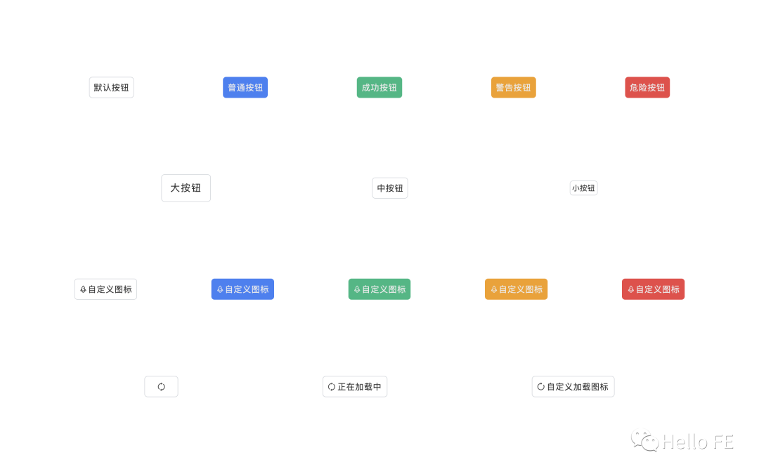
預覽之前,要改一改 App.vue,直接復制粘貼一下就行:
<template>
  <div class="w-screen h-screen flex flex-col justify-evenly">
    <div class="flex justify-evenly items-center">
      <Button>默認按鈕</Button>
      <Button type="primary">普通按鈕</Button>
      <Button type="success">成功按鈕</Button>
      <Button type="warning">警告按鈕</Button>
      <Button type="danger">危險按鈕</Button>
    </div>
    <div class="flex justify-evenly items-center">
      <Button size="lg">大按鈕</Button>
      <Button>中按鈕</Button>
      <Button size="sm">小按鈕</Button>
    </div>
    <div class="flex justify-evenly items-center">
      <Button icon="icon-rocket">自定義圖標</Button>
      <Button type="primary" icon="icon-rocket">自定義圖標</Button>
      <Button type="success" icon="icon-rocket">自定義圖標</Button>
      <Button type="warning" icon="icon-rocket">自定義圖標</Button>
      <Button type="danger" icon="icon-rocket">自定義圖標</Button>
    </div>
    <div class="flex justify-evenly items-center">
      <Button :loading="true" />
      <Button :loading="true" loadingText="正在加載中" />
      <Button
        :loading="true"
        loadingText="自定義加載圖標"
        loadingIcon="icon-reload"
      />
    </div>
  </div>
</template>

<script lang="ts">
import { defineComponent } from 'vue';

import Button from '@/components/Button';

export default defineComponent({
  name: 'App',

  components: {
    Button,
  },
});
</script>
最終實現(xiàn)的效果是這樣的:
看完代碼之后,是不是覺得用 Windi CSS 寫組件庫也挺爽的?
編寫測試用例
組件寫好了,人工測試好像也沒啥問題啊,為啥還要寫測試用例呢?
而且這里還沒采用 TDD 的思想,先寫測試用例再寫代碼,為什么呢?
人工測試當然沒問題,組件能正常運行,也沒發(fā)現(xiàn)什么問題,但是萬一以后要重構(gòu)呢?或者人工測試不夠完美,沒覆蓋到所有分支呢?這就需要用自動化測試的腳本和測試覆蓋率報告來約束了。
至于為什么沒用 TDD,先寫測試用例再寫代碼,是因為我本人抽象能力還不夠,還沒有煉成在編碼之前就抽象出組件的輸入輸出的能力,就只能邊寫邊看,再測試了。(太菜了)
現(xiàn)在就來一起寫測試用例!
引入工具
要做組件的測試就一定要有對應(yīng)的工具對組件進行渲染,并能夠調(diào)用一些 API 來觸發(fā)一些事件。
這里就采用 Vue 官方提供的 Vue Test Utils(VTU) 來測試。
與 Button 同級的目錄下創(chuàng)建一個 Button.test.tsx,引入 VTU 和 Button 組件:
import { shallowMount } from '@vue/test-utils';

import Button from './Button';
事實上 VTU 為我們提供了兩種渲染組件的方法(shallowMount/mount),這里引入的時候選擇的是 shallowMount 而不是 mount,因為在 Button 中,除了 HTML 標簽外不存在其他組件,即 Button 組件內(nèi)沒有包含子組件,所以直接使用 shallowMount。
shallowMount 和 mount 兩者的渲染行為是有差異的,前者只會渲染當前組件,子組件的內(nèi)容不會被渲染,而后者會將整個組件樹都渲染出來。
關(guān)于兩者渲染行為的差異,可以查看這篇文章:Difference between mount and shallowMount in Vue Test Utils[9]
建議在能使用 shallowMount 的情況下優(yōu)先使用 shallowMount,能有效提高跑測試用例的速度。
事件分發(fā)
Button 組件最重要功能當然是 click,所以一定要對 click 事件做測試,組件內(nèi)部一定要能夠向外分發(fā) click 事件,對應(yīng)的測試用例:
it('should emit click event.', async () => {
  const wrapper = shallowMount(Button);

  await wrapper.trigger('click');
  expect(wrapper.emitted('click')).toBeDefined();
});
VTU 渲染組件后會返回一個組件的 wrapper 實例,通過調(diào)用 wrapper 上的方法和屬性能夠?qū)崿F(xiàn)一些能力,上面調(diào)用 wrapper.trigger('click') 就是觸發(fā)組件的 click 事件。
然后在斷言里,需要判斷組件是否有向外分發(fā) click 事件。通過 wrapper.emitted('click') 能夠獲取到組件是否向外分發(fā)了 click 事件,如果有則 wrapper.emitted('click') 的值不為 undefined,就可以斷言其是 toBeDefined 的。
當然,這段測試用例也有坑,那就是只知道組件向外分發(fā)了 click 事件,但是不知道分發(fā)了幾次,所以也有需要改的地方。wrapper.emitted 的返回值是 Event[] | undefined,因此可以改成:
it('should emit click event.', async () => {
  const wrapper = shallowMount(Button);

  await wrapper.trigger('click');
  // expect(wrapper.emitted('click')).toBeDefined();
  expect(wrapper.emitted('click')).toHaveLength(1);
});
Button 組件肯定有被 disabled 的時候,這個時候組件是不可用的,也就是說不能向外分發(fā) click 事件,對應(yīng)的測試用例:
it('should not emit click event when disabled.', async () => {
  const wrapper = shallowMount(Button, {
    props: {
      disabled: true,
    },
  });

  await wrapper.trigger('click');
  expect(wrapper.emitted('click')).toBeUndefined();
});
同樣的,當 Button 組件處于 loading 狀態(tài)的時候,也不能向外分發(fā) click 事件,對應(yīng)的測試用例:
it('should not emit click event when loading.', async () => {
  const wrapper = shallowMount(Button, {
    props: {
      loading: true,
    },
  });

  await wrapper.trigger('click');
  expect(wrapper.emitted('click')).toBeUndefined();
});
組件渲染
事件分發(fā)測試完了之后,就需要測試組件渲染的部分了。
測試渲染通常會用到快照測試,將組件以快照的形式保存下來,一方面能夠直觀地看到渲染結(jié)果,另一方面當渲染結(jié)果發(fā)生變化是能夠得到提醒,查看渲染結(jié)果的變動內(nèi)容。
測試組件渲染的時候也需要轉(zhuǎn)變一下思路,因為組件是使用 Windi CSS 來實現(xiàn)樣式的,所以測試渲染是否正常只需要找到對應(yīng)的元素,判斷 class 上是否有需要的樣式即可。
因為使用了 iconfont 的 Font class,所以測試起來也很方便。
后面的測試用例,都在測試組件渲染并生成快照,直接貼代碼:
it('should render icon correctly.', async () => {
  const wrapper = shallowMount(Button, {
    props: {
      icon: 'icon-rocket',
    },
  });

  expect(wrapper.find('.icon-sync').exists()).toBeFalsy();
  expect(wrapper.find('.icon-rocket').exists()).toBeTruthy();
  expect(wrapper.html()).toMatchSnapshot();

  await wrapper.setProps({ loading: true });

  expect(wrapper.find('.icon-sync').exists()).toBeTruthy();
  expect(wrapper.find('.icon-rocket').exists()).toBeFalsy();
  expect(wrapper.html()).toMatchSnapshot();
});

it('should render text correctly.', async () => {
  const wrapper = shallowMount(Button, {
    props: {
      loadingText: 'Custom Loading',
    },
    slots: {
      default: () => <span>Custom Text</span>,
    },
  });

  expect(wrapper.find('span').exists()).toBeTruthy();
  expect(wrapper.find('span').element).toHaveTextContent(/custom text/gi);
  expect(wrapper.find('.icon-sync').exists()).toBeFalsy();
  expect(wrapper.html()).toMatchSnapshot();

  await wrapper.setProps({ loading: true });

  expect(wrapper.find('span').exists()).toBeTruthy();
  expect(wrapper.find('span').element).toHaveTextContent(/custom loading/gi);
  expect(wrapper.find('.icon-sync').exists()).toBeTruthy();
  expect(wrapper.html()).toMatchSnapshot();
});

it('should render icon slot correctly.', async () => {
  const wrapper = shallowMount(Button, {
    slots: {
      icon: () => <i class="iconfont icon-rocket" />,
    },
  });

  expect(wrapper.find('.icon-sync').exists()).toBeFalsy();
  expect(wrapper.find('.icon-rocket').exists()).toBeTruthy();
  expect(wrapper.html()).toMatchSnapshot();

  await wrapper.setProps({ loading: true });

  expect(wrapper.find('.icon-sync').exists()).toBeTruthy();
  expect(wrapper.find('.icon-rocket').exists()).toBeFalsy();
  expect(wrapper.html()).toMatchSnapshot();
});

it('should render loading slot correctly.', async () => {
  const wrapper = shallowMount(Button, {
    slots: {
      loadingIcon: () => <i class="iconfont icon-reload" />,
      loadingText: () => <span>Custom Loading</span>,
    },
  });

  expect(wrapper.find('.icon-reload').exists()).toBeFalsy();
  expect(wrapper.find('span').exists()).toBeFalsy();
  expect(wrapper.html()).toMatchSnapshot();

  await wrapper.setProps({ loading: true });

  expect(wrapper.find('.icon-reload').exists()).toBeTruthy();
  expect(wrapper.find('span').element).toHaveTextContent(/custom loading/gi);
  expect(wrapper.html()).toMatchSnapshot();
});

it('should render small button correctly.', () => {
  const wrapper = shallowMount(Button, {
    props: {
      size: 'sm',
    },
  });

  expect(wrapper.html()).toMatchSnapshot();
});

it('should render large button correctly.', () => {
  const wrapper = shallowMount(Button, {
    props: {
      size: 'lg',
    },
  });

  expect(wrapper.html()).toMatchSnapshot();
});

it('should render primary button correctly.', () => {
  const wrapper = shallowMount(Button, {
    props: {
      type: 'primary',
    },
  });

  expect(wrapper.element).toHaveClass('bg-blue-500');
  expect(wrapper.html()).toMatchSnapshot();
});

it('should render success button correctly.', () => {
  const wrapper = shallowMount(Button, {
    props: {
      type: 'success',
    },
  });

  expect(wrapper.element).toHaveClass('bg-green-500');
  expect(wrapper.html()).toMatchSnapshot();
});

it('should render warning button correctly.', () => {
  const wrapper = shallowMount(Button, {
    props: {
      type: 'warning',
    },
  });

  expect(wrapper.element).toHaveClass('bg-yellow-500');
  expect(wrapper.html()).toMatchSnapshot();
});

it('should render danger button correctly.', () => {
  const wrapper = shallowMount(Button, {
    props: {
      type: 'danger',
    },
  });

  expect(wrapper.element).toHaveClass('bg-red-500');
  expect(wrapper.html()).toMatchSnapshot();
});

it('should render block button correctly.', () => {
  const wrapper = shallowMount(Button, {
    props: {
      block: true,
    },
  });

  expect(wrapper.element).toHaveClass('block');
  expect(wrapper.html()).toMatchSnapshot();
});

it('should render round button correctly.', () => {
  const wrapper = shallowMount(Button, {
    props: {
      round: true,
    },
  });

  expect(wrapper.element).toHaveClass('rounded-full');
  expect(wrapper.html()).toMatchSnapshot();
});
簡單介紹一下幾個方法:
wrapper.find('span').exists()返回一個boolean,用于判斷span標簽是否存在,find方法的參數(shù)是一個選擇器,可以是id選擇器,也可以是class選擇器等等。wrapper.find('span').element返回一個DOM,用于獲取span標簽對應(yīng)的DOM,也可以獲取其他任何滿足選擇器條件的DOM。wrapper.html()返回一個HTML字符串,用于生成組件快照。toBeTruthy/toBeFalsy用于斷言結(jié)果為真值/假值。toHaveTextContent用于斷言當前元素是否有匹配的textContent,參數(shù)為string | RegExp。toMatchSnapshot用于斷言當前組件快照是否與上一次的組件快照相同,如果沒有組件快照則會創(chuàng)建。
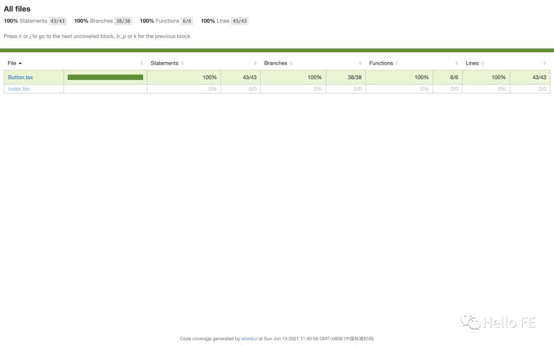
查看測試覆蓋率
按照上面的測試用例跑一輪,測試覆蓋率肯定是 100% 的,這是在簡單組件上測試才有這樣的效果。
事實上在實際應(yīng)用當中,測試覆蓋率很難達到 100%,能夠達到百分之八九十就已經(jīng)是很高的覆蓋率了。
在上面的 test:watch script 里加了 --coverage,Jest 就會在根目錄下生成一個 coverage 文件夾,將里面的 clover.xml 使用瀏覽器打開就能夠查看測試覆蓋的詳情了。
頁面效果像這樣:
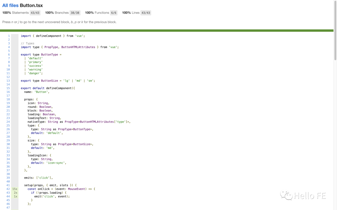
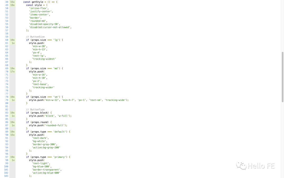
點擊 Button.tsx 還能看到組件代碼被測試的詳細情況,例如某個分支被測試的次數(shù)以及未被測試到的分支:
總結(jié)
在寫這篇文章的同時我也在不斷學習和思考,深感自身代碼功底還不夠。
尤其是在寫組件的時候完全不能抽象出組件的輸入輸出,導致沒有辦法先寫測試用例再寫組件。
希望這篇文章能給和我一樣在不斷學習的同學一些幫助!
參考資料
Jest 是一個令人愉快的 JavaScript 測試框架,專注于簡潔明快。| Jest[10] 下一代前端開發(fā)與構(gòu)建工具 | Vite[11] Next generation utility-first CSS framework. | Windi CSS[12] @vue/cli-plugin-unit-jest | Haoqun Jiang[13] Difference between mount and shallowMount in Vue test utils | Sai gowtham[14] 輕量、可靠的移動端 Vue 組件庫 | Vant[15]
參考資料
試試前端自動化測試!(基礎(chǔ)篇): https://juejin.cn/post/6844904194600599560
[2]試試前端自動化測試!(React 實戰(zhàn)): https://juejin.cn/post/6894234532224958478
[3]Learning-Vue-Test: https://github.com/wjq990112/Learning-Vue-Test
[4]Learning-Vue-Test: https://learning-vue-test.vercel.app/
[5]Vite: https://cn.vitejs.dev/
Windi CSS 官方文檔: https://cn.windicss.org/guide/
Jest: https://jestjs.io/
Ant Design 官方圖標庫: https://www.iconfont.cn/collections/detail?spm=a313x.7781069.1998910419.d9df05512&cid=9402
[9]Difference between mount and shallowMount in Vue Test Utils: https://reactgo.com/vue-testing-mount-vs-shallowmount/
[10]Jest 是一個令人愉快的 JavaScript 測試框架,專注于簡潔明快。| Jest: https://jestjs.io/zh-Hans/
[11]下一代前端開發(fā)與構(gòu)建工具 | Vite: https://cn.vitejs.dev/
[12]Next generation utility-first CSS framework. | Windi CSS: https://cn.windicss.org/guide/
[13]@vue/cli-plugin-unit-jest | Haoqun Jiang: https://github.com/vuejs/vue-cli/tree/dev/packages/@vue/cli-plugin-unit-jest#readme
[14]Difference between mount and shallowMount in Vue test utils | Sai gowtham: https://reactgo.com/vue-testing-mount-vs-shallowmount/
[15]輕量、可靠的移動端 Vue 組件庫 | Vant: https://vant-contrib.gitee.io/vant/v3/#/zh-CN/home