
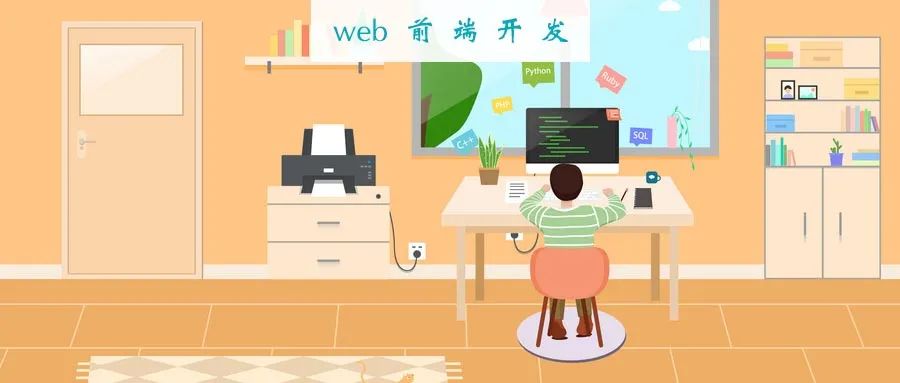
詳解CSS Flexbox,附帶示例
英文 |?https://medium.com/javascript-in-plain-english/css-flexbox-explained-with-examples-85efa38e4770
翻譯 | web前端開(kāi)發(fā)(ID:web_qdkf)
介紹
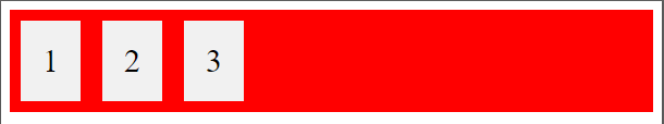
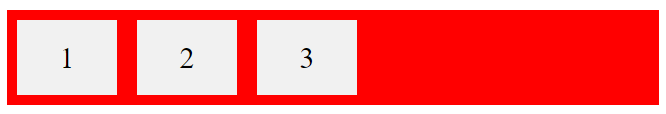
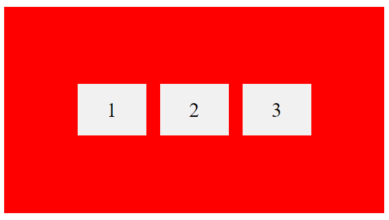
定義一個(gè)容器
1 2 3.container {display: flex;background-color: red;}.container div{background-color: #f1f1f1;margin: 10px;padding: 20px;font-size: 30px;}
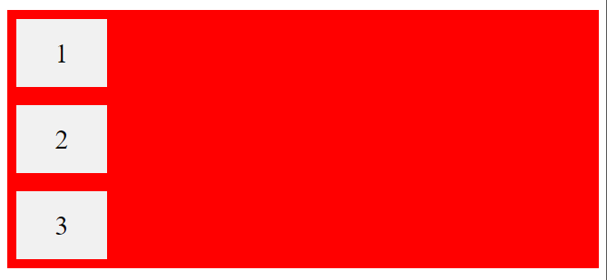
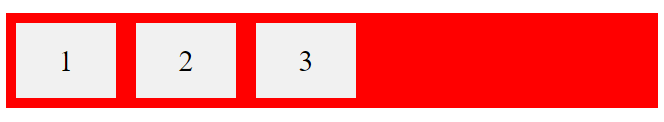
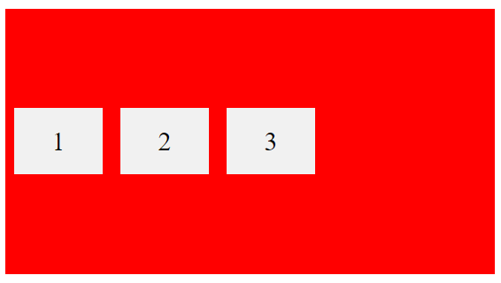
flex-direction屬性
.container {display: flex;flex-direction: column;background-color: red;}.container > div {background-color: #f1f1f1;width: 100px;margin: 10px;text-align: center;line-height: 75px;font-size: 30px;}
.container {display: flex;flex-direction: row;background-color: red;}.container > div {background-color: #f1f1f1;width: 100px;margin: 10px;text-align: center;line-height: 75px;font-size: 30px;}
flex-wrap屬性
HTml:CSS:.container {display: flex;flex-wrap: wrap;background-color: red;}.container > div {background-color: #f1f1f1;width: 100px;margin: 10px;text-align: center;line-height: 75px;font-size: 30px;}
.container {display: flex;flex-wrap: nowrap;background-color: red;}
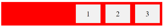
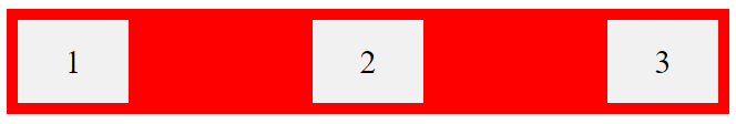
justify-content屬性
.container {display: flex;justify-content: center;}

.container {display: flex;justify-content: flex-start;}
.container {display: flex;justify-content: flex-end;}
.container {display: flex;justify-content: space-between;}
align-items屬性
.container {display: flex;height: 300px;align-items: center;background-color: red;}.container > div {background-color: #f1f1f1;width: 100px;margin: 10px;text-align: center;line-height: 75px;font-size: 30px;}
垂直和水平居中
.container {display: flex;height: 300px;align-items: center;justify-content: center;background-color: red;}.container > div {background-color: #f1f1f1;width: 100px;margin: 10px;text-align: center;line-height: 75px;font-size: 30px;}
子元素
你還應(yīng)該了解一下以下的子元素,我想你會(huì)從中受益的,例如:
order
flex-grow
flex-shrink
flex-basis
flex
align-self
結(jié)論
Flexbox是一項(xiàng)很棒的CSS功能,可讓你輕松設(shè)計(jì)靈活的響應(yīng)式布局結(jié)構(gòu)。我強(qiáng)烈建議你練習(xí)此功能,因?yàn)榫毩?xí)是提高此功能的唯一方法。

評(píng)論
圖片
表情