
純 CSS 實現(xiàn)十個還不錯的 Loading 效果
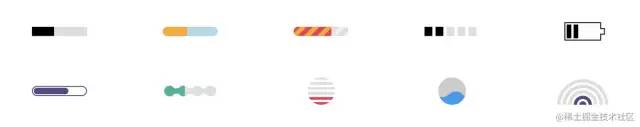
在推特上面看到 T. Afif[1] 介紹的十個 Loading 效果。如上圖。
Yeah,很贊哦,挺實用的,遂記錄下來。
為保證運行正常,咱先規(guī)定下:
*?{
??box-sizing:?border-box;
}
復(fù)制代碼
1. 平滑加載

<div?class="progress-1">div>
復(fù)制代碼
.progress-1?{
??width:120px;
??height:20px;
??background:
???linear-gradient(#000?0?0)?0/0%?no-repeat
???#ddd;
??animation:p1?2s?infinite?linear;
}
@keyframes?p1?{
????100%?{background-size:100%}
}
復(fù)制代碼
linear-gradient(#000 0 0)你可以理解為linear-gradient(#000 0 100%),如果還不熟悉,復(fù)制linear-gradient(#000 0 50%, #f00 50% 0),替換原先的部分跑一下。覺得linear-gradient(#000 0 0)別扭的話,直接寫#000即可。0/0%是background-position: 0;/background-size: 0;的簡寫。
2. 按步加載

<div?class="progress-2">div>
復(fù)制代碼
.progress-2?{
??width:120px;
??height:20px;
??border-radius:?20px;
??background:
???linear-gradient(orange?0?0)?0/0%?no-repeat
???lightblue;
??animation:p2?2s?infinite?steps(10);
}
@keyframes?p2?{
????100%?{background-size:110%}
}
復(fù)制代碼
steps(10)是step(10, end)的簡寫,指明剛開始沒有,所以有第2點的處理100% {background-size:110%}添加多一個step的百分比,上面的step是10,所以是100% + (1/10)*100% = 110%
3. 條紋加載
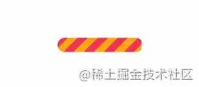
<div?class="progress-3">div>
復(fù)制代碼
.progress-3?{
??width:120px;
??height:20px;
??border-radius:?20px;
??background:
???repeating-linear-gradient(135deg,#f03355?0?10px,#ffa516?0?20px)?0/0%?no-repeat,
???repeating-linear-gradient(135deg,#ddd?0?10px,#eee?0?20px)?0/100%;
??animation:p3?2s?infinite;
}
@keyframes?p3?{
????100%?{background-size:100%}
}
復(fù)制代碼
repeating-linear-gradient(135deg,#ddd 0 10px,#eee 0 20px) 0/100%; 畫出灰色的斑馬線條紋,repeating-linear-gradient(135deg,#f03355 0 10px,#ffa516 0 20px) 0/0% no-repeat 則是進度條加載的條紋。
4. 虛線加載

<div?class="progress-4">div>
復(fù)制代碼
.progress-4?{
??width:120px;
??height:20px;
??-webkit-mask:linear-gradient(90deg,#000?70%,#0000?0)?0/20%;
??background:
???linear-gradient(#000?0?0)?0/0%?no-repeat
???#ddd;
??animation:p4?2s?infinite?steps(6);
}
@keyframes?p4?{
????100%?{background-size:120%}
}
復(fù)制代碼
-webkit-mask 默認有值 repeat,不然遮罩不會有五個。
5. 電池加載
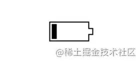
<div?class="progress-5">div>
復(fù)制代碼
.progress-5?{
??width:80px;
??height:40px;
??border:2px?solid?#000;
??padding:3px;
??background:?
????repeating-linear-gradient(90deg,#000?0?10px,#0000?0?16px)?
????0/0%?no-repeat?content-box?content-box;
??position:?relative;
??animation:p5?2s?infinite?steps(6);
}
.progress-5::before?{
??content:"";
??position:?absolute;
??top:?50%;
??left:100%;
??transform:?translateY(-50%);
??width:10px;
??height:?10px;
??border:?2px?solid?#000;
}
@keyframes?p5?{
????100%?{background-size:120%}
}
復(fù)制代碼
原作者對 .progress-5::before 偽元素實現(xiàn)如下:
.progress-5::before?{
??content:"";
??position:?absolute;
??top:-2px;
??bottom:-2px;
??left:100%;
??width:10px;
??background:
????linear-gradient(
????????#0000???calc(50%?-?7px),#000?0?calc(50%?-?5px),
????????#0000?0?calc(50%?+?5px),#000?0?calc(50%?+?7px),#0000?0)?left?/100%?100%,
????linear-gradient(#000?calc(50%?-?5px),#0000?0?calc(50%?+?5px),#000?0)?left?/2px?100%,
????linear-gradient(#0000?calc(50%?-?5px),#000?0?calc(50%?+?5px),#0000????????0)?right/2px?100%;
??background-repeat:no-repeat;
}
復(fù)制代碼
#0000 是透明,同等 transparent
6. 內(nèi)嵌加載
這名字起得有些不貼切,不過不重要,讀者看圖自然理解。

<div?class="progress-6">div>
復(fù)制代碼
.progress-6?{
??width:120px;
??height:22px;
??border-radius:?20px;
??color:?#514b82;
??border:2px?solid;
??position:?relative;
}
.progress-6::before?{
??content:"";
??position:?absolute;
??margin:2px;
??inset:0?100%?0?0;
??border-radius:?inherit;
??background:?#514b82;
??animation:p6?2s?infinite;
}
@keyframes?p6?{
????100%?{inset:0}
}
復(fù)制代碼
inset:0 100% 0 0; 右邊內(nèi)縮 100%,所以在 keyframes 部分需要將 inset 設(shè)置為 0。
7. 珠鏈加載

<div?class="progress-7">div>
復(fù)制代碼
.progress-7?{
??width:120px;
??height:24px;
??-webkit-mask:
????radial-gradient(circle?closest-side,#000?94%,#0000)?0?0/25%?100%,
????linear-gradient(#000?0?0)?center/calc(100%?-?12px)?calc(100%?-?12px)?no-repeat;
??background:
???linear-gradient(#25b09b?0?0)?0/0%?no-repeat
???#ddd;
??animation:p7?2s?infinite?linear;
}
@keyframes?p7?{
????100%?{background-size:100%}
}
復(fù)制代碼
遮罩 -webkit-mask 中 radial-gradient 是將寬度四等份,每份以最小 closest-side 的邊為直徑畫圓。
8. 斑馬線加載

<div?class="progress-8">div>
復(fù)制代碼
.progress-8?{
??width:60px;
??height:60px;
??border-radius:?50%;
??-webkit-mask:linear-gradient(0deg,#000?55%,#0000?0)?bottom/100%?18.18%;
??background:
???linear-gradient(#f03355?0?0)?bottom/100%?0%?no-repeat
???#ddd;
??animation:p8?2s?infinite?steps(7);
}
@keyframes?p8?{
????100%?{background-size:100%?115%}
}
復(fù)制代碼
對 linear-gradient 描繪的角度做調(diào)整,再加上蒙版。
9. 水柱加載

<div?class="progress-9">div>
復(fù)制代碼
.progress-9?{????
??--r1:?154%;
??--r2:?68.5%;
??width:60px;
??height:60px;
??border-radius:?50%;?
??background:
????radial-gradient(var(--r1)?var(--r2)?at?top?,#0000?79.5%,#269af2?80%)?center?left,
????radial-gradient(var(--r1)?var(--r2)?at?bottom,#269af2?79.5%,#0000?80%)?center?center,
????radial-gradient(var(--r1)?var(--r2)?at?top?,#0000?79.5%,#269af2?80%)?center?right,
????#ccc;
??background-size:?50.5%?220%;
??background-position:?-100%?0%,0%?0%,100%?0%;
??background-repeat:no-repeat;
??animation:p9?2s?infinite?linear;
}
@keyframes?p9?{
????33%??{background-position:????0%?33%?,100%?33%?,200%?33%?}
????66%??{background-position:?-100%??66%,0%???66%?,100%?66%?}
????100%?{background-position:????0%?100%,100%?100%,200%?100%}
}
復(fù)制代碼
radial-gradient 畫出水平面的波動,就三個圓。var(--r1) 直接調(diào)用定義好的屬性值。技能 get ...
10. 信號加載

<div?class="progress-10">div>
復(fù)制代碼
.progress-10?{
??width:120px;
??height:60px;
??border-radius:200px?200px?0?0;
??-webkit-mask:repeating-radial-gradient(farthest-side?at?bottom?,#0000?0,#000?1px?12%,#0000?calc(12%?+?1px)?20%);
??background:
???radial-gradient(farthest-side?at?bottom,#514b82?0?95%,#0000?0)?bottom/0%?0%?no-repeat
???#ddd;
??animation:p10?2s?infinite?steps(6);
}
@keyframes?p10?{
????100%?{background-size:120%?120%}
}
復(fù)制代碼
用 repeating-radial-gradient 方法畫出環(huán)狀的蒙版遮罩。radial-gradient 從底部向上圓形漸變填充。
Uha,看了這么多騷操作,你學廢了嗎?
參考和后話
原文:10 CSS-only loaders ready to use\![2] 文章首發(fā) - blogs[3]
關(guān)于本文
作者:Jimmy
https://juejin.cn/post/7080542771387301896