
Element 系列組件之 計(jì)數(shù)器組件

介紹
「EInputNumber」 組件是 「Flutter Element」 組件系列中的計(jì)數(shù)器組件,允許輸入標(biāo)準(zhǔn)的數(shù)字值,可定義范圍。
引入
在 「pubspec.yaml」 中依賴
element_ui:?^0.0.1import
import?'package:element_ui/widgets.dart';
基礎(chǔ)用法

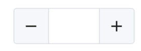
「height」:設(shè)置高度。
EInputNumber(
??height:?45,
)
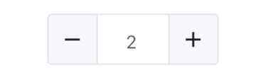
「value」: 設(shè)置初始值
EInputNumber(
??height:?45,
??value:?2,
)
「max」、「min」 :設(shè)置最大/小值
EInputNumber(
??height:?45,
??max:?10,
??min:?0,
)
「step」:步數(shù),默認(rèn) 1
EInputNumber(
??height:?45,
??step:?5,
)

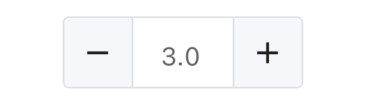
「precision」: 精度,默認(rèn)0
EInputNumber(
??height:?45,
??precision:?1,
)
「type」: 控制按鈕的位置,默認(rèn) 「side」
- **side**:兩邊
- **right**:右邊
EInputNumber(
??height:?45,
??type:?InputNumberControlType.right,
)

「onChanged」: 值發(fā)生變化時回調(diào)。
EInputNumber(
??height:?45,
??onChanged:?(value){
????print('value:$value');
??},
)
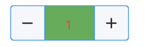
「style」:類型為 「EInputNumberStyle」。
「fontColor」 :字體顏色
「backgroundColor」: 背景顏色
「borderColor」: 線框顏色
EInputNumber(
??height:?45,
??style:?EInputNumberStyle(
????fontColor:?Colors.red,
????backgroundColor:?Colors.green,
????borderColor:?Colors.blue,
??),
)
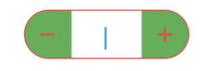
「focusBorderColor」: 獲取焦點(diǎn)時邊框顏色
「iconColor」: 控制圖標(biāo)的顏色
「iconBackgroundColor」 :控制圖標(biāo)的背景顏色
「borderRadius」: 圓角
EInputNumber(
??height:?45,
??style:?EInputNumberStyle(
????focusBorderColor:?Colors.red,
????iconColor:?Colors.red,
????iconBackgroundColor:?Colors.green,
????borderRadius:?BorderRadius.all(Radius.circular(25))
??),
)

評論
圖片
表情