
Material Components——Shape的處理
Material Components是Google官方對Material Deign的最佳實踐,這個庫試圖在不同的Android版本中統(tǒng)一Material Design UI組件的外觀和使用代碼,當然也在不同的平臺上統(tǒng)一這些組件(有針對iOS、web和Flutter的庫的版本)。Material Components庫還實現(xiàn)了新的Material Design規(guī)范中引入的功能。
官方的文檔對Material Components有著非常詳細的講解,地址如下所示。
https://github.com/material-components/material-components-android/blob/master/docs/getting-started.md
這次要講的就是Material Components中對于Shape的處理。
Shape
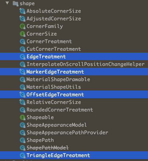
MaterialShapeDrawable類提供了非常有用的工具集,可以為我們的應用程序實現(xiàn)非常酷的效果。MaterialShapeDrawable類讓我們可以通過指定最終形狀的邊緣和角落的樣子來定義形狀。這些基本的形狀定義可以另外使用插值浮動屬性來控制,以允許角和邊緣的動畫。
為了創(chuàng)建自定義的MaterialShapeDrawable,可以使用ShapeAppearanceModel構造函數(shù)。ShapeAppearanceModel使用EdgeTreatment和CornerTreatment兩個類來存儲形狀的每個Edge和Corner的信息(總是有4個Edge和4個Corner,盡管你可以為它們定義幾乎任何形狀)。你可以為每個Edge和Corner設置不同的處理方式,也可以通過一次調用為所有Edge和Corner設置相同的處理方式。
在ShapePathModel中,也有一些預定義的現(xiàn)成的Edge和Corner處理,它們已經(jīng)實現(xiàn)了Material Design規(guī)范中介紹的大部分形狀效果。目前已經(jīng)有了圓角處理(float radius)、切角處理(float size)或三角邊緣處理(float size, boolean inside),它們都能像你期望的那樣完美地工作。
關于Shape的處理,官方有詳細的文檔,地址如下。
https://github.com/material-components/material-components-android/blob/master/docs/theming/Shape.md
統(tǒng)觀Material Design,Google設計的Material Components不僅僅是實現(xiàn)了Android的開發(fā)規(guī)范,實際上Flutter、Web,甚至是iOS,都統(tǒng)一了開發(fā)范式,所以了解過Material Components的開發(fā)者會發(fā)現(xiàn)不論是Android還是Flutter,它們上面都有著類似的影子,大家可以看看https://material.io/develop/android的文檔。
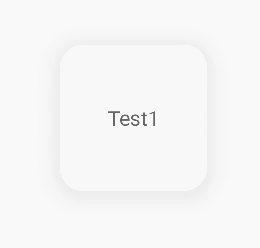
最簡單的使用
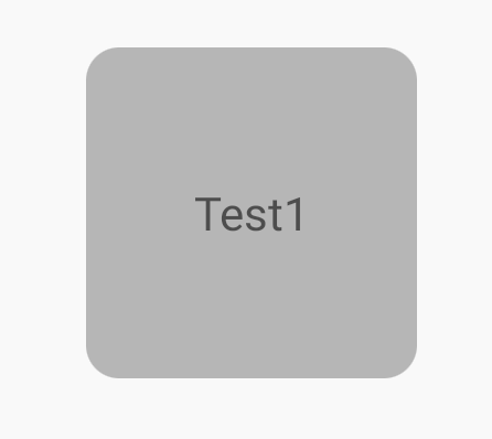
通過ShapeAppearanceModel的Builder函數(shù)可以很方便的控制邊角的Shape,代碼如下所示。
val?shapePathModel?=?ShapeAppearanceModel.builder()
????.setAllCorners(RoundedCornerTreatment())
????.setAllCornerSizes(10.dp())
????.build()
val?backgroundDrawable?=?MaterialShapeDrawable(shapePathModel).apply?{
????setTint(Color.parseColor("#bebebe"))
????paintStyle?=?Paint.Style.FILL
}
test1.background?=?backgroundDrawable
MaterialShapeDrawable實際上充當了一個Drawable的角色,用于創(chuàng)建一個指定Shape的背景。
除了上面這種設置setAllCorners和setAllCornerSizes來確定Corner的方式,還可以通過下面這種方式。
.setAllCorners(CornerFamily.ROUNDED,?8.dp())
展示如圖所示。
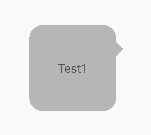
類似的,還可以指定Edge的效果。
val?shapePathModel?=?ShapeAppearanceModel.builder()
????.setAllCorners(RoundedCornerTreatment())
????.setAllCornerSizes(10.dp())
????.setAllEdges(TriangleEdgeTreatment(8.dp(),?true))
????.build()
val?backgroundDrawable?=?MaterialShapeDrawable(shapePathModel).apply?{
????setTint(Color.parseColor("#bebebe"))
????paintStyle?=?Paint.Style.FILL_AND_STROKE
????strokeWidth?=?2.dp()
}
test1.background?=?backgroundDrawable
展示如圖所示。
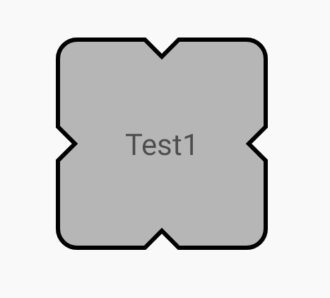
MaterialShapeDrawable還可以對描邊進行設置,如上圖所示。
不過這里要注意的是View的布局邊界問題,默認情況下,超出布局邊界的內容是會被裁剪的,所以這里在使用TriangleEdgeTreatment(8.dp(), true),第二個參數(shù)isInside設置的是true,如果設置成false,就需要指定parent view的clipChildren屬性為false了。
(test1.parent?as??ViewGroup)?.clipChildren?=?false
這一點很重要,如果是封裝的自定義View,通常可以在attachToWindow中進行設置。
在源碼中,已經(jīng)內置了很多不同種類的EdgeTreatment和CornerTreatment,這些基本的Edge和Corner的處理,可以滿足大部分的使用場景。
自定義CornerTreatment和EdgeTreatment
除了系統(tǒng)自定義的基本的Edge和Corner以外,還可以自定義Edge和Corner的樣式。其實代碼很簡單,就是針對給定的ShapePath進行一些裁剪處理,下面就列舉了一些處理的Demo,相信大家一看就能明白是如何處理的了。
class?InnerCutCornerTreatment?:?CornerTreatment()?{
????override?fun?getCornerPath(shapePath:?ShapePath,?angle:?Float,?f:?Float,?size:?Float)?{
????????val?radius?=?size?*?f
????????shapePath.reset(0f,?radius,?180f,?180?-?angle)
????????shapePath.lineTo(radius,?radius)
????????shapePath.lineTo(radius,?0f)
????}
}

class?InnerRoundCornerTreatment?:?CornerTreatment()?{
????override?fun?getCornerPath(shapePath:?ShapePath,?angle:?Float,?f:?Float,?size:?Float)?{
????????val?radius?=?size?*?f
????????shapePath.reset(0f,?radius,?180f,?180?-?angle)
????????shapePath.addArc(-radius,?-radius,?radius,?radius,?angle,?-90f)
????}
}

class?ExtraRoundCornerTreatment?:?CornerTreatment()?{
????override?fun?getCornerPath(shapePath:?ShapePath,?angle:?Float,?f:?Float,?size:?Float)?{
????????val?radius?=?size?*?f
????????shapePath.reset(0f,?radius,?180f,?180?-?angle)
????????shapePath.addArc(-radius,?-radius,?radius,?radius,?angle,?270f)
????}
}

class?ArgEdgeTreatment(val?size:?Float,?val?inside:?Boolean)?:?EdgeTreatment()?{
????override?fun?getEdgePath(length:?Float,?center:?Float,?f:?Float,?shapePath:?ShapePath)?{
????????val?radius?=?size?*?f
????????shapePath.lineTo(center?-?radius,?0f)
????????shapePath.addArc(
????????????center?-?radius,?-radius,
????????????center?+?radius,?radius,
????????????180f,
????????????if?(inside)?-180f?else?180f
????????)
????????shapePath.lineTo(length,?0f)
????}
}

class?QuadEdgeTreatment(val?size:?Float)?:?EdgeTreatment()?{
????override?fun?getEdgePath(length:?Float,?center:?Float,?f:?Float,?shapePath:?ShapePath)?{
????????shapePath.quadToPoint(center,?size?*?f,?length,?0f)
????}
}
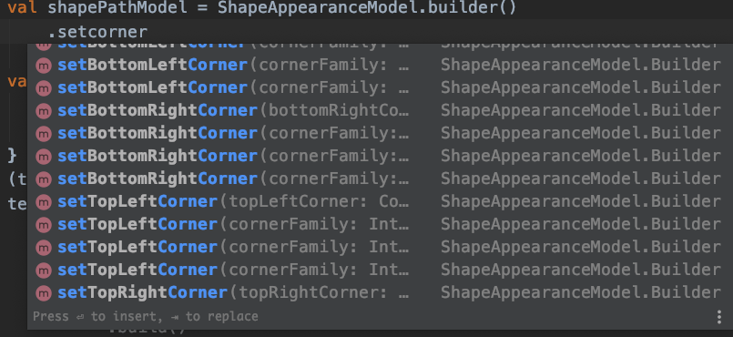
針對單邊、單角的處理
除了可以通過allXXX來統(tǒng)一設置四個角和邊的屬性,當然也是可以指定某個角或者邊的,ShapeAppearanceModel的Builder同樣提供了下面的這些方法來處理單邊和單角。
借助單邊、單角的處理,可以完成一些常用的樣式處理,例如,聊天界面邊界的氣泡效果,代碼如下所示。
val?shapePathModel?=?ShapeAppearanceModel.builder()
????.setAllCorners(RoundedCornerTreatment())
????.setAllCornerSizes(16.dp())
????.setRightEdge(object?:?TriangleEdgeTreatment(8.dp(),?false)?{
????????override?fun?getEdgePath(
????????????length:?Float,
????????????center:?Float,
????????????interpolation:?Float,
????????????shapePath:?ShapePath
????????)?{
????????????super.getEdgePath(length,?12.dp(),?interpolation,?shapePath)
????????}
????})
????.build()
val?backgroundDrawable?=?MaterialShapeDrawable(shapePathModel).apply?{
????setTint(Color.parseColor("#bebebe"))
????paintStyle?=?Paint.Style.FILL
}
(test1.parent?as??ViewGroup)?.clipChildren?=?false
test1.background?=?backgroundDrawable
展示效果如圖所示。
陰影的處理
雖然MD提供了setElevation來設置View的高程,但是國內的設計師普遍不認同這種設計理念,認為Elevation設置的陰影比較生硬不夠自然,借助MaterialShapeDrawable,我們同樣可以來處理陰影。
一般來說,處理陰影不外乎下面幾種方式。
translationZ與elevation,國內設計師不喜歡 使用9Patch陰影圖,一般可以通過http://inloop.github.io/shadow4android/ 來創(chuàng)建,同時View需要預留陰影空間 通過setShadowLayer來繪制,使用比較局限
就目前而言,比較成熟的就是使用MaterialShapeDrawable來實現(xiàn)陰影效果,代碼如下所示。
val?shapePathModel?=?ShapeAppearanceModel.builder()
????.setAllCorners(RoundedCornerTreatment())
????.setAllCornerSizes(16.dp())
????.build()
val?backgroundDrawable?=?MaterialShapeDrawable(shapePathModel).apply?{
????setTint(Color.parseColor("#05bebebe"))
????paintStyle?=?Paint.Style.FILL
????shadowCompatibilityMode?=?MaterialShapeDrawable.SHADOW_COMPAT_MODE_ALWAYS
????initializeElevationOverlay(this@MainActivity)
????shadowRadius?=?16.dp().toInt()
????setShadowColor(Color.parseColor("#D2D2D2"))
????shadowVerticalOffset?=?2.dp().toInt()
}
(test1.parent?as??ViewGroup)?.clipChildren?=?false
test1.background?=?backgroundDrawable
首先,陰影處于布局邊界之外,所以需要使用clipChildren屬性,同時,設置自定義陰影的核心在于shadowCompatibilityMode參數(shù),它由幾個枚舉(SHADOW_COMPAT_MODE_DEFAULT、SHADOW_COMPAT_MODE_NEVER、SHADOW_COMPAT_MODE_ALWAYS),其中SHADOW_COMPAT_MODE_DEFAULT表示是使用elevation的陰影繪制方式,還是fake shadow的繪制方式。
這里需要設置為SHADOW_COMPAT_MODE_ALWAYS,表示始終使用fake shadow。它的幾個參數(shù)shadowRadius、setShadowColor、shadowVerticalOffset分別代表了繪制陰影的三個參數(shù),效果如圖所示。
綜上,通過Material Components的MaterialShapeDrawable,基本上就可以實現(xiàn)Material Design的所有Shape處理。在現(xiàn)代化的Android開發(fā)中,Google已經(jīng)對應用層的很多設計、開發(fā)方式進行了統(tǒng)一和梳理,利用這些先進的開發(fā)工具,可以讓我們平時的開發(fā)更加方便。
修仙
對于Android和Flutter相關技術感興趣的朋友,可以添加我的微信,拉你進Flutter修仙群和Android開發(fā)群,微信號 Tomcat_xu。
https://xuyisheng.top 是我的網(wǎng)站,歡迎大家訪問,我會在這里分享Android、Kotlin和Flutter相關的開發(fā)經(jīng)驗,點擊原文鏈接,一鍵直達。