
用 Pandas 繪制帶交互的可視化圖表
大家好,我是村長。
在Pandas的0.25.0版本之后,提供了一些其他繪圖后端,其中就有我們今天要演示的主角基于Bokeh!
Starting in 0.25 pandas can be extended with third-party plotting backends. The main idea is letting users select a plotting backend different than the provided one based on Matplotlib.
目錄:
0. 環(huán)境準備
1. 折線圖
2. 柱狀圖(條形圖)
3. 散點圖
4. 點圖
5. 階梯圖
6. 餅圖
7. 直方圖
8. 面積圖
9. 地圖
10. 其他

0. 環(huán)境準備
我們用到的是pandas-bokeh,它為Pandas、GeoPandas和Pyspark 的DataFrames提供了Bokeh繪圖后端,類似于Pandas已經(jīng)存在的可視化功能。導入庫后,在DataFrames和Series上就新添加了一個繪圖方法plot_bokeh()。
安裝第三方庫
pip?install?pandas-bokeh
or conda:
conda?install?-c?patrikhlobil?pandas-bokeh
如果你是使用jupyter notebook,可以這樣讓其直接顯示
import?pandas?as?pd
import?pandas_bokeh

pandas_bokeh.output_notebook()
同樣如果輸出是html文件,則可以用以下方式處理
import?pandas?as?pd
import?pandas_bokeh

pandas_bokeh.output_file("Interactive?Plot.html")
當然在使用的時候,記得先設置 繪制后端為pandas_bokeh
import?pandas?as?pd

pd.set_option('plotting.backend',?'pandas_bokeh')
目前這個繪圖方式支持的可視化圖表有以下幾類:
- 折線圖
- 柱狀圖(條形圖)
- 散點圖
- 點圖
- 階梯圖
- 餅圖
- 直方圖
- 面積圖
- 地圖
1. 折線圖
交互元素含有以下幾種:
- 可平移或縮放
- 單擊圖例可以顯示或隱藏折線
- 懸停顯示對應點數(shù)據(jù)信息
先看一個簡單案例:
import?numpy?as?np

np.random.seed(42)
df?=?pd.DataFrame({"谷歌":?np.random.randn(1000)+0.2,?
???????????????????"蘋果":?np.random.randn(1000)+0.17},?
???????????????????index=pd.date_range('1/1/2020',?periods=1000))
df?=?df.cumsum()
df?=?df?+?50
df.plot_bokeh(kind="line")???????#等價于?df.plot_bokeh.line()
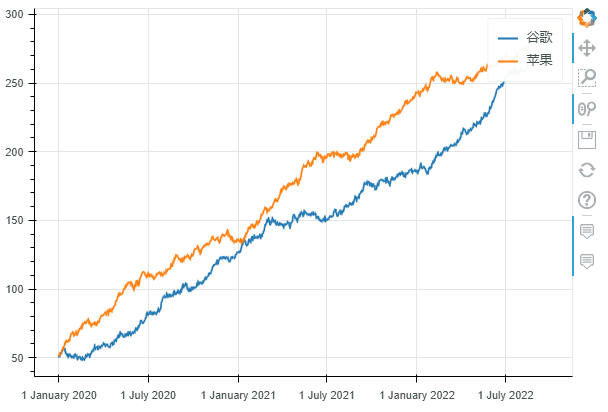 折線圖
折線圖在繪制過程中,我們還可以設置很多參數(shù),用來設置可視化圖表的一些功能:
- kind : 圖表類型,目前支持的有:“l(fā)ine”、“point”、“scatter”、“bar”和“histogram”;在不久的將來,更多的將被實現(xiàn)為水平條形圖、箱形圖、餅圖等
- x:x的值,如果未指定x參數(shù),則索引用于繪圖的 x 值;或者,也可以傳遞與 DataFrame 具有相同元素數(shù)量的值數(shù)組
- y:y的值。
- figsize : 圖的寬度和高度
- title : 設置標題
- xlim / ylim:為 x 和 y 軸設置可見的繪圖范圍(也適用于日期時間 x 軸)
- xlabel / ylabel : 設置 x 和 y 標簽
- logx / logy : 在 x/y 軸上設置對數(shù)刻度
- xticks / yticks : 設置軸上的刻度
- color:為繪圖定義顏色
- colormap:可用于指定要繪制的多種顏色
- hovertool:如果 True 懸停工具處于活動狀態(tài),否則如果為 False 則不繪制懸停工具
- hovertool_string:如果指定,此字符串將用于懸停工具(@{column} 將替換為鼠標懸停在元素上的列的值)
- toolbar_location:指定工具欄位置的位置(None, “above”, “below”, “l(fā)eft” or “right”)),默認值:right
- zooming:啟用/禁用縮放,默認值:True
- panning:啟用/禁用平移,默認值:True
- fontsize_label/fontsize_ticks/fontsize_title/fontsize_legend:設置標簽、刻度、標題或圖例的字體大小(整數(shù)或“15pt”形式的字符串)
- rangetool啟用范圍工具滾動條,默認False
- kwargs **:bokeh.plotting.figure.line 的可選關(guān)鍵字參數(shù)
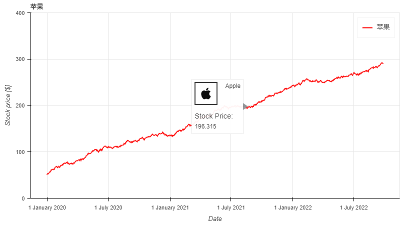
df.plot_bokeh.line(
????figsize=(800,?450),?#?圖的寬度和高度
????y="蘋果",?#?y的值,這里選擇的是df數(shù)據(jù)中的蘋果列
????title="蘋果",?#?標題
????xlabel="Date",?#?x軸標題
????ylabel="Stock?price?[$]",?#?y軸標題
????yticks=[0,?100,?200,?300,?400],?#?y軸刻度值
????ylim=(0,?400),?#?y軸區(qū)間
????toolbar_location=None,?#?工具欄(取消)
????colormap=["red",?"blue"],?#?顏色
????hovertool_string=r"""????????????????????????src='https://dss0.bdstatic.com/-0U0bnSm1A5BphGlnYG/tam-ogel/920152b13571a9a38f7f3c98ec5a6b3f_122_122.jpg'?
????????????????????????height="42"?alt="@imgs"?width="42"
????????????????????????style="float:?left;?margin:?0px?15px?15px?0px;"
????????????????????????border="2">?Apple?
????????????????????????
?????????????????????????Stock?Price:?
?@{蘋果}""",??#?懸停工具顯示形式(支持css)
????panning=False,?#?禁止平移
????zooming=False)?#?禁止縮放
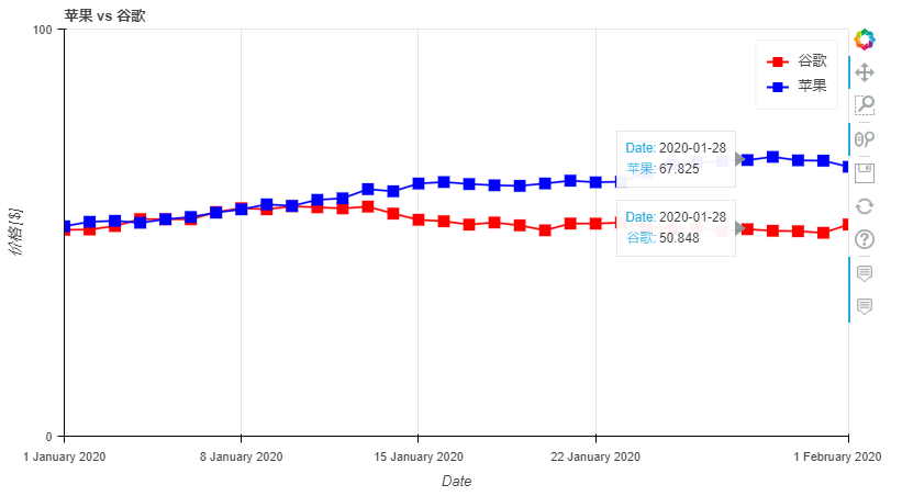
對于折線圖來說,還有一些特殊的參數(shù),它們是:
- plot_data_points:添加繪制線上的數(shù)據(jù)點
- plot_data_points_size:設置數(shù)據(jù)點的大小
- 標記:定義點類型*(默認值:circle)*,可能的值有:“circle”、“square”、“triangle”、“asterisk”、“circle_x”、“square_x”、“inverted_triangle”、“x”、“circle_cross”、“square_cross”、“diamond”、“cross” '
- kwargs **:bokeh.plotting.figure.line 的可選關(guān)鍵字參數(shù)
df.plot_bokeh.line(
????figsize=(800,?450),
????title="蘋果?vs?谷歌",
????xlabel="Date",
????ylabel="價格?[$]",
????yticks=[0,?100,?200,?300,?400],
????ylim=(0,?100),
????xlim=("2020-01-01",?"2020-02-01"),
????colormap=["red",?"blue"],
????plot_data_points=True,?#?是否線上數(shù)據(jù)點
????plot_data_points_size=10,?#?數(shù)據(jù)點的大小
????marker="square")?#?數(shù)據(jù)點的類型
啟動范圍工具滾動條的折線圖
ts?=?pd.Series(np.random.randn(1000),?index=pd.date_range('1/1/2020',?periods=1000))
df?=?pd.DataFrame(np.random.randn(1000,?4),?index=ts.index,?columns=list('ABCD'))
df?=?df.cumsum()

df.plot_bokeh(rangetool=True)
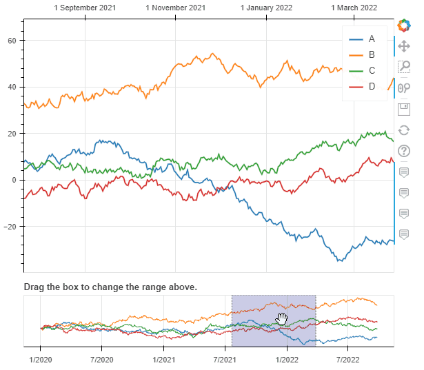 帶有范圍滾動條的折線圖
2. 柱狀圖(條形圖)
柱狀圖沒有特殊的關(guān)鍵字參數(shù),一般分為柱狀圖和堆疊柱狀圖,默認是柱狀圖。
data?=?{
????'fruits':
????['Apples',?'Pears',?'Nectarines',?'Plums',?'Grapes',?'Strawberries'],
????'2015':?[2,?1,?4,?3,?2,?4],
????'2016':?[5,?3,?3,?2,?4,?6],
????'2017':?[3,?2,?4,?4,?5,?3]
}
df?=?pd.DataFrame(data).set_index("fruits")

p_bar?=?df.plot_bokeh.bar(
????ylabel="Price?per?Unit?[€]",?
????title="Fruit?prices?per?Year",?
????alpha=0.6)
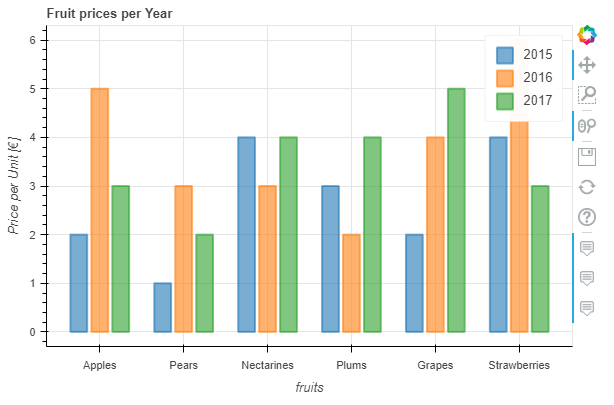 柱狀圖
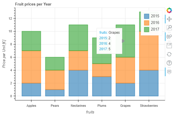
柱狀圖我們可以通過參數(shù)stacked來繪制堆疊柱狀圖:
p_stacked_bar?=?df.plot_bokeh.bar(
????ylabel="Price?per?Unit?[€]",
????title="Fruit?prices?per?Year",
????stacked=True,?#?堆疊柱狀圖
????alpha=0.6)
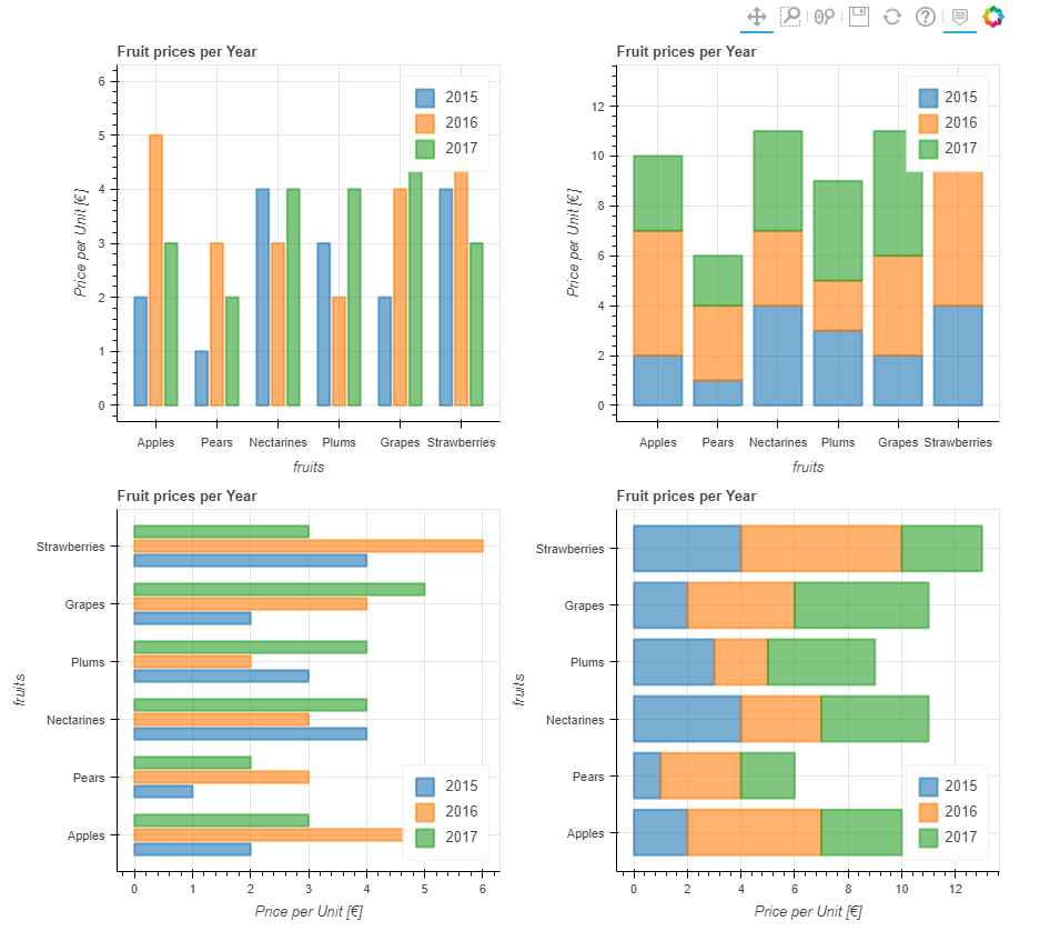
默認情況下,x軸的值就是數(shù)據(jù)索引列的值,我們也可通過指定參數(shù)x來設置x軸;另外,我們還可以通過關(guān)鍵字kind="barh"或訪問器plot_bokeh.barh來進行條形圖繪制。
#Reset?index,?such?that?"fruits"?is?now?a?column?of?the?DataFrame:
df.reset_index(inplace=True)

#Create?horizontal?bar?(via?kind?keyword):
p_hbar?=?df.plot_bokeh(
????kind="barh",
????x="fruits",
????xlabel="Price?per?Unit?[€]",
????title="Fruit?prices?per?Year",
????alpha=0.6,
????legend?=?"bottom_right",
????show_figure=False)

#Create?stacked?horizontal?bar?(via?barh?accessor):
p_stacked_hbar?=?df.plot_bokeh.barh(
????x="fruits",
????stacked=True,
????xlabel="Price?per?Unit?[€]",
????title="Fruit?prices?per?Year",
????alpha=0.6,
????legend?=?"bottom_right",
????show_figure=False)

#Plot?all?barplot?examples?in?a?grid:
pandas_bokeh.plot_grid([[p_bar,?p_stacked_bar],
????????????????????????[p_hbar,?p_stacked_hbar]],?
???????????????????????plot_width=450)
3. 散點圖
散點圖需要指定x和y,以下參數(shù)可選:
- category:確定用于為散點著色的類別對應列字段名
- kwargs **:bokeh.plotting.figure.scatter 的可選關(guān)鍵字參數(shù)
以下繪制表格和散點圖:
#?Load?Iris?Dataset:
df?=?pd.read_csv(
????r"https://raw.githubusercontent.com/PatrikHlobil/Pandas-Bokeh/master/docs/Testdata/iris/iris.csv"
)
df?=?df.sample(frac=1)

#?Create?Bokeh-Table?with?DataFrame:
from?bokeh.models.widgets?import?DataTable,?TableColumn
from?bokeh.models?import?ColumnDataSource

data_table?=?DataTable(
????columns=[TableColumn(field=Ci,?title=Ci)?for?Ci?in?df.columns],
????source=ColumnDataSource(df),
????height=300,
)

#?Create?Scatterplot:
p_scatter?=?df.plot_bokeh.scatter(
????x="petal?length?(cm)",
????y="sepal?width?(cm)",
????category="species",
????title="Iris?DataSet?Visualization",
????show_figure=False,
)

#?Combine?Table?and?Scatterplot?via?grid?layout:
pandas_bokeh.plot_grid([[data_table,?p_scatter]],?plot_width=400,?plot_height=350)
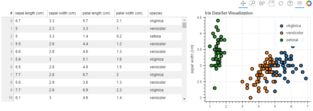 表格與散點圖
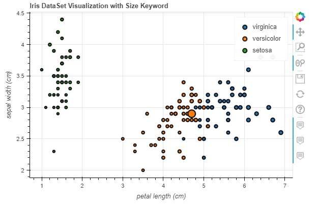
我們還可以傳遞一些參數(shù)比如 散點的大小之類的(用某列的值)
#Change?one?value?to?clearly?see?the?effect?of?the?size?keyword
df.loc[13,?"sepal?length?(cm)"]?=?15

#Make?scatterplot:
p_scatter?=?df.plot_bokeh.scatter(
????x="petal?length?(cm)",
????y="sepal?width?(cm)",
????category="species",
????title="Iris?DataSet?Visualization?with?Size?Keyword",
????size="sepal?length?(cm)",?#?散點大小
)
4. 點圖
點圖比較簡單,直接調(diào)用pointplot即可
import?numpy?as?np

x?=?np.arange(-3,?3,?0.1)
y2?=?x**2
y3?=?x**3
df?=?pd.DataFrame({"x":?x,?"Parabula":?y2,?"Cube":?y3})
df.plot_bokeh.point(
????x="x",
????xticks=range(-3,?4),
????size=5,
????colormap=["#009933",?"#ff3399"],
????title="Pointplot?(Parabula?vs.?Cube)",
????marker="x")
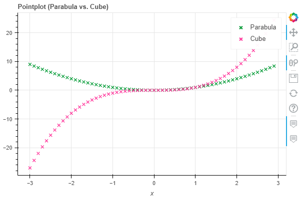 點圖
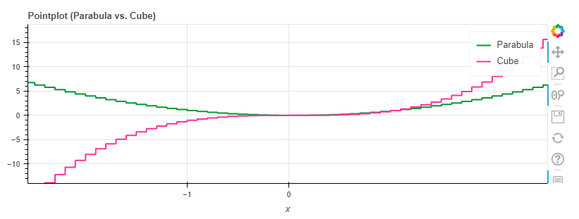
點圖5. 階梯圖
階梯圖主要是需要設置其模式mode,目前可供選擇的是before, after和center
import?numpy?as?np

x?=?np.arange(-3,?3,?1)
y2?=?x**2
y3?=?x**3
df?=?pd.DataFrame({"x":?x,?"Parabula":?y2,?"Cube":?y3})
df.plot_bokeh.step(
????x="x",
????xticks=range(-1,?1),
????colormap=["#009933",?"#ff3399"],
????title="Pointplot?(Parabula?vs.?Cube)",
????figsize=(800,300),
????fontsize_title=30,
????fontsize_label=25,
????fontsize_ticks=15,
????fontsize_legend=5,
????)

df.plot_bokeh.step(
????x="x",
????xticks=range(-1,?1),
????colormap=["#009933",?"#ff3399"],
????title="Pointplot?(Parabula?vs.?Cube)",
????mode="after",
????figsize=(800,300)
????)
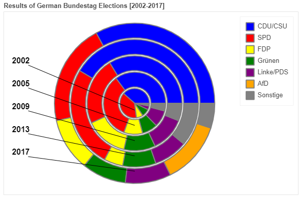
6. 餅圖
這里我們用網(wǎng)上的一份自 2002 年以來德國所有聯(lián)邦議院選舉結(jié)果的數(shù)據(jù)集為例展示
df_pie?=?pd.read_csv(r"https://raw.githubusercontent.com/PatrikHlobil/Pandas-Bokeh/master/docs/Testdata/Bundestagswahl/Bundestagswahl.csv")
df_pie
| Partei | 2002 | 2005 | 2009 | 2013 | 2017 | |
|---|---|---|---|---|---|---|
| 0 | CDU/CSU | 38.5 | 35.2 | 33.8 | 41.5 | 32.9 |
| 1 | SPD | 38.5 | 34.2 | 23.0 | 25.7 | 20.5 |
| 2 | FDP | 7.4 | 9.8 | 14.6 | 4.8 | 10.7 |
| 3 | Grünen | 8.6 | 8.1 | 10.7 | 8.4 | 8.9 |
| 4 | Linke/PDS | 4.0 | 8.7 | 11.9 | 8.6 | 9.2 |
| 5 | AfD | 0.0 | 0.0 | 0.0 | 0.0 | 12.6 |
| 6 | Sonstige | 3.0 | 4.0 | 6.0 | 11.0 | 5.0 |
df_pie.plot_bokeh.pie(
????x="Partei",
????y="2017",
????colormap=["blue",?"red",?"yellow",?"green",?"purple",?"orange",?"grey"],
????title="Results?of?German?Bundestag?Election?2017",
????)
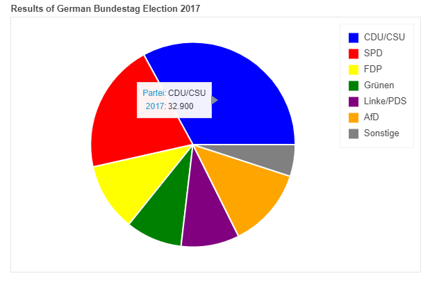 餅圖
餅圖如果我們想繪制全部的列(上圖中我們繪制的是2017年的數(shù)據(jù)),則無需對y賦值,結(jié)果會嵌套顯示在一個圖中:
df_pie.plot_bokeh.pie(
????x="Partei",
????colormap=["blue",?"red",?"yellow",?"green",?"purple",?"orange",?"grey"],
????title="Results?of?German?Bundestag?Elections?[2002-2017]",
????line_color="grey")
7. 直方圖
在繪制直方圖時,有不少參數(shù)可供選擇:
- bins:確定用于直方圖的 bin,如果 bins 是 int,則它定義給定范圍內(nèi)的等寬 bin 數(shù)量(默認為 10),如果 bins 是一個序列,它定義了 bin 邊緣,包括最右邊的邊緣,允許不均勻的 bin 寬度,如果 bins 是字符串,則它定義用于計算最佳 bin 寬度的方法,如histogram_bin_edges所定義
- histogram_type:“sidebyside”、“topontop”或“stacked”,默認值:“topontop”
- stacked:布爾值,如果給定,則將histogram_type覆蓋為*“stacked”*。默認值:*假False
- kwargs **:bokeh.plotting.figure.quad 的可選關(guān)鍵字參數(shù)
import?numpy?as?np

df_hist?=?pd.DataFrame({
????'a':?np.random.randn(1000)?+?1,
????'b':?np.random.randn(1000),
????'c':?np.random.randn(1000)?-?1
????},
????columns=['a',?'b',?'c'])

#Top-on-Top?Histogram?(Default):
df_hist.plot_bokeh.hist(
????bins=np.linspace(-5,?5,?41),
????vertical_xlabel=True,
????hovertool=False,
????title="Normal?distributions?(Top-on-Top)",
????line_color="black")

#Side-by-Side?Histogram?(multiple?bars?share?bin?side-by-side)?also?accessible?via
#kind="hist":
df_hist.plot_bokeh(
????kind="hist",
????bins=np.linspace(-5,?5,?41),
????histogram_type="sidebyside",
????vertical_xlabel=True,
????hovertool=False,
????title="Normal?distributions?(Side-by-Side)",
????line_color="black")

#Stacked?histogram:
df_hist.plot_bokeh.hist(
????bins=np.linspace(-5,?5,?41),
????histogram_type="stacked",
????vertical_xlabel=True,
????hovertool=False,
????title="Normal?distributions?(Stacked)",
????line_color="black")
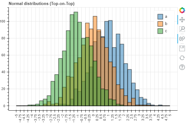 Top-on-Top Histogram (Default)
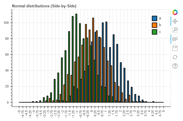 Side-by-Side Histogram
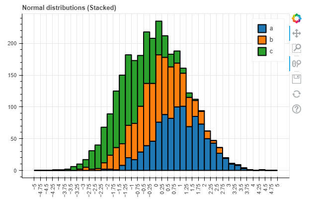 Stacked histogram
同時,對于直方圖我們還有更高級的參數(shù):
- weights:DataFrame 的一列,用作 histogramm 聚合的權(quán)重(另請參見numpy.histogram)
- normed:如果為 True,則直方圖值被歸一化為 1(直方圖值之和 = 1)。也可以傳遞一個整數(shù),例如normed=100將導致帶有百分比 y 軸的直方圖(直方圖值的總和 = 100),默認值:False
- cumulative:如果為 True,則顯示累積直方圖,默認值:False
- show_average:如果為 True,則還顯示直方圖的平均值,默認值:False
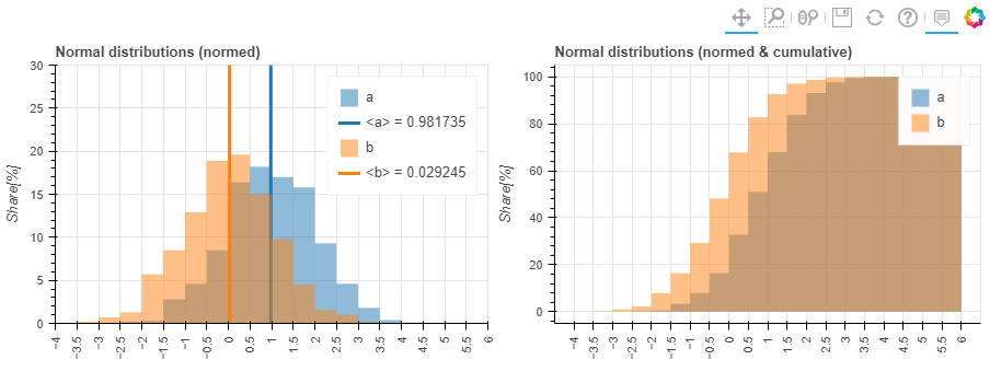
p_hist?=?df_hist.plot_bokeh.hist(
????y=["a",?"b"],
????bins=np.arange(-4,?6.5,?0.5),
????normed=100,
????vertical_xlabel=True,
????ylabel="Share[%]",
????title="Normal?distributions?(normed)",
????show_average=True,
????xlim=(-4,?6),
????ylim=(0,?30),
????show_figure=False)

p_hist_cum?=?df_hist.plot_bokeh.hist(
????y=["a",?"b"],
????bins=np.arange(-4,?6.5,?0.5),
????normed=100,
????cumulative=True,
????vertical_xlabel=True,
????ylabel="Share[%]",
????title="Normal?distributions?(normed?&?cumulative)",
????show_figure=False)

pandas_bokeh.plot_grid([[p_hist,?p_hist_cum]],?plot_width=450,?plot_height=300)?#?儀表盤輸出方式
8. 面積圖
面積圖嘛,提供兩種:堆疊或者在彼此之上繪制
- stacked:如果為 True,則面積圖堆疊;如果為 False,則在彼此之上繪制圖。默認值:False
- kwargs **:bokeh.plotting.figure.patch 的可選關(guān)鍵字參數(shù)
#?我們用?之前餅圖里的數(shù)據(jù)來繪制
df_energy?=?df_pie
df_energy.plot_bokeh.area(
????x="Partei",
????stacked=True,
????legend="top_right",
????colormap=["brown",?"orange",?"black",?"grey",?"blue"],
????title="標題",
????ylabel="Y軸",
????)
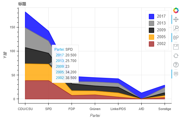 堆疊面積圖
堆疊面積圖df_energy.plot_bokeh.area(
????x="Partei",
????stacked=False,
????legend="top_right",
????colormap=["brown",?"orange",?"black",?"grey",?"blue"],
????title="標題",
????ylabel="Y軸",
????)
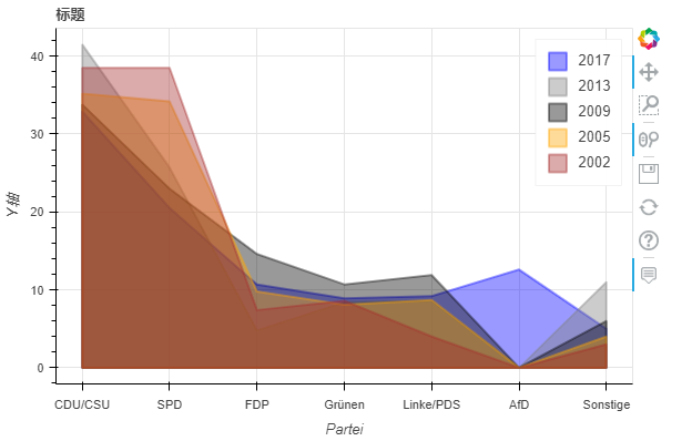 非堆疊面積圖
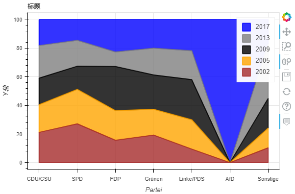
當我們使用normed關(guān)鍵字對圖進行規(guī)范時,還可以看到這種效果:
df_energy.plot_bokeh.area(
????x="Partei",
????stacked=True,
????normed=100,??#?規(guī)范滿100(可看大致占比)
????legend="top_right",
????colormap=["brown",?"orange",?"black",?"grey",?"blue"],
????title="標題",
????ylabel="Y軸",
????)
9. 地圖
關(guān)于地圖繪制部分內(nèi)容較多,這里我們不做詳細介紹,后續(xù)出個專題講解!
plot_bokeh.map函數(shù),參數(shù)x和y分別對應經(jīng)緯度坐標,我們以全球超過100萬居民所有城市為例簡單展示一下:
df_mapplot?=?pd.read_csv(r"https://raw.githubusercontent.com/PatrikHlobil/Pandas-Bokeh/master/docs/Testdata/populated%20places/populated_places.csv")
df_mapplot.head()
| name | pop_max | latitude | longitude | |
|---|---|---|---|---|
| 0 | Mesa | 1085394 | 33.423915 | -111.736084 |
| 1 | Sharjah | 1103027 | 25.371383 | 55.406478 |
| 2 | Changwon | 1081499 | 35.219102 | 128.583562 |
| 3 | Sheffield | 1292900 | 53.366677 | -1.499997 |
| 4 | Abbottabad | 1183647 | 34.149503 | 73.199501 |
df_mapplot["size"]?=?df_mapplot["pop_max"]?/?1000000
df_mapplot.plot_bokeh.map(
????x="longitude",
????y="latitude",
????hovertool_string="""?@{name}?
?
????
?????????????????????????Population:?@{pop_max}?
""",
????tile_provider="STAMEN_TERRAIN_RETINA",
????size="size",?
????figsize=(900,?600),
????title="World?cities?with?more?than?1.000.000?inhabitants")
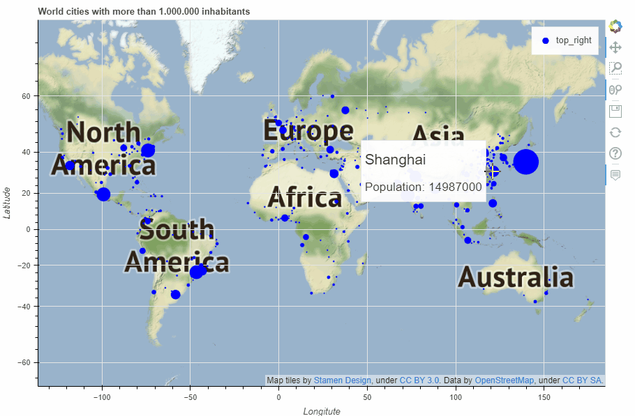 map
map10. 其他
儀表盤輸出,通過pandas_bokeh.plot_grid來設計儀表盤(大家具體看這行代碼的邏輯)
import?pandas?as?pd
import?numpy?as?np
import?pandas_bokeh
pandas_bokeh.output_notebook()

#Barplot:
data?=?{
????'fruits':
????['Apples',?'Pears',?'Nectarines',?'Plums',?'Grapes',?'Strawberries'],
????'2015':?[2,?1,?4,?3,?2,?4],
????'2016':?[5,?3,?3,?2,?4,?6],
????'2017':?[3,?2,?4,?4,?5,?3]
}
df?=?pd.DataFrame(data).set_index("fruits")
p_bar?=?df.plot_bokeh(
????kind="bar",
????ylabel="Price?per?Unit?[€]",
????title="Fruit?prices?per?Year",
????show_figure=False)

#Lineplot:
np.random.seed(42)
df?=?pd.DataFrame({
????"Google":?np.random.randn(1000)?+?0.2,
????"Apple":?np.random.randn(1000)?+?0.17
},
??????????????????index=pd.date_range('1/1/2000',?periods=1000))
df?=?df.cumsum()
df?=?df?+?50
p_line?=?df.plot_bokeh(
????kind="line",
????title="Apple?vs?Google",
????xlabel="Date",
????ylabel="Stock?price?[$]",
????yticks=[0,?100,?200,?300,?400],
????ylim=(0,?400),
????colormap=["red",?"blue"],
????show_figure=False)

#Scatterplot:
from?sklearn.datasets?import?load_iris
iris?=?load_iris()
df?=?pd.DataFrame(iris["data"])
df.columns?=?iris["feature_names"]
df["species"]?=?iris["target"]
df["species"]?=?df["species"].map(dict(zip(range(3),?iris["target_names"])))
p_scatter?=?df.plot_bokeh(
????kind="scatter",
????x="petal?length?(cm)",
????y="sepal?width?(cm)",
????category="species",
????title="Iris?DataSet?Visualization",
????show_figure=False)

#Histogram:
df_hist?=?pd.DataFrame({
????'a':?np.random.randn(1000)?+?1,
????'b':?np.random.randn(1000),
????'c':?np.random.randn(1000)?-?1
},
???????????????????????columns=['a',?'b',?'c'])

p_hist?=?df_hist.plot_bokeh(
????kind="hist",
????bins=np.arange(-6,?6.5,?0.5),
????vertical_xlabel=True,
????normed=100,
????hovertool=False,
????title="Normal?distributions",
????show_figure=False)

#Make?Dashboard?with?Grid?Layout:
pandas_bokeh.plot_grid([[p_line,?p_bar],?
????????????????????????[p_scatter,?p_hist]],?plot_width=450)
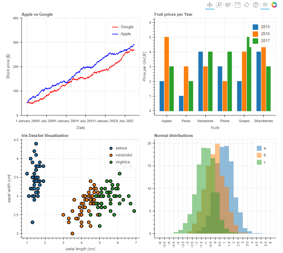 儀表盤輸出
儀表盤輸出又或者這樣:
p_line.plot_width?=?900
p_hist.plot_width?=?900

layout?=?pandas_bokeh.column(p_line,
????????????????pandas_bokeh.row(p_scatter,?p_bar),
????????????????p_hist)??#?指定每行顯示的內(nèi)容

pandas_bokeh.show(layout)
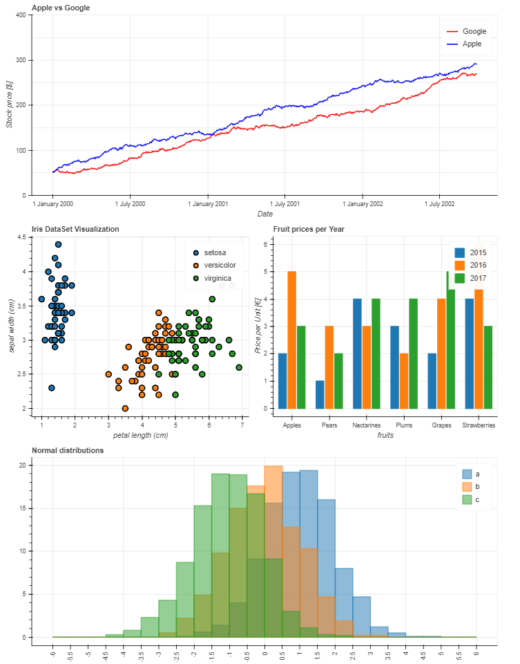 替代儀表板布局
以上就是本次全部內(nèi)容,通過這部分的學習,我們發(fā)現(xiàn)Pandas除了結(jié)合matplotlib常規(guī)繪圖外,還可以通過bokeh繪圖后端快速繪制可交互的圖表,用起來非常方便。
當然,如果想更深入了解或者定制化這些可視化圖表,可能需要對bokeh有更多的了解,這塊查閱官網(wǎng)資料即可!