
用 Python 繪制動態(tài)可視化圖表,太酷了!

Python的Plotly圖形庫,讓你可以毫不費(fèi)力地生成動畫圖表和交互式圖表。安裝模塊
pip?install?plotly
可視化動態(tài)圖
Plotly動畫工具僅需一行代碼就能讓人觀看數(shù)據(jù)隨時間的變化情況,如下圖所示: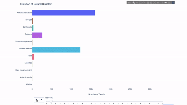
import?plotly.express?as?px
from?vega_datasets?import?data
df?=?data.disasters()
df?=?df[df.Year?>?1990]
fig?=?px.bar(df,
?????????????y="Entity",
?????????????x="Deaths",
?????????????animation_frame="Year",
?????????????orientation='h',
?????????????range_x=[0,?df.Deaths.max()],
?????????????color="Entity")
#?improve?aesthetics?(size,?grids?etc.)
fig.update_layout(width=1000,
??????????????????height=800,
??????????????????xaxis_showgrid=False,
??????????????????yaxis_showgrid=False,
??????????????????paper_bgcolor='rgba(0,0,0,0)',
??????????????????plot_bgcolor='rgba(0,0,0,0)',
??????????????????title_text='Evolution?of?Natural?Disasters',
??????????????????showlegend=False)
fig.update_xaxes(title_text='Number?of?Deaths')
fig.update_yaxes(title_text='')
fig.show()
import?plotly.express?as?px
df?=?px.data.gapminder()
fig?=?px.scatter(
????df,
????x="gdpPercap",
????y="lifeExp",
????animation_frame="year",
????size="pop",
????color="continent",
????hover_name="country",
????log_x=True,
????size_max=55,
????range_x=[100,?100000],
????range_y=[25,?90],

????#???color_continuous_scale=px.colors.sequential.Emrld
)
fig.update_layout(width=1000,
??????????????????height=800,
??????????????????xaxis_showgrid=False,
??????????????????yaxis_showgrid=False,
??????????????????paper_bgcolor='rgba(0,0,0,0)',
??????????????????plot_bgcolor='rgba(0,0,0,0)')
太陽圖
sunburst chart)是一種可視化group by語句的好方法。如果你想通過一個或多個類別變量來分解一個給定的量,那就用太陽圖吧。group by語句可以通過可視化來更有效地展示。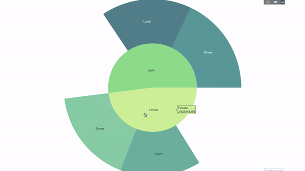
parents參數(shù))并分配對應(yīng)的值即可,這在我們案例中即為group by語句的輸出。import?plotly.graph_objects?as?go
import?plotly.express?as?px
import?numpy?as?np
import?pandas?as?pd
df?=?px.data.tips()
fig?=?go.Figure(go.Sunburst(
????labels=["Female",?"Male",?"Dinner",?"Lunch",?'Dinner?',?'Lunch?'],
????parents=["",?"",?"Female",?"Female",?'Male',?'Male'],
????values=np.append(
????????df.groupby('sex').tip.mean().values,
????????df.groupby(['sex',?'time']).tip.mean().values),
????marker=dict(colors=px.colors.sequential.Emrld)),
????????????????layout=go.Layout(paper_bgcolor='rgba(0,0,0,0)',
?????????????????????????????????plot_bgcolor='rgba(0,0,0,0)'))
fig.update_layout(margin=dict(t=0,?l=0,?r=0,?b=0),
??????????????????title_text='Tipping?Habbits?Per?Gender,?Time?and?Day')
fig.show()
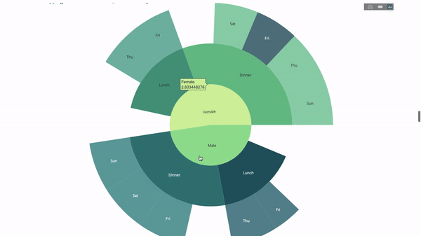
group by語句的值import?plotly.graph_objects?as?go
import?plotly.express?as?px
import?pandas?as?pd
import?numpy?as?np
df?=?px.data.tips()
fig?=?go.Figure(go.Sunburst(labels=[
????"Female",?"Male",?"Dinner",?"Lunch",?'Dinner?',?'Lunch?',?'Fri',?'Sat',
????'Sun',?'Thu',?'Fri?',?'Thu?',?'Fri??',?'Sat??',?'Sun??',?'Fri???',?'Thu???'
],
????????????????????????????parents=[
????????????????????????????????"",?"",?"Female",?"Female",?'Male',?'Male',
????????????????????????????????'Dinner',?'Dinner',?'Dinner',?'Dinner',
????????????????????????????????'Lunch',?'Lunch',?'Dinner?',?'Dinner?',
????????????????????????????????'Dinner?',?'Lunch?',?'Lunch?'
????????????????????????????],
????????????????????????????values=np.append(
????????????????????????????????np.append(
????????????????????????????????????df.groupby('sex').tip.mean().values,
????????????????????????????????????df.groupby(['sex',
????????????????????????????????????????????????'time']).tip.mean().values,
????????????????????????????????),
????????????????????????????????df.groupby(['sex',?'time',
????????????????????????????????????????????'day']).tip.mean().values),
????????????????????????????marker=dict(colors=px.colors.sequential.Emrld)),
????????????????layout=go.Layout(paper_bgcolor='rgba(0,0,0,0)',
?????????????????????????????????plot_bgcolor='rgba(0,0,0,0)'))
fig.update_layout(margin=dict(t=0,?l=0,?r=0,?b=0),
??????????????????title_text='Tipping?Habbits?Per?Gender,?Time?and?Day')
fig.show()
指針圖
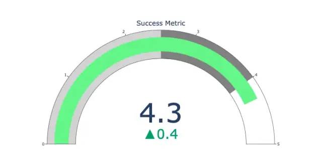
import?plotly.graph_objects?as?go
fig?=?go.Figure(go.Indicator(
????domain?=?{'x':?[0,?1],?'y':?[0,?1]},
????value?=?4.3,
????mode?=?"gauge+number+delta",
????title?=?{'text':?"Success?Metric"},
????delta?=?{'reference':?3.9},
????gauge?=?{'bar':?{'color':?"lightgreen"},
????????'axis':?{'range':?[None,?5]},
?????????????'steps'?:?[
?????????????????{'range':?[0,?2.5],?'color':?"lightgray"},
?????????????????{'range':?[2.5,?4],?'color':?"gray"}],
??????????}))
fig.show()
桑基圖
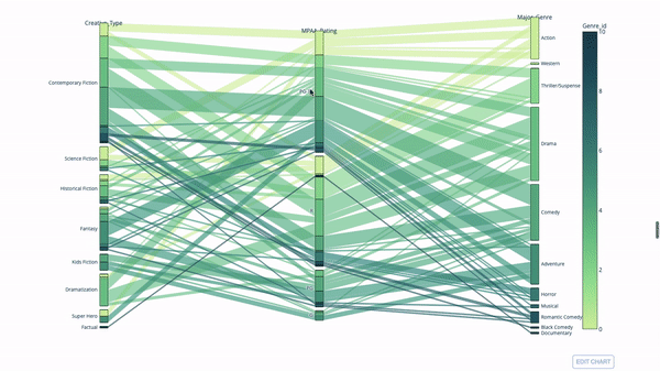
import?plotly.express?as?px
from?vega_datasets?import?data
import?pandas?as?pd
df?=?data.movies()
df?=?df.dropna()
df['Genre_id']?=?df.Major_Genre.factorize()[0]
fig?=?px.parallel_categories(
????df,
????dimensions=['MPAA_Rating',?'Creative_Type',?'Major_Genre'],
????color="Genre_id",
????color_continuous_scale=px.colors.sequential.Emrld,
)
fig.show()
平行坐標(biāo)圖
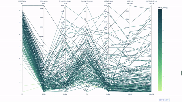
import?plotly.express?as?px
from?vega_datasets?import?data
import?pandas?as?pd
df?=?data.movies()
df?=?df.dropna()
df['Genre_id']?=?df.Major_Genre.factorize()[0]
fig?=?px.parallel_coordinates(
????df,
????dimensions=[
????????'IMDB_Rating',?'IMDB_Votes',?'Production_Budget',?'Running_Time_min',
????????'US_Gross',?'Worldwide_Gross',?'US_DVD_Sales'
????],
????color='IMDB_Rating',
????color_continuous_scale=px.colors.sequential.Emrld)
fig.show()
評論
圖片
表情