
用 matplotlib 繪制 3D 時(shí)間序列動(dòng)態(tài)圖

時(shí)間序列動(dòng)態(tài)圖是顯示時(shí)間演變的非常強(qiáng)大的工具,但 matplotlib 的默認(rèn)動(dòng)態(tài)圖很簡單,不太適合用于比較多個(gè)時(shí)間序列。
動(dòng)態(tài)圖被廣泛使用:從解釋神經(jīng)網(wǎng)絡(luò)如何訓(xùn)練,到顯示合成時(shí)間序列統(tǒng)計(jì)數(shù)據(jù)或波動(dòng)率異常時(shí)應(yīng)該選擇何種基金等問題。
假設(shè)我們想知道在新冠病毒流行期間哪個(gè)股票市場的發(fā)展最好,怎樣使人們都可以直觀的判斷出來呢?我建議創(chuàng)建動(dòng)態(tài)圖,因?yàn)樗喢鳌⒏逦N覀儚?2D 開始,到 3D,最后用 3D 網(wǎng)格來表示。
由于這篇文章的目的是改進(jìn)時(shí)間序列動(dòng)畫,我們將使用 GDP(國內(nèi)生產(chǎn)總值)最高的 10 個(gè)歐洲國家的股票指數(shù)演變作為數(shù)據(jù)。
2019年GDP最高的歐洲國家(不包括俄羅斯和土耳其)是:
| # | Country | Country code | Stock Index |
| 1 | Germany | GER | DAX |
| 2 | United Kingdom | UK | UKX |
| 3 | France | FR | CAC |
| 4 | Italy | IT | FTSEMIB |
| 5 | Spain | ES | IBEX |
| 6 | Netherlands | NL | AEX |
| 7 | Switzerland | CH | SMI |
| 8 | Poland* | PL | WIG |
| 9 | Sweden | SE | OMX |
| 10 | Belgium | BE | BEL20 |
為了比較 2020 年歐洲股票指數(shù)的漲跌,所有動(dòng)態(tài)圖都顯示了指數(shù)從 01/01/2019 到 29/01/2021 1 年(261 天)的的滾動(dòng)股價(jià) 。
2D動(dòng)態(tài)圖
第一種方法是創(chuàng)建所有滾動(dòng)股價(jià)的2D線圖:
def update_lines_2D(num, data, columns, dates, cmap, lines, ax):'''Function that updates the lines of a plot in 2D'''# get the slicecurrent_slice = data[num:261+num, :]current_dates = dates[num:261+num]# for each index...for i in range(current_slice.shape[1]):# get the coordinatesx = np.array(np.arange(current_slice.shape[0]))y = np.array(current_slice[:, i])# crete points and segments to colorpoints = np.array([x, y]).T.reshape(-1, 1, 2)segments = np.concatenate([points[:-1], points[1:]], axis=1)# Create a continuous norm to map from data points to colorsnorm = plt.Normalize(-0.22, 0.22)lines[i].set_segments(segments)lines[i].set_array(y)lines[i].set_color(cmap(y[-1] * 2.5 + 0.5))# update the ticks and labelsax.set_xticklabels([dates[int(val)+num].strftime('%m/%y') for val in ax.get_xticks()[:-1]] + [''])ax.legend(loc='center right', bbox_to_anchor=(1.32, 0.5), fancybox=True, facecolor=(.95,.95,.95,1), framealpha=1, shadow=False, frameon=True, ncol=1, columnspacing=0, prop={'family': 'DejaVu Sans Mono'})# return the linesreturn linesdef init_lines_2D():'''Function that initiates the lines of a plot in 2D'''for line in lines:line.set_array([])return lines
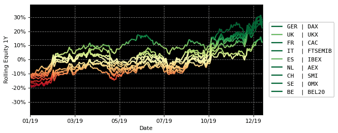
動(dòng)畫看起來很酷,但是當(dāng)線條在時(shí)間上重疊時(shí)很難比較索引,因?yàn)樗鼈兙哂邢嗤念伾珗D。
這可以通過為每個(gè)索引選擇不同的顏色來解決,但會(huì)降低繪圖的可讀性。
3D動(dòng)態(tài)圖
在第二種方法中,添加了第三維。它在給定的 z 坐標(biāo)中分隔每個(gè)索引,創(chuàng)建以下動(dòng)畫:
def update_lines_3D(num, data, columns, dates, cmap, lines, ax):'''Function that updates the lines of a plot in 2D'''# get the slicecurrent_slice = data[num:261+num, :]current_dates = dates[num:261+num]# for each index...for i in range(current_slice.shape[1]):# get the coordinatesx = np.arange(current_slice.shape[0])y = np.tile(i, current_slice.shape[0])z = np.array(current_slice[:, i])# crete points and segments to colorpoints = np.array([x, y, z]).T.reshape(-1, 1, 3)segments = np.concatenate([points[:-1], points[1:]], axis=1)# Create a continuous norm to map from data points to colorsnorm = plt.Normalize(-0.19, 0.19)lines[i].set_segments(segments)lines[i].set_array(z)lines[i].set_color(cmap(z[-1] * 2.5 + 0.5))# update the ticks and labelsax.set_xticklabels([dates[int(val)+num].strftime('%m/%y') for val in ax.get_xticks()[:-1]] + [''], rotation=0, fontdict={'verticalalignment': 'top', 'horizontalalignment': 'center'})ax.legend(loc='center right', bbox_to_anchor=(1.1, 0.46), fancybox=True, facecolor=(.95,.95,.95,1), framealpha=1, shadow=False, frameon=True, ncol=1, columnspacing=0, prop={'family': 'DejaVu Sans Mono'})# return the linesreturn linesdef init_lines_3D():for line in lines:line.set_array([])return lines
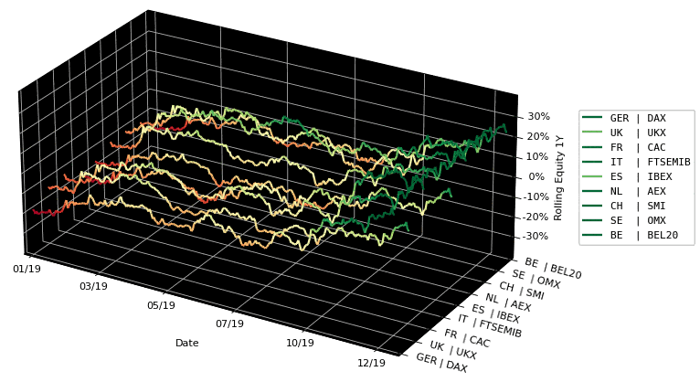
這個(gè)動(dòng)畫看起來比2D版本更酷,但它有一個(gè)很大的缺點(diǎn):深度感完全喪失,不同項(xiàng)目進(jìn)行比較非常困難。不過我們可以添加一個(gè)網(wǎng)格。
3D網(wǎng)格動(dòng)態(tài)圖
最后,添加一條連接每個(gè)時(shí)間步長的所有值的線,創(chuàng)建網(wǎng)格:
def update_mesh_lines_3D(num, data, columns, dates, cmap, lines, mesh_lines, ax):'''Function that updates the lines of a plot in 2D'''# get the slice# current_slice = data[num:261+num, :]current_slice = data[num:int(261/2)+num, :]# for each index...for i in range(current_slice.shape[1]):# get the coordinatesx = np.arange(current_slice.shape[0])y = np.tile(i, current_slice.shape[0])z = np.array(current_slice[:, i])# crete points and segments to colorpoints = np.array([x, y, z]).T.reshape(-1, 1, 3)segments = np.concatenate([points[:-1], points[1:]], axis=1)# Create a continuous norm to map from data points to colorsnorm = plt.Normalize(-0.19, 0.19)lines[i].set_segments(segments)lines[i].set_array(z)lines[i].set_color(cmap(z[-1] * 2.5 + 0.5))# counter to check the current mesh linecounter = 0# for each day...for j in range(current_slice.shape[0]):if j % 1 == 0:# get the coordinatesx = np.tile(j, current_slice.shape[1])y = np.arange(current_slice.shape[1])z = np.array(current_slice[j, :])# crete points and segments to colorpoints = np.array([x, y, z]).T.reshape(-1, 1, 3)segments = np.concatenate([points[:-1], points[1:]], axis=1)# Set the values used for colormappingnorm = plt.Normalize(-0.22, 0.22)mesh_lines[counter].set_segments(segments)mesh_lines[counter].set_array(z)counter += 1# update the ticks and labelsax.set_xticklabels([dates[int(val)+num].strftime('%m/%y') for val in ax.get_xticks()[:-1]] + [''], rotation=0, fontdict={'verticalalignment': 'top', 'horizontalalignment': 'center'})ax.legend(loc='center right', bbox_to_anchor=(1.1, 0.46), fancybox=True, facecolor=(.95,.95,.95,1), framealpha=1, shadow=False, frameon=True, ncol=1, columnspacing=0, prop={'family': 'DejaVu Sans Mono'})# return the linesreturn linesdef init_mesh_lines_3D():for line in lines:line.set_array([])return lines
看看這個(gè)動(dòng)畫,網(wǎng)格確實(shí)有助于以更清晰的方式比較指數(shù)隨時(shí)間的變化情況,從而得出更好的結(jié)論。
結(jié)論
從3D網(wǎng)格圖中,可以得出以下結(jié)論:
UKX(英國)和IBEX(ES)是下跌前和復(fù)蘇期間最弱的指數(shù)。DAX (GER)、OMX (SE)、SMI (CH) 和 AEX (NL) 是下跌前和復(fù)蘇期間最強(qiáng)的指數(shù)。CAC (FR)、FTSEMIB (IT) 和 BEL20 (BE) 在秋季之前是最強(qiáng)的,它們有很小的恢復(fù)。看看 2D 動(dòng)態(tài)圖,人們可能會(huì)得出相同的結(jié)論,但會(huì)變得更難。