
Python數(shù)據(jù)可視化,完整版實操指南 !
我們將從最基本的可視化開始,直接查看數(shù)據(jù),然后繼續(xù)繪制圖表,最后制作交互式圖表。

數(shù)據(jù)集
我們將使用兩個數(shù)據(jù)集來適應(yīng)本文中顯示的可視化效果,數(shù)據(jù)集可通過下方鏈接進行下載。
數(shù)據(jù)集:github.com/albertsl/dat
這些數(shù)據(jù)集都是與人工智能相關(guān)的三個術(shù)語(數(shù)據(jù)科學(xué),機器學(xué)習和深度學(xué)習)在互聯(lián)網(wǎng)上搜索流行度的數(shù)據(jù),從搜索引擎中提取而來。
該數(shù)據(jù)集包含了兩個文件temporal.csv和mapa.csv。在這個教程中,我們將更多使用的第一個包括隨時間推移(從2004年到2020年)的三個術(shù)語的受歡迎程度數(shù)據(jù)。另外,我添加了一個分類變量(1和0)來演示帶有分類變量的圖表的功能。
mapa.csv文件包含按國家/地區(qū)分隔的受歡迎程度數(shù)據(jù)。在最后的可視化地圖時,我們會用到它。
Pandas
在介紹更復(fù)雜的方法之前,讓我們從可視化數(shù)據(jù)的最基本方法開始。我們將只使用熊貓來查看數(shù)據(jù)并了解其分布方式。
我們要做的第一件事是可視化一些示例,查看這些示例包含了哪些列、哪些信息以及如何對值進行編碼等等。
import pandas as pd
df = pd.read_csv('temporal.csv')
df.head(10) #View first 10 data rows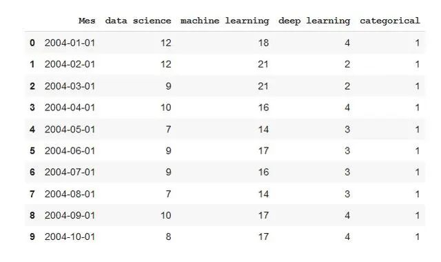
使用命令描述,我們將看到數(shù)據(jù)如何分布,最大值,最小值,均值……
df.describe()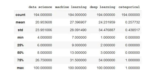
使用info命令,我們將看到每列包含的數(shù)據(jù)類型。我們可以發(fā)現(xiàn)一列的情況,當使用head命令查看時,該列似乎是數(shù)字的,但是如果我們查看后續(xù)數(shù)據(jù),則字符串格式的值將被編碼為字符串。
df.info()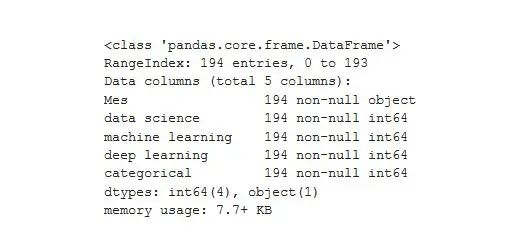
通常情況下,pandas都會限制其顯示的行數(shù)和列數(shù)。這可能讓很多程序員感到困擾,因為大家都希望能夠可視化所有數(shù)據(jù)。
使用這些命令,我們可以增加限制,并且可以可視化整個數(shù)據(jù)。對于大型數(shù)據(jù)集,請謹慎使用此選項,否則可能無法顯示它們。
pd.set_option('display.max_rows',500)
pd.set_option('display.max_columns',500)
pd.set_option('display.width',1000)
使用Pandas樣式,我們可以在查看表格時獲得更多信息。首先,我們定義一個格式字典,以便以清晰的方式顯示數(shù)字(以一定格式顯示一定數(shù)量的小數(shù)、日期和小時,并使用百分比、貨幣等)。不要驚慌,這是僅顯示而不會更改數(shù)據(jù),以后再處理也不會有任何問題。
為了給出每種類型的示例,我添加了貨幣和百分比符號,即使它們對于此數(shù)據(jù)沒有任何意義。
format_dict = {'data science':'${0:,.2f}', 'Mes':'{:%m-%Y}', 'machine learning':'{:.2%}'}
#We make sure that the Month column has datetime format
df['Mes'] = pd.to_datetime(df['Mes'])
#We apply the style to the visualization
df.head().style.format(format_dict)
我們可以用顏色突出顯示最大值和最小值。
format_dict = {'Mes':'{:%m-%Y}'} #Simplified format dictionary with values that do make sense for our data
df.head().style.format(format_dict).highlight_max(color='darkgreen').highlight_min(color='#ff0000')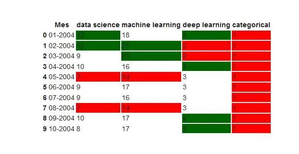
我們使用顏色漸變來顯示數(shù)據(jù)值。
df.head(10).style.format(format_dict).background_gradient(subset=['data science', 'machine learning'], cmap='BuGn')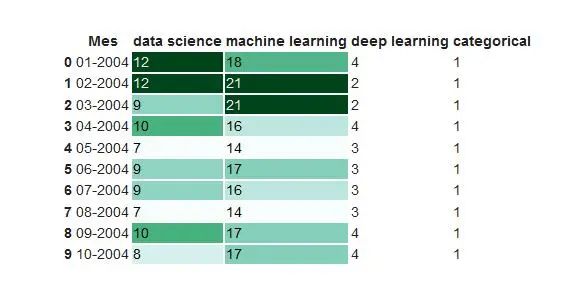
我們也可以用條形顯示數(shù)據(jù)值。
df.head().style.format(format_dict).bar(color='red', subset=['data science', 'deep learning'])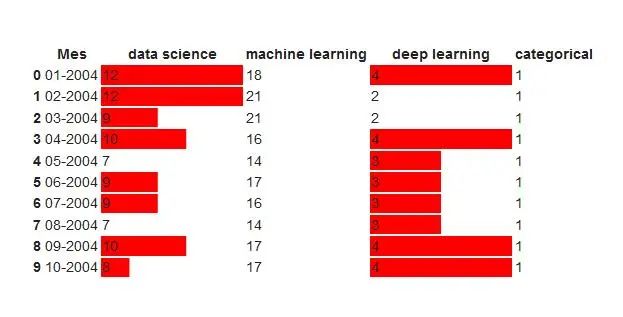
此外,我們還可以結(jié)合以上功能并生成更復(fù)雜的可視化效果。
df.head(10).style.format(format_dict).background_gradient(subset = ['data science','machine learning'],cmap ='BuGn')。highlight_max(color ='yellow')
Pandas分析
Pandas分析是一個庫,可使用我們的數(shù)據(jù)生成交互式報告,我們可以看到數(shù)據(jù)的分布,數(shù)據(jù)的類型以及可能出現(xiàn)的問題。它非常易于使用,只需三行,我們就可以生成一個報告,該報告可以發(fā)送給任何人,即使您不了解編程也可以使用。
from pandas_profiling import ProfileReport
prof = ProfileReport(df)
prof.to_file(output_file='report.html')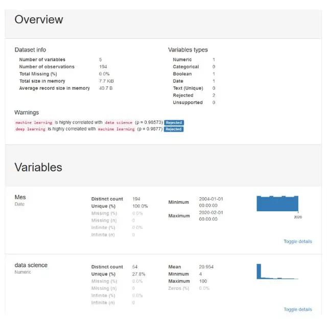
Matplotlib
Matplotlib是用于以圖形方式可視化數(shù)據(jù)的最基本的庫。它包含許多我們可以想到的圖形。僅僅因為它是基本的并不意味著它并不強大,我們將要討論的許多其他數(shù)據(jù)可視化庫都基于它。
Matplotlib的圖表由兩個主要部分組成,即軸(界定圖表區(qū)域的線)和圖形(我們在其中繪制軸,標題和來自軸區(qū)域的東西),現(xiàn)在讓我們創(chuàng)建最簡單的圖:
import matplotlib.pyplot as plt
plt.plot(df['Mes'], df['data science'], label='data science') #The parameter label is to indicate the legend. This doesn't mean that it will be shown, we'll have to use another command that I'll explain later.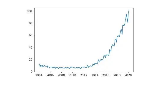
我們可以在同一張圖中制作多個變量的圖,然后進行比較。
plt.plot(df ['Mes'],df ['data science'],label ='data science')
plt.plot(df ['Mes'],df ['machine learning'],label ='machine learning ')
plt.plot(df ['Mes'],df ['deep learning'],label ='deep learning')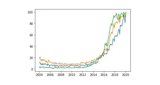
每種顏色代表哪個變量還不是很清楚。我們將通過添加圖例和標題來改進圖表。
plt.plot(df['Mes'], df['data science'], label='data science')
plt.plot(df['Mes'], df['machine learning'], label='machine learning')
plt.plot(df['Mes'], df['deep learning'], label='deep learning')
plt.xlabel('Date')
plt.ylabel('Popularity')
plt.title('Popularity of AI terms by date')
plt.grid(True)
plt.legend()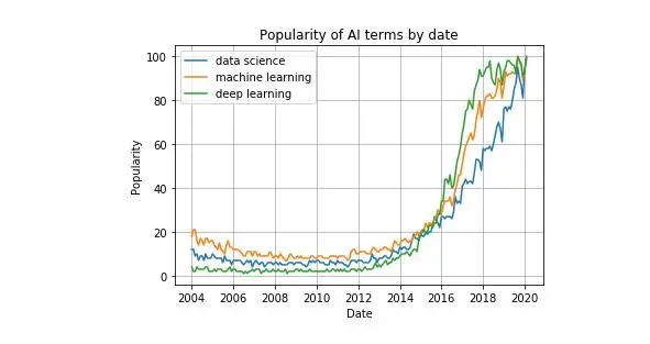
如果您是從終端或腳本中使用Python,則在使用我們上面編寫的函數(shù)定義圖后,請使用plt.show()。如果您使用的是Jupyter Notebook,則在制作圖表之前,將%matplotlib內(nèi)聯(lián)添加到文件的開頭并運行它。
我們可以在一個圖形中制作多個圖形。這對于比較圖表或通過單個圖像輕松共享幾種圖表類型的數(shù)據(jù)非常有用。
fig, axes = plt.subplots(2,2)
axes[0, 0].hist(df['data science'])
axes[0, 1].scatter(df['Mes'], df['data science'])
axes[1, 0].plot(df['Mes'], df['machine learning'])
axes[1, 1].plot(df['Mes'], df['deep learning'])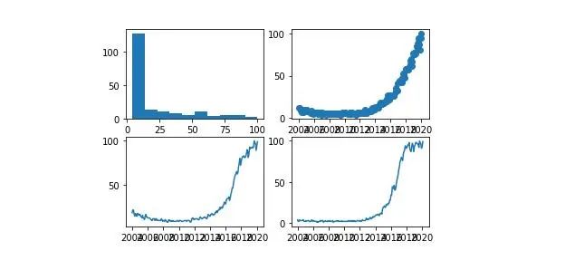
我們可以為每個變量的點繪制具有不同樣式的圖形:
plt.plot(df ['Mes'],df ['data science'],'r-')
plt.plot(df ['Mes'],df ['data science'] * 2,'bs')
plt .plot(df ['Mes'],df ['data science'] * 3,'g ^')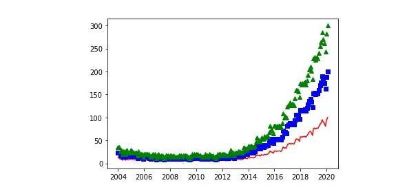
現(xiàn)在讓我們看一些使用Matplotlib可以做的不同圖形的例子。我們從散點圖開始:
plt.scatter(df['data science'], df['machine learning'])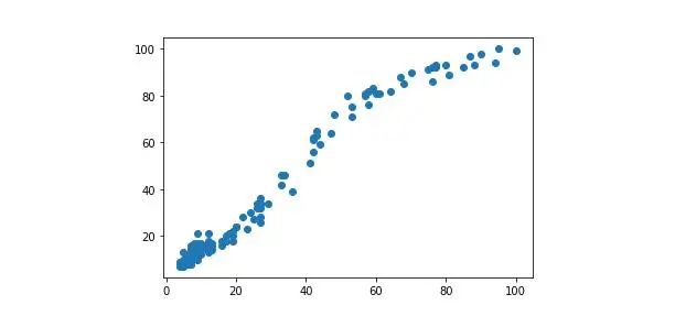
條形圖示例:
plt.bar(df ['Mes'],df ['machine learning'],width = 20)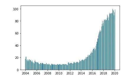
直方圖示例:
plt.hist(df ['deep learning'],bins = 15)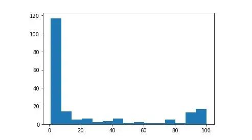
我們可以在圖形中添加文本,并以與圖形中看到的相同的單位指示文本的位置。在文本中,我們甚至可以按照TeX語言添加特殊字符
我們還可以添加指向圖形上特定點的標記。
plt.plot(df['Mes'], df['data science'], label='data science')
plt.plot(df['Mes'], df['machine learning'], label='machine learning')
plt.plot(df['Mes'], df['deep learning'], label='deep learning')
plt.xlabel('Date')
plt.ylabel('Popularity')
plt.title('Popularity of AI terms by date')
plt.grid(True)
plt.text(x='2010-01-01', y=80, s=r'$\lambda=1, r^2=0.8$') #Coordinates use the same units as the graph
plt.annotate('Notice something?', xy=('2014-01-01', 30), xytext=('2006-01-01', 50), arrowprops={'facecolor':'red', 'shrink':0.05})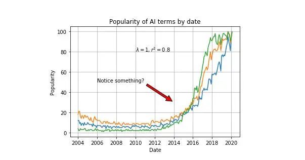
Seaborn
Seaborn是基于Matplotlib的庫。基本上,它提供給我們的是更好的圖形和功能,只需一行代碼即可制作復(fù)雜類型的圖形。
我們導(dǎo)入庫并使用sns.set()初始化圖形樣式,如果沒有此命令,圖形將仍然具有與Matplotlib相同的樣式。我們顯示了最簡單的圖形之一,散點圖:
import seaborn as sns
sns.set()
sns.scatterplot(df['Mes'], df['data science'])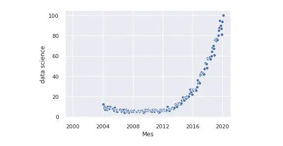
我們可以在同一張圖中添加兩個以上變量的信息。為此,我們使用顏色和大小。我們還根據(jù)類別列的值制作了一個不同的圖:
sns.relplot(x='Mes', y='deep learning', hue='data science', size='machine learning', col='categorical', data=df)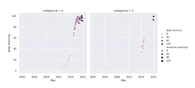
Seaborn提供的最受歡迎的圖形之一是熱圖。通常使用它來顯示數(shù)據(jù)集中變量之間的所有相關(guān)性:
sns.heatmap(df.corr(),annot = True,fmt ='。2f')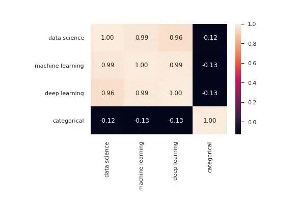
另一個最受歡迎的是配對圖,它向我們顯示了所有變量之間的關(guān)系。如果您有一個大數(shù)據(jù)集,請謹慎使用此功能,因為它必須顯示所有數(shù)據(jù)點的次數(shù)與有列的次數(shù)相同,這意味著通過增加數(shù)據(jù)的維數(shù),處理時間將成倍增加。
sns.pairplot(df)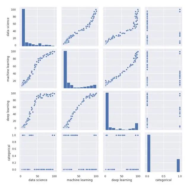
現(xiàn)在讓我們做一個成對圖,顯示根據(jù)分類變量的值細分的圖表。
sns.pairplot(df,hue ='categorical')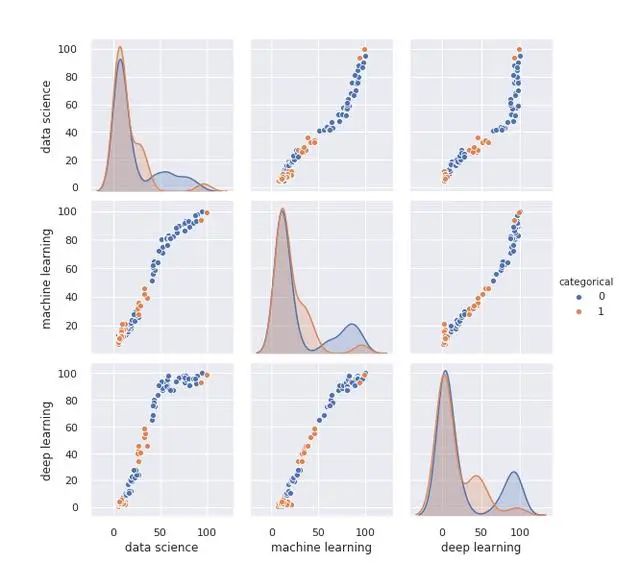
聯(lián)合圖是一個非常有用的圖,它使我們可以查看散點圖以及兩個變量的直方圖,并查看它們的分布方式:
sns.jointplot(x='data science', y='machine learning', data=df)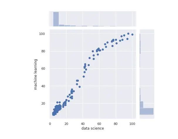
另一個有趣的圖形是ViolinPlot:
sns.catplot(x='categorical', y='data science', kind='violin', data=df)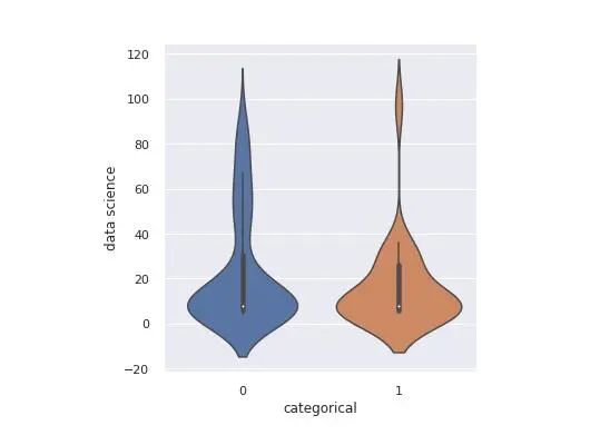
我們可以像使用Matplotlib一樣在一個圖像中創(chuàng)建多個圖形:
fig, axes = plt.subplots(1, 2, sharey=True, figsize=(8, 4))
sns.scatterplot(x="Mes", y="deep learning", hue="categorical", data=df, ax=axes[0])
axes[0].set_title('Deep Learning')
sns.scatterplot(x="Mes", y="machine learning", hue="categorical", data=df, ax=axes[1])
axes[1].set_title('Machine Learning')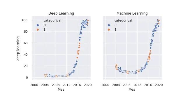
Bokeh
Bokeh是一個庫,可用于生成交互式圖形。我們可以將它們導(dǎo)出到HTML文檔中,并與具有Web瀏覽器的任何人共享。
當我們有興趣在圖形中查找事物并且希望能夠放大并在圖形中移動時,它是一個非常有用的庫。或者,當我們想共享它們并給其他人探索數(shù)據(jù)的可能性時。
我們首先導(dǎo)入庫并定義將要保存圖形的文件:
from bokeh.plotting import figure, output_file, save
output_file('data_science_popularity.html')
我們繪制所需內(nèi)容并將其保存在文件中:
p = figure(title='data science', x_axis_label='Mes', y_axis_label='data science')
p.line(df['Mes'], df['data science'], legend='popularity', line_width=2)
save(p)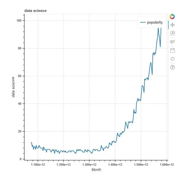
將多個圖形添加到單個文件:
output_file('multiple_graphs.html')
s1 = figure(width=250, plot_height=250, title='data science')
s1.circle(df['Mes'], df['data science'], size=10, color='navy', alpha=0.5)
s2 = figure(width=250, height=250, x_range=s1.x_range, y_range=s1.y_range, title='machine learning') #share both axis range
s2.triangle(df['Mes'], df['machine learning'], size=10, color='red', alpha=0.5)
s3 = figure(width=250, height=250, x_range=s1.x_range, title='deep learning') #share only one axis range
s3.square(df['Mes'], df['deep learning'], size=5, color='green', alpha=0.5)
p = gridplot([[s1, s2, s3]])
save(p)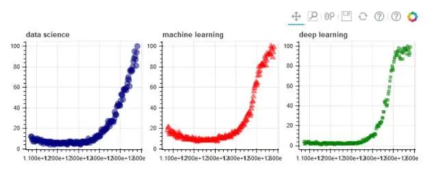
Altair
我認為Altair不會給我們已經(jīng)與其他圖書館討論的內(nèi)容帶來任何新的東西,因此,我將不對其進行深入討論。我想提到這個庫,因為也許在他們的示例畫廊中,我們可以找到一些可以幫助我們的特定圖形。
Folium
Folium是一項研究,可以讓我們繪制地圖,標記,也可以在上面繪制數(shù)據(jù)。Folium讓我們選擇地圖的提供者,這決定了地圖的樣式和質(zhì)量。在本文中,為簡單起見,我們僅將OpenStreetMap視為地圖提供者。
使用地圖非常復(fù)雜,值得一讀。在這里,我們只是看一下基礎(chǔ)知識,并用我們擁有的數(shù)據(jù)繪制幾張地圖。
讓我們從基礎(chǔ)開始,我們將繪制一個簡單的地圖,上面沒有任何內(nèi)容。
import folium
m1 = folium.Map(location=[41.38, 2.17], tiles='openstreetmap', zoom_start=18)
m1.save('map1.html')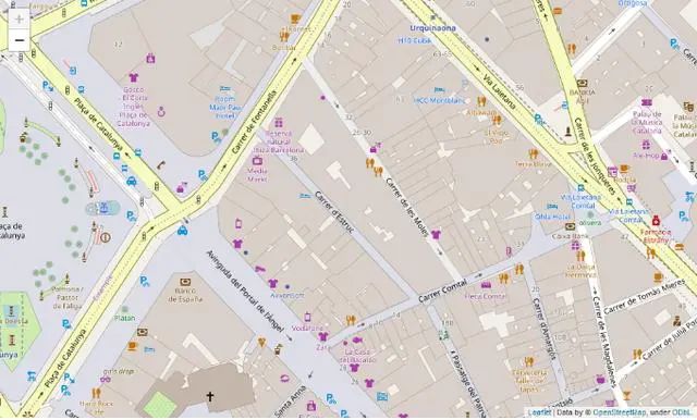
我們?yōu)榈貓D生成一個交互式文件,您可以在其中隨意移動和縮放。
我們可以在地圖上添加標記:
m2 = folium.Map(location=[41.38, 2.17], tiles='openstreetmap', zoom_start=16)
folium.Marker([41.38, 2.176], popup='You can use whatever HTML code you want', tooltip='click here').add_to(m2)
folium.Marker([41.38, 2.174], popup='You can use whatever HTML code you want', tooltip='dont click here').add_to(m2)
m2.save('map2.html')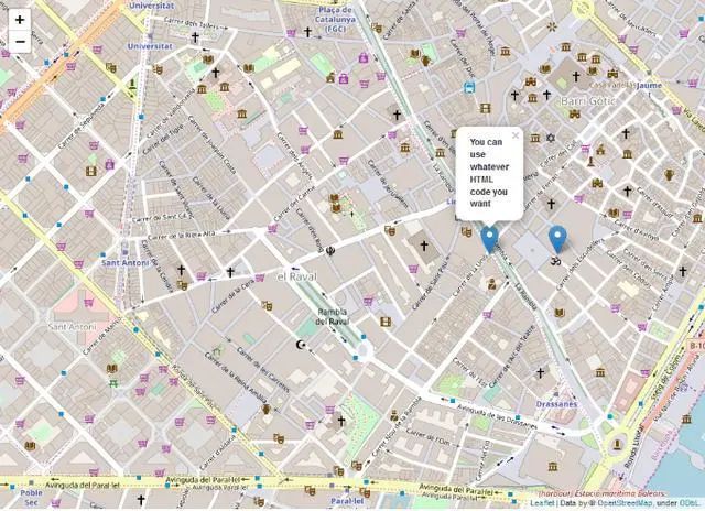
你可以看到交互式地圖文件,可以在其中單擊標記。
在開頭提供的數(shù)據(jù)集中,我們有國家名稱和人工智能術(shù)語的流行度。快速可視化后,您會發(fā)現(xiàn)有些國家缺少這些值之一。我們將消除這些國家,以使其變得更加容易。然后,我們將使用Geopandas將國家/地區(qū)名稱轉(zhuǎn)換為可在地圖上繪制的坐標。
from geopandas.tools import geocode
df2 = pd.read_csv('mapa.csv')
df2.dropna(axis=0, inplace=True)
df2['geometry'] = geocode(df2['País'], provider='nominatim')['geometry'] #It may take a while because it downloads a lot of data.
df2['Latitude'] = df2['geometry'].apply(lambda l: l.y)
df2['Longitude'] = df2['geometry'].apply(lambda l: l.x)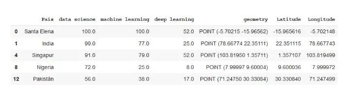
現(xiàn)在,我們已經(jīng)按照緯度和經(jīng)度對數(shù)據(jù)進行了編碼,現(xiàn)在讓我們在地圖上進行表示。我們將從BubbleMap開始,在其中繪制各個國家的圓圈。它們的大小將取決于該術(shù)語的受歡迎程度,而顏色將是紅色或綠色,具體取決于它們的受歡迎程度是否超過某個值。
m3 = folium.Map(location=[39.326234,-4.838065], tiles='openstreetmap', zoom_start=3)
def color_producer(val):
	if val <= 50:
		return 'red'
	else:
		return 'green'
for i in range(0,len(df2)):
	folium.Circle(location=[df2.iloc[i]['Latitud'], df2.iloc[i]['Longitud']], radius=5000*df2.iloc[i]['data science'], color=color_producer(df2.iloc[i]['data science'])).add_to(m3)
m3.save('map3.html')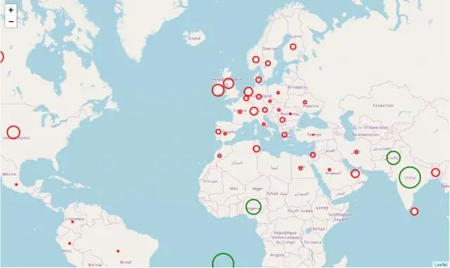
在何時使用哪個庫?
有了各種各樣的庫,怎么做選擇?快速的答案是讓你可以輕松制作所需圖形的庫。
對于項目的初始階段,使用Pandas和Pandas分析,我們將進行快速可視化以了解數(shù)據(jù)。如果需要可視化更多信息,可以使用在matplotlib中可以找到的簡單圖形作為散點圖或直方圖。
對于項目的高級階段,我們可以在主庫(Matplotlib,Seaborn,Bokeh,Altair)的圖庫中搜索我們喜歡并適合該項目的圖形。這些圖形可用于在報告中提供信息,制作交互式報告,搜索特定值等。

另外,再送大家一份《Python數(shù)據(jù)科學(xué)手冊》
以大數(shù)據(jù)、云計算、物聯(lián)網(wǎng)、人工智能等新技術(shù)所推動的數(shù)字化轉(zhuǎn)型正迅速的改變著我們所處的時代,各大互聯(lián)網(wǎng)公司都積累了大量的用戶數(shù)據(jù),比如購物、社交、出行等。充分挖掘數(shù)據(jù)價值,就是需要不斷的和數(shù)據(jù)打交道。
如果你對數(shù)據(jù)分析、數(shù)據(jù)挖掘、數(shù)據(jù)化運營感興趣,卻又無從下手,那么我來給你推薦一本不錯的書籍--《Python數(shù)據(jù)科學(xué)手冊》。

領(lǐng)取方式:
長按掃碼,發(fā)消息?[數(shù)據(jù)分析]