
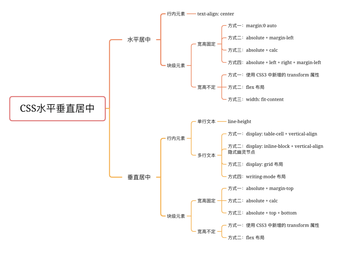
CSS 實現(xiàn)元素水平垂直居中的 N 種方式
回復交流,加入前端編程面試算法每日一題群
水平居中
1. 行內(nèi)元素
若是行內(nèi)元素,給其父元素設(shè)置 text-align:center 即可實現(xiàn)行內(nèi)元素水平居中
<div class="parent">
  <span class="child">測試</span>
</div>
<style>
  .parent {
    background-color: aqua;
    text-align: center; /* 水平居中 */
  }
  .child {
    color: #fff;
    background-color: blueviolet;
  }
</style>

2. 塊級元素
2.1 寬高固定
當寬高固定時,以下 html 示例:
<div class="parent">
  <div class="child"></div>
</div>
<style>
  .parent {
    height: 100px;
    background-color: aqua;
  }
  .child {
    width: 100px;
    height: 100px;
    background-color: blueviolet;
  }
</style>
以下四種方式顯示效果均為:

方式一:margin:0 auto
<style>
  .child {
    margin:0 auto;
  }
</style>
方式二:absolute + margin-left
<style>
  .child {
    position: absolute;
    margin-left: -50px;
    left: 50%;
  }
</style>
方式三:absolute + calc
<style>
  .child {
    position: absolute;
    left: calc(50% - 50px);
  }
</style>
方式四:absolute + left + right + margin-left
<style>
  .child {
    position: absolute;
    left: 0;
    right: 0;
    margin: 0 auto;
  }
</style>
2.2 寬高不定
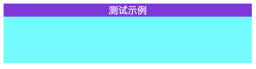
當寬高不定時,以下測試示例:
<div class="parent">
  <div class="child">測試示例</div>
</div>
<style>
  .parent {
    height: 100px;
    background-color: aqua;
  }
  .child {
    background-color: blueviolet;
    color: #fff;
  }
</style>
以下三種方式顯示效果均為:

方式一:使用 CSS3 中新增的 transform 屬性
<style>
  .child {
    position: absolute;
    left: 50%;
    transform:translate(-50%, 0);
  }
</style>
方式二:flex 布局
<style>
  .child {
    display: flex;
    justify-content: center;
  }
</style>
方式三:width: fit-content
<style>
  .child {
    width: fit-content;
    margin: 0 auto;
  }
</style>
fit-content 是 CSS3中 給 width 屬性新加的一個屬性值,它配合 margin 可以輕松實現(xiàn)水平居中
垂直居中
1. 行內(nèi)元素
代碼示例:
<div class="parent">
  <span class="child">測試示例</span>
</div>
<style>
  .parent {
    height: 100px;
    background-color: aqua;
    text-align: center; /* 水平居中 */
  }
  .child {
    color: #fff;
    background-color: blueviolet;
  }
</style>
方式一:line-height(單行文本)
<style>
  .child {
    line-height: 100px;
  }
</style>

當多行時會樣式錯亂,需要用到 vertical-align: middle 布局
方式二:display: table-cell + vertical-align (多行文本)
可用 vertical-align 屬性, 而 vertical-align 只有在父層為 td 或者 th 時, 才會生效,對于其他塊級元素, 例如 div 、 p 等,默認情況是不支持的。
為了使用 vertical-align ,我們需要設(shè)置父元素 display:table , 子元素 display:table-cell; vertical-align:middle;
<style>
  .parent {
    display: table;
  }
  .child {
    display: table-cell;
    vertical-align: middle;
  }
</style>
方式三:display: inline-block + vertical-align 隱式幽靈節(jié)點
設(shè)置幽靈節(jié)點的高度以及幽靈節(jié)點的基線(通過 line-height ),來設(shè)置幽靈節(jié)點的 x-height , 是 span 的中線與幽靈節(jié)點的中線對齊,同樣也可以使 vertical-align: middle; 居中
<style>
  .parent {
    line-height: 100px; /* 通過 line-height 設(shè)置幽靈節(jié)點的基線 */
  }
  .child {
    vertical-align: middle;
    line-height: normal; /* 塊級元素時需要加 */
    display: inline-block; /* 重點,要把 line-height 設(shè)置成 normal, 要不然會繼承100 */
  }
</style>

方式四:display: grid 布局
<style>
  .parent {
    display: grid;
  }
  .child {
    margin: auto;
  }
</style>
效果如上
方式五:writing-mode 布局
writing-mode 屬性定義了文本在水平或垂直方向上如何排布。
<style>
  .parent {
    writing-mode: vertical-lr;
  }
  .child {
    writing-mode: horizontal-tb;
  }
</style>
效果如上
2. 塊級元素
參照 水平居中的塊級元素布局 ,同樣把對水平方向的轉(zhuǎn)換為垂直方向的
2.1 寬高固定
示例代碼:
<div class="parent">
  <div class="child"></div>
</div>
<style>
  body {
    background-color: aqua;
  }
  .child {
    width: 50px;
    height: 50px;
    background-color: blueviolet;
  }
</style>
以下幾種方式顯示效果均為:

方式一:absolute + margin-top
<style>
  .child {
    position: absolute;
    margin-left: -25px;
    left: 50%;
    margin-top: -25px;
    top: 50%;
  }
</style>
方式二:absolute + calc
<style>
  .child {
    position: absolute;
    left: calc(50% - 25px);
    top: calc(50% - 25px);
  }
</style>
方式三:absolute + left + right + top + bottom
<style>
  .child {
    position: absolute;
    left: 0;
    right: 0;
    top: 0;
    bottom: 0;
    margin: auto;
  }
</style>
2.2 寬高不定
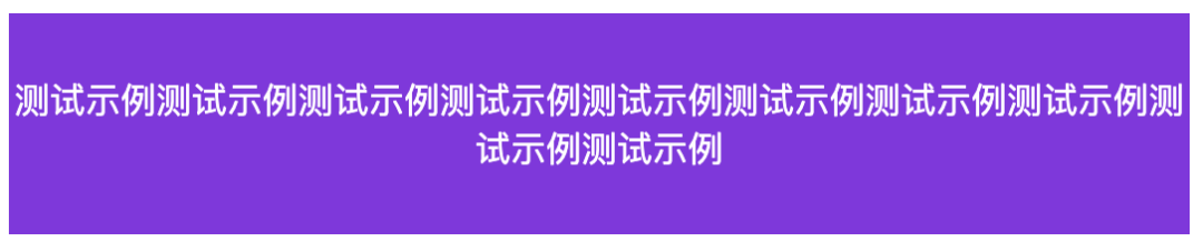
當寬高不定時,以下測試示例:
<div class="parent">
  <div class="child">測試示例</div>
</div>
<style>
  .parent {
    height: 100px;
    background-color: aqua;
  }
  .child {
    background-color: blueviolet;
  }
</style>
以下兩種方式顯示效果均為:

方式一:使用 CSS3 中新增的 transform 屬性
需要設(shè)定 parent 為相對定位( position: relative )
<style>
  .parent {
    position: relative;
  }
  .child {
    position: absolute;
    left: 50%;
    top: 50px;
    transform: translate(-50%, -50%);
  }
</style>
方式二:flex 布局
<style>
  .parent {
    display: flex;
    height: 100%;
    justify-content: center;  /* 水平居中 */
    align-items: center; /* 垂直居中 */
  }
</style>

來源:https://github.com/Advanced-Frontend/Daily-Interview-Question
最后
號內(nèi)回復:
120 套模版