CSS 垂直居中的正確打開方式
點(diǎn)擊上方關(guān)注?前端技術(shù)江湖,一起學(xué)習(xí),天天進(jìn)步
前言之爆錘面試官神器 - CSS
無論是實(shí)際開發(fā)中,亦或者是求職面試中,css 垂直居中往往都是一個繞不開的話題,其中不乏有許多面試者在多次雙重嘗受打擊之后,而沒有一個很好的反擊點(diǎn),剛好結(jié)合自己以前受的委屈和痛苦,來給大家一個錘爆面試官大佬們的機(jī)會。
其實(shí)垂直居中主要分為了兩種類型:居中元素寬高已知?和?居中元素寬高未知,那么我們就結(jié)合這兩種類型來一一做舉例。
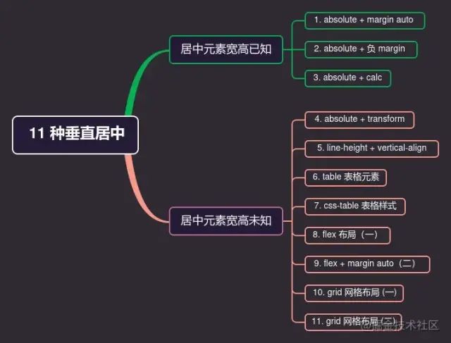
居中元素寬高已知
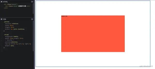
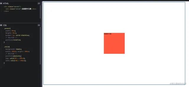
1. absolute + margin auto
顧名思義,就是利用當(dāng)前元素的?position: absolute;?和?margin: auto;
注意使用此方法:父元素與當(dāng)前元素的高度要設(shè)置;
通過將各個方向的距離都設(shè)置為 0,此時將?margin?設(shè)置為?auto,就可以實(shí)現(xiàn)垂直居中顯示了;
具體代碼如下:
.parent{
??position:?relative;
??width:?90vw;
??height:?90vh;
??border:?3px?solid?steelblue;
}

.child{
??background:?tomato;
??width:?50vw;?height:?50vh;
??/*?核心代碼?*/
??position:absolute;
??top:?0;?bottom:?0;?left:?0;?right:?0;
??margin:?auto;
}

復(fù)制代碼
具體效果如下:
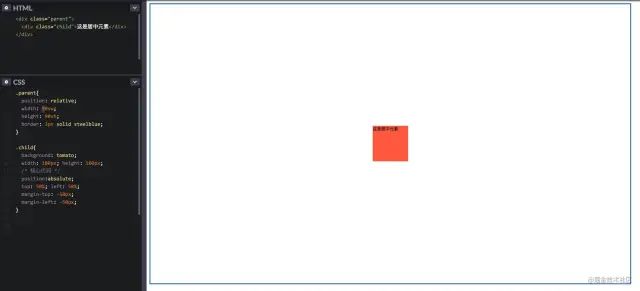
2. absolute + 負(fù) margin
利用絕對定位百分比 50% 來實(shí)現(xiàn),因?yàn)楫?dāng)前元素的百分比是基于相對定位(也就是父元素)來定位的;
然后再用負(fù)的 margin-top 和 margin-left 來進(jìn)行簡單的位移即可,因?yàn)楝F(xiàn)在的負(fù) margin 是基于自身的高度和寬度來進(jìn)行位移的。
具體代碼如下:
.parent{
??position:relative;
??width:?90vw;
??height:?90vh;
??border:?3px?solid?steelblue;
}

.child{
??background:?tomato;
??width:?100px;?height:?100px;
??/*?核心代碼?*/
??position:absolute;
??top:?50%;?left:?50%;
??margin-top:?-50px;
??margin-left:?-50px;
}

復(fù)制代碼
具體效果如下:
3. absolute + calc
使用 CSS3 的一個計(jì)算函數(shù)來進(jìn)行計(jì)算即可;方法與上面類似
具體代碼如下:
.parent{
??width:?90vw;
??height:?90vh;
??border:?3px?solid?steelblue;
??/*?核心代碼?*/
??position:relative;
}

.child{
??background:?tomato;
??width:?200px;?height:?200px;
??/*?核心代碼?*/
??position:absolute;
??top:?calc(50%?-?100px);
??left:?calc(50%?-?100px);
}

復(fù)制代碼
具體效果如下:
居中元素寬高未知
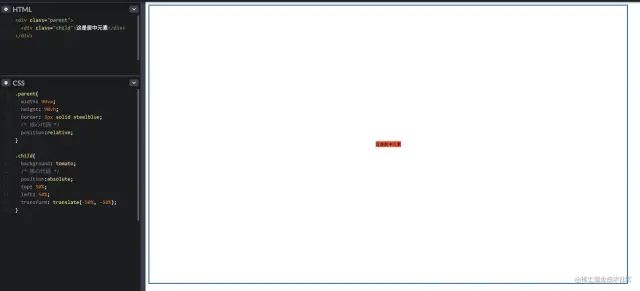
4. absolute + transform
利用 CSS3 的新特性?transform;因?yàn)?transform?的?translate?屬性值如果是一個百分比,那么這個百分比將是基于自身的寬高計(jì)算出來的。
具體代碼如下:
.parent{
??width:?90vw;
??height:?90vh;
??border:?3px?solid?steelblue;
??/*?核心代碼?*/
??position:relative;
}

.child{
??background:?tomato;
??/*?核心代碼?*/
??position:absolute;
??top:?50%;
??left:?50%;
??transform:?translate(-50%,?-50%);
}
復(fù)制代碼
具體效果如下:
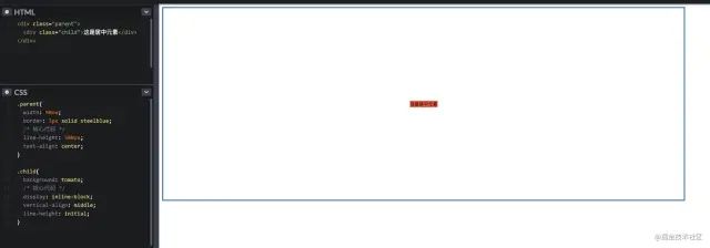
5. line-height + vertical-align
把當(dāng)前元素設(shè)置為行內(nèi)元素,然后通過設(shè)置父元素的?text-align: center;?實(shí)現(xiàn)水平居中;
同時通過設(shè)置當(dāng)前元素的?vertical-align: middle;?來實(shí)現(xiàn)垂直居中;
最后設(shè)置當(dāng)前元素的?line-height: initial;?來繼承父元素的line-height。
具體代碼如下:
.parent{
??width:?90vw;
??border:?3px?solid?steelblue;
??/*?核心代碼?*/
??line-height:?500px;
??text-align:?center;
}

.child{
??background:?tomato;
??/*?核心代碼?*/
??display:?inline-block;
??vertical-align:?middle;
??line-height:?initial;
}
復(fù)制代碼
具體效果如下:
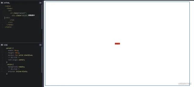
6. table 表格元素
通過最經(jīng)典的 table 元素來進(jìn)行水平垂直居中,不過代碼看起來會很冗余,不推薦使用;
具體代碼如下:
<table>
??<tbody>
????<tr>
??????<td?class="parent">
????????<div?class="child">div>
??????td>
????tr>
??tbody>
table>

<style>
??.parent?{
????width:?90vw;
????height:?90vh;
????border:?3px?solid?steelblue;
????/*?核心代碼?*/
????text-align:?center;
??}
??.child?{
????background:?tomato;
????/*?核心代碼?*/
????display:?inline-block;
??}
style>
復(fù)制代碼
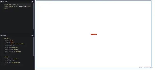
具體效果如下:
7. css-table 表格樣式
如果一定要使用?table?的特性,但是不想寫?table?元素的話,那么css-table?就很適合你;
具體代碼如下:
.parent{
??width:?90vw;
??height:?90vh;
??border:?3px?solid?steelblue;
??/*?核心代碼?*/
??display:?table-cell;
??text-align:?center;
??vertical-align:?middle;
}

.child{
??background:?tomato;
??/*?核心代碼?*/
??display:?inline-block;
}
復(fù)制代碼
具體效果如下:
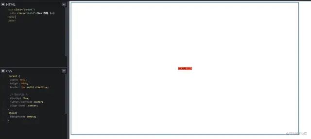
8. flex 布局(一)
要說現(xiàn)在較為流行和使用較多的布局方案,那么非 flex 莫屬了,那么舉例兩個最常見的使用方式 ~
直接在?flex-container?上通過幾行代碼即可很優(yōu)雅的實(shí)現(xiàn)
具體代碼如下:
.parent?{
??width:?90vw;
??height:?90vh;
??border:?3px?solid?steelblue;
??
??/*?核心代碼?*/
??display:?flex;
??justify-content:?center;
?align-items:?center;
}
.child{
??background:?tomato;
}
復(fù)制代碼
justify-content?表示:設(shè)置或檢索彈性盒子元素在主軸(橫軸)方向上的對齊方式;
align-items?表示:定義 flex 子項(xiàng)在 flex 容器的當(dāng)前行的側(cè)軸(縱軸)方向上的對齊方式。
具體效果如下:
9. flex + margin auto(二)
在?flex-item?上更加優(yōu)雅的實(shí)現(xiàn)
具體代碼如下:
.parent{
??width:?90vw;
??height:?90vh;
??border:?3px?solid?steelblue;
??
??/*?核心代碼?*/
??display:?flex;
}

.child{
??background:?tomato;
??
??/*?核心代碼?*/
??margin:?auto;
}
復(fù)制代碼
具體效果如下:
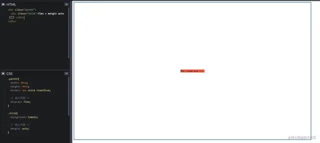
flex 的兩種方法使用取舍,任憑您意
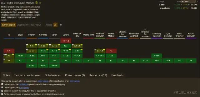
附贈 flex 兼容性圖片一張
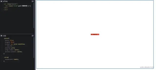
10. grid 網(wǎng)格布局 (一)
grid 布局相信大家在實(shí)際項(xiàng)目中用的較少,主要是該布局實(shí)在是太超前,導(dǎo)致了兼容性不是那么理想,但是不可否認(rèn)的是 grid 的能力在 css 布局中絕對是一個質(zhì)的飛越。
不熟悉的可以看下阮一峰老師的詳細(xì)入門教程[1]
CSS Grid?包含與?Flexbox?幾乎相同的對齊選項(xiàng),因此我們可以在?grid-container?上優(yōu)雅的實(shí)現(xiàn)
具體代碼如下:
.parent{
??width:?90vw;
??height:?90vh;
??border:?3px?solid?steelblue;
??/*?核心代碼?*/
??display:?grid;
??align-items:?center;
??justify-content:?center;
}

.child{
??background:?tomato;??
}
復(fù)制代碼
具體效果如下:
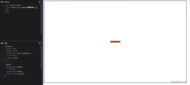
11. grid 網(wǎng)格布局 (二)
同樣我們可以像?Flexbox?一樣,在?grid-item?上優(yōu)雅的實(shí)現(xiàn)
具體代碼如下:
.parent{
??width:?90vw;
??height:?90vh;
??border:?3px?solid?steelblue;
??/*?核心代碼?*/
??display:?grid
}

.child{
??background:?tomato;
??/*?核心代碼?*/
??align-self:?center;
??justify-self:?center;
}
復(fù)制代碼
具體效果如下:
flex 的兩種方法使用取舍,任憑您高興
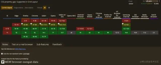
附贈 grid 兼容性圖片一張
總結(jié)
在學(xué)習(xí)了上面的 11 種垂直居中布局方法后,我們簡單概括一下
如果你的項(xiàng)目在 PC 端有兼容性要求并且寬高固定,推薦使用? absolute + 負(fù) margin?方法實(shí)現(xiàn);如果你的項(xiàng)目在 PC 端有兼容性要求并且寬高不固定,推薦使用? css-table?方式實(shí)現(xiàn);如果你的項(xiàng)目在 PC 端無兼容性要求?,推薦使用? flex?實(shí)現(xiàn)居中,當(dāng)然不考慮 IE 的話,grid?也是個不錯的選擇;如果你的項(xiàng)目在移動端使用?,那么推薦你使用? flex?,grid?也可作為備選。
寫在最后
其實(shí)以上的是一種垂直居中方法,只是比較常見的,其實(shí)還有一些比較冷門的方式方法,例如?偽類元素、grid-container 的 grid-template-rows?等,大家下去可以自行嘗試一下 ~
周末已結(jié)束,周一還會遠(yuǎn)嗎,祝大家新的一周新的開始 ~
帥氣美麗的你給個贊唄再走唄 ~
關(guān)于本文
作者:易師傅
https://juejin.cn/post/6991465721565806605
The End
歡迎自薦投稿到《前端技術(shù)江湖》,如果你覺得這篇內(nèi)容對你挺有啟發(fā),記得點(diǎn)個?「在看」哦
點(diǎn)個『在看』支持下?