
巧用 CSS 實(shí)現(xiàn)炫彩三角邊框動(dòng)畫
作者:chokcoco
來(lái)源:SegmentFault 思否社區(qū)
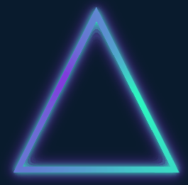
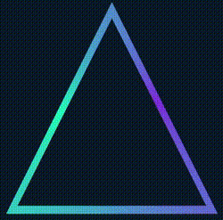
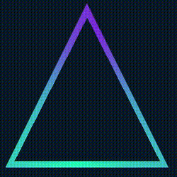
最近有個(gè)小伙伴問(wèn)我,在某個(gè)網(wǎng)站看到一個(gè)使用 SVG 實(shí)現(xiàn)的炫彩三角邊框動(dòng)畫,問(wèn)能否使用 CSS 實(shí)現(xiàn):
很有意思的一個(gè)動(dòng)畫效果,立馬讓我想起了我在 CSS 奇思妙想邊框動(dòng)畫 一文中介紹的邊框動(dòng)畫,非常的類似:
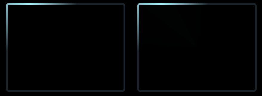
其核心就是利用了角向漸變(conic-gradient),然后將圖案的中心區(qū)域通過(guò)覆蓋遮罩一個(gè)小號(hào)的圖形實(shí)現(xiàn)。
然而,這個(gè)三角形動(dòng)畫里有兩個(gè)難點(diǎn):
整個(gè)圖形是個(gè)三角形
整個(gè)邊框還附帶陰影,并且陰影還是在邊框的兩側(cè)
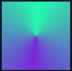
通過(guò)角向漸變實(shí)現(xiàn)主體動(dòng)畫
<div></div>
@property --angle {
  syntax: '<angle>';
  inherits: false;
  initial-value: 0deg;
}

div {
    width: 260px;
    height: 260px;
    background: conic-gradient(from var(--angle), hsl(162, 100%, 58%), hsl(270, 73%, 53%), hsl(162, 100%, 58%));
    animation: rotate 3s infinite linear;
}

@keyframes rotate {
    to {
        --angle: 360deg;
    }
}
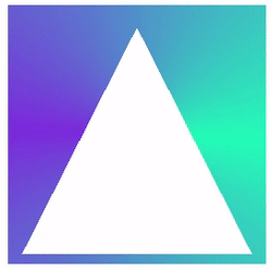
基于矩形圖形得到三角形
div {
    width: 260px;
    height: 260px;
    background: conic-gradient(from var(--angle), hsl(162, 100%, 58%), hsl(270, 73%, 53%), hsl(162, 100%, 58%));
    animation: rotate 3s infinite linear;
  + clip-path: polygon(0 100%, 100% 100%, 50% 0);
}
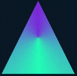
如果背景色不是實(shí)色而是漸變色,這個(gè)方法就失效了 這個(gè)方法實(shí)現(xiàn)的三角形邊框內(nèi)側(cè)無(wú)法添加陰影效果
@property --angle {
syntax: '<angle>';
inherits: false;
initial-value: 0deg;
}
div {
width: 260px;
height: 260px;
background: conic-gradient(from var(--angle), hsl(162, 100%, 58%), hsl(270, 73%, 53%), hsl(162, 100%, 58%));
clip-path: polygon(0 100%, 100% 100%, 50% 0);
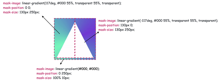
mask:
linear-gradient(117deg, #000 55%, transparent 55%, transparent),
linear-gradient(-117deg, #000 55%, transparent 55%, transparent),
linear-gradient(#000, #000);
mask-position: 0 0, 130px 0, 0 250px;
mask-size: 130px 250px, 130px 250px, 100% 10px;
mask-repeat: no-repeat;
animation: rotate 3s infinite linear;
}
@keyframes rotate {
to {
--angle: 360deg;
}
}
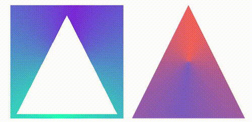
利用 drop-shadow 添加上光影
<div class="g-container">
    <div class="g-triangle"></div>
</div>
@property --angle {
  syntax: '<angle>';
  inherits: false;
  initial-value: 0deg;
}
.g-container {
    width: 260px;
    height: 260px;
    filter: drop-shadow(0 0 5px hsl(162, 100%, 58%)) drop-shadow(0 0 10px hsl(270, 73%, 53%));
}
.g-triangle {
    width: 260px;
    height: 260px;
    background: conic-gradient(from var(--angle), hsl(162, 100%, 58%), hsl(270, 73%, 53%), hsl(162, 100%, 58%));
    clip-path: polygon(0 100%, 100% 100%, 50% 0);
    mask:
        linear-gradient(117deg, #000 55%, transparent 55%, transparent),
        linear-gradient(-117deg, #000 55%, transparent 55%, transparent),
        linear-gradient(#000, #000);
    mask-position: 0 0, 130px 0, 0 250px;
    mask-size: 130px 250px, 130px 250px, 100% 10px;
    mask-repeat: no-repeat;
    animation: rotate 3s infinite linear;
}
@keyframes rotate {
    to {
        --angle: 360deg;
    }
}
使用 clip-path 剪切環(huán)形三角形
<div class="g-container">
    <div class="g-triangle"></div>
</div>
@property --angle {
  syntax: '<angle>';
  inherits: false;
  initial-value: 0deg;
}
.g-container {
    width: 260px;
    height: 260px;
    filter: drop-shadow(0 0 5px hsl(162, 100%, 58%)) drop-shadow(0 0 10px hsl(270, 73%, 53%));
}
.g-triangle {
    width: 200px;
    height: 200px;
    clip-path:
        polygon(
        50% 0%,
        0% 100%,
        8% 100%,
        50% 15%,
        88% 93%,
        7% 93%,
        7% 100%,
        100% 100%
    );
    background: conic-gradient(from var(--angle), hsl(162, 100%, 58%), hsl(270, 73%, 53%), hsl(162, 100%, 58%));
    animation: rotate 3s infinite linear;
}
@keyframes rotate {
    to {
        --angle: 360deg;
    }
}
{
    clip-path: polygon(0% 0%,0% 100%,25% 100%,25% 25%,75% 25%,75% 75%,25% 75%,14% 100%,100% 100%,100% 0%);
}
{
    clip-path: polygon(50% 0%,0% 100%,13% 100%,50% 20%,85% 90%,8% 90%,8% 100%,100% 100%);
}
clip-path:奇妙的 CSS shapes(CSS圖形)
CSS @property 自定義屬性:CSS @property,讓不可能變可能
利用 drop-shadow 生成不規(guī)則圖形的光源及邊框: 妙用 drop-shadow 實(shí)現(xiàn)線條光影效果

評(píng)論
圖片
表情