
巧用 CSS 實現(xiàn)動態(tài)線條 Loading 動畫
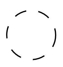
今天,有群友問我,使用 CSS 如何實現(xiàn)如下 Loading 效果:
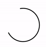
這是一個非常有意思的問題。
我們知道,使用 CSS,我們可以非常輕松的實現(xiàn)這樣一個動畫效果:
<div>div>
div?{
????width:?100px;
????height:?100px;
????border-radius:?50%;
????border:?2px?solid?transparent;
????border-top:?2px?solid?#000;
????border-left:?2px?solid?#000;
????animation:?rotate?3s?infinite?linear;
}
@keyframes?rotate?{
????100%?{
????????transform:?rotate(360deg);
????}
}
動畫如下:
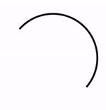
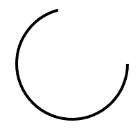
與要求的線條 loading 動畫相比,上述動畫缺少了比較核心的一點在于:
線條在旋轉運動的過程中,長短是會發(fā)生變化的
所以,這里的的難點也就轉變?yōu)榱耍绾蝿討B(tài)的實現(xiàn)弧形線段的長短變化?解決了這個問題,也就基本上解決了上述的線條變換 Loading 動畫。
本文將介紹 CSS 當中,幾種有意思的,可能可以動態(tài)改變弧形線條長短的方式:
方法一:使用遮罩實現(xiàn)
第一種方法,也是比較容易想到的方式,使用遮罩的方式實現(xiàn)。
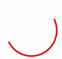
我們實現(xiàn)兩個半圓線條,一個是實際能看到的顏色,另外一個則是和背景色相同的,相對更為粗一點的半圓線條,當兩條線條運動的速率不一致時,我們從視覺上,也就能看到動態(tài)變化的弧形線條。
看看示意圖,一看就懂:
我們把上述紅色線條,替換成背景白色,整體的動畫效果就非常的相似了,偽代碼如下:
<div>div>
div?{
????width:?200px;
????height:?200px;
}
div::before?{
????position:?absolute;
????content:?"";
????top:?0px;?left:?0px;?right:?0px;?bottom:?0px;
????border-radius:?50%;
????border:?3px?solid?transparent;
????border-top:?3px?solid?#000;
????border-left:?3px?solid?#000;
????animation:?rotate?3s?infinite?ease-out;
}
div::after?{
????position:?absolute;
????content:?"";
????top:?-2px;?left:?-2px;?right:?-2px;?bottom:?-2px;
????border-radius:?50%;
????border:?7px?solid?transparent;
????border-bottom:?7px?solid?#fff;
????border-right:?7px?solid?#fff;
????animation:?rotate?4s?infinite?ease-in-out;
}
@keyframes?rotate?{
????100%?{
????????transform:?rotate(0deg);
????}
}
核心就是實現(xiàn)兩條半圓線條,一條黑色,一條背景色,兩段線條以不同的速率運動(通過動畫時間及緩動控制),效果如下:
完整的代碼你可以猛擊 -- CodePen Demo - Linear Loading[1]
上述方案最大的 2 個問題在于:
如果背景色不是純色,會露餡 如果要求能展現(xiàn)的線段長度大于半個圓,無法完成
基于此,我們只能另辟蹊徑。
方法二:借助 SVG 的 stroke-* 能力
在之前非常多的篇文章中,都有講到過在 CSS 配合 SVG,我們可以實現(xiàn)各種簡單或復雜的線條動畫,像是簡單的:

或者自定義復雜路徑的復雜的線條動畫:

> 對 CSS/SVG 實現(xiàn)線條動畫感興趣的,但是還不太了解的,可以看看我的這篇文章 -- 【W(wǎng)eb動畫】SVG 線條動畫入門[2]
在這里,我們只需要一個簡單的 SVG 標簽 stroke-dasharray 和 stroke-dashoffset 即可輕松完成上述效果:
<svg?class="circular"?viewbox="25?25?50?50">
??<circle?class="path"?cx="50"?cy="50"?r="20"?fill="none"?/>
svg>
.circular?{
??width:?100px;
??height:?100px;
??animation:?rotate?2s?linear?infinite;
}
.path?{
??stroke-dasharray:?1,?200;
??stroke-dashoffset:?0;
??stroke:?#000;
??animation:?dash?1.5s?ease-in-out?infinite
}
@keyframes?rotate?{
??100%?{
????transform:?rotate(360deg);
??}
}
@keyframes?dash?{
??0%?{
????stroke-dasharray:?1,?200;
????stroke-dashoffset:?0;
??}
??50%?{
????stroke-dasharray:?89,?200;
????stroke-dashoffset:?-35px;
??}
??100%?{
????stroke-dasharray:?89,?200;
????stroke-dashoffset:?-124px;
??}
}
簡單解釋下:
stroke:類比 css 中的 border-color,給 svg 圖形設定邊框顏色;stroke-dasharray:值是一組數(shù)組,沒數(shù)量上限,每個數(shù)字交替表示劃線與間隔的寬度;stroke-dashoffset:dash 模式到路徑開始的距離。
我們利用 stroke-dasharray 將原本完整的線條切割成多段,假設是 stroke-dasharray: 10, 10 表示這樣一個圖形:
第一個 10 表示線段的長度,第二個 10 表示兩條可見的線段中間的空隙。
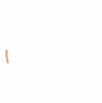
而實際代碼中的 stroke-dasharray: 1, 200,表示在兩條 1px 的線段中間,間隔 200px,由于直徑 40px 的圓的周長為 40 * π ≈ 125.6px,小于 200,所以實際如圖下,只有一個點:

同理,stroke-dasharray: 89, 200 表示:
通過 animation,讓線段在這兩種狀態(tài)之間補間變換。而 stroke-dashoffset 的作用則是將線段向前推移,配合父容器的 transform: rotate() 旋轉動畫,使得視覺效果,線段是在一直在向一個方向旋轉。結果如下:
完整的代碼你可以戳這里:CodePen Demo -- Linear loading[3]
OK,還會有同學說了,我不想引入 SVG 標簽,我只想使用純 CSS 方案。這里,還有一種利用 CSS @property 的純 CSS 方案。
使用 CSS @property 讓 conic-gradient 動起來
這里我們需要借助 CSS @property 的能力,使得本來無法實現(xiàn)動畫效果的角向漸變,動起來。
這個方法,我在介紹 CSS @property 的文章中也有提及 -- CSS @property,讓不可能變可能[4]
正常來說,漸變是無法進行動畫效果的,如下所示:
<div>div>
.normal?{
????width:?200px;
????height:?200px;
????border-radius:?50%;
????background:?conic-gradient(yellowgreen,?yellowgreen?25%,?transparent?25%,?transparent?100%);?
????transition:?background?300ms;
????
????&:hover?{
????????background:?conic-gradient(yellowgreen,?yellowgreen?60%,?transparent?60.1%,?transparent?100%);?
????}
}
將會得到這樣一種效果,由于 conic-gradient 是不支持過渡動畫的,得到的是一幀向另外一幀的直接變化:
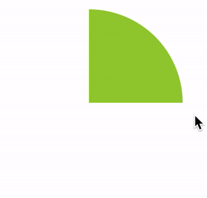
好,使用 CSS @property 自定義變量改造一下:
@property?--per?{
??syntax:?'<percentage>';
??inherits:?false;
??initial-value:?25%;
}

div?{
????background:?conic-gradient(yellowgreen,?yellowgreen?var(--per),?transparent?var(--per),?transparent?100%);?
????transition:?--per?300ms?linear;
????
????&:hover?{
????????--per:?60%;
????}
}
看看改造后的效果:

在這里,我們可以讓漸變動態(tài)的動起來,賦予了動畫的能力。
我們只需要再引入 mask,將中間部分裁切掉,即可實現(xiàn)上述線條 Loading 動畫,偽代碼如下:
<div>div>
@property?--per?{
????syntax:?"<percentage>";
????inherits:?false;
????initial-value:?10%;
}

div?{
????position:?relative;
????width:?100px;
????height:?100px;
????border-radius:?50%;
????animation:?rotate?11s?infinite?ease-in-out;

????&::before?{
????????content:?"";
????????position:?absolute;
????????top:?0;
????????left:?0;
????????right:?0;
????????bottom:?0;
????????border-radius:?50%;
????????background:?conic-gradient(transparent,?transparent?var(--per),?#fa7?var(--per),?#fa7);
????????mask:?radial-gradient(transparent,?transparent?47.5px,?#000?48px,?#000);
????????animation:?change?3s?infinite?cubic-bezier(0.57,?0.29,?0.49,?0.76);
????}
}

@keyframes?change?{
????50%?{
????????transform:?rotate(270deg);
????????--per:?98%;
????}
????100%?{
????????transform:?rotate(720deg);
????}
}

@keyframes?rotate?{
????100%?{
????????transform:?rotate(360deg);
????????filter:?hue-rotate(360deg);
????}
}
這里,我順便加上了 filter: hue-rotate(),讓線條在旋轉的同時,顏色也跟著變化,最終效果如下,這是一個純 CSS 解決方案:
完整的代碼你可以猛擊這里:Linear Loading Animation[5]
本方案的唯一問題在于,當前 CSS @property 的兼容性稍微不是那么樂觀。當然,未來可期。
最后
簡單總結一下,本文介紹了 3 種實現(xiàn)動態(tài)弧形線條長短變化的 Loading 動畫,當然,它們各有優(yōu)劣,實際使用的時候根據(jù)實際情況具體取舍。
有的時候,切圖也許也是更省時間的一種方式。
好了,本文到此結束,希望本文對你有所幫助 :)
如果還有什么疑問或者建議,可以多多交流,原創(chuàng)文章,文筆有限,才疏學淺,文中若有不正之處,萬望告知。
參考資料
CodePen Demo - Linear Loading: https://codepen.io/Chokcoco/pen/PvqYNJ
[2]【W(wǎng)eb動畫】SVG 線條動畫入門: https://www.cnblogs.com/coco1s/p/6225973.html
[3]CodePen Demo -- Linear loading: https://codepen.io/Chokcoco/pen/jOGQGJP?editors=1100
[4]CSS @property,讓不可能變可能: https://github.com/chokcoco/iCSS/issues/109
[5]Linear Loading Animation: https://codepen.io/Chokcoco/pen/ZEXmJxP?editors=1100
[6]Github -- iCSS: https://github.com/chokcoco/iCSS
結語
「關注公眾號IQ前端,一個專注于CSS/JS開發(fā)技巧的前端公眾號,更多前端小干貨等著你喔」