
「HTML+CSS」--自定義按鈕樣式【003】
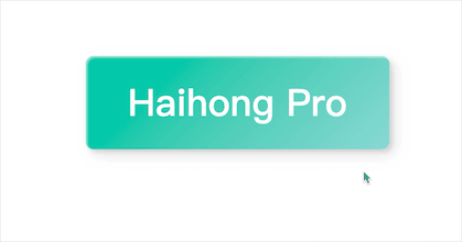
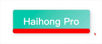
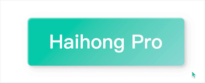
Part1效果展示
Part2思路
上面效果可以概括為:
鼠標未停留時:青色(漸變)背景,正中文字為白色,button四角做了圓角處理 鼠標停留時:淺青色背景從上至下,依次覆蓋button 鼠標離開button時:淺青色背景從上至下,依次消失,button逐漸恢復原樣
根據(jù)效果圖可以得出實現(xiàn)的一些思路:
初始狀態(tài),設(shè)置button背景為漸變青色,中間文字為白色,做圓角、陰影處理 初看有兩個過渡效果,其實是可以用一個元素的過渡transition實現(xiàn)的 這里我們就利用button的::before偽類元素來實現(xiàn) 將::before設(shè)置為絕對定位,初始位置為左下角(右下也是可以的),其中width設(shè)置為100%,height為0 觸發(fā)hover時,height設(shè)置為100%,top設(shè)置為0 (記住這里的關(guān)鍵點top:0) 還有就是,button和::before的背景顏色需要有所深淺變化
這里使用的漸變色:
深青(漸變):linear-gradient(315deg, #89d8d3 0%, #03c8a8 74%); 淺青(漸變):linear-gradient(315deg, #4dccc6 0%, #96e4df 74%);
Part3Demo代碼
HTML
<!DOCTYPE html>
<html lang="en">
<head>
    <meta charset="UTF-8">
    <meta http-equiv="X-UA-Compatible" content="IE=edge">
    <meta name="viewport" content="width=device-width, initial-scale=1.0">
    <link rel="stylesheet" href="style.css">
    <title>Document</title>
</head>
<body>
    <button class="btn">Haihong Pro</button>
</body>
</html>
CSS
html,body{
    margin: 0;
    height: 100%;
}
body{
    display: flex;
    justify-content: center;
    align-items: center;
}
.btn{
    width: 390px;
    height: 120px;
    background:linear-gradient(315deg, #89d8d3 0%, #03c8a8 74%);
    border: none;
    border-radius: 10px;
    font-family: 'Lato', sans-serif;
    font-weight: 500;
    font-size: 48px;
    color: #fff;
    box-shadow: inset 2px 2px 2px 0px rgba(255, 255, 255, .5),
    7px 7px 20px 0px rgba(0, 0, 0, .1),
    4px 4px 5px 0px rgba(0, 0, 0, .1);
    outline: none;
    position: relative;
    z-index: 0;
}
.btn::before{
    position:absolute;
    content: '';
    left: 0;
    bottom:0;
    width: 100%;
    height: 0;
    transition: all 0.3s ease;
    border-radius: 10px;
    background: linear-gradient(315deg, #4dccc6 0%, #96e4df 74%);
    z-index: -1;
}
.btn:hover::before{
    top: 0;
    height: 100%;
}
.btn:active{
    top: 2px;
}
Part4疑點詳解
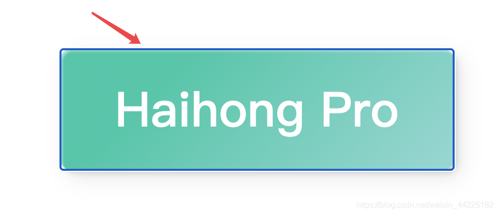
1.為什么觸發(fā)hover時,除了設(shè)置height:100%外,還需要設(shè)置top:0呢?上面效果圖原理是怎樣呢?
為了便于觀察,我們將::before的初始狀態(tài)顯示出來
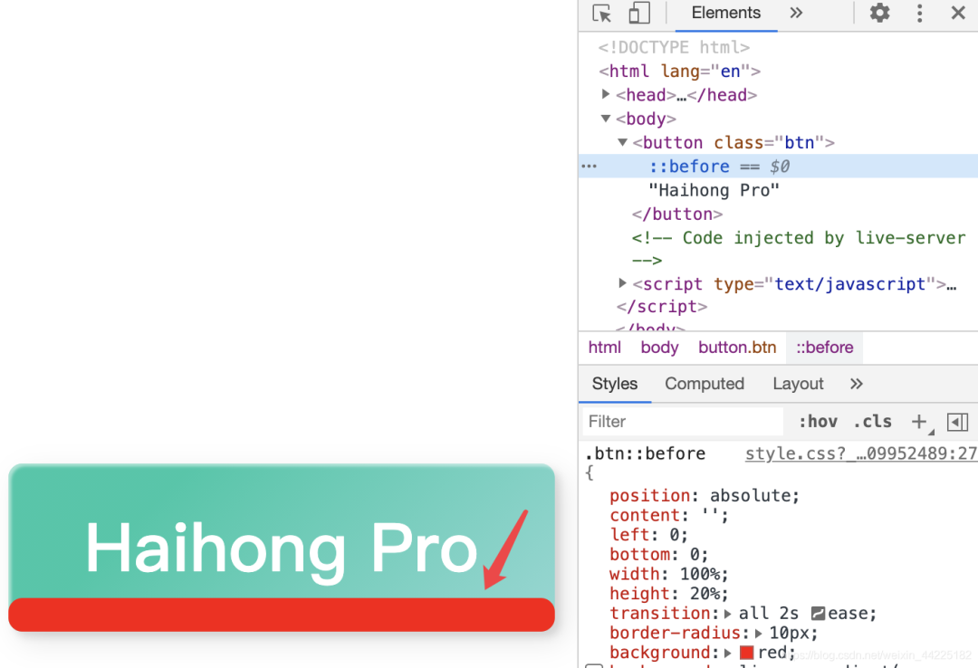
初始時,before的位置是在左下角(bottom:0 left:0)
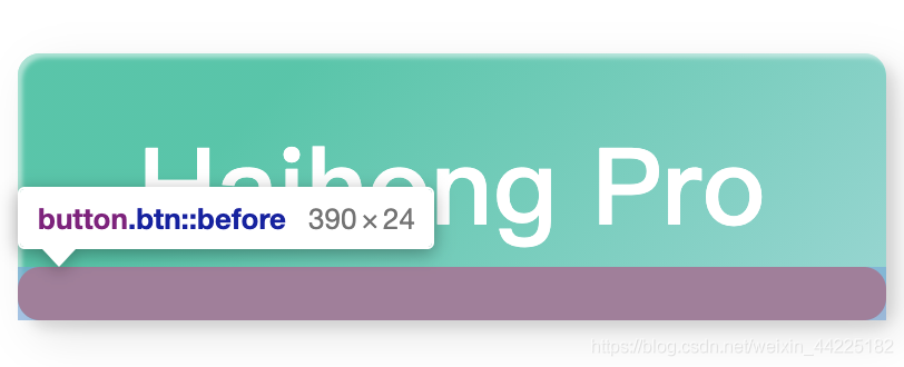
觸發(fā)hover時,如果只是設(shè)置heigth:100%,產(chǎn)生的效果如下:
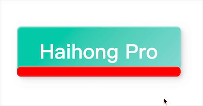
如果此時立即將位置改為左上角(top:0 left:0),就會產(chǎn)生從上至下的效果:
所以還需要在觸發(fā)hover時,添加 top:0 ( left就不需要變了,因為原本設(shè)置好了 )
2.為什么最后需要設(shè)置:active呢?
.btn:active{
    top: 2px;
}
emmm,就是產(chǎn)生一個點擊按鈕的動態(tài)效果(點擊一下,動一下),具體可以查看css :active的作用,這里就不多說了。
Part5踩坑
1.button、button::before需要設(shè)置z-index,分別為0和-1(確定button在上面一層就行)
不然,會產(chǎn)生如下效果:
2.button中記得設(shè)置 outline: none;
不然,點擊button后,會出現(xiàn)藍色邊框
注:前兩次文章中海轟也沒有發(fā)現(xiàn)這個問題,今天寫的的時候,點擊后才發(fā)現(xiàn)了這個問題
Part6結(jié)語
學習來源:
https://codepen.io/yuhomyan/pen/OJMejWJ
學習過程:
閱讀源碼 查閱相應函數(shù)語法 弄懂原理,理清思路 不看源碼來復現(xiàn)效果 總結(jié)
文章僅作為學習筆記,記錄學習過程中遇到的一些問題以及解決辦法。
文中若有不正確的地方,希望可以得到您的指出~

評論
圖片
表情