
「HTML+CSS」自定義加載動畫【015】
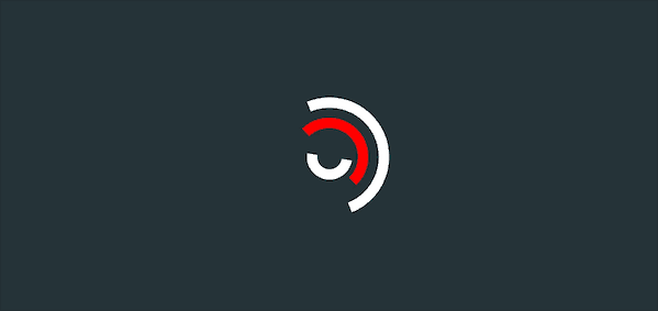
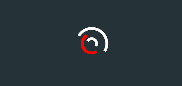
Part1效果展示
Part2Demo代碼
HTML
<!DOCTYPE html>
<html lang="en">
<head>
    <meta charset="UTF-8">
    <meta http-equiv="X-UA-Compatible" content="IE=edge">
    <meta name="viewport" content="width=device-width, initial-scale=1.0">
    <link rel="stylesheet" href="style.css">
    <title>Document</title>
</head>
<body>
    <section><span></span></section>
</body>
</html>
CSS
html,body{
  margin: 0;
  height: 100%;
}
body{
  display: flex;
  justify-content: center;
  align-items: center;
  background: #263238;
}
section {
    width: 650px;
    height: 300px;
    padding: 10px;
    position: relative;
    display: flex;
    align-items: center;
    justify-content: center;
    /* 紅色邊框僅作提示 */
    border: 2px solid red;
}

span{
  width : 96px;
  height: 96px;
  border: 10px solid ;
  border-color: white white transparent transparent;
  border-radius: 50%;
  position: relative;
  animation: rotation 2s linear infinite;
}
span::before{
  position: absolute;
  content: '';
  left: 0;
  right: 0;
  top: 0;
  bottom: 0;
  margin: auto;
  width:  56px;
  height:  56px;
  border: 10px solid;
  border-color: transparent transparent red red;
  border-radius: 50%;
  /* 注意這里的時間 */
  animation: rotationback 1s linear infinite;
}
 span::after{
  position: absolute;
  content: '';
  left: 0;
  right: 0;
  top: 0;
  bottom: 0;
  margin: auto;
  width:  24px;
  height:  24px;
  border: 10px solid;
  border-radius: 50%;
  border-color:  white white transparent transparent;
  /* 注意這里的時間 */
  animation: rotation 3s linear infinite;
 }

@keyframes rotation {
  0% { transform: rotate(0deg) }
  100% { transform: rotate(360deg)
  }
}
@keyframes rotationback {
  0% { transform: rotate(360deg) }
  100% { transform: rotate(0deg)
  }
}
Part3原理詳解
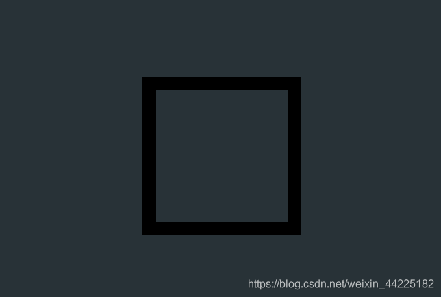
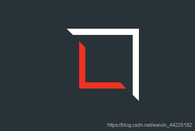
步驟1
利用span標(biāo)簽,生成一個正方形
寬度、高度均為96px 邊框:10px solid ;
 width : 96px;
  height: 96px;
  border: 10px solid ;
效果圖如下
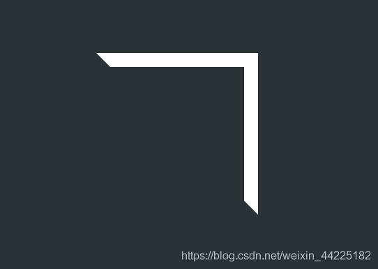
步驟2
上/右邊框顏色設(shè)置為白色,下/左邊框顏色為透明
border-color: white white transparent transparent;
效果圖如下
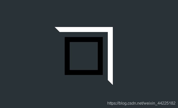
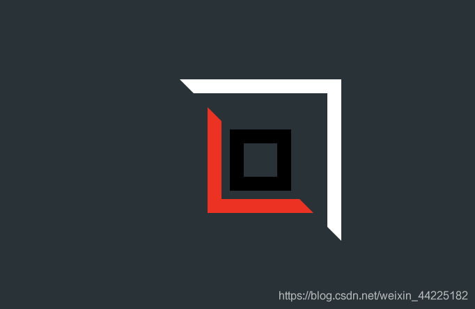
步驟3
設(shè)置span::before偽類
絕對定位 寬度、高度均為56px 邊框:10px solid 位于span正中央(上下左右居中)
position: absolute;
  content: '';

  /* 上下左右居中 絕對定位時*/
  left: 0;
  right: 0;
  top: 0;
  bottom: 0;
  margin: auto;

  width:  56px;
  height:  56px;
  border: 10px solid;
效果圖如下
步驟4
span::before設(shè)置邊框顏色
下/左邊框顏色為紅色 上/右邊框顏色為透明
border-color: transparent transparent red red;
效果圖如下
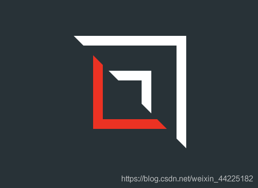
步驟5
設(shè)置span::after元素
寬度、高度均為24px 邊框:10px solid 絕對定位 位于span正中央(上下左右居中)
  position: absolute;
  content: '';

  /*上下左右居中*/
  left: 0;
  right: 0;
  top: 0;
  bottom: 0;
  margin: auto;

  width:  24px;
  height:  24px;
  border: 10px solid;
效果圖如下
步驟6
設(shè)置span::after的邊框顏色
上/右邊框顏色為白色 下/左邊框顏色為透明
border-color: white white transparent transparent;
效果圖如下
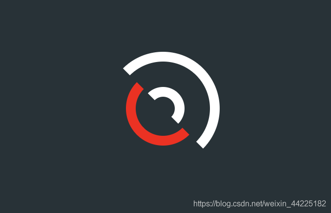
步驟7
對span、span::before、span::after圓角化
border-radius: 50%;
效果圖如下
步驟8
為span添加動畫
順時針 2s 無限循環(huán)
animation: rotation 2s linear infinite;
@keyframes rotation {
  0% { transform: rotate(0deg) }
  100% { transform: rotate(360deg)
  }
}
效果圖如下

步驟9
為span::before添加動畫
逆時針 1s 無限循環(huán)
animation: rotationback 1s linear infinite;
@keyframes rotationback {
  0% { transform: rotate(360deg) }
  100% { transform: rotate(0deg)
  }
}
效果圖如下
步驟10
為span::after添加動畫
順時針 3s 無限循環(huán)
animation: rotation 3s linear infinite;
@keyframes rotationback {
  0% { transform: rotate(360deg) }
  100% { transform: rotate(0deg)
  }
}
效果圖如下
Part4結(jié)語
學(xué)習(xí)來源:
https://codepen.io/bhadupranjal/pen/vYLZYqQ
文章僅作為學(xué)習(xí)筆記,記錄從0到1的一個過程。
希望對您有所幫助,如有錯誤歡迎小伙伴指正~
我是 海轟?(?ˊ?ˋ)?
如果您覺得寫得可以的話請點個贊吧
謝謝支持??

評論
圖片
表情