
愛了!用 Python 自動生成 Excel 數(shù)據(jù)報表

今天給大家來一波實戰(zhàn),使用Python自動化生成數(shù)據(jù)報表!
從一條條的數(shù)據(jù)中,創(chuàng)建出一張數(shù)據(jù)報表,得出你想要的東西,提高效率。
主要使用到pandas、xlwings以及matplotlib這幾個庫。
先來看一下動態(tài)的GIF,都是程序自動生成。
下面我們就來看看這個案例吧,水果蔬菜銷售報表。
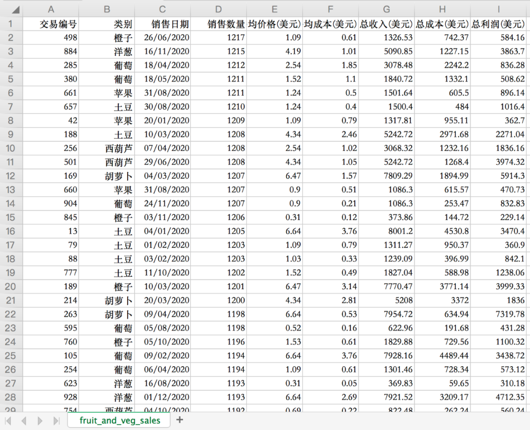
原始數(shù)據(jù)如下,主要有水果蔬菜名稱、銷售日期、銷售數(shù)量、平均價格、平均成本、總收入、總成本、總利潤等。
先導(dǎo)入相關(guān)庫,使用pandas讀取原始數(shù)據(jù)。
import pandas as pd
import xlwings as xw
import matplotlib.pyplot as plt

# 對齊數(shù)據(jù)
pd.set_option('display.unicode.ambiguous_as_wide', True)
pd.set_option('display.unicode.east_asian_width', True)

# 讀取數(shù)據(jù)
df = pd.read_csv(r"fruit_and_veg_sales.csv")
print(df)
結(jié)果如下。
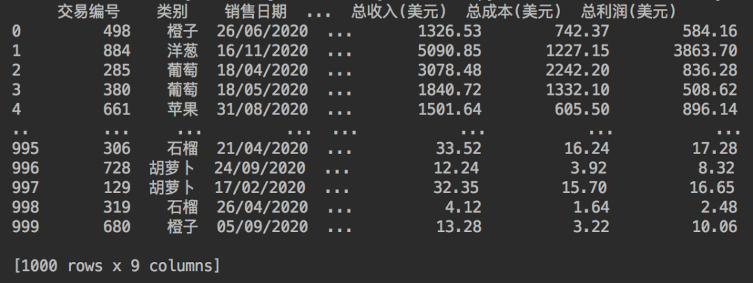
一共是有1000行的銷售數(shù)據(jù)。
使用xlwings庫創(chuàng)建一個Excel工作簿,在工作簿中創(chuàng)建一個表,表名為fruit_and_veg_sales,然后將原始數(shù)據(jù)復(fù)制進去。
# 創(chuàng)建原始數(shù)據(jù)表并復(fù)制數(shù)據(jù)
wb = xw.Book()
sht = wb.sheets["Sheet1"]
sht.name = "fruit_and_veg_sales"
sht.range("A1").options(index=False).value = d
關(guān)于xlwings庫的使用,小F推薦兩個文檔地址
中文版:
https://www.kancloud.cn/gnefnuy/xlwings-docs/1127455
英文版:
https://docs.xlwings.org/en/stable/index.html
推薦使用中文版,可以降低學(xué)習(xí)難度...

當(dāng)然關(guān)于Excel的VBA操作,也可以看看微軟的文檔。

地址:
https://docs.microsoft.com/zh-cn/office/vba/api/overview/excel
將原始數(shù)據(jù)取過來后,再在工作簿中創(chuàng)建一個可視化表,即Dashboard表。
# 創(chuàng)建表
wb.sheets.add('Dashboard')
sht_dashboard = wb.sheets('Dashboard')
現(xiàn)在,我們有了一個包含兩個工作表的Excel工作簿。fruit_and_veg_sales表有我們的數(shù)據(jù),Dashboard表則是空白的。
下面使用pandas來處理數(shù)據(jù),生成Dashboard表的數(shù)據(jù)信息。
DashBoard表的頭兩個表格,一個是產(chǎn)品的利潤表格,一個是產(chǎn)品的銷售數(shù)量表格。
使用到了pandas的數(shù)據(jù)透視表函數(shù)。
# 總利潤透視表
pv_total_profit = pd.pivot_table(df, index='類別', values='總利潤(美元)', aggfunc='sum')
print(pv_total_profit)

# 銷售數(shù)量透視表
pv_quantity_sold = pd.pivot_table(df, index='類別', values='銷售數(shù)量', aggfunc='sum')
print(pv_quantity_sold)
得到數(shù)據(jù)如下。

稍后會將數(shù)據(jù)放置到Excel的表中去。
下面對月份進行分組匯總,得出每個月的銷售情況。
# 查看每列的數(shù)據(jù)類型
print(df.dtypes)
df["銷售日期"] = pd.to_datetime(df["銷售日期"])

# 每日的數(shù)據(jù)情況
gb_date_sold = df.groupby(df["銷售日期"].dt.to_period('m')).sum()[["銷售數(shù)量", '總收入(美元)', '總成本(美元)', "總利潤(美元)"]]
gb_date_sold.index = gb_date_sold.index.to_series().astype(str)
print(gb_date_sold)
得到結(jié)果如下。
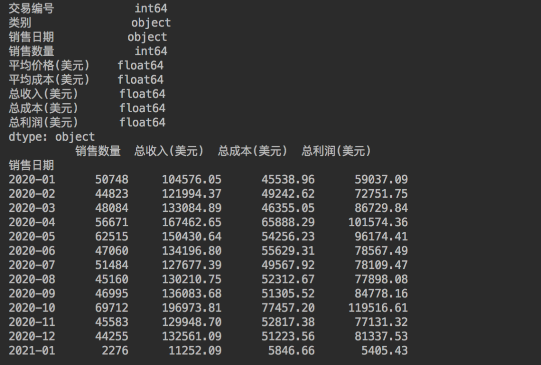
這里先對數(shù)據(jù)進行了查詢,發(fā)現(xiàn)日期列為object,是不能進行分組匯總的。
所以使用了pd.to_datetime()對其進行了格式轉(zhuǎn)換,而后根據(jù)時間進行分組匯總,得到每個月的數(shù)據(jù)情況。
最后一個groupby將為Dashboard表提供第四個數(shù)據(jù)信息。
# 總收入前8的日期數(shù)據(jù)
gb_top_revenue = (df.groupby(df["銷售日期"])
    .sum()
    .sort_values('總收入(美元)', ascending=False)
    .head(8)
    )[["銷售數(shù)量", '總收入(美元)', '總成本(美元)', "總利潤(美元)"]]
print(gb_top_revenue)
總收入前8的日期,得到結(jié)果如下。

現(xiàn)在我們有了4份數(shù)據(jù),可以將其附加到Excel中。
# 設(shè)置背景顏色, 從A1單元格到Z1000單元格的矩形區(qū)域
sht_dashboard.range('A1:Z1000').color = (198, 224, 180)

# A、B列的列寬
sht_dashboard.range('A:B').column_width = 2.22
print(sht_dashboard.range('B2').api.font_object.properties.get())
# B2單元格, 文字內(nèi)容、字體、字號、粗體、顏色、行高(主標(biāo)題)
sht_dashboard.range('B2').value = '銷售數(shù)據(jù)報表'
sht_dashboard.range('B2').api.font_object.name.set('黑體')
sht_dashboard.range('B2').api.font_object.font_size.set(48)
sht_dashboard.range('B2').api.font_object.bold.set(True)
sht_dashboard.range('B2').api.font_object.color.set([0, 0, 0])
sht_dashboard.range('B2').row_height = 61.2

# B2單元格到W2單元格的矩形區(qū)域, 下邊框的粗細(xì)及顏色
sht_dashboard.range('B2:W2').api.get_border(which_border=9).weight.set(4)
sht_dashboard.range('B2:W2').api.get_border(which_border=9).color.set([0, 176, 80])

# 不同產(chǎn)品總的收益情況圖表名稱、字體、字號、粗體、顏色(副標(biāo)題)
sht_dashboard.range('M2').value = '每種產(chǎn)品的收益情況'
sht_dashboard.range('M2').api.font_object.name.set('黑體')
sht_dashboard.range('M2').api.font_object.font_size.set(20)
sht_dashboard.range('M2').api.font_object.bold.set(True)
sht_dashboard.range('M2').api.font_object.color.set([0, 0, 0])

# 主標(biāo)題和副標(biāo)題的分割線, 粗細(xì)、顏色、線型
sht_dashboard.range('L2').api.get_border(which_border=7).weight.set(3)
sht_dashboard.range('L2').api.get_border(which_border=7).color.set([0, 176, 80])
sht_dashboard.range('L2').api.get_border(which_border=7).line_style.set(-4115)
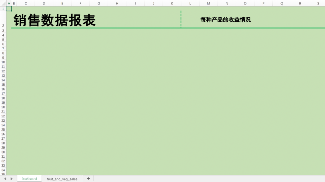
先配置一些基本內(nèi)容,比如文字,顏色背景,邊框線等,如下圖。
使用函數(shù),批量生成四個表格的格式。
# 表格生成函數(shù).
def create_formatted_summary(header_cell, title, df_summary, color):
    """
    Parameters
    ----------
    header_cell : Str
        左上角單元格位置, 放置數(shù)據(jù)

    title : Str
        當(dāng)前表格的標(biāo)題

    df_summary : DataFrame
        表格的數(shù)據(jù)

    color : Str
        表格填充色
    """

    # 可選擇的表格填充色
    colors = {"purple": [(112, 48, 160), (161, 98, 208)],
              "blue": [(0, 112, 192), (155, 194, 230)],
              "green": [(0, 176, 80), (169, 208, 142)],
              "yellow": [(255, 192, 0), (255, 217, 102)]}

    # 設(shè)置表格標(biāo)題的列寬
    sht_dashboard.range(header_cell).column_width = 1.5

    # 獲取單元格的行列數(shù)
    row, col = sht_dashboard.range(header_cell).row, sht_dashboard.range(header_cell).column

    # 設(shè)置表格的標(biāo)題及相關(guān)信息, 如:字號、行高、向左居中對齊、顏色、粗體、表格的背景顏色等
    summary_title_range = sht_dashboard.range((row, col))
    summary_title_range.value = title
    summary_title_range.api.font_object.font_size.set(14)
    summary_title_range.row_height = 32.5
    # 垂直對齊方式
    summary_title_range.api.verticalalignment = xw.constants.HAlign.xlHAlignCenter
    summary_title_range.api.font_object.color.set([255, 255, 255])
    summary_title_range.api.font_object.bold.set(True)
    sht_dashboard.range((row, col),
                        (row, col + len(df_summary.columns) + 1)).color = colors[color][0]  # Darker color

    # 設(shè)置表格內(nèi)容、起始單元格、數(shù)據(jù)填充、字體大小、粗體、顏色填充
    summary_header_range = sht_dashboard.range((row + 1, col + 1))
    summary_header_range.value = df_summary
    summary_header_range = summary_header_range.expand('right')
    summary_header_range.api.font_object.font_size.set(11)
    summary_header_range.api.font_object.bold.set(True)
    sht_dashboard.range((row + 1, col),
                        (row + 1, col + len(df_summary.columns) + 1)).color = colors[color][1]  # Darker color
    sht_dashboard.range((row + 1, col + 1),
                        (row + len(df_summary), col + len(df_summary.columns) + 1)).autofit()

    for num in range(1, len(df_summary) + 2, 2):
        sht_dashboard.range((row + num, col),
                            (row + num, col + len(df_summary.columns) + 1)).color = colors[color][1]

    # 找到表格的最后一行
    last_row = sht_dashboard.range((row + 1, col + 1)).expand('down').last_cell.row
    side_border_range = sht_dashboard.range((row + 1, col), (last_row, col))

    # 給表格左邊添加帶顏色的邊框
    side_border_range.api.get_border(which_border=7).weight.set(3)
    side_border_range.api.get_border(which_border=7).color.set(colors[color][1])
    side_border_range.api.get_border(which_border=7).line_style.set(-4115)


# 生成4個表格
create_formatted_summary('B5', '每種產(chǎn)品的收益情況', pv_total_profit, 'green')
create_formatted_summary('B17', '每種產(chǎn)品的售出情況', pv_quantity_sold, 'purple')
create_formatted_summary('F17', '每月的銷售情況', gb_date_sold, 'blue')
create_formatted_summary('F5', '每日總收入排名Top8 ', gb_top_revenue, 'yellow')
得到結(jié)果如下。
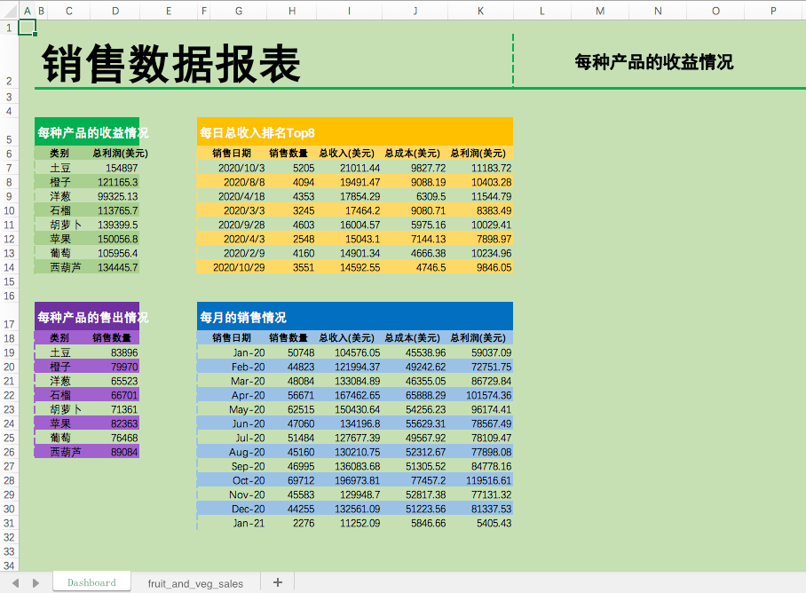
可以看到,一行行的數(shù)據(jù)經(jīng)過Python的處理,變?yōu)橐荒苛巳坏谋砀瘛?br>
最后再繪制一個matplotlib圖表,添加一張logo圖片,并保存Excel文件。
# 中文顯示
plt.rcParams['font.sans-serif']=['Songti SC']

# 使用Matplotlib繪制可視化圖表, 餅圖
fig, ax = plt.subplots(figsize=(6, 3))
pv_total_profit.plot(color='g', kind='bar', ax=ax)

# 添加圖表到Excel
sht_dashboard.pictures.add(fig, name='ItemsChart',
                           left=sht_dashboard.range("M5").left,
                           top=sht_dashboard.range("M5").top,
                           update=True)

# 添加logo到Excel
logo = sht_dashboard.pictures.add(image="pie_logo.png",
                           name='PC_3',
                           left=sht_dashboard.range("J2").left,
                           top=sht_dashboard.range("J2").top+5,
                           update=True)

# 設(shè)置logo的大小
logo.width = 54
logo.height = 54

# 保存Excel文件
wb.save(rf"水果蔬菜銷售報表.xlsx")
此處需設(shè)置一下中文顯示,否則會顯示不了中文,只有一個個方框。
得到最終的水果蔬菜銷售報表。

本文的示例代碼,可以在Mac+Excel2016中運行的,與Windows還是會有一些區(qū)別,API函數(shù)的調(diào)用(pywin32 or appscript)。
比如表格文字的字體設(shè)置。
# Windows
sht_dashboard.range('B2').api.font.name = '黑體'

# Mac
sht_dashboard.range('B2').api.font_object.name.set('黑體')