
【CSS】1062- 49 個(gè)常用 CSS 樣式清單整理
來(lái)源 :https://www.mdeditor.tw/pl/pSGX

1、文字超出部分顯示省略號(hào)
單行文本的溢出顯示省略號(hào)(一定要有寬度)
 p{
    width:200rpx;
    overflow: hidden;
    text-overflow:ellipsis;
    white-space: nowrap;
 }
多行文本溢出顯示省略號(hào)
p {
    display: -webkit-box;
    -webkit-box-orient: vertical;
    -webkit-line-clamp: 3;
    overflow: hidden;
 }
2、中英文自動(dòng)換行
word-break:break-all;只對(duì)英文起作用,以字母作為換行依據(jù)word-wrap:break-word; 只對(duì)英文起作用,以單詞作為換行依據(jù)white-space:pre-wrap; 只對(duì)中文起作用,強(qiáng)制換行white-space:nowrap; 強(qiáng)制不換行,都起作用
p{
  word-wrap: break-word;
  white-space: normal;
  word-break: break-all;
}
//不換行
.wrap {
  white-space:nowrap;
}
//自動(dòng)換行
.wrap {
  word-wrap: break-word;
  word-break: normal;
}
//強(qiáng)制換行
.wrap {
  word-break:break-all;
}
3、文字陰影
text-shadow 為網(wǎng)頁(yè)字體添加陰影,通過(guò)對(duì)text-shadow屬性設(shè)置相關(guān)的屬性值。屬性與值的說(shuō)明如下:text-shadow: [X-offset,Y-offset,Blur,Color];
X-offset:指陰影居于字體水平偏移的位置。
Y-offset:指陰影居于字體垂直偏移的位置。
Blur:指陰影的模糊值。
color:指陰影的顏色;
h1{
text-shadow: 5px 5px 5px #FF0000;
}
4、設(shè)置placeholder的字體樣式
input::-webkit-input-placeholder { /* Chrome/Opera/Safari */
  color: red;
}
input::-moz-placeholder { /* Firefox 19+ */
  color: red;
}
input:-ms-input-placeholder { /* IE 10+ */
  color: red;
}
input:-moz-placeholder { /* Firefox 18- */
  color: red;
}
5、不固定高寬 div 垂直居中的方法
方法一:偽元素和 inline-block / vertical-align(兼容 IE8)
.box-wrap:before {
      content: '';
      display: inline-block;
      height: 100%;
      vertical-align: middle;
      margin-right: -0.25em; //微調(diào)整空格
}
.box {
     display: inline-block;
     vertical-align: middle;
}
方法二:flex(不兼容 ie8 以下)
.box-wrap {
     height: 300px;
     justify-content:center;
     align-items:center;
     display:flex;
     background-color:#666;
 }
方法三:transform(不兼容 ie8 以下)
 .box-wrap {
     width:100%;
     height:300px;
     background:rgba(0,0,0,0.7);
     position:relative;
}
.box{
    position:absolute;
    left:50%;
    top:50%;
    transform:translateX(-50%) translateY(-50%);
    -webkit-transform:translateX(-50%) translateY(-50%);
}
方法四:設(shè)置 margin:auto(該方法得嚴(yán)格意義上的非固定寬高,而是 50%的父級(jí)的寬高。)
.box-wrap {
    position: relative;
    width:100%;
    height:300px;
    background-color:#f00;
}
.box-content{
    position: absolute;
    top:0;
    left:0;
    bottom:0;
    right:0;
    width:50%;
    height:50%;
    margin:auto;
    background-color:#ff0;
}
6、解決IOS頁(yè)面滑動(dòng)卡頓
body,html{
    -webkit-overflow-scrolling: touch;
}
7、設(shè)置滾動(dòng)條樣式
.test::-webkit-scrollbar{
  /*滾動(dòng)條整體樣式*/
  width : 10px;  /*高寬分別對(duì)應(yīng)橫豎滾動(dòng)條的尺寸*/
  height: 1px;
}
.test::-webkit-scrollbar-thumb {
  /*滾動(dòng)條里面小方塊*/
  border-radius   : 10px;
  background-color: skyblue;
  background-image: -webkit-linear-gradient(
      45deg,
      rgba(255, 255, 255, 0.2) 25%,
      transparent 25%,
      transparent 50%,
      rgba(255, 255, 255, 0.2) 50%,
      rgba(255, 255, 255, 0.2) 75%,
      transparent 75%,
      transparent
  );
}
.test::-webkit-scrollbar-track {
  /*滾動(dòng)條里面軌道*/
  box-shadow   : inset 0 0 5px rgba(0, 0, 0, 0.2);
  background   : #ededed;
  border-radius: 10px;
}
8、實(shí)現(xiàn)隱藏滾動(dòng)條同時(shí)又可以滾動(dòng)
.demo::-webkit-scrollbar {
  display: none; /* Chrome Safari */
}

.demo {
  scrollbar-width: none; /* firefox */
  -ms-overflow-style: none; /* IE 10+ */
  overflow-x: hidden;
  overflow-y: auto;
}
9、css 繪制三角形
div {
    width: 0;
    height: 0;
    border-width: 0 40px 40px;
    border-style: solid;
    border-color: transparent transparent red;
}
效果如下: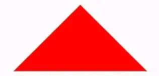
實(shí)現(xiàn)帶邊框的三角形:
<div id="blue"><div>

#blue {
    position:relative;
    width: 0;
    height: 0;
    border-width: 0 40px 40px;
    border-style: solid;
    border-color: transparent transparent blue;
}
#blue:after {
    content: "";
    position: absolute;
    top: 1px;
    left: -38px;
    border-width: 0 38px 38px;
    border-style: solid;
    border-color: transparent transparent yellow;
}
效果如下: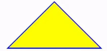
注: 如果想繪制右直角三角,則將左 border 設(shè)置為 0;如果想繪制左直角三角,將右 border 設(shè)置為 0 即可(其它情況同理)。
10、Table表格邊框合并
table,tr,td{
  border: 1px solid #666;
}
table{
  border-collapse: collapse;
}
11、css 選取第 n 個(gè)標(biāo)簽元素
first-child first-child 表示選擇列表中的第一個(gè)標(biāo)簽。
last-child last-child 表示選擇列表中的最后一個(gè)標(biāo)簽
nth-child(3) 表示選擇列表中的第 3 個(gè)標(biāo)簽
nth-child(2n) 這個(gè)表示選擇列表中的偶數(shù)標(biāo)簽
nth-child(2n-1) 這個(gè)表示選擇列表中的奇數(shù)標(biāo)簽
nth-child(n+3) 這個(gè)表示選擇列表中的標(biāo)簽從第 3 個(gè)開(kāi)始到最后。
nth-child(-n+3) 這個(gè)表示選擇列表中的標(biāo)簽從 0 到 3,即小于 3 的標(biāo)簽。
nth-last-child(3) 這個(gè)表示選擇列表中的倒數(shù)第 3 個(gè)標(biāo)簽。
使用方法:
li:first-child{}
12、移動(dòng)端軟鍵盤(pán)變?yōu)樗阉鞣绞?/strong>
默認(rèn)情況下軟鍵盤(pán)上該鍵位為前往或者確認(rèn)等文字,要使其變?yōu)樗阉魑淖郑枰?input 上加上 type 聲明:
<form action="#">
    <input type="search" placeholder="請(qǐng)輸入..." name="search" />
</form>
需要一個(gè) form 標(biāo)簽套起來(lái),并且設(shè)置 action 屬性,這樣寫(xiě)完之后輸入法的右下角就會(huì)自動(dòng)變成搜索,同時(shí),使用了 search 類(lèi)型后,搜索框上會(huì)默認(rèn)自帶刪除按鈕。
13、onerror 處理圖片異常
使用 onerror 異常處理時(shí),若 onerror 的圖片也出現(xiàn)問(wèn)題,則圖片顯示會(huì)陷入死循環(huán),所以要在賦值異常圖片之后,將地址置空
<img onerror="this.src='url;this.onerror=null'" />
14、背景圖片的大小
.bg-img{
    background:url(../img/find_pw_on_2.png)  no-repeat center center !important;
    background-size: 27px auto !important;
    /*background-size: 100% 100%;*/
    /*background-size: 50px 100px*/
}
15、文字之間的間距
單詞text-indent抬頭距離,letter-spacing字與字間距
p{
  text-indent:10px;//單詞抬頭距離
  letter-spacing:10px;//間距
}
16、元素占滿整個(gè)屏幕
heigth如果使用100%,會(huì)根據(jù)父級(jí)的高度來(lái)決定,所以使用100vh單位。
.dom{
  width:100%;
  height:100vh;
}
17、CSS實(shí)現(xiàn)文本兩端對(duì)齊
.wrap {
    text-align: justify;
    text-justify: distribute-all-lines;  //ie6-8
    text-align-last: justify;  //一個(gè)塊或行的最后一行對(duì)齊方式
    -moz-text-align-last: justify;
    -webkit-text-align-last: justify;
}
18、實(shí)現(xiàn)文字豎向排版
// 單列展示時(shí)
.wrap {
    width: 25px;
    line-height: 18px;
    height: auto;
    font-size: 12px;
    padding: 8px 5px;
    word-wrap: break-word;/*英文的時(shí)候需要加上這句,自動(dòng)換行*/
}
// 多列展示時(shí)
.wrap {
    height: 210px;
    line-height: 30px;
    text-align: justify;
    writing-mode: vertical-lr;  //從左向右
    writing-mode: tb-lr;        //IE從左向右
    //writing-mode: vertical-rl;  -- 從右向左
    //writing-mode: tb-rl;        -- 從右向左
}
19、使元素鼠標(biāo)事件失效
.wrap {
  // 如果按tab能選中該元素,如button,然后按回車(chē)還是能執(zhí)行對(duì)應(yīng)的事件,如click。
 pointer-events: none;
 cursor: default;
}
20、禁止用戶選擇
.wrap {
  -webkit-touch-callout: none;
  -webkit-user-select: none;
  -khtml-user-select: none;
  -moz-user-select: none;
  -ms-user-select: none;
  user-select: none;
}
21、使用硬件加速
在瀏覽器中用css開(kāi)啟硬件加速,使GPU (Graphics Processing Unit) 發(fā)揮功能,從而提升性能。硬件加速在移動(dòng)端尤其有用,因?yàn)樗梢杂行У臏p少資源的利用。
目前主流瀏覽器會(huì)檢測(cè)到頁(yè)面中某個(gè)DOM元素應(yīng)用了某些CSS規(guī)則時(shí)就會(huì)開(kāi)啟,最顯著的特征的元素的3D變換。如果不使用3D變形,我們可以通過(guò)下面方式來(lái)開(kāi)啟:
.wrap {
    transform: translateZ(0);
}
22、頁(yè)面動(dòng)畫(huà)出現(xiàn)閃爍問(wèn)題
在 Chrome and Safari中,當(dāng)我們使用CSS transforms 或者 animations時(shí)可能會(huì)有頁(yè)面閃爍的效果,下面的代碼可以修復(fù)此情況:
.cube {
   -webkit-backface-visibility: hidden;
   backface-visibility: hidden;

   -webkit-perspective: 1000;
   perspective: 1000;
   /* Other transform properties here */
}
在webkit內(nèi)核的瀏覽器中,另一個(gè)行之有效的方法是
.cube {
   -webkit-transform: translate3d(0, 0, 0);
   transform: translate3d(0, 0, 0);
  /* Other transform properties here */
}
23、字母大小寫(xiě)轉(zhuǎn)換
p {text-transform: uppercase}  // 將所有字母變成大寫(xiě)字母
p {text-transform: lowercase}  // 將所有字母變成小寫(xiě)字母
p {text-transform: capitalize} // 首字母大寫(xiě)
p {font-variant: small-caps}   // 將字體變成小型的大寫(xiě)字母
24、將一個(gè)容器設(shè)為透明
.wrap {
  filter:alpha(opacity=50);
  -moz-opacity:0.5;
  -khtml-opacity: 0.5;
  opacity: 0.5;
}
25、消除transition閃屏
.wrap {
    -webkit-transform-style: preserve-3d;
    -webkit-backface-visibility: hidden;
    -webkit-perspective: 1000;
}
26、識(shí)別字符串里的 '\n' 并換行
一般在富文本中返回?fù)Q行符不是<br>的標(biāo)簽,而且\n。不使用正則轉(zhuǎn)換的情況下,可通過(guò)下面樣式實(shí)現(xiàn)換行。
body {
   white-space: pre-line;
}
27、移除a標(biāo)簽被點(diǎn)鏈接的邊框
a {
  outline: none;//或者outline: 0
  text-decoration:none; //取消默認(rèn)下劃線
}
28、CSS顯示鏈接之后的URL
<a href="http://www.webqdkf.com">有課前端網(wǎng)</a>
<style>
a:after {content: " (" attr(href) ")";}
</style>
29、select內(nèi)容居中顯示、下拉內(nèi)容右對(duì)齊
select{
    text-align: center;
    text-align-last: center;
}
select option {
    direction: rtl;
}
30、修改input輸入框中光標(biāo)的顏色不改變字體的顏色
input{
    color:  #fff;
    caret-color: red;
}
31、子元素固定寬度 父元素寬度被撐開(kāi)
// 父元素下的子元素是行內(nèi)元素
.wrap {
  white-space: nowrap;
}
// 若父元素下的子元素是塊級(jí)元素
.wrap {
  white-space: nowrap;  // 子元素不被換行
  display: inline-block;
}
32、讓div里的圖片和文字同時(shí)上下居中
這里不使用flex布局的情況。通過(guò)vertival-align
.wrap {
  height: 100,
  line-height: 100
}
img {
  vertival-align:middle
}
// vertical-align css的屬性vertical-align用來(lái)指定行內(nèi)元素(inline)或表格單元格(table-cell)元素的垂直對(duì)齊方式。只對(duì)行內(nèi)元素、表格單元格元素生效,不能用它垂直對(duì)齊塊級(jí)元素
// vertical-align:baseline/top/middle/bottom/sub/text-top;
33、實(shí)現(xiàn)寬高等比例自適應(yīng)矩形
.scale {
  width: 100%;
  padding-bottom: 56.25%;
  height: 0;
  position: relative;
}
.item {
  position: absolute;
  width: 100%;
  height: 100%;
  background-color: 499e56;
}
<div class="scale">
     <div class="item">
         這里是所有子元素的容器
     </div>
 </div>
34、transfrom的rotate屬性在span標(biāo)簽下失效
span {
  display: inline-block
}
35、CSS加載動(dòng)畫(huà)
主要是通過(guò)css旋轉(zhuǎn)動(dòng)畫(huà)的實(shí)現(xiàn):
.dom{
  -webkit-animation:circle 1s infinite linear;
}
@keyframes circle{
  0%{ transform: rotate(0deg); }
  100%{ transform: rotate(360deg); }
}
實(shí)現(xiàn)如下效果:
<div class="loader"></div>
<style>
.loader {
  border: 16px solid #f3f3f3;
  border-radius: 50%;
  border-top: 16px solid #3498db;
  width: 80px;
  height: 80px;
  -webkit-animation: spin 2s linear infinite;
  animation: spin 2s linear infinite;
}

@-webkit-keyframes spin {
  0% { -webkit-transform: rotate(0deg); }
  100% { -webkit-transform: rotate(360deg); }
}

@keyframes spin {
  0% { transform: rotate(0deg); }
  100% { transform: rotate(360deg); }
}
</style>
36、文字漸變效果實(shí)現(xiàn)
<div class="text_signature " >fly63前端網(wǎng),一個(gè)免費(fèi)學(xué)習(xí)前端知識(shí)的網(wǎng)站</div>
<style>
.text_signature {
    -webkit-background-clip: text;
    -webkit-text-fill-color: transparent;
    background-image: linear-gradient(to right, #ec2239, #40a4e2,#ea96f5);
    width: 320px;
}
</style>
37、好看的邊框陰影
<div class="text_shadow"></div>
<style>
.text_shadow{
  width:500px;
  height:100px;
  box-shadow: 0px 0px 13px 1px rgba(51, 51, 51, 0.1);
}
</style>
38、好看的背景漸變
<div class="text_gradient"></div>
<style>
.text_gradient{
  width:500px;
  height:100px;
  background: linear-gradient(25deg, rgb(79, 107, 208), rgb(98, 141, 185), rgb(102, 175, 161), rgb(92, 210, 133)) rgb(182, 228, 253);
}
</style>
39、實(shí)現(xiàn)立體字的效果
<div class="text_solid">有課前端網(wǎng)-web前端技術(shù)學(xué)習(xí)平臺(tái)</div>
<style>
.text_solid{
    font-size: 32px;
    text-align: center;
    font-weight: bold;
    line-height:100px;
    text-transform:uppercase;
    position: relative;
  background-color: #333;
    color:#fff;
    text-shadow:
    0px 1px 0px #c0c0c0,
    0px 2px 0px #b0b0b0,
    0px 3px 0px #a0a0a0,
    0px 4px 0px #909090,
    0px 5px 10px rgba(0, 0, 0, 0.6);
}
</style>
40、全屏背景圖片的實(shí)現(xiàn)
.swper{
  background-image: url(./img/bg.jpg);
  width:100%;
  height:100%;//父級(jí)高不為100%請(qǐng)使用100vh
  zoom: 1;
  background-color: #fff;
  background-repeat: no-repeat;
  background-size: cover;
  -webkit-background-size: cover;
  -o-background-size: cover;
  background-position: center 0;
}
41、實(shí)現(xiàn)文字描邊的2種方法
方式一:
.stroke {
      -webkit-text-stroke: 1px greenyellow;
     text-stroke: 1px greenyellow;
}
方式二:
.stroke {
  text-shadow:#000 1px 0 0,#000 0 1px 0,#000 -1px 0 0,#000 0 -1px 0;
  -webkit-text-shadow:#000 1px 0 0,#000 0 1px 0,#000 -1px 0 0,#000 0 -1px 0;
  -moz-text-shadow:#000 1px 0 0,#000 0 1px 0,#000 -1px 0 0,#000 0 -1px 0;
  *filter: Glow(color=#000, strength=1);
}
42、元素透明度的實(shí)現(xiàn)
.dom{
  opacity:0.4;
  filter:alpha(opacity=40); /* IE8 及其更早版本 */
}
使用rgba()設(shè)置顏色透明度。
.demo{
  background:rgba(255,0,0,1);
}
說(shuō)明:RGBA 是代表Red(紅色) Green(綠色) Blue(藍(lán)色)和 Alpha(不透明度)三個(gè)單詞的縮寫(xiě)。
43、解決1px邊框變粗問(wèn)題
.dom{
  height: 1px;
  background: #dbdbdb;
  transform:scaleY(0.5);
}
Ps:出現(xiàn)1px變粗的原因,比如在2倍屏?xí)r1px的像素實(shí)際對(duì)應(yīng)2個(gè)物理像素。
44、CSS不同單位的運(yùn)算
css自己也能夠進(jìn)行簡(jiǎn)單的運(yùn)算,主要是用到了calc這個(gè)函數(shù)。實(shí)現(xiàn)不同單位的加減運(yùn)算:
.div{
   width: calc(100% - 50px);
}
45、CSS實(shí)現(xiàn)文字模糊效果
.vague_text{
  color: transparent;
  text-shadow: #111 0 0 5px;
}
46、通過(guò)濾鏡讓圖標(biāo)變灰
一張彩色的圖片就能實(shí)現(xiàn)鼠標(biāo)移入變彩色,移出變灰的效果。
<a href='' class='icon'><img src='01.jpg' /></a>
<style>
.icon{
  -webkit-filter: grayscale(100%);
  -moz-filter: grayscale(100%);
  -ms-filter: grayscale(100%);
  -o-filter: grayscale(100%);
  filter: grayscale(100%);
  filter: gray;
}
.icon:hover{
  filter: none;
  -webkit-filter: grayscale(0%);
}
</style>
47、圖片自適應(yīng)object-fit
當(dāng)圖片比例不固定時(shí),想要讓圖片自適應(yīng),一般都會(huì)用background-size:cover/contain,但是這個(gè)只適用于背景圖。css3中可使用object-fit屬性來(lái)解決圖片被拉伸或是被縮放的問(wèn)題。使用的提前條件:圖片的父級(jí)容器要有寬高。
img{
    width: 100%;
    height: 100%;
    object-fit: cover;
}
fill: 默認(rèn)值。內(nèi)容拉伸填滿整個(gè)content box, 不保證保持原有的比例。contain: 保持原有尺寸比例。長(zhǎng)度和高度中長(zhǎng)的那條邊跟容器大小一致,短的那條等比縮放,可能會(huì)有留白。cover: 保持原有尺寸比例。寬度和高度中短的那條邊跟容器大小一致,長(zhǎng)的那條等比縮放。可能會(huì)有部分區(qū)域不可見(jiàn)。(常用)none: 保持原有尺寸比例。同時(shí)保持替換內(nèi)容原始尺寸大小。scale-down:保持原有尺寸比例,如果容器尺寸大于圖片內(nèi)容尺寸,保持圖片的原有尺寸,不會(huì)放大失真;容器尺寸小于圖片內(nèi)容尺寸,用法跟contain一樣。
48、行內(nèi)標(biāo)簽元素出現(xiàn)間隙問(wèn)題
方式一:父級(jí)font-size設(shè)置為0
.father{
 font-size:0;
}
方式二:父元素上設(shè)置word-spacing的值為合適的負(fù)值
.father{
   word-spacing:-2px
}
其它方案:1將行內(nèi)元素寫(xiě)為1行(影響閱讀);2使用浮動(dòng)樣式(會(huì)影響布局)。
49、解決vertical-align屬性不生效
在使用vertical-align:middle實(shí)現(xiàn)垂直居中的時(shí)候,經(jīng)常會(huì)發(fā)現(xiàn)不生效的情況。這里需要注意它生效需要滿足的條件:
**作用環(huán)境:**父元素設(shè)置line-height。需要和height一致。或者將display屬性設(shè)置為table-cell,將塊元素轉(zhuǎn)化為單元格。
**作用對(duì)象:**子元素中的inline-block和inline元素。
<div class="box">
  <img src=".\test.jpg"/>
  <span>內(nèi)部文字</span>
</div>
<style>
.box{
  width:300px;
  line-height: 300px;
  font-size: 16px;
}
.box img{
  width: 30px;
  height:30px;
  vertical-align:middle
}
.box span{
  vertical-align:middle
}
</style>
PS:vertical-align不可繼承,必須對(duì)子元素單獨(dú)設(shè)置。同時(shí)需要注意的是line-height的高度基于font-size(即字體的高度),如果文字要轉(zhuǎn)行會(huì)出現(xiàn)異常哦。本文完~

回復(fù)“加群”與大佬們一起交流學(xué)習(xí)~
點(diǎn)擊“閱讀原文”查看 120+ 篇原創(chuàng)文章