
Pandas一行代碼繪制25種美圖

導讀:今天介紹一下,如何用Pandas的一行代碼繪制 25 種美圖。
單組折線圖、多組折線圖、單組條形圖、多組條形圖、堆積條形圖、水平堆積條形圖、直方圖、分面直方圖、箱圖、面積圖、堆積面積圖、散點圖、單組餅圖、多組餅圖、分面圖、hexbin圖、andrews_curves圖、核密度圖、parallel_coordinates圖、autocorrelation_plot圖、radviz圖、bootstrap_plot圖、子圖(subplot)、子圖任意排列、圖中繪制數(shù)據(jù)表格
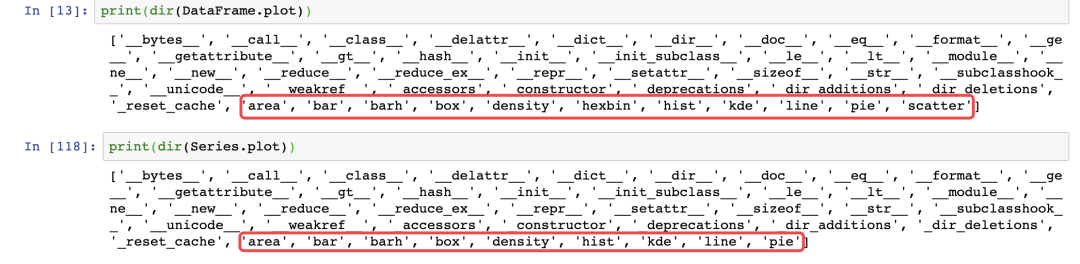
pandas.DataFrame.plot
pandas.Series.plot
import matplotlib.pyplot as plt
import numpy as np
import pandas as pd
from pandas import DataFrame,Series
plt.style.use('dark_background')#設置繪圖風格np.random.seed(0)#使得每次生成的隨機數(shù)相同
ts = pd.Series(np.random.randn(1000), index=pd.date_range("1/1/2000", periods=1000))
ts1 = ts.cumsum()#累加
ts1.plot(kind="line")#默認繪制折線圖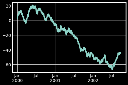
np.random.seed(0)
df = pd.DataFrame(np.random.randn(1000, 4), index=ts.index, columns=list("ABCD"))
df = df.cumsum()
df.plot()#默認繪制折線圖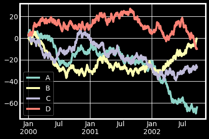
df.iloc[5].plot(kind="bar")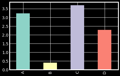
df2 = pd.DataFrame(np.random.rand(10, 4), columns=["a", "b", "c", "d"])
df2.plot.bar()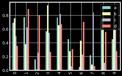
05 堆積條形圖
df2.plot.bar(stacked=True)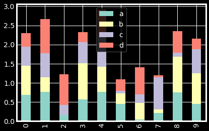
06 水平堆積條形圖
df2.plot.barh(stacked=True)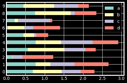
07 直方圖
df4 = pd.DataFrame(
    {
        "a": np.random.randn(1000) + 1,
        "b": np.random.randn(1000),
        "c": np.random.randn(1000) - 1,
    },
    columns=["a", "b", "c"],
)
df4.plot.hist(alpha=0.8)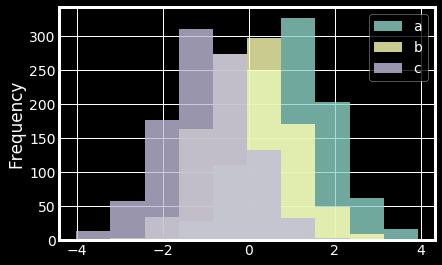
08 分面直方圖
df.diff().hist(color="r", alpha=0.9, bins=50)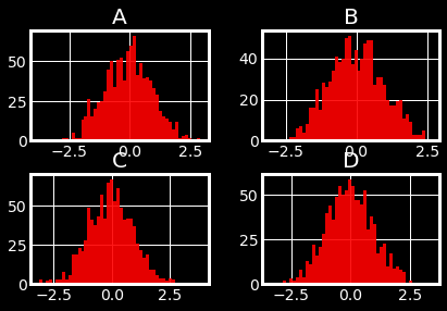
09 箱圖
df = pd.DataFrame(np.random.rand(10, 5), columns=["A", "B", "C", "D", "E"])
df.plot.box()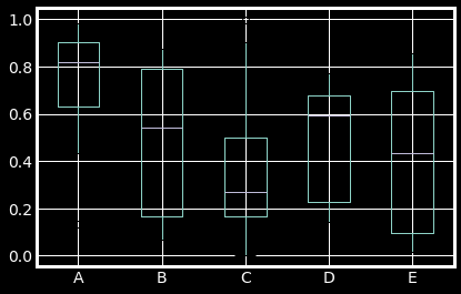
10 面積圖
df = pd.DataFrame(np.random.rand(10, 4), columns=["a", "b", "c", "d"])
df.plot.area()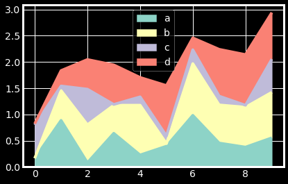
11 堆積面積圖
df.plot.area(stacked=False)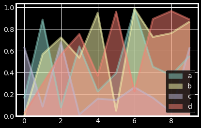
12 散點圖
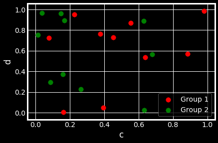
ax = df.plot.scatter(x="a", y="b", color="r", label="Group 1",s=90)
df.plot.scatter(x="c", y="d", color="g", label="Group 2", ax=ax,s=90)
13 單組餅圖
series = pd.Series(3 * np.random.rand(4), index=["a", "b", "c", "d"], name="series")
series.plot.pie(figsize=(6, 6))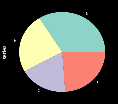
14 多組餅圖
df = pd.DataFrame(
    3 * np.random.rand(4, 2), index=["a", "b", "c", "d"], columns=["x", "y"]
)
df.plot.pie(subplots=True, figsize=(8, 4))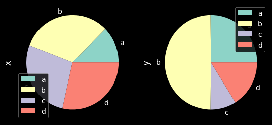
15 分面圖
import matplotlib as mpl
mpl.rc_file_defaults()
plt.style.use('fivethirtyeight')
from pandas.plotting import scatter_matrix
df = pd.DataFrame(np.random.randn(1000, 4), columns=["a", "b", "c", "d"])
scatter_matrix(df, alpha=0.2, figsize=(6, 6), diagonal="kde")
plt.show()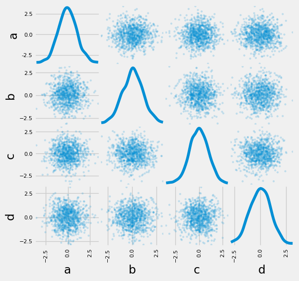
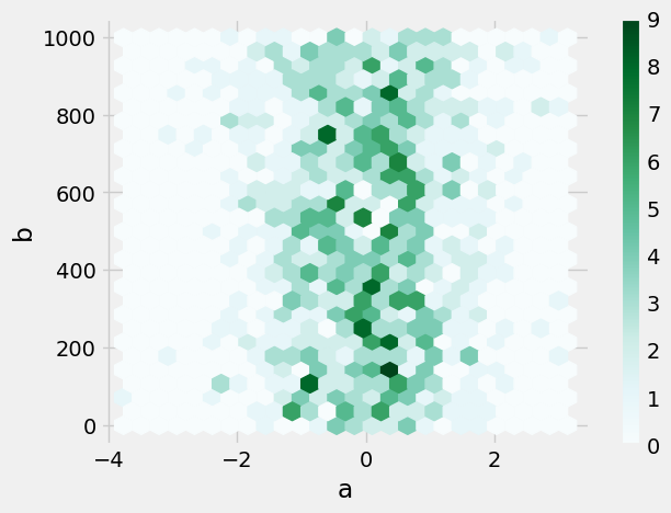
16 hexbin圖
df = pd.DataFrame(np.random.randn(1000, 2), columns=["a", "b"])
df["b"] = df["b"] + np.arange(1000)
df.plot.hexbin(x="a", y="b", gridsize=25)
17 andrews_curves圖
from pandas.plotting import andrews_curves
mpl.rc_file_defaults()
data = pd.read_csv("iris.data.txt")
plt.style.use('dark_background')
andrews_curves(data, "Name")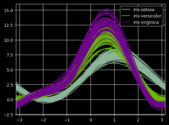
18 核密度圖
ser = pd.Series(np.random.randn(1000))
ser.plot.kde()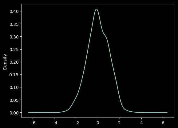
19 parallel_coordinates圖
from pandas.plotting import parallel_coordinates
data = pd.read_csv("iris.data.txt")
plt.figure()
parallel_coordinates(data, "Name")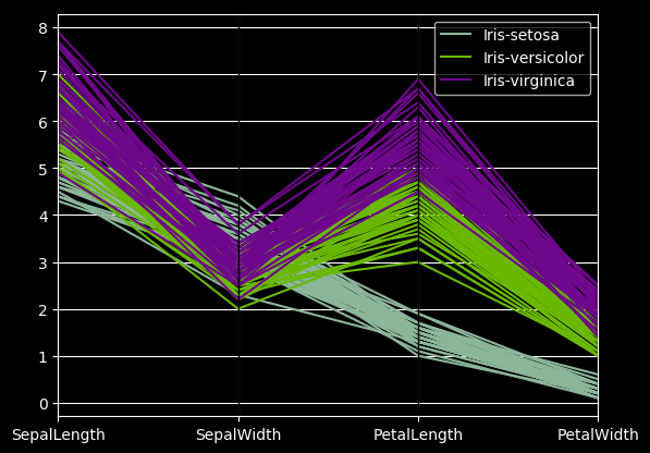
20 autocorrelation_plot圖
from pandas.plotting import autocorrelation_plot
plt.figure();
spacing = np.linspace(-9 * np.pi, 9 * np.pi, num=1000)
data = pd.Series(0.7 * np.random.rand(1000) + 0.3 * np.sin(spacing))
autocorrelation_plot(data)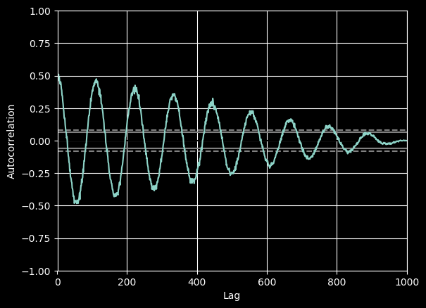
21 radviz圖
from pandas.plotting import radviz
data = pd.read_csv("iris.data.txt")
plt.figure()
radviz(data, "Name")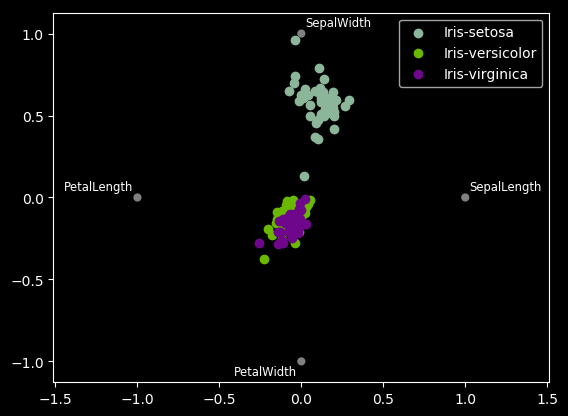
22 bootstrap_plot圖
from pandas.plotting import bootstrap_plot
data = pd.Series(np.random.rand(1000))
bootstrap_plot(data, size=50, samples=500, color="grey")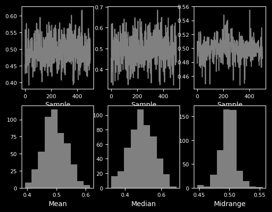
23 子圖(subplot)
df = pd.DataFrame(np.random.randn(1000, 4), index=ts.index, columns=list("ABCD"))
df.plot(subplots=True, figsize=(6, 6))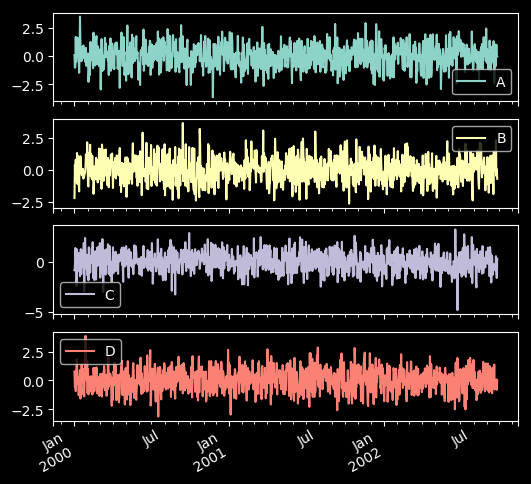
24 子圖任意排列
df.plot(subplots=True, layout=(2, 3), figsize=(6, 6), sharex=False)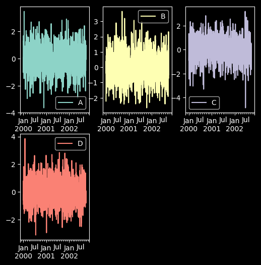
fig, axes = plt.subplots(4, 4, figsize=(9, 9))
plt.subplots_adjust(wspace=0.5, hspace=0.5)
target1 = [axes[0][0], axes[1][1], axes[2][2], axes[3][3]]
target2 = [axes[3][0], axes[2][1], axes[1][2], axes[0][3]]
df.plot(subplots=True, ax=target1, legend=False, sharex=False, sharey=False);
(-df).plot(subplots=True, ax=target2, legend=False, sharex=False, sharey=False)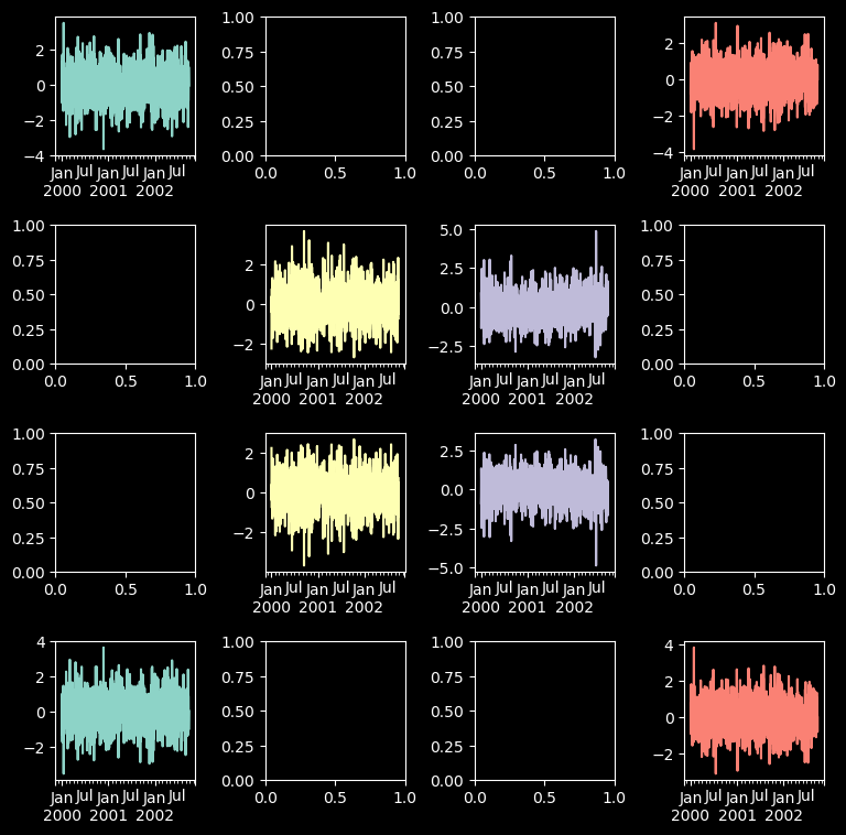
25 圖中繪制數(shù)據(jù)表格
from pandas.plotting import table
mpl.rc_file_defaults()
#plt.style.use('dark_background')
fig, ax = plt.subplots(1, 1)
table(ax, np.round(df.describe(), 2), loc="upper right", colWidths=[0.2, 0.2, 0.2]);
df.plot(ax=ax, ylim=(0, 2), legend=None);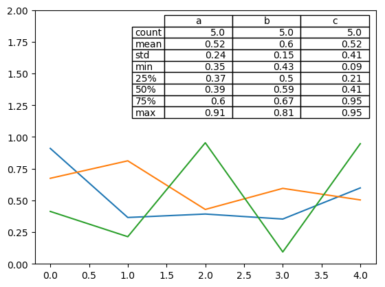


評論
圖片
表情