
沒想到,Python能幾行代碼制作Web可視化頁面!
一談到Web頁面,可能大家首先想到就是HTML,CSS或JavaScript。
本次小F就給大家介紹一下如何用Python制作一個數(shù)據(jù)可視化網(wǎng)頁,使用到的是Streamlit庫。
輕松的將一個Excel數(shù)據(jù)文件轉(zhuǎn)換為一個Web頁面,提供給所有人在線查看。
每當你對Excel文件進行更改保存,Web頁面還能夠?qū)崟r進行更新,確實挺不錯的。
Streamlit的文檔和教程地址如下。
https://docs.streamlit.io/en/stable/
https://streamlit.io/gallery
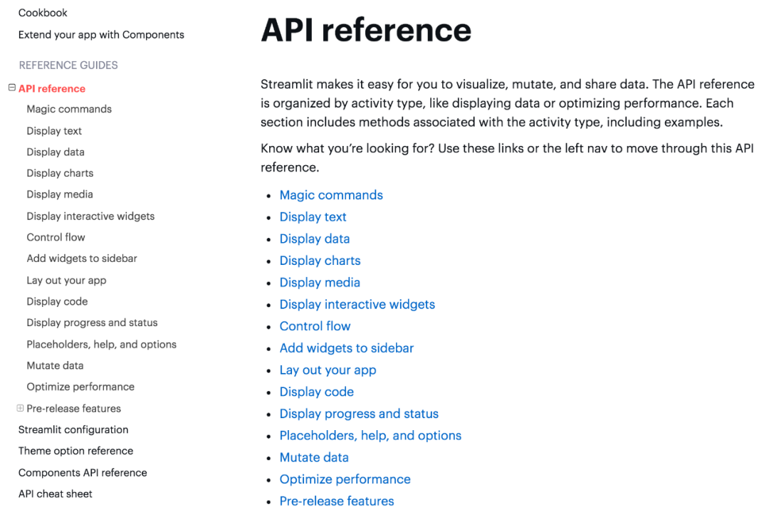
相關(guān)的API使用可以去文檔中查看,都有詳細的解釋。
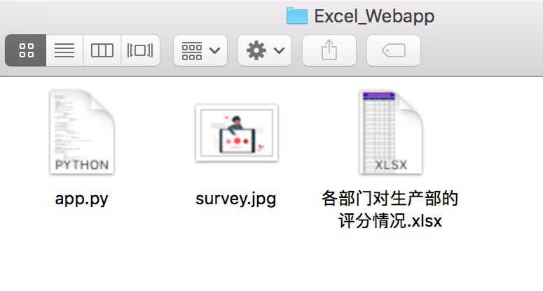
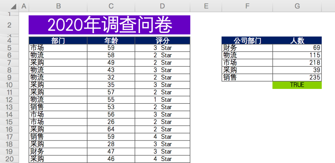
項目一共有三個文件,程序、圖片、Excel表格數(shù)據(jù)。
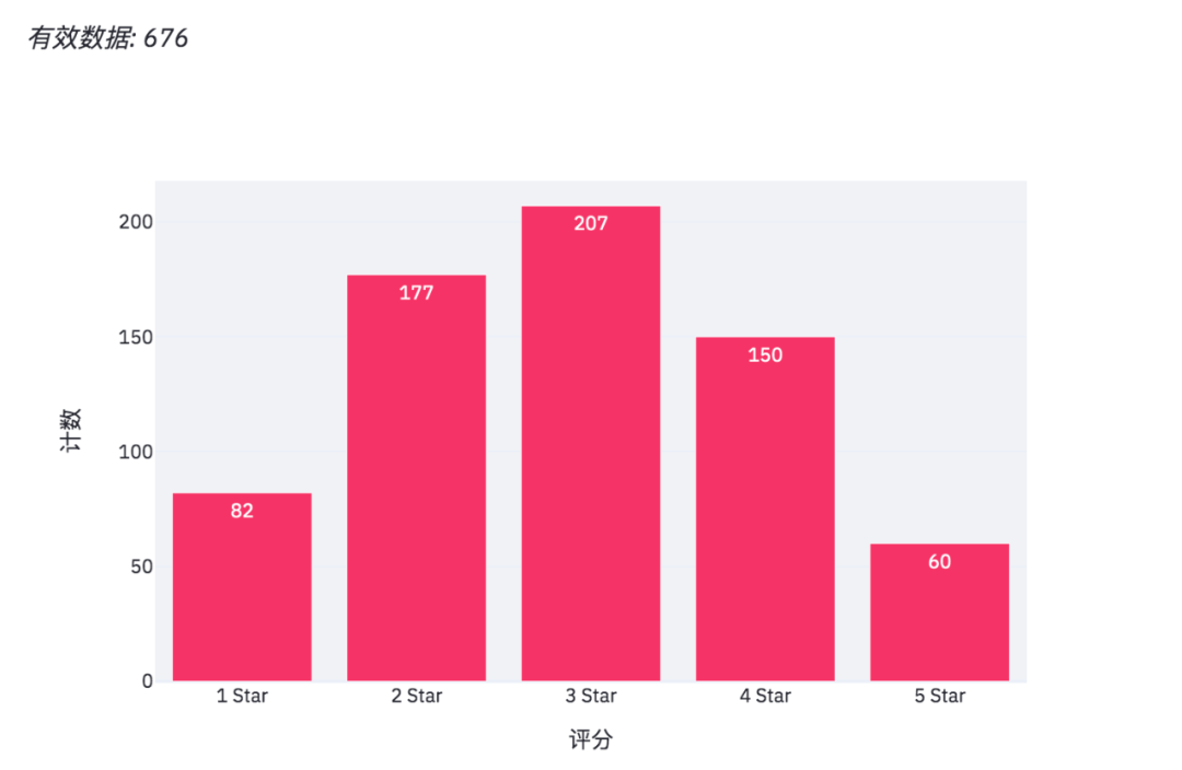
數(shù)據(jù)情況如下,某公司年底問卷調(diào)查(虛構(gòu)數(shù)據(jù)),各相關(guān)部門對生產(chǎn)部門在工作協(xié)作上的打分情況。
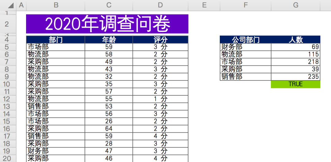
有效數(shù)據(jù)總計約676條,匿名問卷,包含問卷填寫人所屬部門,年齡,評分。
最后對各部門參與人數(shù)進行匯總計數(shù)(右側(cè)數(shù)據(jù))。
首先來安裝一下相關(guān)的Python庫,使用百度源。
# 安裝streamlit
pip install streamlit -i https://mirror.baidu.com/pypi/simple/

# 安裝Plotly Express
pip install plotly_express==0.4.0 -i https://mirror.baidu.com/pypi/simple/

# 安裝xlrd
pip install xlrd==1.2.0 -i https://mirror.baidu.com/pypi/simple/
因為我們的數(shù)據(jù)文件是xlsx格式,最新版的xlrd,只支持xls文件。
所以需要指定xlrd版本為1.2.0,這樣pandas才能成功讀取數(shù)據(jù)。
命令行終端啟動網(wǎng)頁。
# 命令行終端打開文件所在路徑
cd Excel_Webapp

# 運行網(wǎng)頁
streamlit run app.py
成功以后會有提示,并且瀏覽器會自動彈出網(wǎng)頁。

如果沒有自動彈出,可以直接訪問上圖中的地址。
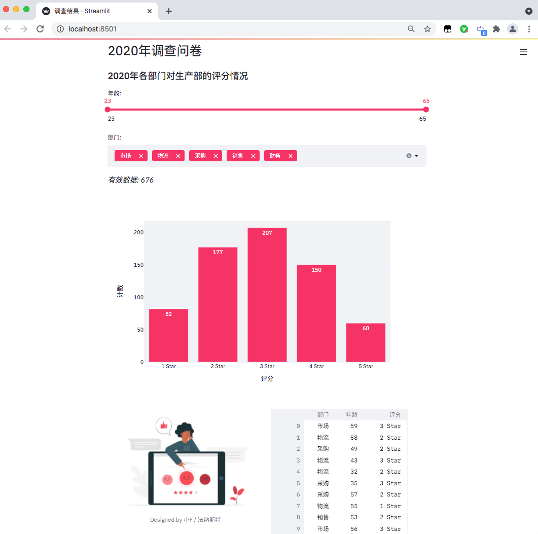
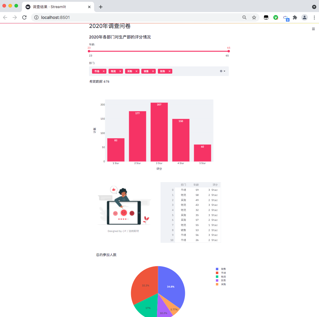
得到結(jié)果如下,一個數(shù)據(jù)可視化網(wǎng)頁出來了。
目前只能在本地訪問查看,如果你想放在網(wǎng)上,可以通過服務(wù)器部署,需要自行去研究~
下面我們來看看具體的代碼吧。
import pandas as pd
import streamlit as st
import plotly.express as px
from PIL import Image
# 設(shè)置網(wǎng)頁名稱
st.set_page_config(page_title='調(diào)查結(jié)果')
# 設(shè)置網(wǎng)頁標題
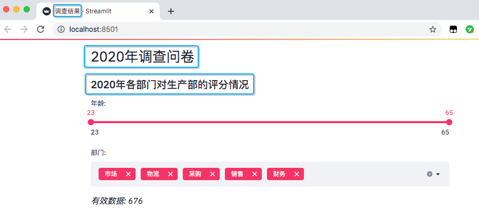
st.header('2020年調(diào)查問卷')
# 設(shè)置網(wǎng)頁子標題
st.subheader('2020年各部門對生產(chǎn)部的評分情況')
導入相關(guān)的Python包,pandas處理數(shù)據(jù),streamlit用來生成網(wǎng)頁,plotly.express則是生成圖表,PIL讀取圖片。
設(shè)置了網(wǎng)頁名稱,以及網(wǎng)頁里的標題和子標題。
# 讀取數(shù)據(jù)
excel_file = '各部門對生產(chǎn)部的評分情況.xlsx'
sheet_name = 'DATA'

df = pd.read_excel(excel_file,
                   sheet_name=sheet_name,
                   usecols='B:D',
                   header=3)

# 此處為各部門參加問卷調(diào)查人數(shù)
df_participants = pd.read_excel(excel_file,
                                sheet_name=sheet_name,
                                usecols='F:G',
                                header=3)
df_participants.dropna(inplace=True)

# streamlit的多重選擇(選項數(shù)據(jù))
department = df['部門'].unique().tolist()
# streamlit的滑動條(年齡數(shù)據(jù))
ages = df['年齡'].unique().tolist()
讀取Excel表格數(shù)據(jù),并且得出年齡分布以及部門情況,一共是有5個部門。
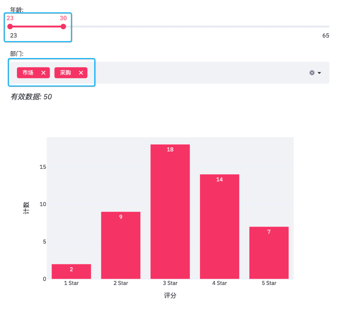
添加滑動條和多重選擇的數(shù)據(jù)選項。
# 滑動條, 最大值、最小值、區(qū)間值
age_selection = st.slider('年齡:',
                          min_value=min(ages),
                          max_value=max(ages),
                          value=(min(ages), max(ages)))

# 多重選擇, 默認全選
department_selection = st.multiselect('部門:',
                                      department,
                                      default=department)
結(jié)果如下。
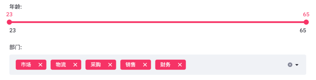
年齡是從23至65,部門則是市場、物流、采購、銷售、財務(wù)這幾個。
由于滑動條和多重選擇是可變的,需要根據(jù)過濾條件得出最終數(shù)據(jù)。
# 根據(jù)選擇過濾數(shù)據(jù)
mask = (df['年齡'].between(*age_selection)) & (df['部門'].isin(department_selection))
number_of_result = df[mask].shape[0]

# 根據(jù)篩選條件, 得到有效數(shù)據(jù)
st.markdown(f'*有效數(shù)據(jù): {number_of_result}*')

# 根據(jù)選擇分組數(shù)據(jù)
df_grouped = df[mask].groupby(by=['評分']).count()[['年齡']]
df_grouped = df_grouped.rename(columns={'年齡': '計數(shù)'})
df_grouped = df_grouped.reset_index()
得到數(shù)據(jù)便可以繪制柱狀圖了。
# 繪制柱狀圖, 配置相關(guān)參數(shù)
bar_chart = px.bar(df_grouped,
                   x='評分',
                   y='計數(shù)',
                   text='計數(shù)',
                   color_discrete_sequence=['#F63366']*len(df_grouped),
                   template='plotly_white')
st.plotly_chart(bar_chart)
使用plotly繪制柱狀圖。
當我們在網(wǎng)頁調(diào)整選項時,有效數(shù)據(jù)和柱狀圖也會隨之變化。
此外streamlit還可以給網(wǎng)頁添加圖片和交互式表格。
# 添加圖片和交互式表格
col1, col2 = st.beta_columns(2)
image = Image.open('survey.jpg')
col1.image(image,
           caption='Designed by 小F / 法納斯特',
           use_column_width=True)
col2.dataframe(df[mask], width=300)
得到結(jié)果如下。

可以看到表格有一個滑動條,可以使用鼠標滾輪滾動查看。
最后便是繪制一個餅圖啦!
# 繪制餅圖
pie_chart = px.pie(df_participants,
                   title='總的參加人數(shù)',
                   values='人數(shù)',
                   names='公司部門')
st.plotly_chart(pie_chart)
結(jié)果如下。
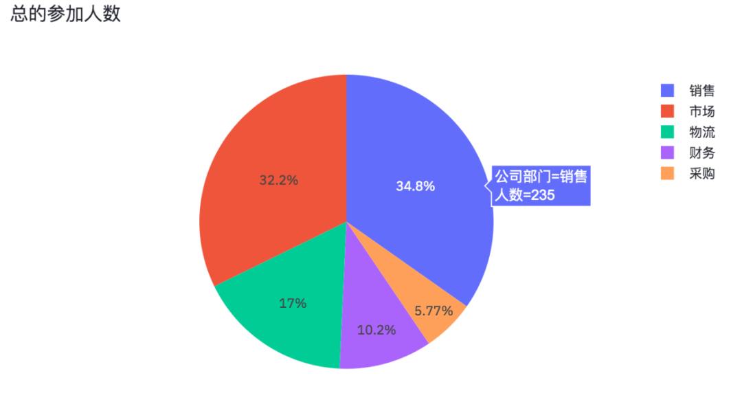
各部門參加問卷調(diào)查的人數(shù),也是一個可以交互的圖表。
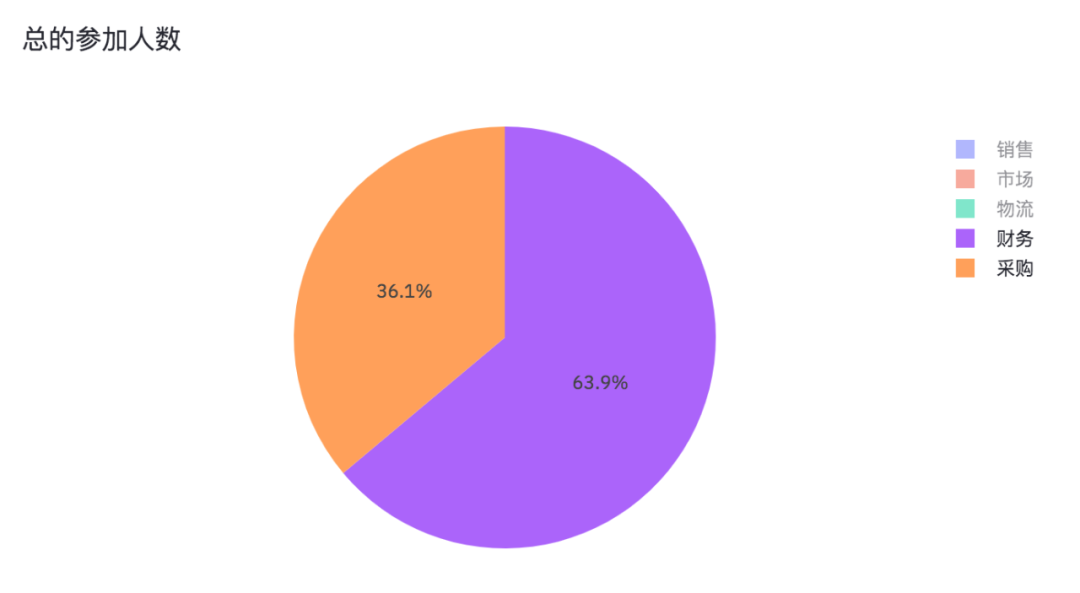
將銷售、市場、物流取消掉,我們就能看出財務(wù)和采購參加問卷調(diào)查的人數(shù)占比情況。
好了,本期的分享就到此結(jié)束了,有興趣的小伙伴可以自行去實踐學習。

加入知識星球【我們談?wù)摂?shù)據(jù)科學】
SQL打卡進行中,限時優(yōu)惠20元
500+小伙伴一起學習!
· 推薦閱讀 ·
在windows和linux上高效快捷地發(fā)布Dash應(yīng)用