
推薦一個超強的 Python 數(shù)據(jù)可視化動畫庫
今天給大家介紹一個非常棒的數(shù)據(jù)可視化庫,sjvisualizer
根據(jù)時間序列數(shù)據(jù)制作動態(tài)圖表,包含條形圖、餅圖、堆疊條形圖、折線圖、堆疊面積圖。
可以先看一下官方的示例~
只需幾行代碼,就可以制作電腦瀏覽器發(fā)展史的動態(tài)圖表。
GitHub地址:
https://github.com/SjoerdTilmans/sjvisualizer
使用pip進行該庫的安裝。
# 安裝sjvisualizer
pip install sjvisualizer
然后需要加載特定格式的數(shù)據(jù),下面是一個數(shù)據(jù)示例。
其中第一列中包含日期,隨后的每個列標題都是數(shù)據(jù)類別,下面包含每個日期的值。
此外還可以進行一些自定義配置,比如添加圖標、添加自定義顏色以及調(diào)整可視化的大小。
大家可以查看相應(yīng)的文檔。
https://www.sjdataviz.com/software
作者還提供了不少其它案例,并且提供了數(shù)據(jù)源。

同樣可以訪問如下地址,進行查看。
https://www.sjdataviz.com/data
下面就來看一下官方提供的幾個示例代碼吧~
最受關(guān)注的Instagram賬號。
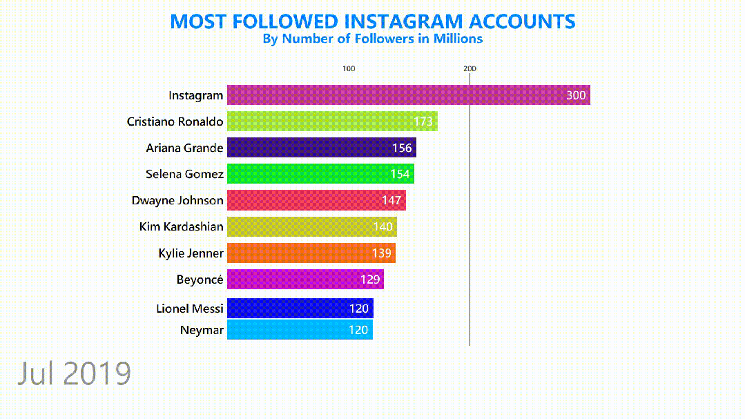
數(shù)據(jù)集情況如下。
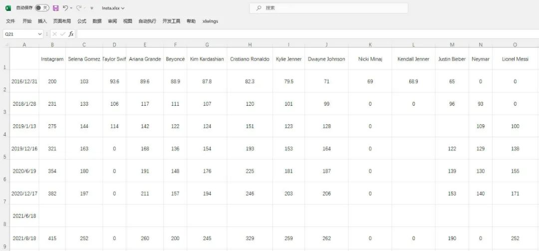
發(fā)現(xiàn)數(shù)據(jù)有部分缺失,說明程序會進行補全操作。
具體代碼如下。
from sjvisualizer import Canvas
from sjvisualizer import DataHandler
from sjvisualizer import BarRace
import json


def main(fps=60, duration=0.35):
    number_of_frames = duration * 60 * fps

    # 加載顏色配置文件
    with open('colors/colors.json') as f:
        colors = json.load(f)

    # 加載數(shù)據(jù)源
    df = DataHandler.DataHandler(excel_file="data/Insta.xlsx", number_of_frames=number_of_frames).df

    canvas = Canvas.canvas()

    # 添加條形圖圖表
    bar_chart = BarRace.bar_race(canvas=canvas.canvas, df=df, colors=colors)
    canvas.add_sub_plot(bar_chart)

    # 添加靜態(tài)文字
    canvas.add_title("MOST FOLLOWED INSTAGRAM ACCOUNTS", color=(0, 132, 255))
    canvas.add_sub_title("By Number of Followers in Millions", color=(0, 132, 255))

    # 時間設(shè)置
    canvas.add_time(df=df, time_indicator="month")

    # 保存顏色配置文件
    with open("colors/colors.json", "w") as file:
        json.dump(colors, file, indent=4)

    # 輸出視頻文件
    canvas.play(fps=fps, record=True, file_name="output1.mp4")


if __name__ == "__main__":
    main()
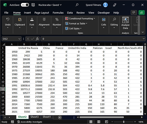
桌面操作系統(tǒng)市場份額。
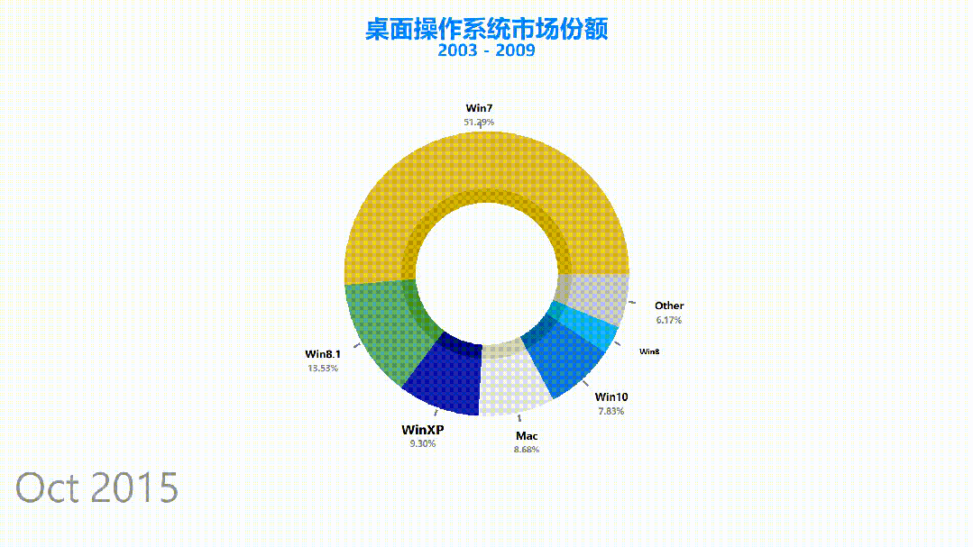
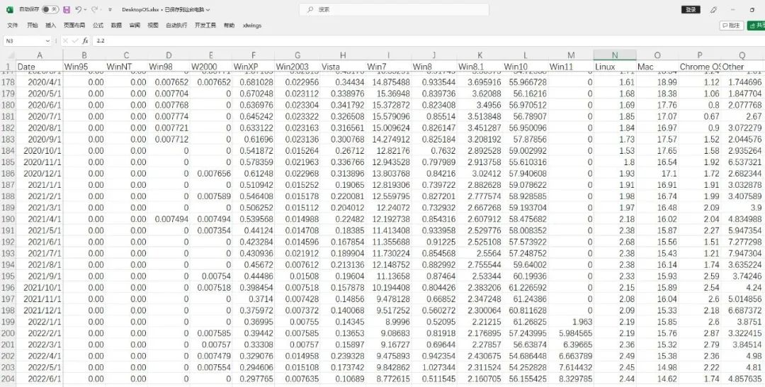
數(shù)據(jù)集情況如下,一共有200多條。
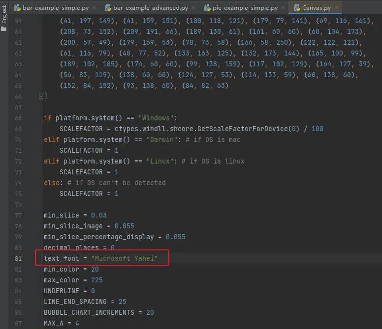
其中本次設(shè)置了中文字體,可以在代碼中進行修改。
餅圖動態(tài)圖表代碼如下。
from sjvisualizer import Canvas
from sjvisualizer import DataHandler
from sjvisualizer import PieRace
import json


def main(fps=60, duration=0.35):
    number_of_frames = duration * 60 * fps

    # 加載顏色配置文件
    with open('colors/colors.json') as f:
        colors = json.load(f)

    df = DataHandler.DataHandler(excel_file="data/DesktopOS.xlsx", number_of_frames=number_of_frames).df

    canvas = Canvas.canvas()

    # 添加餅圖圖表
    bar_chart = PieRace.pie_plot(canvas=canvas.canvas, df=df, colors=colors)
    canvas.add_sub_plot(bar_chart)

    # 加載靜態(tài)文字
    canvas.add_title("桌面操作系統(tǒng)市場份額", color=(0, 132, 255))
    canvas.add_sub_title("2003 - 2009", color=(0, 132, 255))

    # 時間設(shè)置
    canvas.add_time(df=df, time_indicator="month")

    # 保存顏色配置文件
    with open("colors/colors.json", "w") as file:
        json.dump(colors, file, indent=4)

    canvas.play(fps=fps, record=True, file_name="output3.mp4")


if __name__ == "__main__":
    main()
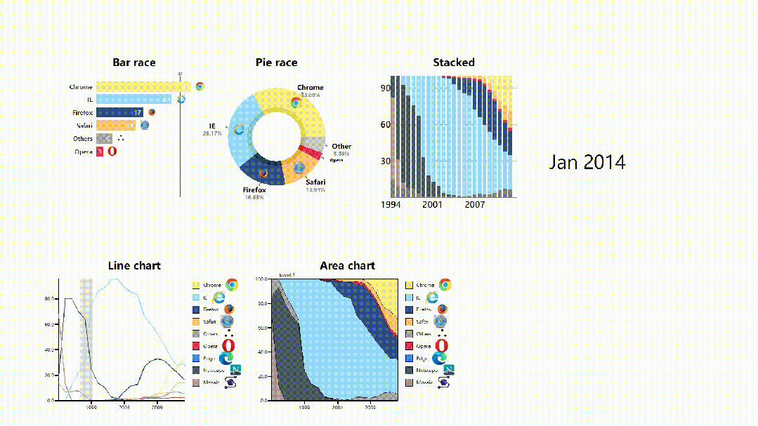
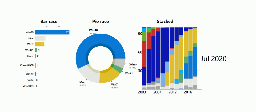
電腦瀏覽器發(fā)展史動態(tài)圖表。
可以發(fā)現(xiàn)每個圖表都帶有瀏覽器的logo。
如果你想要添加自定義的圖像logo,是不需要進行任何編碼!
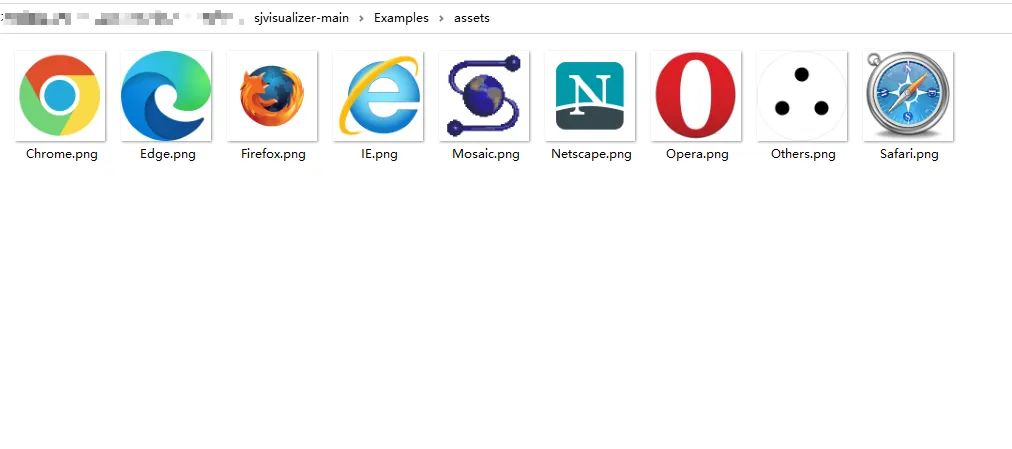
只需將圖像文件 (.png) 放入assets文件夾中,只要它與我們的數(shù)據(jù)類別具有相同的名稱,程序就會自動選擇。
合成圖動態(tài)圖表代碼如下。
from sjvisualizer import Canvas
from sjvisualizer import DataHandler
from sjvisualizer import BarRace
from sjvisualizer import PieRace
from sjvisualizer import Date
from sjvisualizer import StackedBarChart
from sjvisualizer import LineChart
from sjvisualizer import AreaChart
import json


def main(fps=60, duration=0.35):
    number_of_frames = duration * 60 * fps

    # 加載顏色配置文件
    with open('colors/colors.json') as f:
        colors = json.load(f)

    df = DataHandler.DataHandler(excel_file="data/browsers.xlsx", number_of_frames=number_of_frames).df

    canvas = Canvas.canvas()

    width = int(canvas.canvas["width"])
    height = int(canvas.canvas["height"])

    chart_height = int(height / 3.5)

    # 條形圖
    bar_chart = BarRace.bar_race(canvas=canvas.canvas, df=df, title="Bar race", colors=colors, height=chart_height,
                                 width=int(width / 6), x_pos=int(height / 3 / 2), y_pos=int(width / 5) / 2)
    canvas.add_sub_plot(bar_chart)

    # 餅圖
    pie_plot = PieRace.pie_plot(canvas=canvas.canvas, df=df, title="Pie race", colors=colors, height=chart_height,
                                width=int(width / 6), x_pos=int(height / 3 / 2 * 3), y_pos=int(width / 5) / 2)
    canvas.add_sub_plot(pie_plot)

    # 堆疊圖
    stacked = StackedBarChart.stacked_bar_chart(canvas=canvas.canvas, df=df, title="Stacked", colors=colors,
                                                height=chart_height,
                                                width=int(width / 6), x_pos=int(height / 3 / 2 * 5.5),
                                                y_pos=int(width / 5) / 2, number_of_bars=25)
    canvas.add_sub_plot(stacked)

    # 折線圖時間線
    events = {
        "Event 1": ["28/01/1998", "28/01/2000"],
        "Event 2": ["28/01/2018", "28/01/2019"]
    }

    # 折線圖
    line = LineChart.line_chart(canvas=canvas, df=df, title="Line chart", colors=colors, height=chart_height,
                                width=int(width / 6), x_pos=int(height / 3 / 2),
                                y_pos=int(width / 5) + 1.05 * chart_height, events=events)
    canvas.add_sub_plot(line)

    # 面積圖
    area = AreaChart.area_chart(canvas=canvas, df=df, title="Area chart", colors=colors, height=chart_height,
                                width=int(width / 6), x_pos=int(height / 3 * 2),
                                y_pos=int(width / 5) + 1.05 * chart_height)
    canvas.add_sub_plot(area)

    # 時間設(shè)置
    date = Date.date(canvas=canvas.canvas, height=int(height / 20),
                     width=int(width / 20), x_pos=int(height / 3 / 2 * 8), y_pos=int(width / 5), time_indicator="month",
                     df=df)
    canvas.add_sub_plot(date)

    # 保存顏色配置文件
    with open("colors/colors.json", "w") as file:
        json.dump(colors, file, indent=4)

    canvas.play(fps=fps, record=True, file_name="output2.mp4")


if __name__ == "__main__":
    main()
相信不少小伙伴,對自己做的靜態(tài)圖表平平無奇而煩惱。
那么試試動態(tài)圖表,應(yīng)該是個不錯的選擇。
不僅有新意,而且還直觀+美觀。
不過市面上不少工具都需要收費使用,如果你的預(yù)算不夠,那么Python動態(tài)數(shù)據(jù)可視化庫,倒是一個不錯的選擇,免費~
··· END ···