
分享一個(gè)Python數(shù)據(jù)可視化動(dòng)畫庫(kù)
入門教程、案例源碼、學(xué)習(xí)資料、讀者群
請(qǐng)?jiān)L問(wèn): python666.cn
大家好,歡迎來(lái)到 Crossin的編程教室 !
今天給大家介紹一個(gè)非常棒的數(shù)據(jù)可視化庫(kù),sjvisualizer。
根據(jù)時(shí)間序列數(shù)據(jù)制作動(dòng)態(tài)圖表,包含條形圖、餅圖、堆疊條形圖、折線圖、堆疊面積圖。
可以先看一下官方的示例~
只需幾行代碼,就可以制作電腦瀏覽器發(fā)展史的動(dòng)態(tài)圖表。
GitHub地址:
https://github.com/SjoerdTilmans/sjvisualizer
使用pip進(jìn)行該庫(kù)的安裝。
# 安裝sjvisualizer
pip install sjvisualizer
然后需要加載特定格式的數(shù)據(jù),下面是一個(gè)數(shù)據(jù)示例。
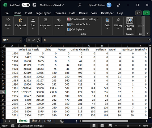
其中第一列中包含日期,隨后的每個(gè)列標(biāo)題都是數(shù)據(jù)類別,下面包含每個(gè)日期的值。
此外還可以進(jìn)行一些自定義配置,比如添加圖標(biāo)、添加自定義顏色以及調(diào)整可視化的大小。
大家可以查看相應(yīng)的文檔。
https://www.sjdataviz.com/software
作者還提供了不少其它案例,并且提供了數(shù)據(jù)源。
同樣可以訪問(wèn)如下地址,進(jìn)行查看。
https://www.sjdataviz.com/data
下面就來(lái)看一下官方提供的幾個(gè)示例代碼吧~
最受關(guān)注的Instagram賬號(hào)。
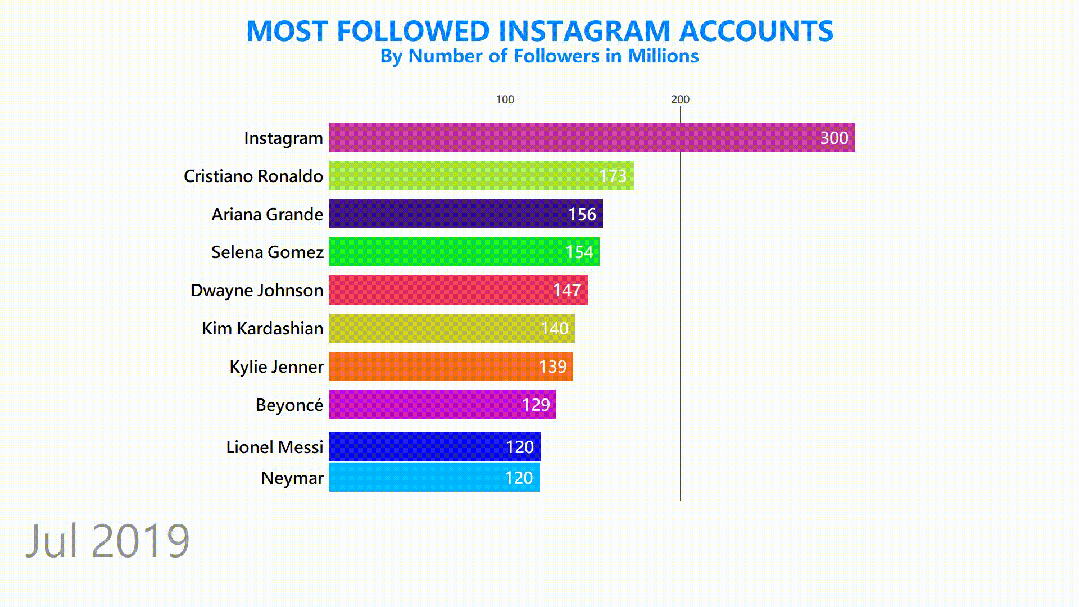
數(shù)據(jù)集情況如下。
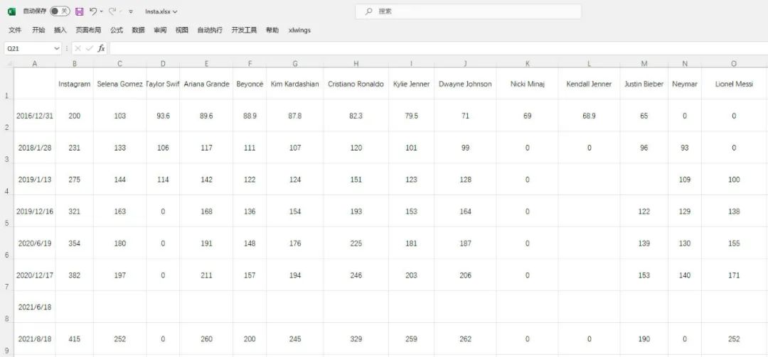
發(fā)現(xiàn)數(shù)據(jù)有部分缺失,說(shuō)明程序會(huì)進(jìn)行補(bǔ)全操作。
具體代碼如下。
from sjvisualizer import Canvas
from sjvisualizer import DataHandler
from sjvisualizer import BarRace
import json


def main(fps=60, duration=0.35):
    number_of_frames = duration * 60 * fps

    # 加載顏色配置文件
    with open('colors/colors.json') as f:
        colors = json.load(f)

    # 加載數(shù)據(jù)源
    df = DataHandler.DataHandler(excel_file="data/Insta.xlsx", number_of_frames=number_of_frames).df

    canvas = Canvas.canvas()

    # 添加條形圖圖表
    bar_chart = BarRace.bar_race(canvas=canvas.canvas, df=df, colors=colors)
    canvas.add_sub_plot(bar_chart)

    # 添加靜態(tài)文字
    canvas.add_title("MOST FOLLOWED INSTAGRAM ACCOUNTS", color=(0, 132, 255))
    canvas.add_sub_title("By Number of Followers in Millions", color=(0, 132, 255))

    # 時(shí)間設(shè)置
    canvas.add_time(df=df, time_indicator="month")

    # 保存顏色配置文件
    with open("colors/colors.json", "w") as file:
        json.dump(colors, file, indent=4)

    # 輸出視頻文件
    canvas.play(fps=fps, record=True, file_name="output1.mp4")


if __name__ == "__main__":
    main()
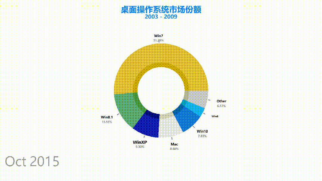
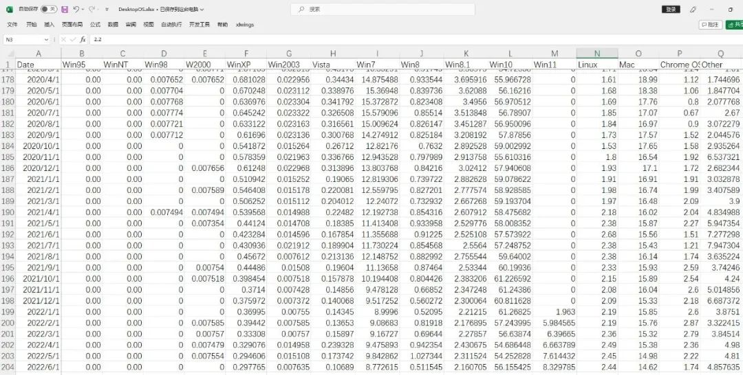
桌面操作系統(tǒng)市場(chǎng)份額。
數(shù)據(jù)集情況如下,一共有200多條。
其中本次設(shè)置了中文字體,可以在代碼中進(jìn)行修改。
餅圖動(dòng)態(tài)圖表代碼如下。
from sjvisualizer import Canvas
from sjvisualizer import DataHandler
from sjvisualizer import PieRace
import json


def main(fps=60, duration=0.35):
    number_of_frames = duration * 60 * fps

    # 加載顏色配置文件
    with open('colors/colors.json') as f:
        colors = json.load(f)

    df = DataHandler.DataHandler(excel_file="data/DesktopOS.xlsx", number_of_frames=number_of_frames).df

    canvas = Canvas.canvas()

    # 添加餅圖圖表
    bar_chart = PieRace.pie_plot(canvas=canvas.canvas, df=df, colors=colors)
    canvas.add_sub_plot(bar_chart)

    # 加載靜態(tài)文字
    canvas.add_title("桌面操作系統(tǒng)市場(chǎng)份額", color=(0, 132, 255))
    canvas.add_sub_title("2003 - 2009", color=(0, 132, 255))

    # 時(shí)間設(shè)置
    canvas.add_time(df=df, time_indicator="month")

    # 保存顏色配置文件
    with open("colors/colors.json", "w") as file:
        json.dump(colors, file, indent=4)

    canvas.play(fps=fps, record=True, file_name="output3.mp4")


if __name__ == "__main__":
    main()
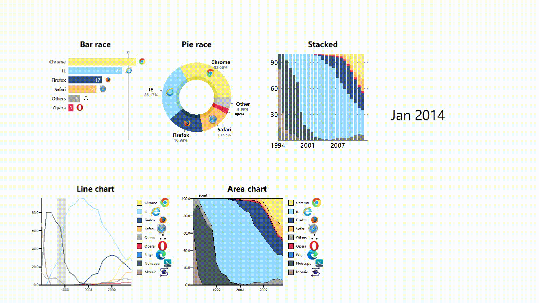
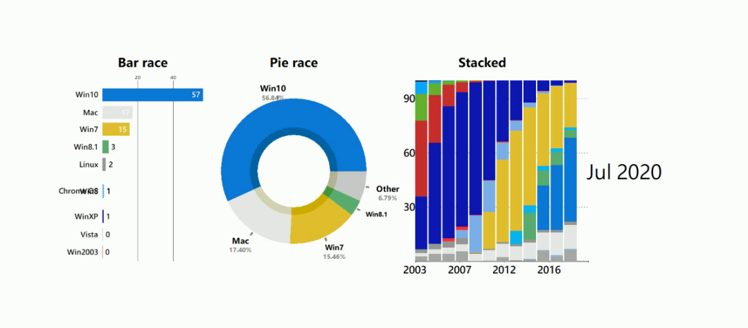
電腦瀏覽器發(fā)展史動(dòng)態(tài)圖表。
可以發(fā)現(xiàn)每個(gè)圖表都帶有瀏覽器的logo。
如果你想要添加自定義的圖像logo,是不需要進(jìn)行任何編碼!
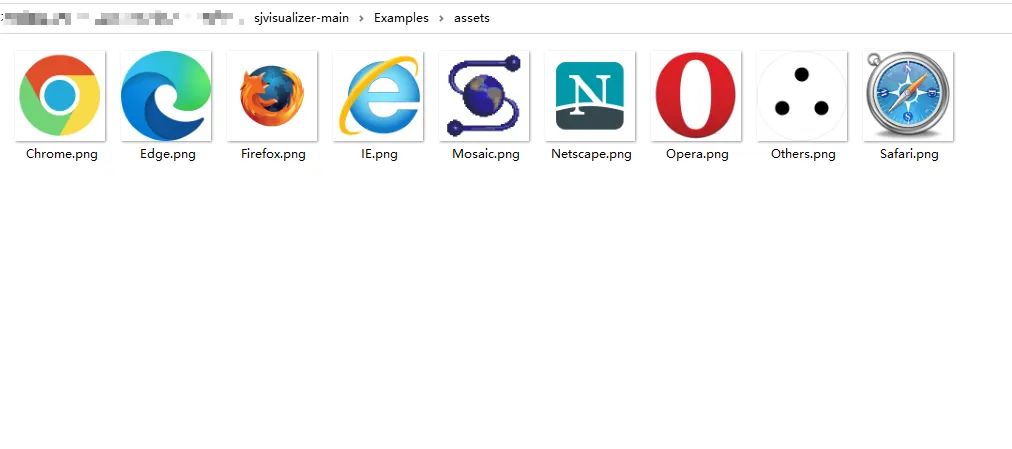
只需將圖像文件 (.png) 放入assets文件夾中,只要它與我們的數(shù)據(jù)類別具有相同的名稱,程序就會(huì)自動(dòng)選擇。
合成圖動(dòng)態(tài)圖表代碼如下。
from sjvisualizer import Canvas
from sjvisualizer import DataHandler
from sjvisualizer import BarRace
from sjvisualizer import PieRace
from sjvisualizer import Date
from sjvisualizer import StackedBarChart
from sjvisualizer import LineChart
from sjvisualizer import AreaChart
import json


def main(fps=60, duration=0.35):
    number_of_frames = duration * 60 * fps

    # 加載顏色配置文件
    with open('colors/colors.json') as f:
        colors = json.load(f)

    df = DataHandler.DataHandler(excel_file="data/browsers.xlsx", number_of_frames=number_of_frames).df

    canvas = Canvas.canvas()

    width = int(canvas.canvas["width"])
    height = int(canvas.canvas["height"])

    chart_height = int(height / 3.5)

    # 條形圖
    bar_chart = BarRace.bar_race(canvas=canvas.canvas, df=df, title="Bar race", colors=colors, height=chart_height,
                                 width=int(width / 6), x_pos=int(height / 3 / 2), y_pos=int(width / 5) / 2)
    canvas.add_sub_plot(bar_chart)

    # 餅圖
    pie_plot = PieRace.pie_plot(canvas=canvas.canvas, df=df, title="Pie race", colors=colors, height=chart_height,
                                width=int(width / 6), x_pos=int(height / 3 / 2 * 3), y_pos=int(width / 5) / 2)
    canvas.add_sub_plot(pie_plot)

    # 堆疊圖
    stacked = StackedBarChart.stacked_bar_chart(canvas=canvas.canvas, df=df, title="Stacked", colors=colors,
                                                height=chart_height,
                                                width=int(width / 6), x_pos=int(height / 3 / 2 * 5.5),
                                                y_pos=int(width / 5) / 2, number_of_bars=25)
    canvas.add_sub_plot(stacked)

    # 折線圖時(shí)間線
    events = {
        "Event 1": ["28/01/1998", "28/01/2000"],
        "Event 2": ["28/01/2018", "28/01/2019"]
    }

    # 折線圖
    line = LineChart.line_chart(canvas=canvas, df=df, title="Line chart", colors=colors, height=chart_height,
                                width=int(width / 6), x_pos=int(height / 3 / 2),
                                y_pos=int(width / 5) + 1.05 * chart_height, events=events)
    canvas.add_sub_plot(line)

    # 面積圖
    area = AreaChart.area_chart(canvas=canvas, df=df, title="Area chart", colors=colors, height=chart_height,
                                width=int(width / 6), x_pos=int(height / 3 * 2),
                                y_pos=int(width / 5) + 1.05 * chart_height)
    canvas.add_sub_plot(area)

    # 時(shí)間設(shè)置
    date = Date.date(canvas=canvas.canvas, height=int(height / 20),
                     width=int(width / 20), x_pos=int(height / 3 / 2 * 8), y_pos=int(width / 5), time_indicator="month",
                     df=df)
    canvas.add_sub_plot(date)

    # 保存顏色配置文件
    with open("colors/colors.json", "w") as file:
        json.dump(colors, file, indent=4)

    canvas.play(fps=fps, record=True, file_name="output2.mp4")


if __name__ == "__main__":
    main()
相信不少小伙伴,對(duì)自己做的靜態(tài)圖表平平無(wú)奇而煩惱。
那么試試動(dòng)態(tài)圖表,應(yīng)該是個(gè)不錯(cuò)的選擇。
不僅有新意,而且還直觀+美觀。
不過(guò)市面上不少工具都需要收費(fèi)使用,如果你的預(yù)算不夠,那么Python動(dòng)態(tài)數(shù)據(jù)可視化庫(kù),倒是一個(gè)不錯(cuò)的選擇,免費(fèi)~
作者:小F

本書從 Python 和 Excel 結(jié)合使用的角度講解處理分析數(shù)據(jù)的思路、方法與實(shí)戰(zhàn)應(yīng)用。不論是希望從事數(shù)據(jù)分析崗位的學(xué)習(xí)者,還是其他職業(yè)的辦公人員,都可以通過(guò)本書的學(xué)習(xí)掌握 Python 分析數(shù)據(jù)的技能。書中創(chuàng)新性地將 ChatGPT 引入到教學(xué)當(dāng)中,用 ChatGPT 答疑并提供實(shí)訓(xùn)代碼,并介紹了使用 ChatGPT 輔助學(xué)習(xí)的一些實(shí)用技巧,給學(xué)習(xí)者帶來(lái)全新的學(xué)習(xí)方式。
京東雙十一5折優(yōu)惠進(jìn)行中
讀者朋友們購(gòu)買后可在后臺(tái)聯(lián)系我,加入讀者交流群,Crossin會(huì)為你開(kāi)啟陪讀模式,解答你在閱讀本書時(shí)的一切疑問(wèn)。
_往期文章推薦_
【教程】: python