
介紹一個(gè)Python模塊,繪制超級(jí)驚艷的可視化動(dòng)圖
pip命令行來安裝pip?install?ipyvizzu牛刀小試
Pandas導(dǎo)入數(shù)據(jù)集,代碼如下import?pandas?as?pd
from?ipyvizzu?import?Chart,?Data,?Config
data_frame?=?pd.read_csv("titanic.csv")
在導(dǎo)入數(shù)據(jù)集完畢之后,小編先來介紹一下使用該模塊的大致步驟,我們實(shí)例化Data()對(duì)象,然后將導(dǎo)入的數(shù)據(jù)集放置其中,代碼如下
data?=?Data()
data.add_data_frame(data_frame)
然后我們?cè)賹?shí)例化圖表對(duì)象Chart(),將含有數(shù)據(jù)集的data放置其中
chart?=?Chart()
chart.animate(data)
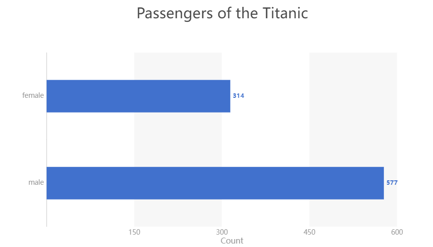
chart.animate(Config({"x":?"Count",?"y":?"Sex",?"label":?"Count","title":"Passengers?of?the?Titanic"}))
output
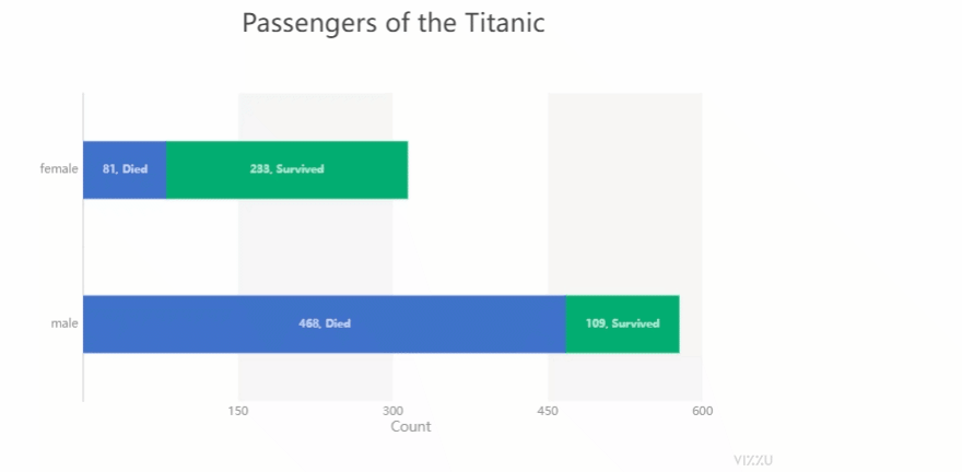
然后我們?cè)俅嘶A(chǔ)之上,在添加上下面的代碼,
chart.animate(Config({"x":?["Count","Survived"],?"label":?["Count","Survived"],?"color":?"Survived"}))
output
import?pandas?as?pd
from?ipyvizzu?import?Chart,?Data,?Config

data_frame?=?pd.read_csv("titanic.csv")
data?=?Data()
data.add_data_frame(data_frame)
chart?=?Chart()
chart.animate(data)
chart.animate(Config({"x":?"Count",?"y":?"Sex",?"label":?"Count","title":"Passengers?of?the?Titanic"}))
chart.animate(Config({"x":?["Count","Survived"],?"label":?["Count","Survived"],?"color":?"Survived"}))
chart.animate(Config({"x":?"Count",?"y":?["Sex","Survived"]}))
output

散點(diǎn)圖與直方圖之間的動(dòng)圖轉(zhuǎn)變
github的地址是:https://github.com/vizzuhq/ipyvizzu/tree/mainimport?pandas?as?pd
from?ipyvizzu?import?Chart,?Data,?Config,?Style
data_frame?=?pd.read_csv("chart_types_eu.csv",?dtype={"Year":?str})
data?=?Data()
data.add_data_frame(data_frame)
chart?=?Chart()
chart.animate(data)
chart.animate(
????Config(
????????{
????????????"channels":?{
????????????????"x":?["Joy?factors",?"Value?6?(+/-)"],
????????????????"y":?"Value?5?(+/-)",
????????????????"color":?"Joy?factors",
????????????????"size":?"Value?2?(+)",
????????????????"label":?"Country_code",
????????????},
????????????"title":?"Bubble?Plot",
????????????"geometry":?"circle",
????????}
????)
)
output
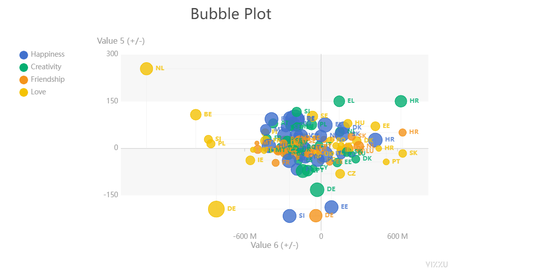
title參數(shù)在設(shè)置標(biāo)題,size參數(shù)在設(shè)置散點(diǎn)的大小以及color參數(shù)在設(shè)置散點(diǎn)的顏色,接下來我們來繪制直方圖,代碼如下chart.animate(
????Config(
????????{
????????????"channels":?{
????????????????"y":?"Joy?factors",
????????????????"x":?["Value?2?(+)",?"Country_code"],
????????????????"label":?None
????????????},
????????????"title":?"Bar?Chart",
????????????"geometry":?"rectangle",
????????????"orientation":?"vertical",
????????}
????),
????geometry={"delay":?0.7,?"duration":?1},
)
output

然后我們?cè)谥狈綀D上標(biāo)上標(biāo)記,代碼如下
chart.animate(
????Config(
????????{"channels":?{"x":?{"set":?["Value?2?(+)"]},?"label":?{"set":?["Value?2?(+)"]}}}
????)
)
我們總體來看一下出來的動(dòng)圖效果,如下圖所示
END
推薦閱讀
牛逼!Python常用數(shù)據(jù)類型的基本操作(長(zhǎng)文系列第①篇)
牛逼!Python的判斷、循環(huán)和各種表達(dá)式(長(zhǎng)文系列第②篇)
吳恩達(dá)deeplearining.ai的經(jīng)典總結(jié)資料
Ps:從小程序直接獲取下載
評(píng)論
圖片
表情