
圖片懶加載從簡單到復雜
(加星標,提升前端技能)
作者:hateonion
https://hateonion.me/posts/19jan30/
為什么要做圖片的懶加載
圖片懶加載的原理
圖片懶加載的簡單實現(xiàn)
// index.cssimg[src] {filter: blur(0.2em);}img {filter: blur(0em);transition: filter 0.5s;}
(function lazyLoad(){const imageToLazy = document.querySelectorAll('img[src]');const loadImage = function (image) {image.setAttribute('src', image.getAttribute('src'));image.addEventListener('load', function() {image.removeAttribute("src");})}imageToLazy.forEach(function(image){loadImage(image);})})()
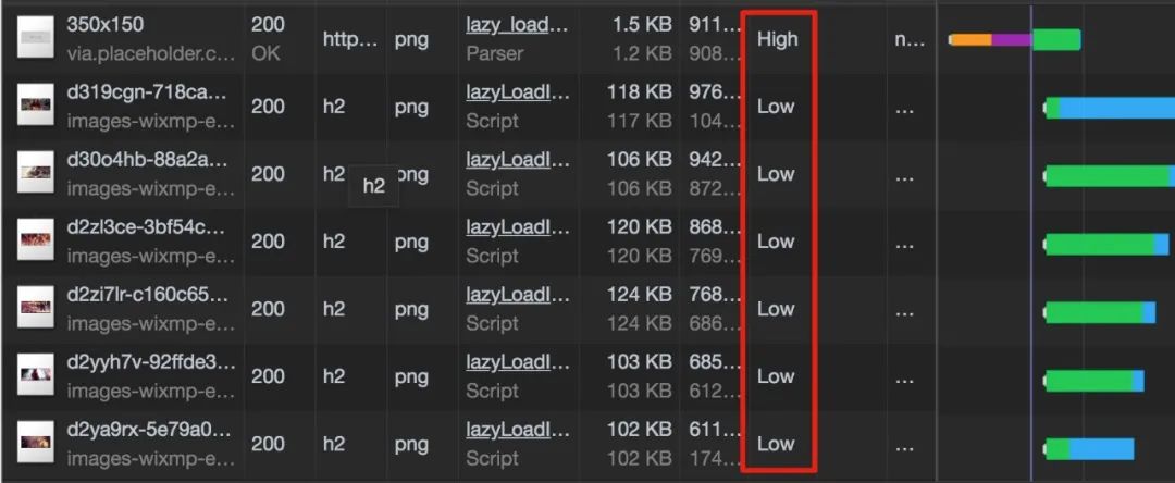
圖片懶加載的進階實現(xiàn)–滾動加載
(function lazyLoad(){const imageToLazy = document.querySelectorAll('img[src]');const loadImage = function (image) {image.setAttribute('src', image.getAttribute('src'));image.addEventListener('load', function() {image.removeAttribute("src");})}const intersectionObserver = new IntersectionObserver(function(items, observer) {items.forEach(function(item) {if(item.isIntersecting) {loadImage(item.target);observer.unobserve(item.target);}});});imageToLazy.forEach(function(image){intersectionObserver.observe(image);})})()
如何選擇合適的Placeholder圖片
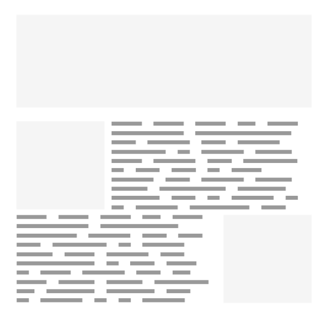
圖片尺寸已知
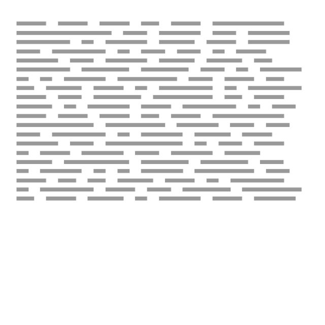
圖片尺寸未知
懶加載防止布局抖動
.lazy-load__container{position: relative;display: block;height: 0;}.lazy-load__container.feature {// feature image 的高寬比設(shè)置成42.8%// 對于其他圖片 比如 post圖片,高寬比可能會不同,可以使用其他css class去設(shè)置padding-bottom: 42.8%;}.lazy-load__container img {position: absolute;top:0;left:0;height: 100%;width: 100%;}
像Medium一樣懶加載圖片
使用 aspect ratio box 創(chuàng)建占位元素。 在html解析時只加載一個小尺寸的圖片,并且添加blur效果。 最后使用js選擇性的加載真實圖片。
總結(jié)
懶加載用戶當前視窗中的圖片可以提升頁面的加載性能。 懶加載的思路是在html解析時先加載一個placeholder圖片,最后再用js選擇性的加載真實圖片。 如果需要滾動加載可以使用 Intersection Observer 。 對于固定尺寸和不定尺寸的圖片,我們可以選擇不同的服務(wù)去或者placeholder圖片。 對于圖片尺寸不確定引起的布局抖動問題我們可以使用 aspect ratio box 來解決。
參考資料
Progressive Loading Lazy loading with responsive images and unknown height Simple image placeholders for lazy loading images How Medium does progressive image loading Sizing Fluid Image Containers with a Little CSS Padding Hack
掃碼關(guān)注公眾號,訂閱更多精彩內(nèi)容。

評論
圖片
表情