
【Flutter】滑動效果評價組件

「Flutter」是Google的UI工具包,可通過一個代碼庫構(gòu)建漂亮的,本機編譯的移動,Web和桌面應(yīng)用程序。
在在本博客中,我們將探討「Flutter中」 的**Reviews Slider。**我們將看到如何在flutter應(yīng)用程序中使用「reviews_slider」包來實現(xiàn)帶有生動變化的微笑的演示程序Reviews Slider演示程序。
pub地址:https://pub.dev/packages/reviews_slider
評論滑塊
評論滑塊是一個帶有變化的微笑的動畫小部件,用于收集用戶調(diào)查得分。當(dāng)用戶點擊微笑并向左或向右旋轉(zhuǎn)或向左旋轉(zhuǎn)時,然后更改微笑形狀。
該演示視頻演示了如何在flutter中使用評論滑塊。它顯示了使用「Flutter」應(yīng)用程序中的「reviews_slider」包,評論滑塊將如何工作。當(dāng)用戶從左到右或從右到左旋轉(zhuǎn)微笑并更改形狀時,它顯示了一個具有變化的微笑的動畫小部件。它會顯示在您的設(shè)備上。
評論滑塊的一些參數(shù):
**onChange:**此參數(shù)用于在指針更改滑塊的值并且不再與屏幕接觸時觸發(fā)。 **options:**此參數(shù)用于評論標(biāo)題,例如好,差,好等。 **optionStyle:**此參數(shù)用于審閱標(biāo)題的文本樣式,例如顏色,大小等。 **initialValue:**此參數(shù)用于滑塊的初始值。缺省值init值為2。
使用
添加依賴
reviews_slider: ^1.0.5引入
import 'package:reviews_slider/reviews_slider.dart';運行命令:「flutter packages get」
啟用「AndriodX」
org.gradle.jvmargs=-Xmx1536M
android.enableR8=true
android.useAndroidX=true
android.enableJetifier=true
在libs目錄下創(chuàng)建 「reviews_demo.dart」 文件
首先,我們將創(chuàng)建一個整數(shù)變量。
int selectedValue1;
我們將在void **onChange1()「方法上添加一個變量。在此方法中,我們將添加」setState()。**在此setState中,我們將添加等于該值的selectedValue1變量。
void onChange1(int value){
  setState((){
    selectedValue1 = value;

  });
}
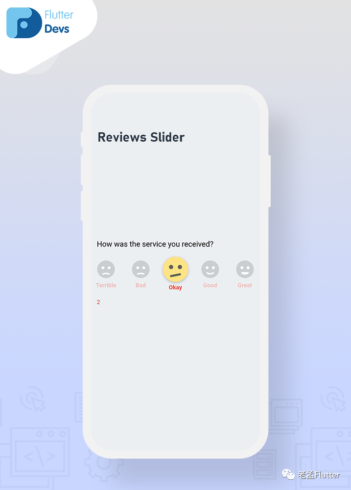
我們將添加一個列小部件,并且mainAxisAlignment作為中心,并且crossAxisAlignment已啟動。我們將添加一個文本和「ReviewSlider()。「在ReviewSlider中,我們將添加」optionStyle」表示評論標(biāo)題的文本樣式,例如顏色,大小等,而「onChange則」意味著只要指針更改了滑塊的值并且不再與屏幕接觸,就會觸發(fā)。另外,我們將添加文本selectedValue1.toString()。它將顯示在設(shè)備上。
Column(
  mainAxisAlignment: MainAxisAlignment.center,
  crossAxisAlignment: CrossAxisAlignment.start,
  children: <Widget>[
    Text(
      'How was the service you received?',
      style: TextStyle(color: Colors.black,
          fontSize: 18),
    ),
    SizedBox(height: 20),
    ReviewSlider(
      optionStyle: TextStyle(
        color: Colors.red,
        fontWeight: FontWeight.bold,
      ),
      onChange: onChange1,
    ),
    Text(selectedValue1.toString(),style: TextStyle(color: Colors.red),
   ),
  ],
),
現(xiàn)在,我們將添加多個具有不同顏色的文本樣式的滑塊。
Column(
  mainAxisAlignment: MainAxisAlignment.center,
  crossAxisAlignment: CrossAxisAlignment.start,
  children: <Widget>[
    Text(
      'How was the service you received?',
      style: TextStyle(color: Colors.black,
          fontSize: 18),
    ),
    SizedBox(height: 20),
    ReviewSlider(
      optionStyle: TextStyle(
        color: Colors.red,
        fontWeight: FontWeight.bold,
      ),
      onChange: onChange1,
    ),
    Text(selectedValue1.toString(),style: TextStyle(color: Colors.red),),
    SizedBox(height: 20),
    Text(
      'Quality of our product?',
      style: TextStyle(color: Colors.black, fontSize: 18),
    ),
    SizedBox(height: 20),
    ReviewSlider(
      optionStyle: TextStyle(
        color: Colors.orange,
        fontWeight: FontWeight.bold,
      ),
      onChange: onChange2,
      initialValue: 1,
    ),
    Text(selectedValue2.toString(),style: TextStyle(color: Colors.orange)),
    SizedBox(height: 20),
    Text(
      'Price of our product?',
      style: TextStyle(color: Colors.black, fontSize: 18),
    ),
    SizedBox(height: 20),
    ReviewSlider(
      optionStyle: TextStyle(
        color: Colors.black,
        fontWeight: FontWeight.bold,
      ),
      onChange: onChange3,
      initialValue: 3,
    ),
    Text(selectedValue3.toString(),style: TextStyle(color: Colors.black)),
  ],
),
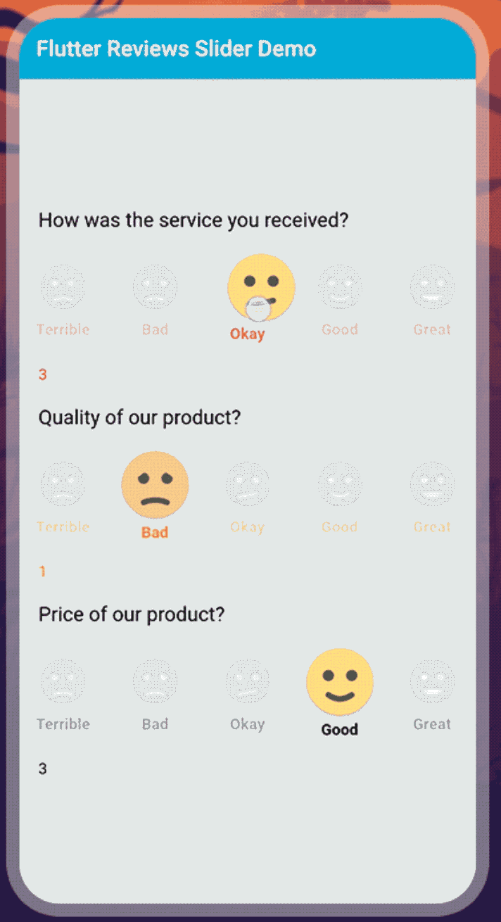
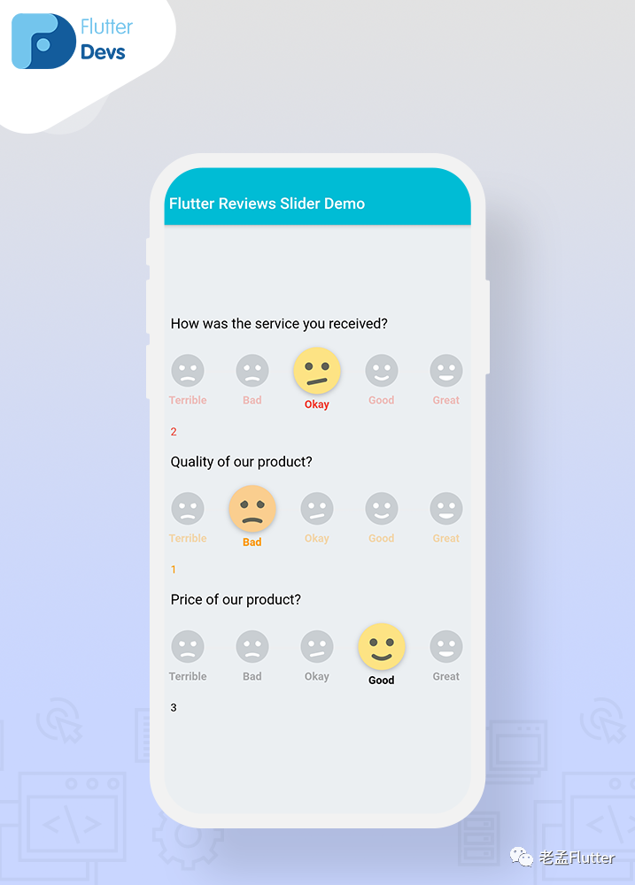
我們將添加三個帶有不同文本顏色,不同的initialValue和不同標(biāo)題的評論滑塊。當(dāng)我們運行應(yīng)用程序時,我們應(yīng)該獲得屏幕的輸出,如屏幕下方的截圖所示。
完整實現(xiàn)
import 'package:flutter/material.dart';
import 'package:reviews_slider/reviews_slider.dart';


class ReviewsDemo extends StatefulWidget {
  @override
  _ReviewsDemoState createState() => _ReviewsDemoState();
}

class _ReviewsDemoState extends State<ReviewsDemo> {
  int selectedValue1;
  int selectedValue2;
  int selectedValue3;

  void onChange1(int value) {
    setState(() {
      selectedValue1 = value;

    });
  }

  void onChange2(int value) {
    setState(() {
      selectedValue2 = value;
    });
  }
  void onChange3(int value) {
    setState(() {
      selectedValue3 = value;
    });
  }

  @override
  Widget build(BuildContext context) {
    return Scaffold(
      backgroundColor: Colors.blueGrey[50],
      appBar: AppBar(
        backgroundColor: Colors.cyan,
        title: Text("Flutter Reviews Slider Demo"),
        automaticallyImplyLeading: false,
      ),
      body: SafeArea(
        child: Padding(
          padding: const EdgeInsets.only(left:18.0),
          child: Column(
            mainAxisAlignment: MainAxisAlignment.center,
            crossAxisAlignment: CrossAxisAlignment.start,
            children: <Widget>[
              Text(
                'How was the service you received?',
                style: TextStyle(color: Colors.black,
                    fontSize: 18),
              ),
              SizedBox(height: 20),
              ReviewSlider(
                optionStyle: TextStyle(
                  color: Colors.red,
                  fontWeight: FontWeight.bold,
                ),
                onChange: onChange1,
              ),
              Text(selectedValue1.toString(),style: TextStyle(color: Colors.red),),
              SizedBox(height: 20),
              Text(
                'Quality of our product?',
                style: TextStyle(color: Colors.black, fontSize: 18),
              ),
              SizedBox(height: 20),
              ReviewSlider(
                optionStyle: TextStyle(
                  color: Colors.orange,
                  fontWeight: FontWeight.bold,
                ),
                onChange: onChange2,
                initialValue: 1,
              ),
              Text(selectedValue2.toString(),style: TextStyle(color: Colors.orange)),
              SizedBox(height: 20),
              Text(
                'Price of our product?',
                style: TextStyle(color: Colors.black, fontSize: 18),
              ),
              SizedBox(height: 20),
              ReviewSlider(
                optionStyle: TextStyle(
                  color: Colors.black,
                  fontWeight: FontWeight.bold,
                ),
                onChange: onChange3,
                initialValue: 3,
              ),
              Text(selectedValue3.toString(),style: TextStyle(color: Colors.black)),
            ],
          ),
        ),
      ),
    );
  }
}
原文鏈接:https://medium.com/flutterdevs/review-slider-in-flutter-d0b04046b4eb
