
PyCharm母公司JetBrains又出可視化神器!
本文簡單介紹下偶遇的一個不錯「python可視化工具lets-plot」,喜歡用R中的ggplot2繪制統(tǒng)計圖的小伙伴一定要看看~
?a、lets-plot由JetBrains(沒錯,「和PyCharm同出一家」)開發(fā),主要「參考R語言中的ggplot2」,「擅長統(tǒng)計圖」,但多了「交互能力」,所以也是基于圖層圖形語法(the Grammar of Graphics),和之前介紹的plotnine一樣,繪圖原理可參考之前文章:
b、可在 「IntelliJ IDEA and PyCharm安裝 lets-plot插件」 "Lets-Plot in SciView"。
?
lets-plot安裝
pip install lets-plot
或者
conda install lets-plot
lets-plot快速繪圖
import numpy as np
from lets_plot import *

LetsPlot.setup_html()  #默認開啟Javascript交互模式

#LetsPlot.setup_html(no_js=True)#關閉Javascript交互模式

#數(shù)據(jù)準備
np.random.seed(12)
data = dict(cond=np.repeat(['A', 'B'], 200),
            rating=np.concatenate(
                (np.random.normal(0, 1, 200), np.random.normal(1, 1.5, 200))))

#繪圖
ggplot(data, aes(x='rating', fill='cond')) + ggsize(500, 250) \
+ geom_density(color='dark_green', alpha=0.7) + scale_fill_brewer(type='seq') \
+ theme(axis_line_y='blank')
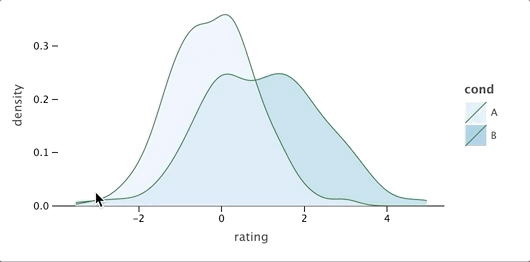 可以看出,語法幾乎和ggplot2一行,但是,「比ggplot2多了交互」,上圖為開啟了交互模式,可以鼠標點擊查看對應位置數(shù)據(jù)信息,LetsPlot.setup_html(no_js=True)控制交互模式的開啟與關閉。
lets-plot詳細介紹
lets-plot所有方法
import lets_plot

print(dir(lets_plot))#輸出lets_plot的方法
?['Dict', 'GGBunch', 'LetsPlot', 'NO_JS', 'OFFLINE', '__all__', '__builtins__', '__cached__', '__doc__', '__file__', '__loader__', '__name__', '__package__', '__path__', '__spec__', '__version__', '_global_settings', '_kbridge', '_settings', '_type_utils', '_version', 'aes', 'arrow', 'bistro', 'cfg', '「coord」_cartesian', 'coord_fixed', 'coord_map', 'element_blank', 'export', 'extend_path', 'facet_grid', 'facet_wrap', 'frontend_context', '「geom」_abline', 'geom_area', 'geom_bar', 'geom_bin2d', 'geom_boxplot', 'geom_contour', 'geom_contourf', 'geom_crossbar', 'geom_density', 'geom_density2d', 'geom_density2df', 'geom_errorbar', 'geom_freqpoly', 'geom_histogram', 'geom_hline', 'geom_image', 'geom_jitter', 'geom_line', 'geom_linerange', 'geom_livemap', 'geom_map', 'geom_path', 'geom_point', 'geom_pointrange', 'geom_polygon', 'geom_raster', 'geom_rect', 'geom_ribbon', 'geom_segment', 'geom_smooth', 'geom_step', 'geom_text', 'geom_tile', 'geom_vline', 'get_global_bool', 'gg_image_matrix', 'ggplot', 'ggsave', 'ggsize', 'ggtitle', 'guide_colorbar', 'guide_legend', 'guides', 'is_production', 'labs', 'layer', 'layer_tooltips', 'lims', 'mapping', 'maptiles_lets_plot', 'maptiles_zxy', 'plot', 'position_dodge', 'position_jitter', 'position_jitterdodge', 'position_nudge', '「sampling」_group_random', 'sampling_group_systematic', 'sampling_pick', 'sampling_random', 'sampling_random_stratified', 'sampling_systematic', 'sampling_vertex_dp', 'sampling_vertex_vw', '「scale」_alpha', 'scale_alpha_identity', 'scale_alpha_manual', 'scale_color_brewer', 'scale_color_continuous', 'scale_color_discrete', 'scale_color_gradient', 'scale_color_gradient2', 'scale_color_grey', 'scale_color_hue', 'scale_color_identity', 'scale_color_manual', 'scale_fill_brewer', 'scale_fill_continuous', 'scale_fill_discrete', 'scale_fill_gradient', 'scale_fill_gradient2', 'scale_fill_grey', 'scale_fill_hue', 'scale_fill_identity', 'scale_fill_manual', 'scale_linetype_identity', 'scale_linetype_manual', 'scale_shape', 'scale_shape_identity', 'scale_shape_manual', 'scale_size', 'scale_size_area', 'scale_size_identity', 'scale_size_manual', 'scale_x_continuous', 'scale_x_datetime', 'scale_x_discrete', 'scale_x_discrete_reversed', 'scale_x_log10', 'scale_x_reverse', 'scale_y_continuous', 'scale_y_datetime', 'scale_y_discrete', 'scale_y_discrete_reversed', 'scale_y_log10', 'scale_y_reverse', 'settings_utils', 'stat_corr', 'theme', 'xlab', 'xlim', 'ylab', 'ylim']
?
「coord_開頭」為坐標系設置方法; 「geom_開頭」的為lets-plot支持的圖形類別; 「sampling_開頭」的為數(shù)據(jù)變換方法 「sacle_開頭」的為標度設置方法;
支持圖形類別
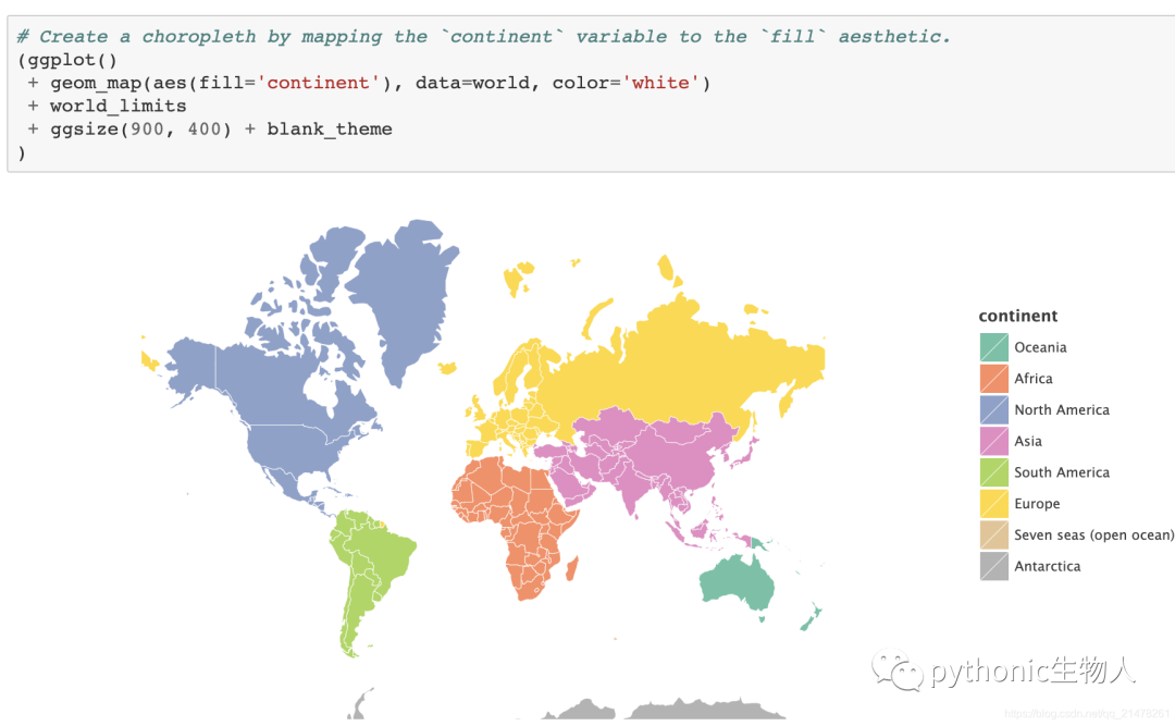
結(jié)合geopandas繪制地圖
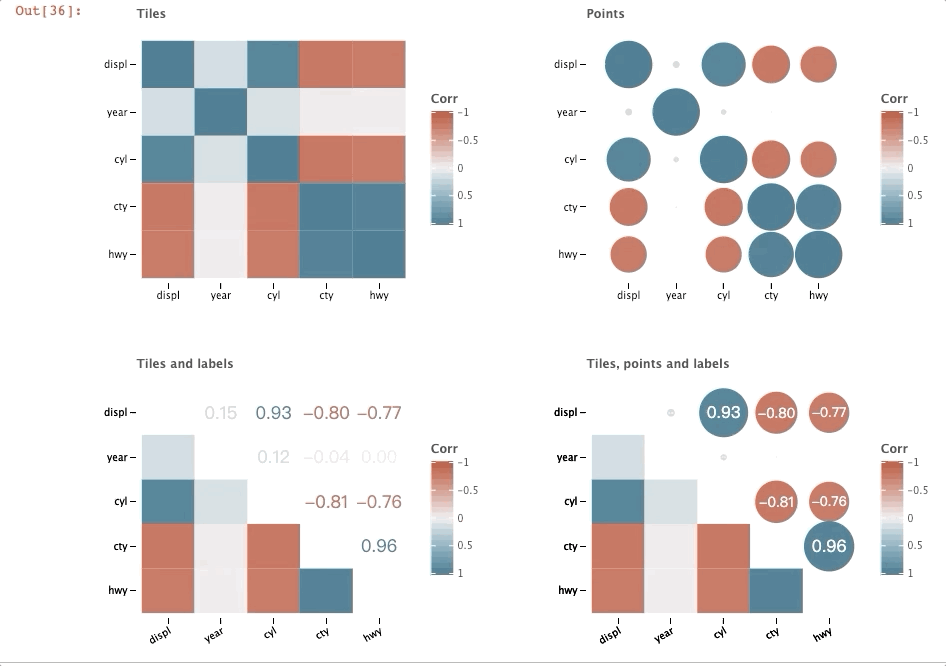
相關性圖(Correlation Plot)
import pandas as pd
from lets_plot import *
from lets_plot.bistro.corr import *

mpg_df = pd.read_csv('letplot.data//mpg.csv').drop(columns=['Unnamed: 0'])


def group(plots):
    """
    定義拼圖函數(shù)group
    """
    bunch = GGBunch()
    for idx, p in enumerate(plots):
        x = (idx % 2) * 450
        y = int(idx / 2) * 350
        bunch.add_plot(p, x, y)

    return bunch


group([
    corr_plot(mpg_df).tiles().build() + ggtitle("Tiles"),
    corr_plot(mpg_df).points().build() + ggtitle("Points"),
    corr_plot(mpg_df).tiles().labels().build() + ggtitle("Tiles and labels"),
    corr_plot(mpg_df).points().labels().tiles().build() +
    ggtitle("Tiles, points and labels")
])
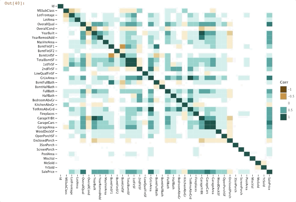
housing_df = pd.read_csv("letplot.data//Ames_house_prices_train.csv")

corr_plot(housing_df).tiles().palette_BrBG().build()
圖片分面(Image Matrix)
import numpy as np
from lets_plot import *
from lets_plot.bistro.im import image_matrix

from PIL import Image
from io import BytesIO

image = Image.open('./dog.png')#一張旺財?shù)膒ng
img = np.asarray(image)

rows = 2
cols = 3
X = np.empty([rows, cols], dtype=object)
X.fill(img)

分布關系圖(distribution plot)
geom_histogram, geom_density, geom_vline, geom_freqpoly, geom_boxplot, geom_histogram
#geom_histogram
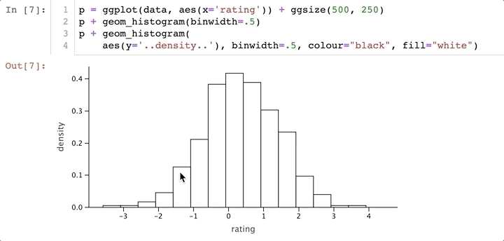
from pandas import DataFrame
import numpy as np
from lets_plot import *
LetsPlot.setup_html()
np.random.seed(123)
#數(shù)據(jù)準備
data = DataFrame(
dict(cond=np.repeat(['A', 'B'], 200),
rating=np.concatenate(
(np.random.normal(0, 1, 200), np.random.normal(.8, 1, 200)))))
#繪直方圖
p = ggplot(data, aes(x='rating')) + ggsize(500, 250)
p + geom_histogram(binwidth=.5)
p + geom_histogram(
aes(y='..density..'), binwidth=.5, colour="black", fill="white")
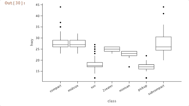
「geom_boxplot」
df = pd.read_csv('letplot.data//mpg.csv')

ggplot(df, aes('class', 'hwy')) + \
    geom_boxplot(tooltips=layer_tooltips().format('^Y', '.2f')        # all positionals
                                          .format('^ymax', '.3f')     # use number format --> "ymax: value"
                                          .format('^middle', '{.3f}') # use line format --> "value"
                                          .format('^ymin', 'ymin is {.3f}')) + \
    theme(legend_position='none')
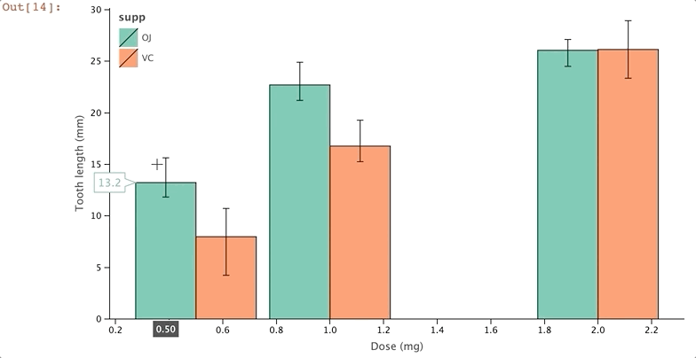
誤差棒圖(errorbar plot)
geom_errorbar, geom_line, geom_point, geom_bar, geom_crossbar, geom_linerange, geom_pointrange
pd = position_dodge(0.1)
data = dict(supp=['OJ', 'OJ', 'OJ', 'VC', 'VC', 'VC'],
            dose=[0.5, 1.0, 2.0, 0.5, 1.0, 2.0],
            length=[13.23, 22.70, 26.06, 7.98, 16.77, 26.14],
            len_min=[11.83, 21.2, 24.50, 4.24, 15.26, 23.35],
            len_max=[15.63, 24.9, 27.11, 10.72, 19.28, 28.93])

p = ggplot(data, aes(x='dose', color='supp'))
p + geom_errorbar(aes(ymin='len_min', ymax='len_max', group='supp'), color='black', width=.1, position=pd) \
+ geom_line(aes(y='length'), position=pd) \
+ geom_point(aes(y='length'), position=pd, size=5)
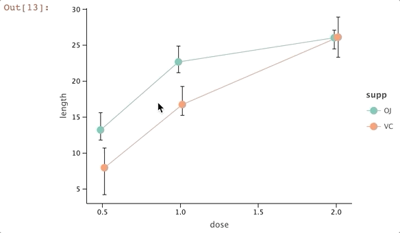
p1 = p \
+ xlab("Dose (mg)") \
+ ylab("Tooth length (mm)") \
+ scale_color_manual(['orange', 'dark_green'], na_value='gray') \
+ ggsize(700, 400)

p1 \
+ geom_bar(aes(y='length', fill='supp'), stat='identity', position='dodge', color='black') \
+ geom_errorbar(aes(ymin='len_min', ymax='len_max', group='supp'), color='black', width=.1, position=position_dodge(0.9)) \
+ theme(legend_justification=[0,1], legend_position=[0,1])
散點圖+趨勢線(scatter/smooth plot)
geom_point, geom_smooth (stat_smooth)
mpg_df = pd.read_csv ("letplot.data/mpg.csv")
p = (ggplot(mpg_df, aes(x='displ', y='cty', fill='drv', size='hwy'))
     + scale_size(range=[5, 15], breaks=[15, 40])
     + ggsize(700, 450)
    )

(p
 + geom_point(shape=21, color='white',
              tooltips=layer_tooltips()
                          .anchor('top_right')
                          .min_width(180)
                          .format('cty', '.0f')
                          .format('hwy', '.0f')
                          .format('drv', '{}wd')
                          .line('@manufacturer @model')
                          .line('cty/hwy [mpg]|@cty/@hwy')
                          .line('@|@class')
                          .line('drive train|@drv')
                          .line('@|@year'))
)
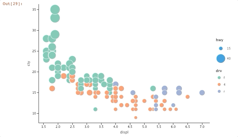 關于右上角的顯示設置(「tooltips」),更多見https://jetbrains.github.io/lets-plot-docs/pages/features/tooltips.html
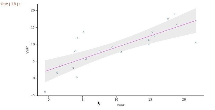
import random

random.seed(123)
data = dict(cond=np.repeat(['A', 'B'], 10),
            xvar=[i + random.normalvariate(0, 3) for i in range(0, 20)],
            yvar=[i + random.normalvariate(0, 3) for i in range(0, 20)])

p = ggplot(data, aes(x='xvar', y='yvar')) + ggsize(600, 350)
p + geom_point(shape=1) + geom_smooth()
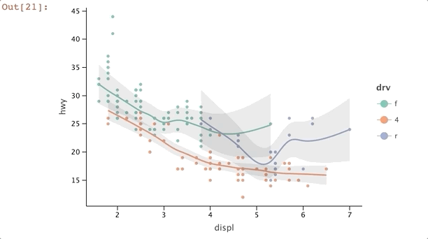
import pandas as pd

mpg_df = pd.read_csv('letplot.data/mpg.csv')
mpg_plot = ggplot(mpg_df, aes(x='displ', y='hwy'))
mpg_plot + geom_point(aes(color='drv'))\
         + geom_smooth(aes(color='drv'), method='loess', size=1)
density plot
geom_density2d, geom_density2df, geom_bin2d, geom_polygon, geom_point
cov0 = [[1, -.8], [-.8, 1]]
cov1 = [[1, .8], [.8, 1]]
cov2 = [[10, .1], [.1, .1]]
x0, y0 = np.random.multivariate_normal(mean=[-2, 0], cov=cov0, size=400).T
x1, y1 = np.random.multivariate_normal(mean=[2, 0], cov=cov1, size=400).T
x2, y2 = np.random.multivariate_normal(mean=[0, 1], cov=cov2, size=400).T
data = dict(x=np.concatenate((x0, x1, x2)), y=np.concatenate((y0, y1, y2)))
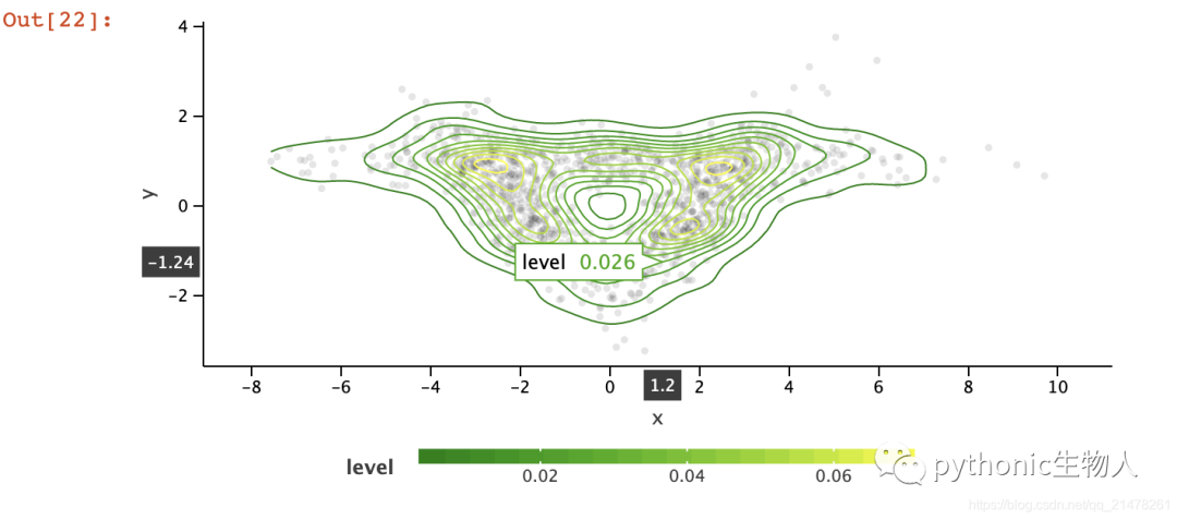
p = ggplot(data, aes('x', 'y')) + ggsize(600, 300) + geom_point(color='black',
alpha=.1)
p + geom_density2d(aes(color='..level..')) \
+ scale_color_gradient(low='dark_green', high='yellow', guide=guide_colorbar(barheight=10, barwidth=300)) \
+ theme(legend_position='bottom')
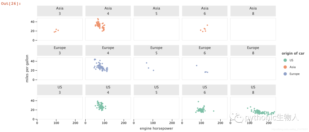
分面圖(facet plot)
data = pd.read_csv('letplot.data/mpg2.csv')
p = (ggplot(data, aes(x="engine horsepower", y="miles per gallon")) +
     geom_point(aes(color="origin of car")))
p + facet_wrap(facets=["origin of car", "number of cylinders"], ncol=5)
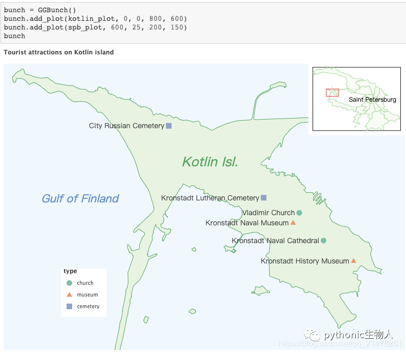
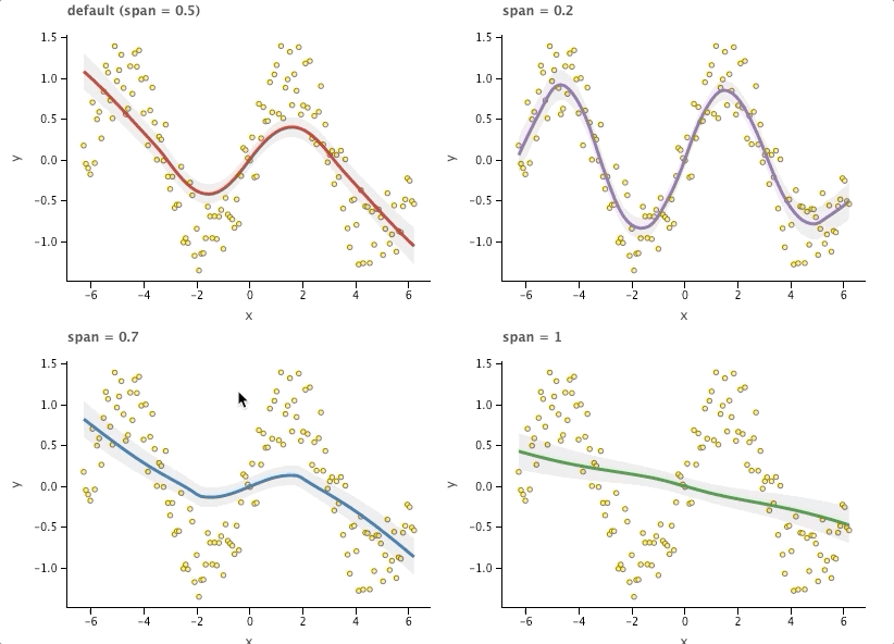
拼圖(GGBunch)
import math
import random
import numpy as np

n = 150
x_range = np.arange(-2 * math.pi, 2 * math.pi, 4 * math.pi / n)
y_range = np.sin(x_range) + np.array(
    [random.uniform(-.5, .5) for i in range(n)])
df = pd.DataFrame({'x': x_range, 'y': y_range})

p = ggplot(df, aes(x='x', y='y')) + geom_point(
    shape=21, fill='yellow', color='#8c564b')
p1 = p + geom_smooth(method='loess', size=1.5,
                     color='#d62728') + ggtitle('default (span = 0.5)')
p2 = p + geom_smooth(method='loess', span=.2, size=1.5,
                     color='#9467bd') + ggtitle('span = 0.2')
p3 = p + geom_smooth(method='loess', span=.7, size=1.5,
                     color='#1f77b4') + ggtitle('span = 0.7')
p4 = p + geom_smooth(method='loess', span=1, size=1.5,
                     color='#2ca02c') + ggtitle('span = 1')

bunch = GGBunch()
bunch.add_plot(p1, 0, 0, 400, 300)
bunch.add_plot(p2, 400, 0, 400, 300)
bunch.add_plot(p3, 0, 300, 400, 300)
bunch.add_plot(p4, 400, 300, 400, 300)
bunch.show()
reference
更多功能,見github~
https://github.com/JetBrains/lets-plot