
python數(shù)據(jù)分析(數(shù)據(jù)可視化)
數(shù)據(jù)分析初始階段,通常都要進(jìn)行可視化處理。數(shù)據(jù)可視化旨在直觀展示信息的分析結(jié)果和構(gòu)思,令某些抽象數(shù)據(jù)具象化,這些抽象數(shù)據(jù)包括數(shù)據(jù)測(cè)量單位的性質(zhì)或數(shù)量。本章用的程序庫(kù)matplotlib是建立在Numpy之上的一個(gè)Python圖庫(kù),它提供了一個(gè)面向?qū)ο蟮腁PI和一個(gè)過(guò)程式類的MATLAB API,他們可以并行使用。本文涉及的主題有:
matplotlib簡(jiǎn)單繪圖
對(duì)數(shù)圖
散點(diǎn)圖
圖例和注解
三維圖
pandas繪圖
時(shí)滯圖
自相關(guān)圖
Plot.ly
1、matplotlib繪圖入門
代碼:
import matplotlib.pyplot as plt
import numpy as np
x=np.linspace(0,20)  #linspace()函數(shù)指定橫坐標(biāo)范圍
plt.plot(x,.5+x)
plt.plot(x,1+2*x,'--')
plt.show()
運(yùn)行結(jié)果:
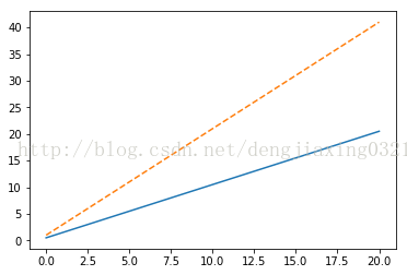
通過(guò)show函數(shù)將圖形顯示在屏幕上,也可以用savefig()函數(shù)把圖形保存到文件中。
2、對(duì)數(shù)圖
所謂對(duì)數(shù)圖,實(shí)際上就是使用對(duì)數(shù)坐標(biāo)繪制的圖形。對(duì)于對(duì)數(shù)刻度來(lái)說(shuō),其間隔表示的是變量的值在數(shù)量級(jí)上的變化,這與線性刻度有很大的不同。對(duì)數(shù)圖又分為兩種不同的類型,其中一種稱為雙對(duì)數(shù)圖,它的特點(diǎn)是兩個(gè)坐標(biāo)軸都采用對(duì)數(shù)刻度,對(duì)應(yīng)的matplotlibh函數(shù)是matplotlib.pyplot..loglog()。半對(duì)數(shù)圖的一個(gè)坐標(biāo)軸采用線性刻度,另一個(gè)坐標(biāo)軸使用對(duì)數(shù)刻度,它對(duì)應(yīng)的matplotlib API是semilogx()函數(shù)和semilogy()函數(shù),在雙對(duì)數(shù)圖上,冪律表現(xiàn)為直線;在半對(duì)數(shù)圖上,直線則代表的是指數(shù)律。
??摩爾定律大意為集成電路上晶體管的數(shù)量每?jī)赡暝黾右槐丁T趆ttps://en.wikipedia.org/wiki/Transistor_count#Microprocessors頁(yè)面有一個(gè)數(shù)據(jù)表,記錄了不同年份微處理器上晶體管的數(shù)量。我們?yōu)檫@些數(shù)據(jù)制作一個(gè)CSV文件,名為transcount.csv,其中只包含晶體管數(shù)量和年份值。
代碼:
import matplotlib.pyplot as plt
import numpy as np
import pandas as pd
df=pd.read_csv('H:\Python\data\\transcount.csv')
df=df.groupby('year').aggregate(np.mean)  #按年份分組,以數(shù)量均值聚合
#print grouped.mean()
years=df.index.values  #得到所有年份信息
counts=df['trans_count'].values
#print counts
poly=np.polyfit(years,np.log(counts),deg=1)  #線性擬合數(shù)據(jù)
print "poly:",poly
plt.semilogy(years,counts,'o')
plt.semilogy(years,np.exp(np.polyval(poly,years)))  #polyval用于對(duì)多項(xiàng)式進(jìn)行評(píng)估
plt.show()
#print df
#df=df.groupby('year').aggregate(np.mean)
運(yùn)行結(jié)果:
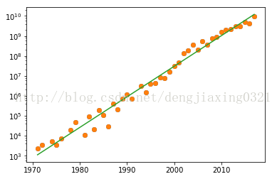
實(shí)線表示的是趨勢(shì)線,實(shí)心圓表示的是數(shù)據(jù)點(diǎn)。
3、散點(diǎn)圖
散點(diǎn)圖可以形象展示直角坐標(biāo)系中兩個(gè)變量之間的關(guān)系,每個(gè)數(shù)據(jù)點(diǎn)的位置實(shí)際上就是兩個(gè)變量的值。泡式圖是對(duì)散點(diǎn)圖的一種擴(kuò)展。在泡式圖中,每個(gè)數(shù)據(jù)點(diǎn)都被一個(gè)氣泡所包圍,它由此得名;而第三個(gè)變量的值正好可以用來(lái)確定氣泡的相對(duì)大小。
在https://en.wikipedia.org/wiki/Transistor_count#GPU頁(yè)面上,有個(gè)記錄GPU晶體數(shù)量的數(shù)據(jù)表,我們用這些晶體管數(shù)量年份數(shù)據(jù)新建表gpu_transcount.csv。借助matplotlib API提供的scatter()函數(shù)繪制散點(diǎn)圖。
代碼:
import matplotlib.pyplot as plt
import numpy as np
import pandas as pd
df=pd.read_csv('H:\Python\data\\transcount.csv')
df=df.groupby('year').aggregate(np.mean)
gpu=pd.read_csv('H:\Python\data\\gpu_transcount.csv')
gpu=gpu.groupby('year').aggregate(np.mean)
df=pd.merge(df,gpu,how='outer',left_index=True,right_index=True)
df=df.replace(np.nan,0)
print df

years=df.index.values
counts=df['trans_count'].values
gpu_counts=df['gpu_counts'].values
cnt_log=np.log(counts)
plt.scatter(years,cnt_log,c=200*years,s=20+200*gpu_counts/gpu_counts.max(),alpha=0.5)  #表示顏色,s表示標(biāo)量或數(shù)組
plt.show()
運(yùn)行結(jié)果
      trans_count    gpu_counts
year
1971         2300  0.000000e+00
1972         3500  0.000000e+00
1974         5400  0.000000e+00
1975         3510  0.000000e+00
1976         7500  0.000000e+00
1978        19000  0.000000e+00
1979        48500  0.000000e+00
1981        11500  0.000000e+00
1982        94500  0.000000e+00
1983        22000  0.000000e+00
1984       190000  0.000000e+00
1985       105333  0.000000e+00
1986        30000  0.000000e+00
1987       413000  0.000000e+00
1988       215000  0.000000e+00
1989       745117  0.000000e+00
1990      1200000  0.000000e+00
1991       692500  0.000000e+00
1993      3100000  0.000000e+00
1994      1539488  0.000000e+00
1995      4000000  0.000000e+00
1996      4300000  0.000000e+00
1997      8150000  3.500000e+06
1998      7500000  0.000000e+00
1999     16062200  1.533333e+07
2000     31500000  2.500000e+07
2001     45000000  5.850000e+07
2002    137500000  8.500000e+07
2003    190066666  1.260000e+08
2004    352000000  1.910000e+08
2005    198500000  3.120000e+08
2006    555600000  5.325000e+08
2007    371600000  4.882500e+08
2008    733200000  7.166000e+08
2009    904000000  9.155000e+08
2010   1511666666  1.804143e+09
2011   2010000000  1.370952e+09
2012   2160625000  3.121667e+09
2013   3015000000  3.140000e+09
2014   3145000000  3.752500e+09
2015   4948000000  8.450000e+09
2016   4175000000  7.933333e+09
2017   9637500000  8.190000e+09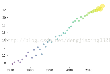
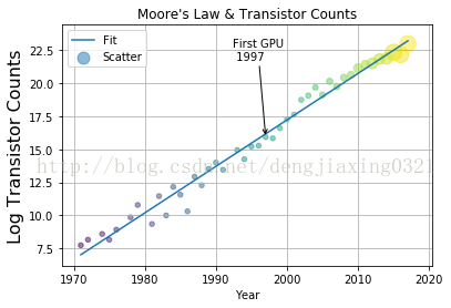
4、圖例和注解
要想做出讓人眼前一亮的神圖,圖例和注解肯定是少不了的。一般情況下,數(shù)據(jù)圖都帶有下列輔助信息。
用來(lái)描述圖中各數(shù)據(jù)序列的圖例,matplotlib提供的legend()函數(shù)可以為每個(gè)數(shù)據(jù)序列提供相應(yīng)的標(biāo)簽。
對(duì)圖中要點(diǎn)的注解。可以借助matplotlib提供的annotate()函數(shù)。
橫軸和縱軸的標(biāo)簽,可以通過(guò)xlabel()和ylabel()繪制出來(lái)。
一個(gè)說(shuō)明性質(zhì)的標(biāo)題,通常由matplotlib的title函數(shù)來(lái)提供.
網(wǎng)格,對(duì)于輕松定位數(shù)據(jù)點(diǎn)非常有幫助。grid()函數(shù)可以用來(lái)決定是否使用網(wǎng)格。
代碼:
import matplotlib.pyplot as plt
import numpy as np
import pandas as pd
df=pd.read_csv('H:\Python\data\\transcount.csv')
df=df.groupby('year').aggregate(np.mean)
gpu=pd.read_csv('H:\Python\data\\gpu_transcount.csv')
gpu=gpu.groupby('year').aggregate(np.mean)
df=pd.merge(df,gpu,how='outer',left_index=True,right_index=True)
df=df.replace(np.nan,0)
years=df.index.values
counts=df['trans_count'].values
gpu_counts=df['gpu_counts'].values
#print df
poly=np.polyfit(years,np.log(counts),deg=1)
plt.plot(years,np.polyval(poly,years),label='Fit')

gpu_start=gpu.index.values.min()
y_ann=np.log(df.at[gpu_start,'trans_count'])
ann_str="First GPU\n %d"%gpu_start
plt.annotate(ann_str,xy=(gpu_start,y_ann),arrowprops=dict(arrowstyle="->"),xytext=(-30,+70),textcoords='offset points')


cnt_log=np.log(counts)
plt.scatter(years,cnt_log,c=200*years,s=20+200*gpu_counts/gpu_counts.max(),alpha=0.5,label="Scatter")  #表示顏色,s表示標(biāo)量或數(shù)組
plt.legend(loc="upper left")
plt.grid()
plt.xlabel("Year")
plt.ylabel("Log Transistor Counts",fontsize=16)
plt.title("Moore's Law & Transistor Counts")
plt.show()
運(yùn)行結(jié)果:
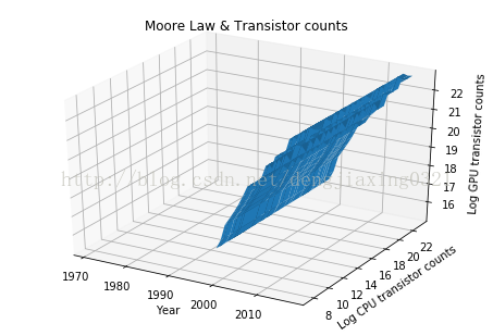
5、三維圖
Axes3D是由matplotlib提供的一個(gè)類,可以用來(lái)繪制三維圖。通過(guò)講解這個(gè)類的工作機(jī)制,就能夠明白面向?qū)ο蟮膍atplotlib API的原理了,matplotlib的Figure類是存放各種圖像元素的頂級(jí)容器。
代碼:
from mpl_toolkits.mplot3d.axes3d import Axes3D
import matplotlib.pyplot as plt
import numpy as np
import pandas as pd
df=pd.read_csv('H:\Python\data\\transcount.csv')
df=df.groupby('year').aggregate(np.mean)
gpu=pd.read_csv('H:\Python\data\\gpu_transcount.csv')
gpu=gpu.groupby('year').aggregate(np.mean)
df=pd.merge(df,gpu,how='outer',left_index=True,right_index=True)
df=df.replace(np.nan,0)
fig=plt.figure()
ax=Axes3D(fig)
X=df.index.values
Y=np.log(df['trans_count'].values)
X,Y=np.meshgrid(X,Y)
Z=np.log(df['gpu_counts'].values)
ax.plot_surface(X,Y,Z)
ax.set_xlabel('Year')
ax.set_ylabel('Log CPU transistor counts')
ax.set_zlabel('Log GPU transistor counts')
ax.set_title('Moore Law & Transistor counts')
plt.show()
運(yùn)行結(jié)果:
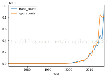
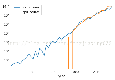
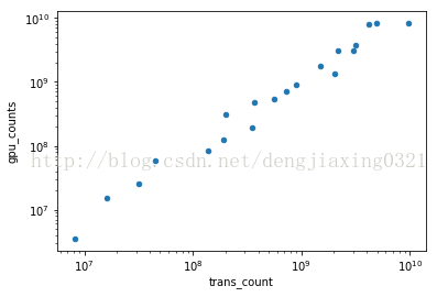
6、pandas繪圖
pandas的Series類和DataFrame類中的plot()方法都封裝了相關(guān)的matplotlib函數(shù)。如果不帶任何參數(shù),使用plot方法繪制圖像如下:
代碼:
import matplotlib.pyplot as plt
import numpy as np
import pandas as pd
df=pd.read_csv('H:\Python\data\\transcount.csv')
df=df.groupby('year').aggregate(np.mean)
gpu=pd.read_csv('H:\Python\data\\gpu_transcount.csv')
gpu=gpu.groupby('year').aggregate(np.mean)
df=pd.merge(df,gpu,how='outer',left_index=True,right_index=True)
df=df.replace(np.nan,0)
df.plot()
df.plot(logy=True) ?#創(chuàng)建半對(duì)數(shù)圖
df[df['gpu_counts']>0].plot(kind='scatter',x='trans_count',y='gpu_counts',loglog=True) ?#loglog=True ?生成雙對(duì)數(shù)
plt.show()
運(yùn)行結(jié)果:
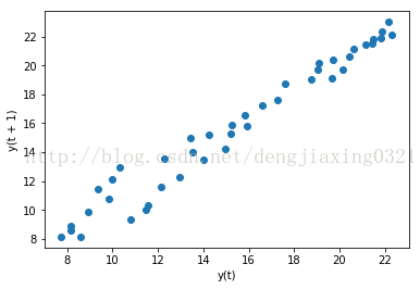
7、時(shí)滯圖
時(shí)滯圖實(shí)際上就是一個(gè)散點(diǎn)圖,只不過(guò)把時(shí)間序列的圖像及相同序列在時(shí)間軸上后延圖像放一起展示而已。例如,我們可以利用這種圖考察今年的CPU晶體管數(shù)量與上一年度CPU晶體管數(shù)量之間的相關(guān)性。可以利用pandas字庫(kù)pandas.tools.plotting中的lag_plot()函數(shù)來(lái)繪制時(shí)滯圖,滯默認(rèn)為1。
代碼:
import matplotlib.pyplot as plt
import numpy as np
import pandas as pd
from pandas.tools.plotting import lag_plot
df=pd.read_csv('H:\Python\data\\transcount.csv')
df=df.groupby('year').aggregate(np.mean)
gpu=pd.read_csv('H:\Python\data\\gpu_transcount.csv')
gpu=gpu.groupby('year').aggregate(np.mean)
df=pd.merge(df,gpu,how='outer',left_index=True,right_index=True)
df=df.replace(np.nan,0)
lag_plot(np.log(df['trans_count']))
plt.show()
運(yùn)行結(jié)果:
8、自相關(guān)圖
自相關(guān)圖描述的是時(shí)間序列在不同時(shí)間延遲情況下的自相關(guān)性。所謂自相關(guān),就是一個(gè)時(shí)間序列與相同數(shù)據(jù)在不同時(shí)間延遲情況下的相互關(guān)系。利用pandas子庫(kù)pandas.tools.plotting 中的autocorrelation_plot()函數(shù),就可以畫出自相關(guān)圖了。
代碼:
import matplotlib.pyplot as plt
import numpy as np
import pandas as pd
from pandas.tools.plotting import autocorrelation_plot
df=pd.read_csv('H:\Python\data\\transcount.csv')
df=df.groupby('year').aggregate(np.mean)
gpu=pd.read_csv('H:\Python\data\\gpu_transcount.csv')
gpu=gpu.groupby('year').aggregate(np.mean)
df=pd.merge(df,gpu,how='outer',left_index=True,right_index=True)
df=df.replace(np.nan,0)
autocorrelation_plot(np.log(df['trans_count']))  #繪制自相關(guān)圖
plt.show()
運(yùn)行結(jié)果:
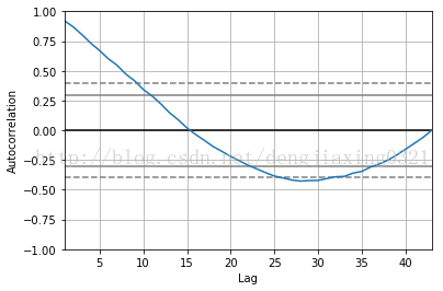
從圖中可以看出,較之于時(shí)間上越遠(yuǎn)(即時(shí)間延遲越大)的數(shù)值,當(dāng)前的數(shù)值與時(shí)間上越接近(及時(shí)間延遲越小)的數(shù)值相關(guān)性越大;當(dāng)時(shí)間延遲極大時(shí),相關(guān)性為0;
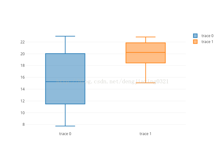
9、Plot.ly
Plot.ly實(shí)際上是一個(gè)網(wǎng)站,它不僅提供了許多數(shù)據(jù)可視化的在線工具,同時(shí)還提供了可在用戶機(jī)器上使用的對(duì)應(yīng)的python庫(kù)。可以通過(guò)Web接口或以本地導(dǎo)入并分析數(shù)據(jù),可以將分析結(jié)果公布到Plot.ly網(wǎng)站上。
安裝plotly庫(kù):pip install plotly
先在plotly注冊(cè)一個(gè)賬號(hào),然后產(chǎn)生一個(gè)api_key。最后可以繪制箱形圖。
代碼:
import numpy as np
import pandas as pd
import plotly.plotly as py
from plotly.graph_objs import *
from getpass import getpass
df=pd.read_csv('H:\Python\data\\transcount.csv')
df=df.groupby('year').aggregate(np.mean)
gpu=pd.read_csv('H:\Python\data\\gpu_transcount.csv')
gpu=gpu.groupby('year').aggregate(np.mean)
df=pd.merge(df,gpu,how='outer',left_index=True,right_index=True)
df=df.replace(np.nan,0)
api_key=getpass()
py.sign_in(username='dengjiaxing',api_key='qPCrc5EA7unk9PlhNwLG')
counts=np.log(df['trans_count'].values)
gpu_counts=np.log(df['gpu_counts'].values)
data=Data([Box(y=counts),Box(y=gpu_counts)])
plot_url=py.plot(data,filename='moore-law-scatter')
print plot_url
運(yùn)行結(jié)果:
《數(shù)據(jù)科學(xué)與人工智能》公眾號(hào)推薦朋友們學(xué)習(xí)和使用Python語(yǔ)言,需要加入Python語(yǔ)言群的,請(qǐng)掃碼加我個(gè)人微信,備注【姓名-Python群】,我誠(chéng)邀你入群,大家學(xué)習(xí)和分享。