
【動(dòng)畫消消樂】HTML+CSS 自定義加載動(dòng)畫 069
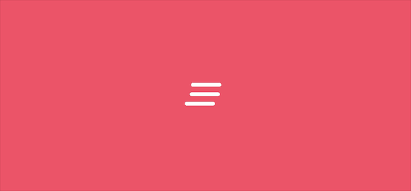
Part1效果展示
Part2Demo代碼
HTML
<!DOCTYPE html>
<html lang="en">
<head>
    <meta charset="UTF-8">
    <meta http-equiv="X-UA-Compatible" content="IE=edge">
    <meta name="viewport" content="width=device-width, initial-scale=1.0">
    <link rel="stylesheet" href="style.css">
    <title>Document</title>
</head>
<body>
    <section><span></span></section>
</body>
</html>
CSS
html, body {
  margin: 0;
  height: 100%;
}

body {
  display: flex;
  justify-content: center;
  align-items: center;
  background: #ed556a;
  /* background-color: #82466e; */
  animation: backColor 4s infinite;
}

section {
  width: 650px;
  height: 300px;
  padding: 10px;
  position: relative;
  display: flex;
  align-items: center;
  justify-content: center;
  border: 2px solid white;
}

span {
  width: 48px;
  height: 6px;
  display: inline-block;
  position: relative;
  border-radius: 4px;
  /* background-color: black; */
  top: -35px;
  color: white;
  animation: loading .6s linear infinite;
}

@keyframes loading {
  0% {
    box-shadow: -10px 20px, 10px 35px, 0px 50px;
  }
  25% {
    box-shadow: 0px 20px, 0px 35px, 10px 50px;
  }
  50% {
    box-shadow: 10px 20px, -10px 35px, 0px 50px;
  }
  75% {
    box-shadow: 0px 20px, 0px 35px, -10px 50px;
  }
  100% {
    box-shadow: -10px 20px, 10px 35px, 0px 50px;
  }
}
Part3原理詳解
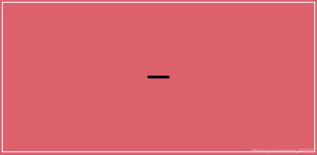
步驟1
使用span標(biāo)簽,設(shè)置為
相對(duì)定位 寬度:48px 高度:6px border-radius: 4px 背景色:黑色 color:白色(之后陰影是白色的)
span {
  width: 48px;
  height: 6px;
  position: relative;
  border-radius: 4px;
  background-color: black;
  color: white;
}
效果圖如下
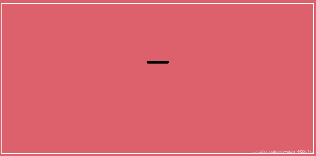
步驟2
將span上移35px
span {
  top: -35px;
}
效果圖如下
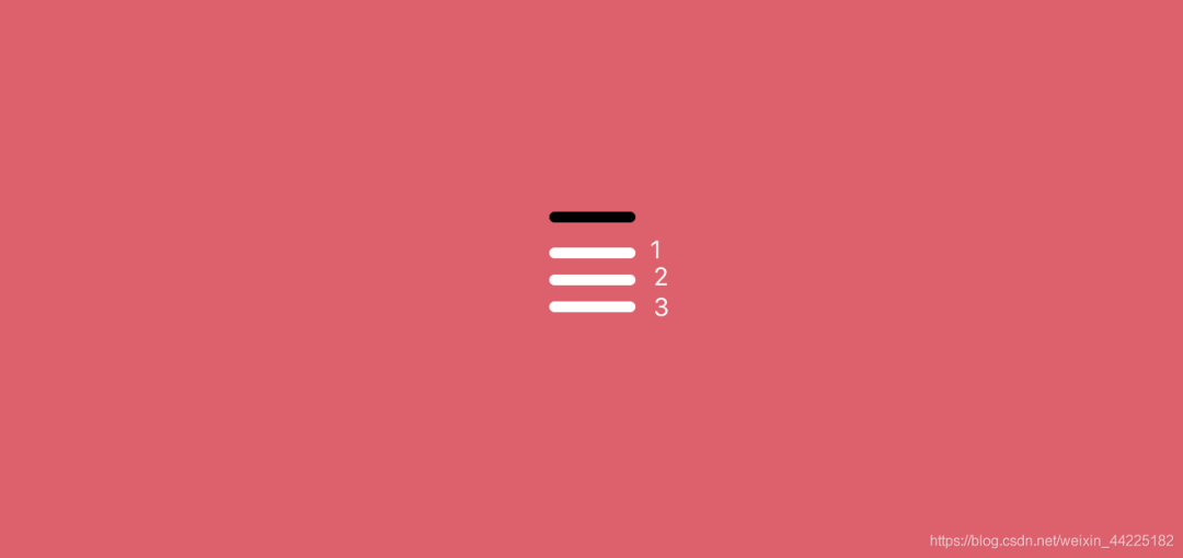
步驟3
使用span的三個(gè)陰影 ,位置關(guān)系為
box-shadow: 0px 20px, /*陰影1*/
			0px 35px, /*陰影2*/
			0px 50px;/*陰影3*/
效果圖如下
步驟4
為span的三個(gè)陰影添加動(dòng)畫
每個(gè)陰影動(dòng)畫過程其實(shí)都一致,只是初始位置不同
這里以一個(gè)陰影的動(dòng)畫效果為例,其余同理可得
陰影1動(dòng)畫關(guān)鍵有5幀
簡(jiǎn)單描述為:從左移動(dòng)到右,再回到左邊
位置關(guān)系上,y軸偏移量一直不變,x軸方向偏移量變化
變化為 -10 -> 0 -> 10 -> 0 -> -10
代碼為
 @keyframes loadingx {
  0% {
    box-shadow: -10px 20px;
  }
  25% {
    box-shadow: 0px 20px;
  }
  50% {
    box-shadow: 10px 20px;
  }
  75% {
    box-shadow: 0px 20px;
  }
  100% {
    box-shadow: -10px 20px;
  }
 }
注意這里
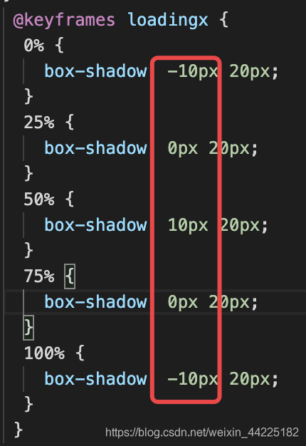
效果圖如下
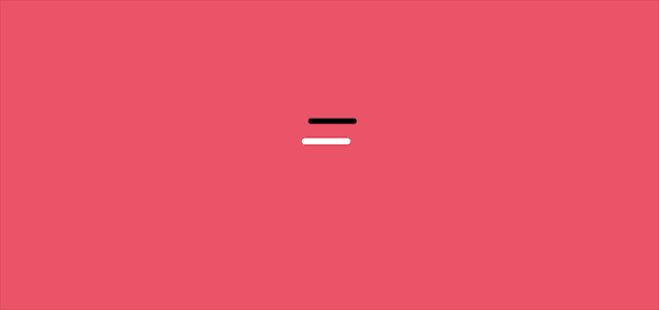
陰影2、3 同理
只是動(dòng)畫初始位置不同
陰影2 10 -> 0 -> -10 -> 0 -> 10
陰影3 0 -> -10 -> 0 -> 10 -> 0
@keyframes loading {
  0% {
    box-shadow: -10px 20px, 10px 35px, 0px 50px;
  }
  25% {
    box-shadow: 0px 20px, 0px 35px, 10px 50px;
  }
  50% {
    box-shadow: 10px 20px, -10px 35px, 0px 50px;
  }
  75% {
    box-shadow: 0px 20px, 0px 35px, -10px 50px;
  }
  100% {
    box-shadow: -10px 20px, 10px 35px, 0px 50px;
  }
}
三個(gè)陰影動(dòng)畫效果如下
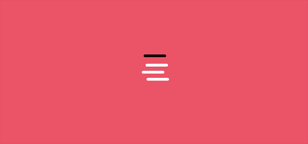
步驟5
注釋掉span背景色
span {
  /* background-color: black; */
}
最終效果圖如下
Part4結(jié)語(yǔ)
希望對(duì)您有所幫助
如有錯(cuò)誤歡迎小伙伴指正~
我是 海轟?(?ˊ?ˋ)?
如果您覺得寫得可以的話
請(qǐng)點(diǎn)個(gè)贊吧
謝謝支持??
評(píng)論
圖片
表情