
python制作儀表盤圖
今天教大家用pyecharts畫儀表盤
儀表盤 (Gauge) 是一種擬物化的圖表,刻度表示度量,指針表示維度,指針角度表示數(shù)值。儀表盤圖表就像汽車的速度表一樣,有一個圓形的表盤及相應(yīng)的刻度,有一個指針指向當前數(shù)值。目前很多的管理報表或報告上都是用這種圖表,以直觀的表現(xiàn)出某個指標的進度或?qū)嶋H情況。
儀表盤的好處在于它能跟人們的常識結(jié)合,使大家馬上能理解看什么、怎么看。擬物化的方式使圖標變得更友好更人性化,正確使用可以提升用戶體驗。
常用的儀表盤主要有以下4種類型
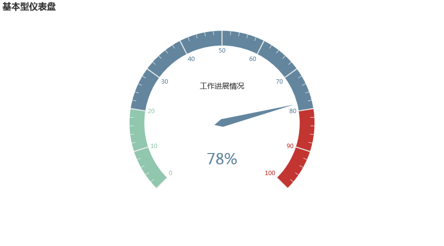
一、基本型儀表盤
from?pyecharts?import?options?as?opts
from?pyecharts.charts?import?Gauge

c?=?(
????Gauge()
????.add("",?[("工作進展情況",?78)])
????.set_global_opts(title_opts=opts.TitleOpts(title="基本型儀表盤"))
)
c.render_notebook()
二、給儀表盤設(shè)置顏色
from?pyecharts?import?options?as?opts
from?pyecharts.charts?import?Gauge

c?=?(
????Gauge()
????.add(
????????"業(yè)務(wù)指標",
????????[("完成率",?66)],
????????axisline_opts=opts.AxisLineOpts(
????????????linestyle_opts=opts.LineStyleOpts(
????????????????color=[(0.3,?"#67e0e3"),?(0.7,?"#37a2da"),?(1,?"#fd666d")],?width=30
????????????)
????????),
????)
????.set_global_opts(
????????title_opts=opts.TitleOpts(title="設(shè)置不同顏色"),
????????legend_opts=opts.LegendOpts(is_show=False),
????)
)
c.render_notebook()
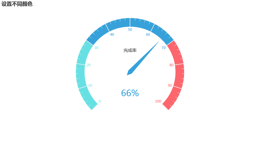
將儀表盤劃分為0-0.3、0.3-0.7、0.7-1三個段,并設(shè)置不同的顏色
三、改變儀表盤刻度
from?pyecharts?import?options?as?opts
from?pyecharts.charts?import?Gauge

c?=?(
????Gauge()
????.add(
????????"業(yè)務(wù)指標",
????????[("完成率",?55.5)],
????????split_number=20,
????????axisline_opts=opts.AxisLineOpts(
????????????linestyle_opts=opts.LineStyleOpts(
????????????????color=[(0.3,?"#00CDCD"),?(0.7,?"#CDBE70"),?(1,?"#00EE00")],?width=30
????????????)
????????),
????????detail_label_opts=opts.LabelOpts(formatter="{value}"),
????)
????.set_global_opts(
????????title_opts=opts.TitleOpts(title="Gauge-分割段數(shù)-Label"),
????????legend_opts=opts.LegendOpts(is_show=False),
????)
)
c.render_notebook()
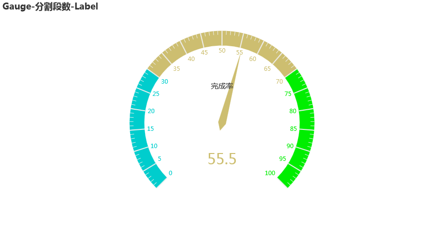
如果想讓儀表盤的刻度變成5,那么我們可以把它分成20份(split_number=20)
四、改變儀表盤的大小
from?pyecharts?import?options?as?opts
from?pyecharts.charts?import?Gauge

c?=?(
????Gauge()
????.add("",?[("完成率",?66.6)],?radius="60%")
????.set_global_opts(title_opts=opts.TitleOpts(title="半徑改為?60%"))
)
c.render_notebook()
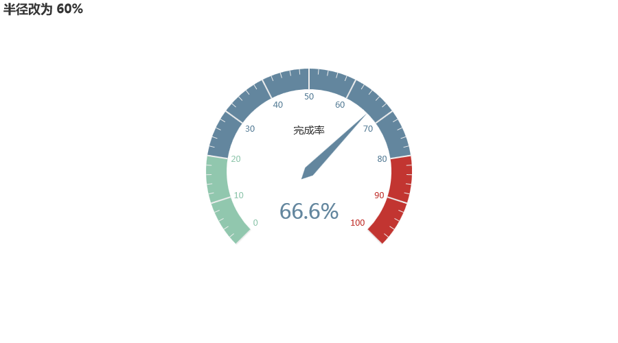
radius="60%"可以把儀表盤半徑改為默認半徑的60%
五、改變儀表盤內(nèi)文字字體
from?pyecharts?import?options?as?opts
from?pyecharts.charts?import?Gauge

c?=?(
????Gauge()
????.add(
????????"",
????????[("完成率",?66.6)],
????????title_label_opts=opts.LabelOpts(
????????????font_size=40,?color="blue",?font_family="Microsoft?YaHei"
????????),
????)
????.set_global_opts(title_opts=opts.TitleOpts(title="Gauge-改變輪盤內(nèi)的字體"))
)
c.render_notebook()
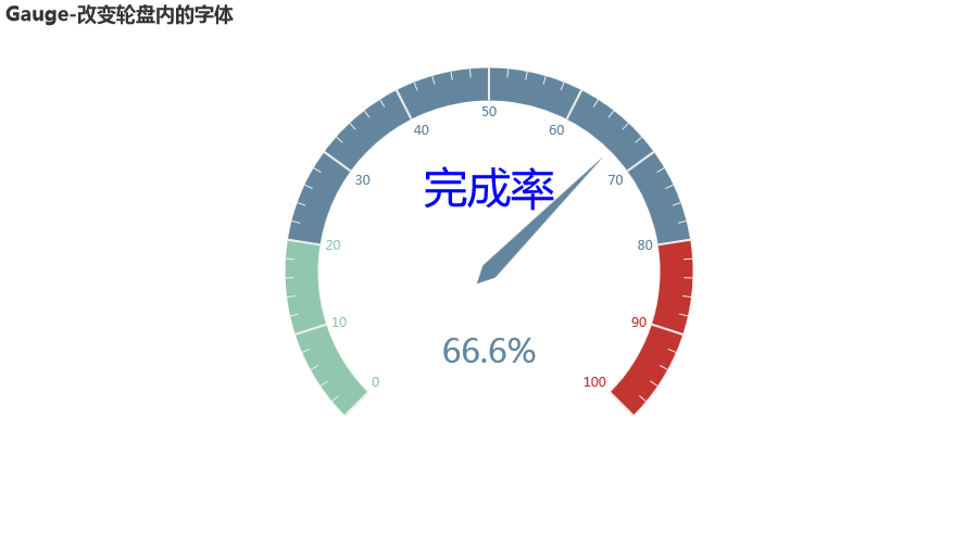
可以分別設(shè)置大小(font_size)、顏色(color)和字體(font_family)
-完-
完整代碼:https://yihang.cowtransfer.com/s/1724905e89c24e

推薦閱讀
(點擊標題可跳轉(zhuǎn)閱讀)
我是如何純靠技術(shù)在大學(xué)月入上萬,收獲人生第一個10W
轉(zhuǎn)了嗎 ? ? ? ? ? ? ? ? ? ? ? ? ? ? ? ?? ?? ? ? ? ? ? ? ? ? ? ? ? ? ? ?贊了嗎 在看嗎


評論
圖片
表情