
用 Python 制作子彈圖也這么簡單,愛了~
眾所周知,Python 的應用是非常廣泛的,今天我們就通過 matplotlib 庫學習下如何制作精美的子彈圖
1什么是子彈圖
一個子彈圖約定俗成的定義
子彈圖使用長度/高度、位置和顏色對數(shù)據(jù)進行編碼,以顯示與目標和性能帶相比的實際情況
我們先來看下子彈圖大概長什么樣子
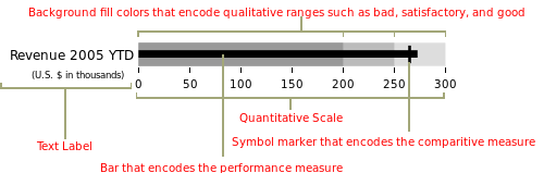
子彈圖具有單一的主要度量(例如,當前年初至今的收入),將該度量與一個或多個其他度量進行比較以豐富其含義(例如,與目標相比),并將其顯示在性能的定性范圍的背景,例如差、滿意和好。定性范圍顯示為單一色調的不同強度,使色盲者可以辨別它們,并將儀表板上的顏色使用限制在最低限度
好了,差不多這就是子彈圖的應用場景和繪制標準了,下面我們就開始制作吧
2構建圖表
思路大致是,可以使用堆疊條形圖來表示各種范圍,并使用另一個較小的條形圖來表示值,最后,用一條垂直線標記目標
可以看出,我們需要多個組件圖層,使用 matplotlib 來實現(xiàn)會比較方便
import?matplotlib.pyplot?as?plt
import?seaborn?as?sns
from?matplotlib.ticker?import?FuncFormatter

%matplotlib?inline
這里我們還導入了 Seaborn,是因為 Seaborn 有一些非常有用的工具來管理調色板,利用這種功能比嘗試以其他方式復制它更容易
我們需要生成調色板的主要原因是我們很可能希望為各種定性范圍生成視覺上吸引人的配色方案,直接使用 seaborn 來完成會方便很多
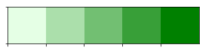
在下面的例子中,我們可以使用 palplot 便利函數(shù)來顯示 5 種綠色色調的調色板
sns.palplot(sns.light_palette("green",?5))
sns.palplot(sns.light_palette("purple",8,?reverse=True))
以相反的順序制作 8 種不同深淺的紫色

我們現(xiàn)在知道了如何設置調色板,接下來讓我們使用 Matplotlib 根據(jù)上面列出的原則創(chuàng)建一個簡單的子彈圖
首先,定義我們想要繪制的值
limits?=?[80,?100,?150]
data_to_plot?=?("Example?1",?105,?120)
這個將創(chuàng)建 3 個范圍:0-80、81-100、101-150 和一個值為 105 和目標線為 120 的“示例”線 接下來,構建一個藍色調色板:
palette?=?sns.color_palette("Blues_r",?len(limits))
接下來是構建范圍的堆積條形圖:
fig,?ax?=?plt.subplots()
ax.set_aspect('equal')
ax.set_yticks([1])
ax.set_yticklabels([data_to_plot[0]])

prev_limit?=?0
for?idx,?lim?in?enumerate(limits):
????ax.barh([1],?lim-prev_limit,?left=prev_limit,?height=15,?color=palette[idx])
????prev_limit?=?lim

然后我們可以添加一個較小的條形圖來表示 105 的值:
ax.barh([1],?data_to_plot[1],?color='black',?height=5)

已經(jīng)初見雛形了
最后一步是使用 axvline 添加目標標記:
ax.axvline(data_to_plot[2],?color="gray",?ymin=0.10,?ymax=0.9)

上面我就完成了子彈圖的簡單制作,但是我們所有的測試數(shù)值都是寫死的,下面我們編寫一個可以填寫任意數(shù)值的代碼
3最終代碼
def?bulletgraph(data=None,?limits=None,?labels=None,?axis_label=None,?title=None,
????????????????size=(5,?3),?palette=None,?formatter=None,?target_color="gray",
????????????????bar_color="black",?label_color="gray"):
????#?Determine?the?max?value?for?adjusting?the?bar?height
????#?Dividing?by?10?seems?to?work?pretty?well
????h?=?limits[-1]?/?10

????#?Use?the?green?palette?as?a?sensible?default
????if?palette?is?None:
????????palette?=?sns.light_palette("green",?len(limits),?reverse=False)

????#?Must?be?able?to?handle?one?or?many?data?sets?via?multiple?subplots
????if?len(data)?==?1:
????????fig,?ax?=?plt.subplots(figsize=size,?sharex=True)
????else:
????????fig,?axarr?=?plt.subplots(len(data),?figsize=size,?sharex=True)

????#?Add?each?bullet?graph?bar?to?a?subplot
????for?idx,?item?in?enumerate(data):

????????#?Get?the?axis?from?the?array?of?axes?returned?when?the?plot?is?created
????????if?len(data)?>?1:
????????????ax?=?axarr[idx]

????????#?Formatting?to?get?rid?of?extra?marking?clutter
????????ax.set_aspect('equal')
????????ax.set_yticklabels([item[0]])
????????ax.set_yticks([1])
????????ax.spines['bottom'].set_visible(False)
????????ax.spines['top'].set_visible(False)
????????ax.spines['right'].set_visible(False)
????????ax.spines['left'].set_visible(False)

????????prev_limit?=?0
????????for?idx2,?lim?in?enumerate(limits):
????????????#?Draw?the?bar
????????????ax.barh([1],?lim?-?prev_limit,?left=prev_limit,?height=h,
????????????????????color=palette[idx2])
????????????prev_limit?=?lim
????????rects?=?ax.patches
????????#?The?last?item?in?the?list?is?the?value?we're?measuring
????????#?Draw?the?value?we're?measuring
????????ax.barh([1],?item[1],?height=(h?/?3),?color=bar_color)

????????#?Need?the?ymin?and?max?in?order?to?make?sure?the?target?marker
????????#?fits
????????ymin,?ymax?=?ax.get_ylim()
????????ax.vlines(
????????????item[2],?ymin?*?.9,?ymax?*?.9,?linewidth=1.5,?color=target_color)

????#?Now?make?some?labels
????if?labels?is?not?None:
????????for?rect,?label?in?zip(rects,?labels):
????????????height?=?rect.get_height()
????????????ax.text(
????????????????rect.get_x()?+?rect.get_width()?/?2,
????????????????-height?*?.4,
????????????????label,
????????????????ha='center',
????????????????va='bottom',
????????????????color=label_color)
????if?formatter:
????????ax.xaxis.set_major_formatter(formatter)
????if?axis_label:
????????ax.set_xlabel(axis_label)
????if?title:
????????fig.suptitle(title,?fontsize=14)
????fig.subplots_adjust(hspace=0)
代碼雖然看起來有點長,但是其實都是上面步驟的疊加,都比較簡單,就不再重復說明了
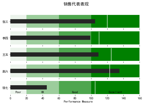
我們直接調用一下看看效果
data_to_plot2?=?[("張三",?105,?120),
?????????????????("李四",?99,?110),
?????????????????("王五",?109,?125),
?????????????????("趙六",?135,?123),
?????????????????("錢七",?45,?105)]

bulletgraph(data_to_plot2,?limits=[20,?60,?100,?160],
????????????labels=["Poor",?"OK",?"Good",?"Excellent"],?size=(8,5),
????????????axis_label="Performance?Measure",?label_color="black",
????????????bar_color="#252525",?target_color='#f7f7f7',
????????????title="銷售代表表現(xiàn)")
我們還可以進行一些優(yōu)化,格式化 x 軸以便更一致地顯示信息
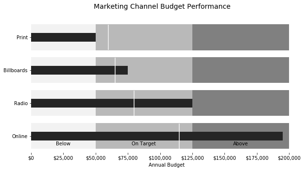
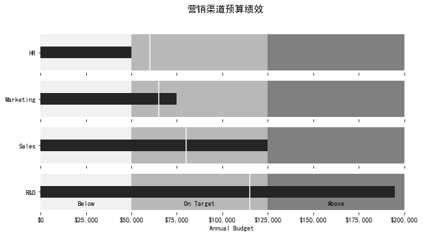
在下面這個例子中,我們可以衡量一家假設公司的營銷預算績效
def?money(x,?pos):
????'The?two?args?are?the?value?and?tick?position'
????return?"${:,.0f}".format(x)
????
money_fmt?=?FuncFormatter(money)
data_to_plot3?=?[("HR",?50000,?60000),
?????????????????("Marketing",?75000,?65000),
?????????????????("Sales",?125000,?80000),
?????????????????("R&D",?195000,?115000)]
palette?=?sns.light_palette("grey",?3,?reverse=False)
bulletgraph(data_to_plot3,?limits=[50000,?125000,?200000],
????????????labels=["Below",?"On?Target",?"Above"],?size=(10,5),
????????????axis_label="Annual?Budget",?label_color="black",
????????????bar_color="#252525",?target_color='#f7f7f7',?palette=palette,
????????????title="營銷渠道預算績效",
????????????formatter=money_fmt)
看起來效果都不錯哦,怎么樣,一起跟著做起來吧!
END
推薦閱讀
牛逼!Python常用數(shù)據(jù)類型的基本操作(長文系列第①篇)
牛逼!Python的判斷、循環(huán)和各種表達式(長文系列第②篇)