
利用Python添加AB實(shí)驗(yàn)顯著性標(biāo)注
在常規(guī)的實(shí)驗(yàn)統(tǒng)計(jì)分析過(guò)程中,我們經(jīng)常需要在組間數(shù)據(jù)間添加顯著性標(biāo)注,而在統(tǒng)計(jì)學(xué)中,數(shù)據(jù)間的差異顯著性檢驗(yàn)則是統(tǒng)計(jì)假設(shè)檢驗(yàn)的一種,是一種對(duì)組間數(shù)據(jù)或組內(nèi)不同數(shù)據(jù)之間是否有差異以及差異是否明顯判斷方法。
今天,小編給大家?guī)?lái)的是如何使用Python-Seaborn進(jìn)行顯著性統(tǒng)計(jì)圖表繪制,詳細(xì)內(nèi)容如下:
Python-Seaborn自定義函數(shù)繪制 Python-statannotations庫(kù)添加顯著性標(biāo)注
Python-Seaborn 自定義函數(shù)繪制
我們可以通過(guò)自定義繪圖函數(shù)的方式在統(tǒng)計(jì)圖表中添加顯著性標(biāo)注,這里我們直接使用Seaborn自帶的iris數(shù)據(jù)集進(jìn)行繪制,具體內(nèi)容如下:
自定義P值和星號(hào)對(duì)應(yīng)關(guān)系
由于是完全的自定義,這里需要定義一個(gè)函數(shù)將P值結(jié)果和對(duì)應(yīng)星號(hào)進(jìn)行轉(zhuǎn)化,代碼如下:
def?convert_pvalue_to_asterisks(pvalue):
????if?pvalue?<=?0.0001:
????????return?"****"
????elif?pvalue?<=?0.001:
????????return?"***"
????elif?pvalue?<=?0.01:
????????return?"**"
????elif?pvalue?<=?0.05:
????????return?"*"
????return?"ns"
scipy.stats 計(jì)算顯著性指標(biāo)
由于scipy.stats部分中提供多種顯著性檢驗(yàn)方法,如T-test、ANOVA等,由于篇幅有限,這里只介紹scipy.stats.ttest_ind() t檢驗(yàn)方法,詳細(xì)結(jié)算過(guò)程如下:
iris?=?sns.load_dataset("iris")
data_p?=?iris[["sepal_length","species"]]
stat,p_value?=?scipy.stats.ttest_ind(data_p[data_p["species"]=="setosa"]["sepal_length"],
?????????????????????????????????????data_p[data_p["species"]=="versicolor"]["sepal_length"],
?????????????????????????????????????equal_var=False)
上述結(jié)果就將P值計(jì)算,然后再通過(guò)之前定義的convert_pvalue_to_asterisks函數(shù)進(jìn)行轉(zhuǎn)換,得到星號(hào)表示形式。
可視化繪制
這一步主要使用自定義的繪圖方法進(jìn)行顯著性標(biāo)注繪制,詳細(xì)繪制代碼如下:
plt.rcParams['font.family']?=?['Times?New?Roman']
plt.rcParams["axes.labelsize"]?=?18
palette=['#0073C2FF','#EFC000FF','#868686FF']

fig,ax?=?plt.subplots(figsize=(5,4),dpi=100,facecolor="w")
ax?=?sns.barplot(x="species",y="sepal_length",data=iris,palette=palette,
?????????????????estimator=np.mean,ci="sd",?capsize=.1,errwidth=1,errcolor="k",
?????????????????ax=ax,
?????????????????**{"edgecolor":"k","linewidth":1})
#?添加P值
x1,?x2?=?0,?1
y,h?=?data_p["sepal_length"].mean()+1,.2
#繪制橫線位置
ax.plot([x1,?x1,?x2,?x2],?[y,?y+h,?y+h,?y],?lw=1,?c="k")?
#添加P值
ax.text((x1+x2)*.5,?y+h,?"T-test:?"+?p_value_cov,?ha='center',?va='bottom',?color="k")

ax.tick_params(which='major',direction='in',length=3,width=1.,labelsize=14,bottom=False)
for?spine?in?["top","left","right"]:
????ax.spines[spine].set_visible(False)
ax.spines['bottom'].set_linewidth(2)
ax.grid(axis='y',ls='--',c='gray')
ax.set_axisbelow(True)
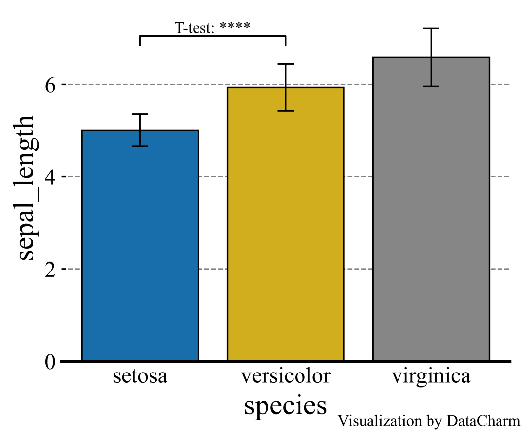
「注意」:這里由于是自定義繪制,在添加其他組間數(shù)據(jù)的顯著性編著時(shí)也采用相同方法。
在涉及較多組之間繪制P值是有沒(méi)有較為方便便捷的方法呢?下面小編介紹一個(gè)優(yōu)秀的第三方拓展庫(kù)進(jìn)行繪制。
Python-statannotations庫(kù)添加顯著性標(biāo)注
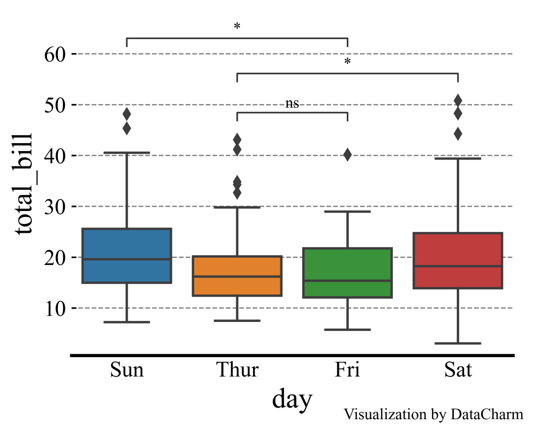
Python-statannotations庫(kù)則是針對(duì)Seaborn繪圖對(duì)象進(jìn)行顯著性標(biāo)注的專(zhuān)用庫(kù),其可以提供柱形圖、箱線圖、小提琴圖等統(tǒng)計(jì)圖表的顯著性標(biāo)注繪制,計(jì)算P值方法基于scipy.stats方法,這里我們簡(jiǎn)單列舉幾個(gè)示例演示即可,更多詳細(xì)內(nèi)容可參看:Python-statannotations官網(wǎng)[1]。
「樣例一」:
import?seaborn?as?sns

from?statannotations.Annotator?import?Annotator

df?=?sns.load_dataset("tips")
x?=?"day"
y?=?"total_bill"
order?=?['Sun',?'Thur',?'Fri',?'Sat']
fig,ax?=?plt.subplots(figsize=(5,4),dpi=100,facecolor="w")
ax?=?sns.boxplot(data=df,?x=x,?y=y,?order=order,ax=ax)

pairs=[("Thur",?"Fri"),?("Thur",?"Sat"),?("Fri",?"Sun")]
annotator?=?Annotator(ax,?pairs,?data=df,?x=x,?y=y,?order=order)
annotator.configure(test='Mann-Whitney',?text_format='star',line_height=0.03,line_width=1)
annotator.apply_and_annotate()

ax.tick_params(which='major',direction='in',length=3,width=1.,labelsize=14,bottom=False)
for?spine?in?["top","left","right"]:
????ax.spines[spine].set_visible(False)
ax.spines['bottom'].set_linewidth(2)
ax.grid(axis='y',ls='--',c='gray')
ax.set_axisbelow(True)
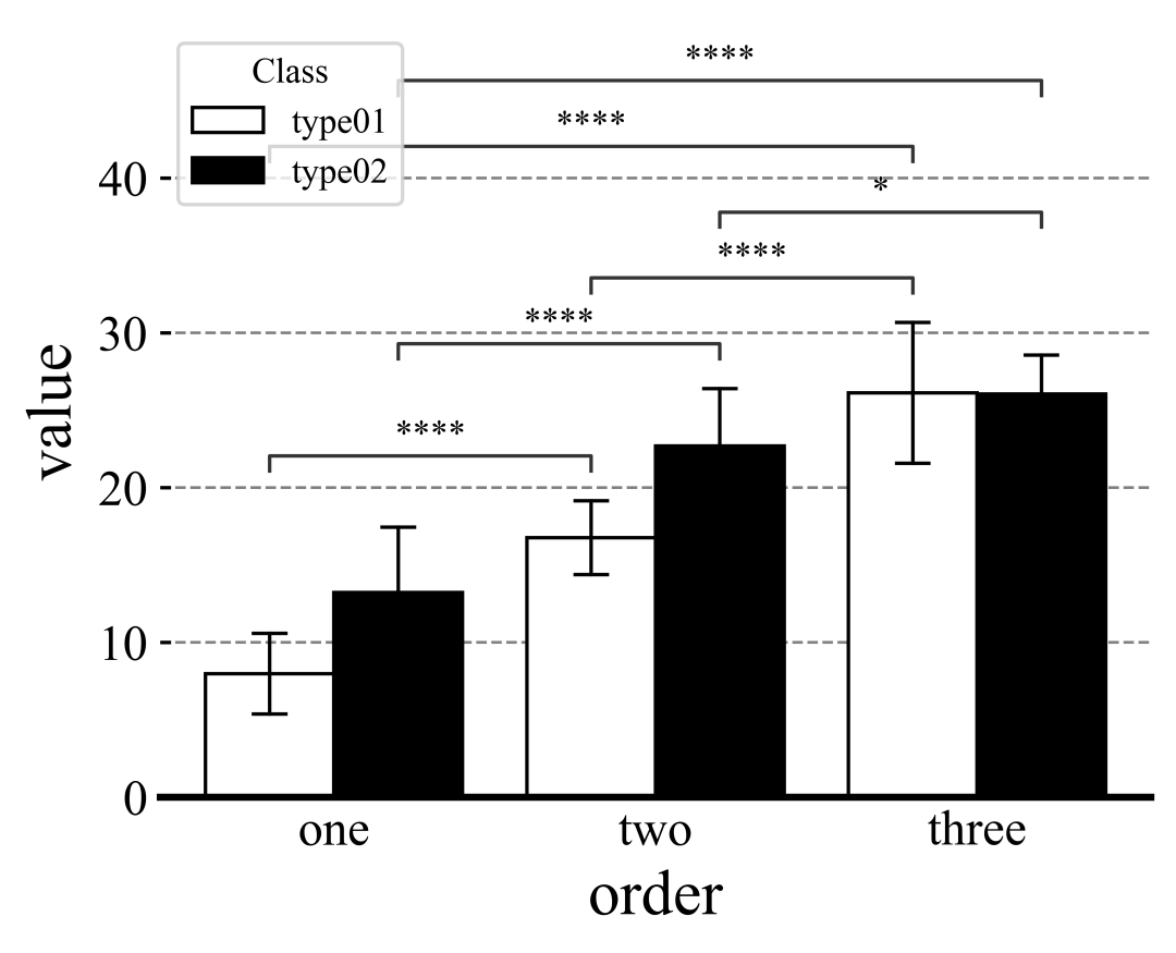
「樣例二」:
import?seaborn?as?sns
import?matplotlib.pyplot?as?plt
plt.rcParams['font.family']?=?['Times?New?Roman']
plt.rcParams["axes.labelsize"]?=?18
#palette=['#0073C2FF','#EFC000FF']
palette=['#E59F01','#56B4E8']
#palette?=?["white","black"]


fig,ax?=?plt.subplots(figsize=(5,4),dpi=100,facecolor="w")
ax?=?sns.barplot(x="order",y="value",hue="class",data=group_data_p,palette=palette,ci="sd",
?????????????????capsize=.1,errwidth=1,errcolor="k",ax=ax,
?????????????????**{"edgecolor":"k","linewidth":1})

#?添加P值
box_pairs?=?[(("one","type01"),("two","type01")),
?????????????(("one","type02"),("two","type02")),
?????????????(("one","type01"),("three","type01")),
?????????????(("one","type02"),("three","type02")),
?????????????(("two","type01"),("three","type01")),
?????????????(("two","type02"),("three","type02"))]


annotator?=??Annotator(ax,?data=group_data_p,?x="order",y="value",hue="class",
??????????????????????pairs=box_pairs)
annotator.configure(test='t-test_ind',?text_format='star',line_height=0.03,line_width=1)
annotator.apply_and_annotate()

當(dāng)然,還可以設(shè)置灰色系顏色,如下:
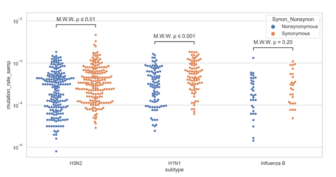
「樣例三」如果針對(duì)組間數(shù)據(jù)進(jìn)行統(tǒng)計(jì)分析,可以設(shè)置pairs參數(shù)據(jù)如下:
box_pairs?=?[(("one","type01"),("one","type02")),
?????????????(("two","type01"),("two","type02")),
?????????????(("three","type01"),("three","type02"))]

其他比如抖動(dòng)圖、橫向分組柱形圖等,可視化結(jié)果如下:

參考資料
Python-statannotations官網(wǎng): https://github.com/trevismd/statannotations。


