
Python數(shù)據(jù)可視化的3大步驟,你知道嗎?
Python實(shí)現(xiàn)可視化的三個(gè)步驟:
確定問(wèn)題,選擇圖形 轉(zhuǎn)換數(shù)據(jù),應(yīng)用函數(shù) 參數(shù)設(shè)置,一目了然

點(diǎn):scatter plot 二維數(shù)據(jù),適用于簡(jiǎn)單二維關(guān)系; 線:line plot 二維數(shù)據(jù),適用于時(shí)間序列; 柱狀:bar plot 二維數(shù)據(jù),適用于類別統(tǒng)計(jì); 顏色:heatmap 適用于展示第三維度;
合并:merge,concat,combine_frist(類似于數(shù)據(jù)庫(kù)中的全外連接) 重塑:reshape;軸向旋轉(zhuǎn):pivot(類似excel數(shù)據(jù)透視表) 去重:drop_duplicates 映射:map 填充替換:fillna,replace 重命名軸索引:rename
#導(dǎo)入包import numpy as npimport pandas as pdimport matplotlib.pyplot as plt
#創(chuàng)建畫布fig = plt.figure()<Figure size 432x288 with 0 Axes>#創(chuàng)建subplot,221表示這是2行2列表格中的第1個(gè)圖像。ax1 = fig.add_subplot(221)#但現(xiàn)在更習(xí)慣使用以下方法創(chuàng)建畫布和圖像,2,2表示這是一個(gè)2*2的畫布,可以放置4個(gè)圖像fig , axes = plt.subplots(2,2,sharex=True,sharey=True)#plt.subplot的sharex和sharey參數(shù)可以指定所有的subplot使用相同的x,y軸刻度。
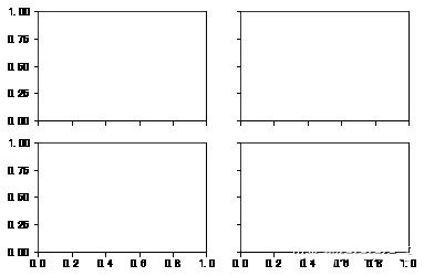
subplots_adjust(left=None,bottom=None,right=None,top=None,wspace=None,hspace=None)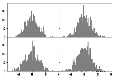
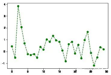
plt.plot(np.random.randn(30),color='g',linestyle='--',marker='o')[<matplotlib.lines.Line2D at 0x8c919b0>]
plt.plot(np.random.randn(30),color='g',linestyle='--',marker='o')plt.xlim() #不帶參數(shù)調(diào)用,顯示當(dāng)前參數(shù);#可將xlim替換為另外兩個(gè)方法試試(-1.4500000000000002, 30.45)
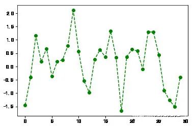
plt.plot(np.random.randn(30),color='g',linestyle='--',marker='o')plt.xlim([0,15]) #橫軸刻度變成0-15(0, 15)
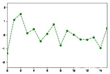
fig = plt.figure();ax = fig.add_subplot(1,1,1)ax.plot(np.random.randn(1000).cumsum())ticks = ax.set_xticks([0,250,500,750,1000]) #設(shè)置刻度值labels = ax.set_xticklabels(['one','two','three','four','five']) #設(shè)置刻度標(biāo)簽ax.set_title('My first Plot') #設(shè)置標(biāo)題ax.set_xlabel('Stage') #設(shè)置軸標(biāo)簽Text(0.5,0,'Stage')
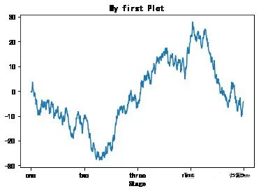
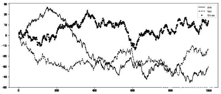
fig = plt.figure(figsize=(12,5));ax = fig.add_subplot(111)ax.plot(np.random.randn(1000).cumsum(),'k',label='one') #傳入label參數(shù),定義label名稱ax.plot(np.random.randn(1000).cumsum(),'k--',label='two')ax.plot(np.random.randn(1000).cumsum(),'k.',label='three')#圖形創(chuàng)建完后,只需要調(diào)用legend參數(shù)將label調(diào)出來(lái)即可。ax.legend(loc='best') #要求不是很嚴(yán)格的話,建議使用loc=‘best’參數(shù)來(lái)讓它自己選擇最佳位置<matplotlib.legend.Legend at 0xa8f5a20>
plt.plot(np.random.randn(1000).cumsum())plt.text(600,10,'test ',family='monospace',fontsize=10)#中文注釋在默認(rèn)環(huán)境下并不能正常顯示,需要修改配置文件,使其支持中文字體。具體步驟請(qǐng)自行搜索。
fname:含有文件路徑的字符串,拓展名指定文件類型 dpi:分辨率,默認(rèn)100 facecolor,edgcolor 圖像的背景色,默認(rèn)‘w’白色 format:顯示設(shè)置文件格式('png','pdf','svg','ps','jpg'等) bbox_inches:圖表需要保留的部分。如果設(shè)置為“tight”,則將嘗試剪除圖像周圍的空白部分
plt.savefig('./plot.jpg') #保存圖像為plot名稱的jpg格式圖像<Figure size 432x288 with 0 Axes>
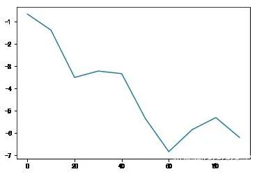
import matplotlib.pyplot as plts = pd.Series(np.random.randn(10).cumsum(),index=np.arange(0,100,10))s.plot() #Series對(duì)象的索引index會(huì)傳給matplotlib用作繪制x軸。<matplotlib.axes._subplots.AxesSubplot at 0xf553128>
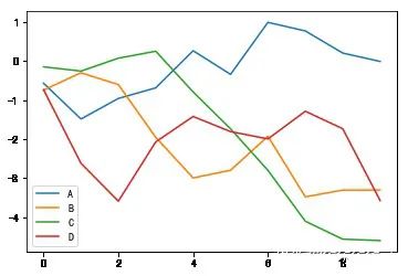
df = pd.DataFrame(np.random.randn(10,4).cumsum(0),columns=['A','B','C','D'])df.plot() #plot會(huì)自動(dòng)為不同變量改變顏色,并添加圖例<matplotlib.axes._subplots.AxesSubplot at 0xf4f9eb8>
label:用于圖表的標(biāo)簽 style:風(fēng)格字符串,'g--' alpha:圖像的填充不透明度(0-1) kind:圖表類型(bar,line,hist,kde等) xticks:設(shè)定x軸刻度值 yticks:設(shè)定y軸刻度值 xlim,ylim:設(shè)定軸界限,[0,10] grid:顯示軸網(wǎng)格線,默認(rèn)關(guān)閉 rot:旋轉(zhuǎn)刻度標(biāo)簽 use_index:將對(duì)象的索引用作刻度標(biāo)簽 logy:在Y軸上使用對(duì)數(shù)標(biāo)尺
subplots:將各個(gè)DataFrame列繪制到單獨(dú)的subplot中 sharex,sharey:共享x,y軸 figsize:控制圖像大小 title:圖像標(biāo)題 legend:添加圖例,默認(rèn)顯示 sort_columns:以字母順序繪制各列,默認(rèn)使用當(dāng)前順序
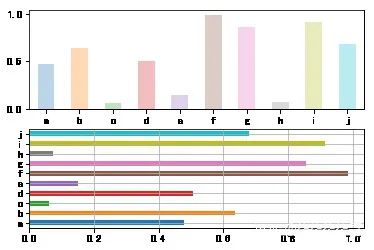
fig,axes = plt.subplots(2,1)data = pd.Series(np.random.rand(10),index=list('abcdefghij'))data.plot(kind='bar',ax=axes[0],rot=0,alpha=0.3)data.plot(kind='barh',ax=axes[1],grid=True)<matplotlib.axes._subplots.AxesSubplot at 0xfe39898>

加入知識(shí)星球【我們談?wù)摂?shù)據(jù)科學(xué)】
500+小伙伴一起學(xué)習(xí)!
· 推薦閱讀 ·
Python中最值得學(xué)習(xí)的第三方JSON庫(kù)
評(píng)論
圖片
表情