
【布局】483- 推薦 15 種水平垂直居中布局方案

https://juejin.im/post/5db706d5f265da4d31073959
我們在日常的開發(fā)中,經(jīng)常會遇到這樣一個問題,就是如何實現(xiàn)居中水平垂直居中對齊。并且在面試中也會出現(xiàn)這樣的問題,但是我們往往回答的不是很全部,而導(dǎo)致沒有得到面試加分。接下來我們通過不同的方式來實現(xiàn),讓我們成功破解這道面試。
1、定寬高
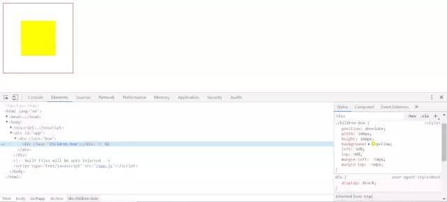
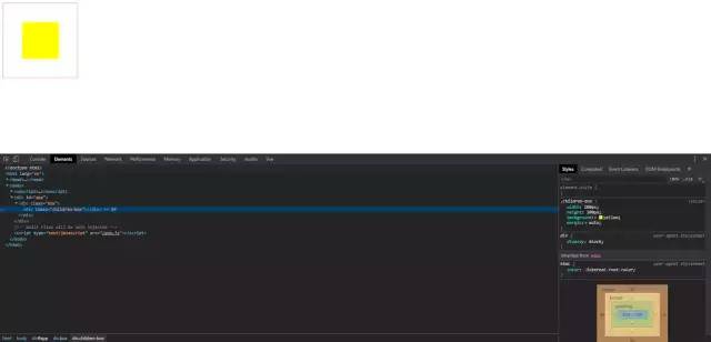
一、絕對定位和負magin值
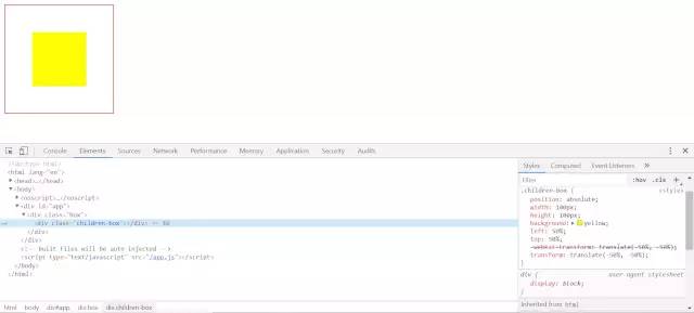
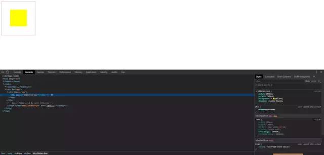
二、絕對定位 + transform
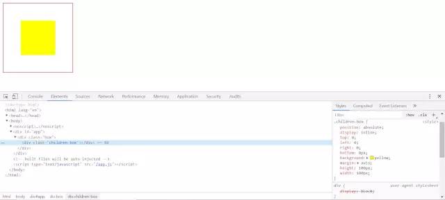
三、絕對定位 + left/right/bottom/top + margin
四、flex布局
五、grid布局
六、table-cell + vertical-align + inline-block/margin: auto
2、不定寬高
一、絕對定位 + transform
二、table-cell
三、flex布局
四、flex變異布局
五、grid + flex布局
六、gird + margin布局
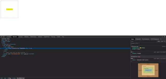
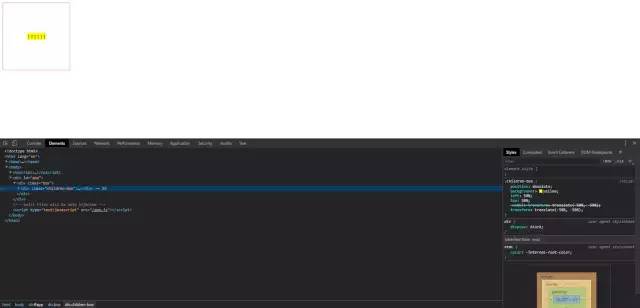
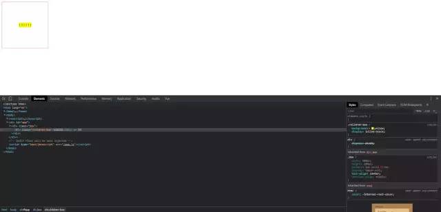
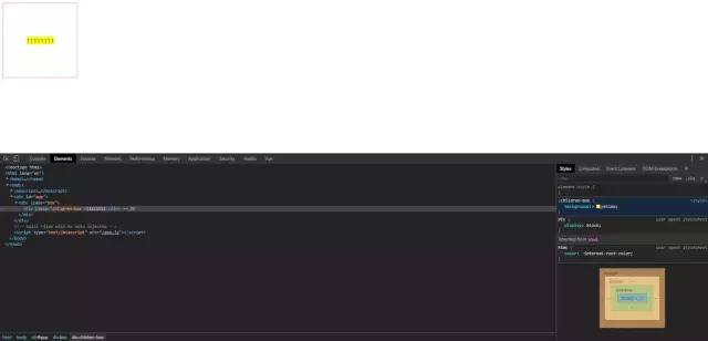
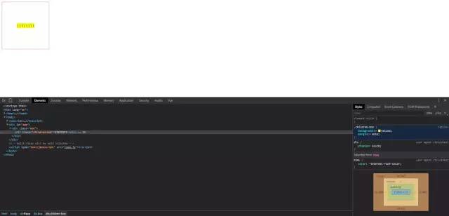
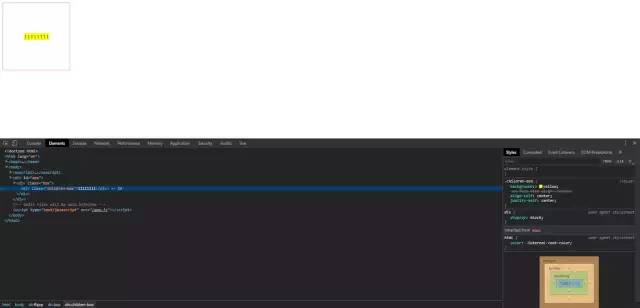
七、writing-mode屬性布局
11111
writing-mode 屬性定義了文本在水平或垂直方向上如何排布。兼容性上還有些小瑕疵,但大部分瀏覽器已經(jīng)支持。
3、番外(圖片定高|不定高水平垂直居中)
一、table-cell

二、 ::after
三、 ::before
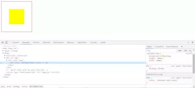
四、總結(jié)
這里總結(jié)了很多種垂直水平居中的方法,但是肯定不是最完全的,還有很多其他中方式。但是總體的思路可以總結(jié)為以下幾點。
一、內(nèi)聯(lián)元素居中布局
水平居中
行內(nèi)元素可設(shè)置:text-align: center;
flex布局設(shè)置父元素:display: flex; justify-content: center;
垂直居中
單行文本父元素確認(rèn)高度:height === line-height
多行文本父元素確認(rèn)高度:disaply: table-cell; vertical-align: middle;
二、塊級元素居中布局
水平居中
定寬: margin: 0 auto;
不定寬:參考上訴例子中不定寬高例子。
垂直居中
position: absolute設(shè)置left、top、margin-left、margin-to(定高);
position: fixed設(shè)置margin: auto(定高);
display: table-cell;
transform: translate(x, y);
flex(不定高,不定寬);
grid(不定高,不定寬),兼容性相對比較差;
回復(fù)“加群”與大佬們一起交流學(xué)習(xí)~
