
我用Python的Seaborn庫(kù)繪制17個(gè)超好看圖表

Seaborn簡(jiǎn)介
定義
Seaborn是一個(gè)基于matplotlib且數(shù)據(jù)結(jié)構(gòu)與pandas統(tǒng)一的統(tǒng)計(jì)圖制作庫(kù)。Seaborn框架旨在以數(shù)據(jù)可視化為中心來(lái)挖掘與理解數(shù)據(jù)。
優(yōu)點(diǎn)
-
代碼較少
-
圖形美觀
-
功能齊全
-
主流模塊安裝
pip命令安裝
pip install matplotlib
pip install seaborn
從github安裝
pip install git+https://github.com/mwaskom/seaborn.git
流程
導(dǎo)入繪圖模塊
mport matplotlib.pyplot as plt
import seaborn as sns
提供顯示條件
%matplotlib inline #在Jupyter中正常顯示圖形
導(dǎo)入數(shù)據(jù)
#Seaborn內(nèi)置數(shù)據(jù)集導(dǎo)入
dataset = sns.load_dataset('dataset')

#外置數(shù)據(jù)集導(dǎo)入(以csv格式為例)
dataset = pd.read_csv('dataset.csv')
設(shè)置畫布
#設(shè)置一塊大小為(12,6)的畫布
plt.figure(figsize=(12, 6))
輸出圖形
#整體圖形背景樣式,共5種:"white", "dark", "whitegrid", "darkgrid", "ticks"
sns.set_style('white')

#以條形圖為例輸出圖形
sns.barplot(x=x,y=y,data=dataset,...)

'''
barplot()括號(hào)里的是需要設(shè)置的具體參數(shù),
涉及到數(shù)據(jù)、顏色、坐標(biāo)軸、以及具體圖形的一些控制變量,
基本的一些參數(shù)包括'x'、'y'、'data',分別表示x軸,y軸,
以及選擇的數(shù)據(jù)集。
'''
保存圖形
#將畫布保存為png、jpg、svg等格式圖片
plt.savefig('jg.png')
實(shí)戰(zhàn)
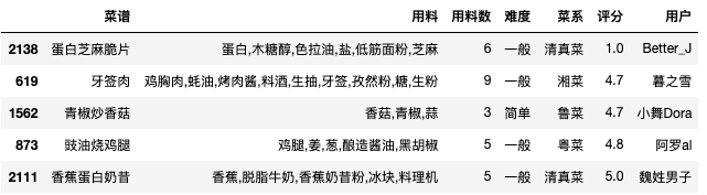
#數(shù)據(jù)準(zhǔn)備
df = pd.read_csv('./cook.csv') #讀取數(shù)據(jù)集(「菜J學(xué)Python」公眾號(hào)后臺(tái)回復(fù)cook獲取)
df['難度'] = df['用料數(shù)'].apply(lambda x:'簡(jiǎn)單' if x<5 else('一般' if x<15  else '較難')) #增加難度字段
df = df[['菜譜','用料','用料數(shù)','難度','菜系','評(píng)分','用戶']] #選擇需要的列
df.sample(5)  #查看數(shù)據(jù)集的隨機(jī)5行數(shù)據(jù)
#導(dǎo)入相關(guān)包
import numpy as np
import pandas as pd
import matplotlib.pyplot as plt
import matplotlib as mpl
import seaborn as sns
%matplotlib inline
plt.rcParams['font.sans-serif'] = ['SimHei']  # 設(shè)置加載的字體名
plt.rcParams['axes.unicode_minus'] = False    # 解決保存圖像是負(fù)號(hào)'-'顯示為方塊的問(wèn)題
sns.set_style('white')   #設(shè)置圖形背景樣式為white
直方圖
#語(yǔ)法
'''
seaborn.distplot(a, bins=None, hist=True, kde=True, rug=False, fit=None,
hist_kws=None, kde_kws=None, rug_kws=None, fit_kws=None, color=None,
vertical=False, norm_hist=False, axlabel=None, label=None, ax=None)
'''
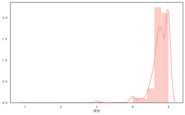
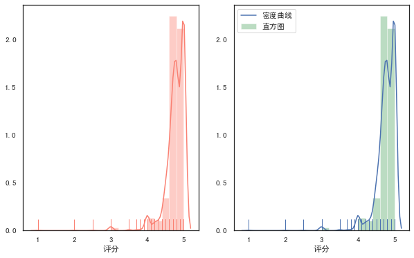
#distplot()輸出直方圖,默認(rèn)擬合出密度曲線
plt.figure(figsize=(10, 6)) #設(shè)置畫布大小
rate = df['評(píng)分']
sns.distplot(rate,color="salmon",bins=20) #參數(shù)color樣式為salmon,bins參數(shù)設(shè)定數(shù)據(jù)片段的數(shù)量
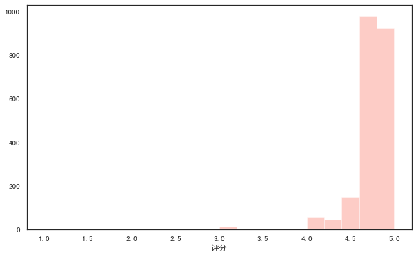
#kde參數(shù)設(shè)為False,可去掉擬合的密度曲線
plt.figure(figsize=(10, 6))
sns.distplot(rate,kde=False,color="salmon",bins=20)
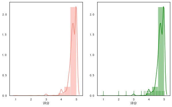
#設(shè)置rug參數(shù),可添加觀測(cè)數(shù)值的邊際毛毯
fig,axes=plt.subplots(1,2,figsize=(10,6)) #為方便對(duì)比,創(chuàng)建一個(gè)1行2列的畫布,figsize設(shè)置畫布大小

sns.distplot(rate,color="salmon",bins=10,ax=axes[0]) #axes[0]表示第一張圖(左圖)

sns.distplot(rate,color="green",bins=10,rug=True,ax=axes[1]) #axes[1]表示第一張圖(右圖)
#多個(gè)參數(shù)可通過(guò)字典傳遞
fig,axes=plt.subplots(1,2,figsize=(10,6))
sns.distplot(rate,color="salmon",bins=20,rug=True,ax=axes[0])

sns.distplot(rate,rug=True,
                     hist_kws={'color':'g','label':'直方圖'},
                     kde_kws={'color':'b','label':'密度曲線'},
                     bins=20,
                     ax=axes[1])
散點(diǎn)圖
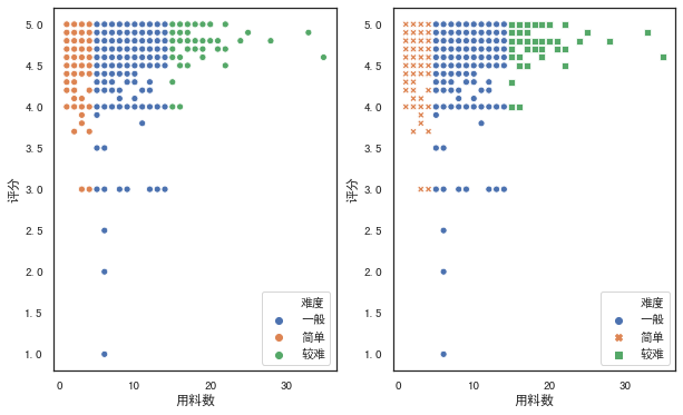
常規(guī)散點(diǎn)圖:scatterplot
#語(yǔ)法
'''
seaborn.scatterplot(x=None, y=None, hue=None, style=None, size=None,
data=None, palette=None, hue_order=None, hue_norm=None, sizes=None,
size_order=None, size_norm=None, markers=True, style_order=None, x_bins=None,
y_bins=None, units=None, estimator=None, ci=95, n_boot=1000, alpha='auto',
x_jitter=None, y_jitter=None, legend='brief', ax=None, **kwargs)
'''

fig,axes=plt.subplots(1,2,figsize=(10,6))
#hue參數(shù),對(duì)數(shù)據(jù)進(jìn)行細(xì)分
sns.scatterplot(x="用料數(shù)", y="評(píng)分",hue="難度",data=df,ax=axes[0])

#style參數(shù)通過(guò)不同的顏色和標(biāo)記顯示分組變量
sns.scatterplot(x="用料數(shù)", y="評(píng)分",hue="難度",style='難度',data=df,ax=axes[1])
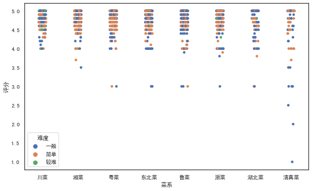
分簇散點(diǎn)圖:stripplot
#語(yǔ)法
'''
seaborn.stripplot(x=None, y=None, hue=None, data=None, order=None,
hue_order=None, jitter=True, dodge=False, orient=None, color=None,
palette=None, size=5, edgecolor='gray', linewidth=0, ax=None, **kwargs)
'''

#設(shè)置jitter參數(shù)控制抖動(dòng)的大小
plt.figure(figsize=(10, 6))
sns.stripplot(x="菜系", y="評(píng)分",hue="難度",jitter=1,data=df)
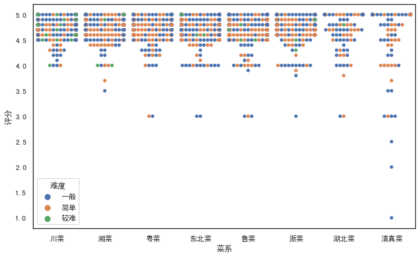
分類散點(diǎn)圖:swarmplot
#繪制分類散點(diǎn)圖(帶分布屬性)
#語(yǔ)法
'''
seaborn.swarmplot(x=None, y=None, hue=None, data=None, order=None,
hue_order=None, dodge=False, orient=None, color=None, palette=None,
size=5, edgecolor='gray', linewidth=0, ax=None, **kwargs)
'''

plt.figure(figsize=(10, 6))
sns.swarmplot(x="菜系", y="評(píng)分",hue="難度",data=df)
條形圖
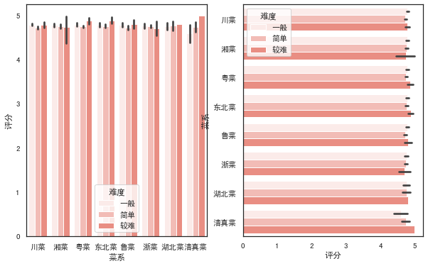
常規(guī)條形圖:barplot
#語(yǔ)法
'''
seaborn.barplot(x=None, y=None, hue=None, data=None, order=None,
hue_order=None,ci=95, n_boot=1000, units=None, orient=None, color=None,
palette=None, saturation=0.75, errcolor='.26', errwidth=None, capsize=None,
ax=None, estimator=<function mean>,**kwargs)
'''

#barplot()默認(rèn)展示的是某種變量分布的平均值(可通過(guò)修改estimator參數(shù)為max、min、median等)
# from numpy import median
fig,axes=plt.subplots(1,2,figsize=(10,6))
sns.barplot(x='菜系',y='評(píng)分',color="r",data=df,ax=axes[0])

sns.barplot(x='菜系',y='評(píng)分',color="salmon",data=df,estimator=min,ax=axes[1])

fig,axes=plt.subplots(1,2,figsize=(10,6))
#設(shè)置hue參數(shù),對(duì)x軸的數(shù)據(jù)進(jìn)行細(xì)分
sns.barplot(x='菜系',y='評(píng)分',color="salmon",hue='難度',data=df,ax=axes[0])
#調(diào)換x和y的順序,可將縱向條形圖轉(zhuǎn)為水平條形圖
sns.barplot(x='評(píng)分',y='菜系',color="salmon",hue='難度',data=df,ax=axes[1])
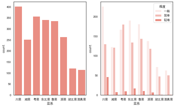
計(jì)數(shù)條形圖:countplot
#語(yǔ)法
'''
seaborn.countplot(x=None, y=None, hue=None, data=None, order=None,
hue_order=None, orient=None, color=None, palette=None, saturation=0.75, dodge=True, ax=None, **kwargs)
'''

fig,axes=plt.subplots(1,2,figsize=(10,6))
#選定某個(gè)字段,countplot()會(huì)自動(dòng)統(tǒng)計(jì)該字段下各類別的數(shù)目
sns.countplot(x='菜系',color="salmon",data=df,ax=axes[0])
#同樣可以加入hue參數(shù)
sns.countplot(x='菜系',color="salmon",hue='難度',data=df,ax=axes[1])
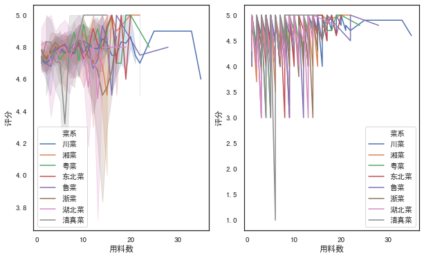
折線圖
#語(yǔ)法
'''
seaborn.lineplot(x=None, y=None, hue=None, size=None, style=None,
data=None, palette=None, hue_order=None, hue_norm=None, sizes=None, size_order=None,
size_norm=None, dashes=True, markers=None, style_order=None, units=None, estimator='mean',
ci=95, n_boot=1000, sort=True, err_style='band', err_kws=None, legend='brief', ax=None, **kwargs)
'''

fig,axes=plt.subplots(1,2,figsize=(10,6))
#默認(rèn)折線圖有聚合
sns.lineplot(x="用料數(shù)", y="評(píng)分", hue="菜系",data=df,ax=axes[0])

#estimator參數(shù)設(shè)置為None可取消聚合
sns.lineplot(x="用料數(shù)", y="評(píng)分", hue="菜系",estimator=None,data=df,ax=axes[1])
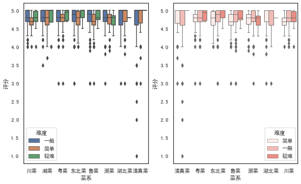
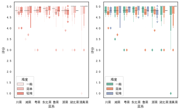
箱圖
箱線圖:boxplot
#語(yǔ)法
'''
seaborn.boxplot(x=None, y=None, hue=None, data=None, order=None,
hue_order=None, orient=None, color=None, palette=None, saturation=0.75,
width=0.8, dodge=True, fliersize=5, linewidth=None, whis=1.5, notch=False, ax=None, **kwargs)
'''
fig,axes=plt.subplots(1,2,figsize=(10,6))
sns.boxplot(x='菜系',y='評(píng)分',hue='難度',data=df,ax=axes[0])

#調(diào)節(jié)order和hue_order參數(shù),可以控制x軸展示的順序,linewidth調(diào)節(jié)線寬
sns.boxplot(x='菜系',y='評(píng)分',hue='難度',data=df,color="salmon",linewidth=1,
                    order=['清真菜','粵菜','東北菜','魯菜','浙菜','湖北菜','川菜'],
                    hue_order=['簡(jiǎn)單','一般','較難'],ax=axes[1])
箱型圖:boxenplot
#語(yǔ)法
'''
seaborn.boxenplot(x=None, y=None, hue=None, data=None, order=None,
hue_order=None, orient=None, color=None, palette=None, saturation=0.75,
width=0.8, dodge=True, k_depth='proportion', linewidth=None, scale='exponential',
outlier_prop=None, ax=None, **kwargs)
'''

fig,axes=plt.subplots(1,2,figsize=(10,6))
sns.boxenplot(x='菜系',y='評(píng)分',hue='難度',data=df,color="salmon",ax=axes[0])

#palette參數(shù)可設(shè)置調(diào)色板
sns.boxenplot(x='菜系',y='評(píng)分',hue='難度',data=df, palette="Set2",ax=axes[1])
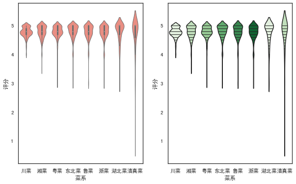
小提琴圖
#語(yǔ)法
'''
seaborn.violinplot(x=None, y=None, hue=None, data=None, order=None,
hue_order=None, bw='scott', cut=2, scale='area', scale_hue=True,
gridsize=100, width=0.8, inner='box', split=False, dodge=True, orient=None,
linewidth=None, color=None, palette=None, saturation=0.75, ax=None, **kwargs)
'''

fig,axes=plt.subplots(1,2,figsize=(10,6))
sns.violinplot(x='菜系',y='評(píng)分',data=df, color="salmon",linewidth=1,ax=axes[0])
#inner參數(shù)可在小提琴內(nèi)部添加圖形,palette設(shè)置顏色漸變
sns.violinplot(x='菜系',y='評(píng)分',data=df,palette=sns.color_palette('Greens'),inner='stick',ax=axes[1])
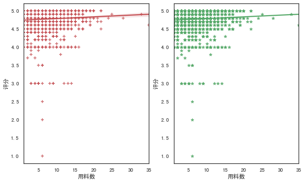
回歸圖
regplot
'''
seaborn.regplot(x, y, data=None, x_estimator=None, x_bins=None, x_ci='ci',
                scatter=True, fit_reg=True, ci=95, n_boot=1000, units=None,
                order=1, logistic=False, lowess=False, robust=False, logx=False,
                x_partial=None, y_partial=None, truncate=False, dropna=True,
                x_jitter=None, y_jitter=None, label=None, color=None, marker='o',
                scatter_kws=None, line_kws=None, ax=None)
'''

fig,axes=plt.subplots(1,2,figsize=(10,6))
#marker參數(shù)可設(shè)置數(shù)據(jù)點(diǎn)的形狀
sns.regplot(x='用料數(shù)',y='評(píng)分',data=df,color='r',marker='+',ax=axes[0])
#ci參數(shù)設(shè)置為None可去除直線附近陰影(置信區(qū)間)
sns.regplot(x='用料數(shù)',y='評(píng)分',data=df,ci=None,color='g',marker='*',ax=axes[1])
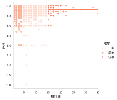
lmplot
#語(yǔ)法
'''
seaborn.lmplot(x, y, data, hue=None, col=None, row=None, palette=None,
               col_wrap=None, height=5, aspect=1, markers='o', sharex=True,
               sharey=True, hue_order=None, col_order=None, row_order=None,
               legend=True, legend_out=True, x_estimator=None, x_bins=None,
               x_ci='ci', scatter=True, fit_reg=True, ci=95, n_boot=1000,
               units=None, order=1, logistic=False, lowess=False, robust=False,
               logx=False, x_partial=None, y_partial=None, truncate=False,
               x_jitter=None, y_jitter=None, scatter_kws=None, line_kws=None, size=None)
'''

#lmplot()可以設(shè)置hue,進(jìn)行多個(gè)類別的顯示,而regplot()是不支持的
sns.lmplot(x='用料數(shù)',y='評(píng)分',hue='難度',data=df,
           palette=sns.color_palette('Reds'),ci=None,markers=['*','o','+'])
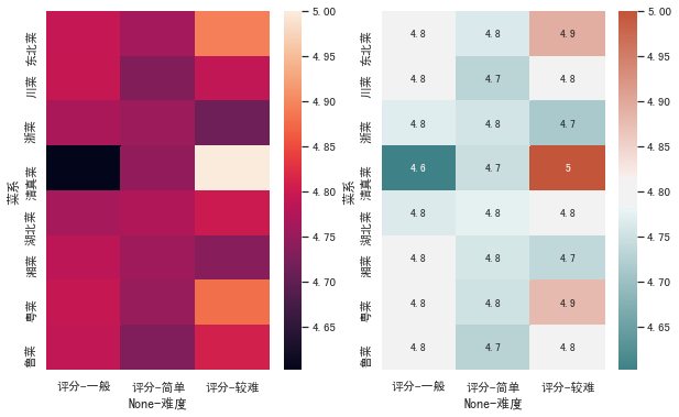
熱力圖
#語(yǔ)法
'''
seaborn.heatmap(data, vmin=None, vmax=None, cmap=None, center=None,
                robust=False, annot=None, fmt='.2g', annot_kws=None,
                linewidths=0, linecolor='white', cbar=True, cbar_kws=None,
                cbar_ax=None, square=False, xticklabels='auto',
                yticklabels='auto', mask=None, ax=None, **kwargs)
'''

fig,axes=plt.subplots(1,2,figsize=(10,6))
h=pd.pivot_table(df,index=['菜系'],columns=['難度'],values=['評(píng)分'],aggfunc=np.mean)
sns.heatmap(h,ax=axes[0])

#annot參數(shù)設(shè)置為True可顯示數(shù)字,cmap參數(shù)可設(shè)置熱力圖調(diào)色板
cmap = sns.diverging_palette(200,20,sep=20,as_cmap=True)
sns.heatmap(h,annot=True,cmap=cmap,ax=axes[1])
#保存圖形
plt.savefig('jg.png')
      戀習(xí)Python
     關(guān)注戀習(xí)Python,Python都好練


        好文章,我在看??
評(píng)論
圖片
表情