
吹爆了這個(gè)可視化神器,上手后直接開大~
回復(fù)“書籍”即可獲贈(zèng)Python從入門到進(jìn)階共10本電子書

大家好,我是明哥。
今天給大家推薦一個(gè)可視化神器 - Plotly_express ,上手非常的簡單,基本所有的圖都只要一行代碼就能繪出一張非常酷炫的可視化圖。
以下是這個(gè)神器的詳細(xì)使用方法,文中附含大量的 GIF 動(dòng)圖示例圖。
注:源代碼( .ipypnb 文件)的獲取方式,我放在文末了。記得下載
1. 環(huán)境準(zhǔn)備
本文的是在如下環(huán)境下測試完成的。
Python3.7 Jupyter notebook Pandas1.1.3 Plotly_express0.4.1
其中 Plotly_express0.4.1 是本文的主角,安裝它非常簡單,只需要使用 pip install 就可以
$ python3 -m pip install plotly_express
2. 工具概述
在說 plotly_express之前,我們先了解下plotly。Plotly是新一代的可視化神器,由TopQ量化團(tuán)隊(duì)開源。雖然Ploltly功能非常之強(qiáng)大,但是一直沒有得到重視,主要原因還是其設(shè)置過于繁瑣。因此,Plotly推出了其簡化接口:Plotly_express,下文中統(tǒng)一簡稱為px。
px是對(duì)Plotly.py的一種高級(jí)封裝,其內(nèi)置了很多實(shí)用且現(xiàn)代的繪圖模板,用戶只需要調(diào)用簡單的API函數(shù)即可實(shí)用,從而快速繪制出漂亮且動(dòng)態(tài)的可視化圖表。
px是完全免費(fèi)的,用戶可以任意使用它。最重要的是,px和plotly生態(tài)系統(tǒng)的其他部分是完全兼容的。用戶不僅可以在Dash中使用,還能通過Orca將數(shù)據(jù)導(dǎo)出為幾乎任意文件格式。
官網(wǎng)的學(xué)習(xí)資料:https://plotly.com/
px的安裝是非常簡單的,只需要通過pip install plotly_express來安裝即可。安裝之后的使用:
import plotly_express as px
3. 開始繪圖
接下來我們通過px中自帶的數(shù)據(jù)集來繪制各種精美的圖形。
gapminder tips wind
3.1 數(shù)據(jù)集
首先我們看下px中自帶的數(shù)據(jù)集:
import pandas as pd
import numpy as np
import plotly_express as px  # 現(xiàn)在這種方式也可行:import plotly.express as px

# 數(shù)據(jù)集
gapminder = px.data.gapminder()
gapminder.head()  # 取出前5條數(shù)據(jù)
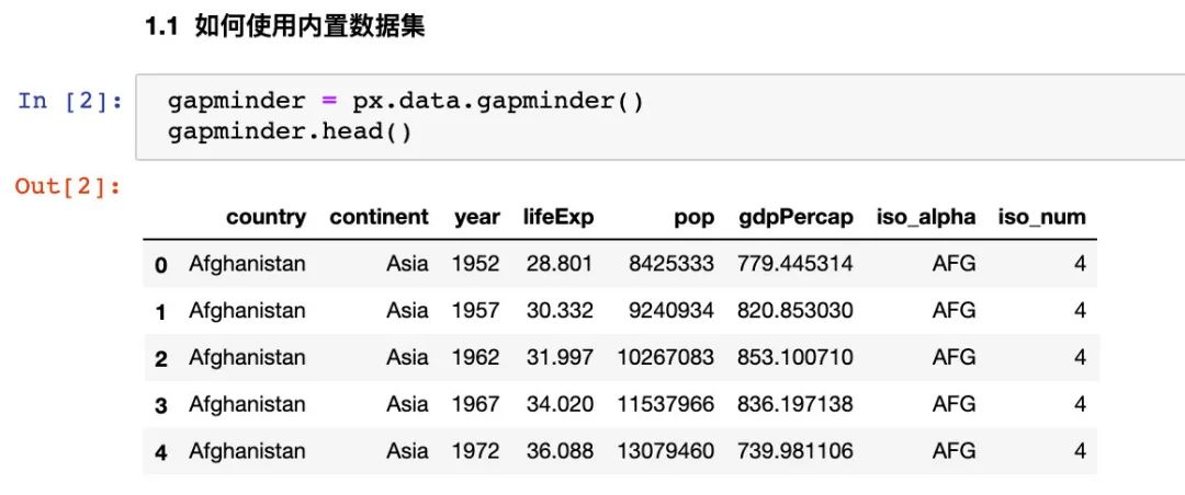
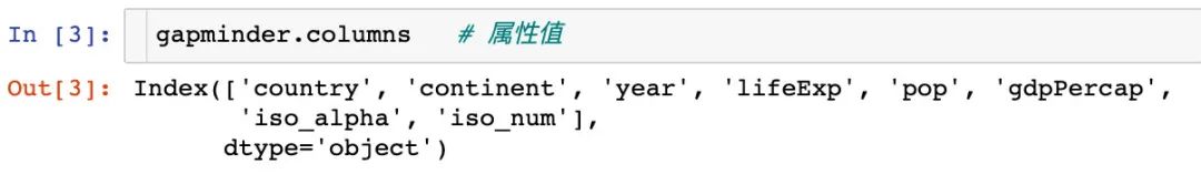
我們看看全部屬性值:
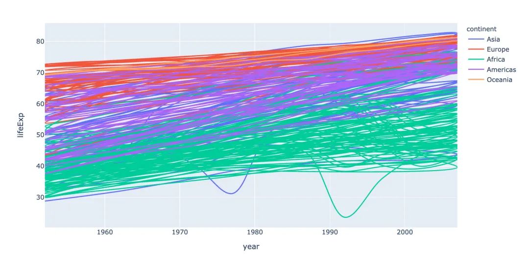
3.2 線型圖
線型圖line在可視化制圖中是很常見的。利用px能夠快速地制作線型圖:
# line 圖
fig = px.line(
  gapminder,  # 數(shù)據(jù)集
  x="year",  # 橫坐標(biāo)
  y="lifeExp",  # 縱坐標(biāo)
  color="continent",  # 顏色的數(shù)據(jù)
  line_group="continent",  # 線性分組
  hover_name="country",   # 懸停hover的數(shù)據(jù)
  line_shape="spline",  # 線的形狀
  render_mode="svg"  # 生成的圖片模式
)
fig.show()
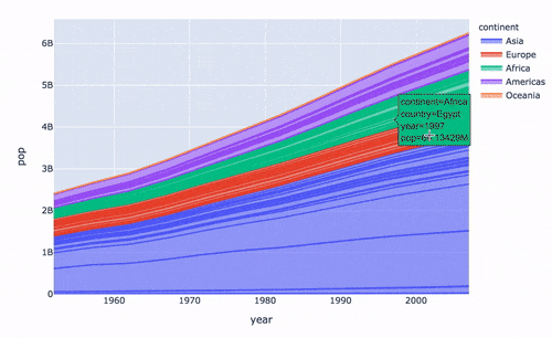
再來制作面積圖:
# area 圖
fig = px.area(
  gapminder,  # 數(shù)據(jù)集
  x="year",  # 橫坐標(biāo)
  y="pop",  # 縱坐標(biāo)
  color="continent",   # 顏色
  line_group="country"  # 線性組別
)
fig.show()
3.3 散點(diǎn)圖
散點(diǎn)圖的制作調(diào)用scatter方法:
指定size參數(shù)還能改變每個(gè)點(diǎn)的大小:
px.scatter(
  gapminder2007   # 繪圖DataFrame數(shù)據(jù)集
  ,x="gdpPercap"  # 橫坐標(biāo)
  ,y="lifeExp"  # 縱坐標(biāo)
  ,color="continent"  # 區(qū)分顏色
  ,size="pop"   # 區(qū)分圓的大小
  ,size_max=60  # 散點(diǎn)大小
)
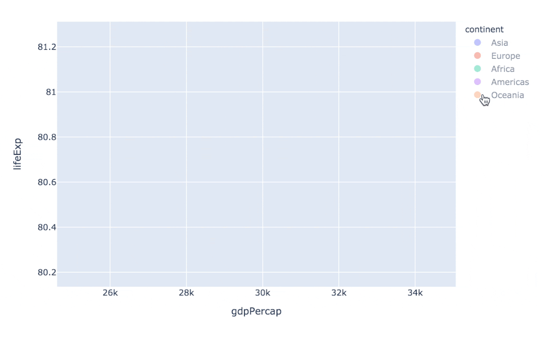
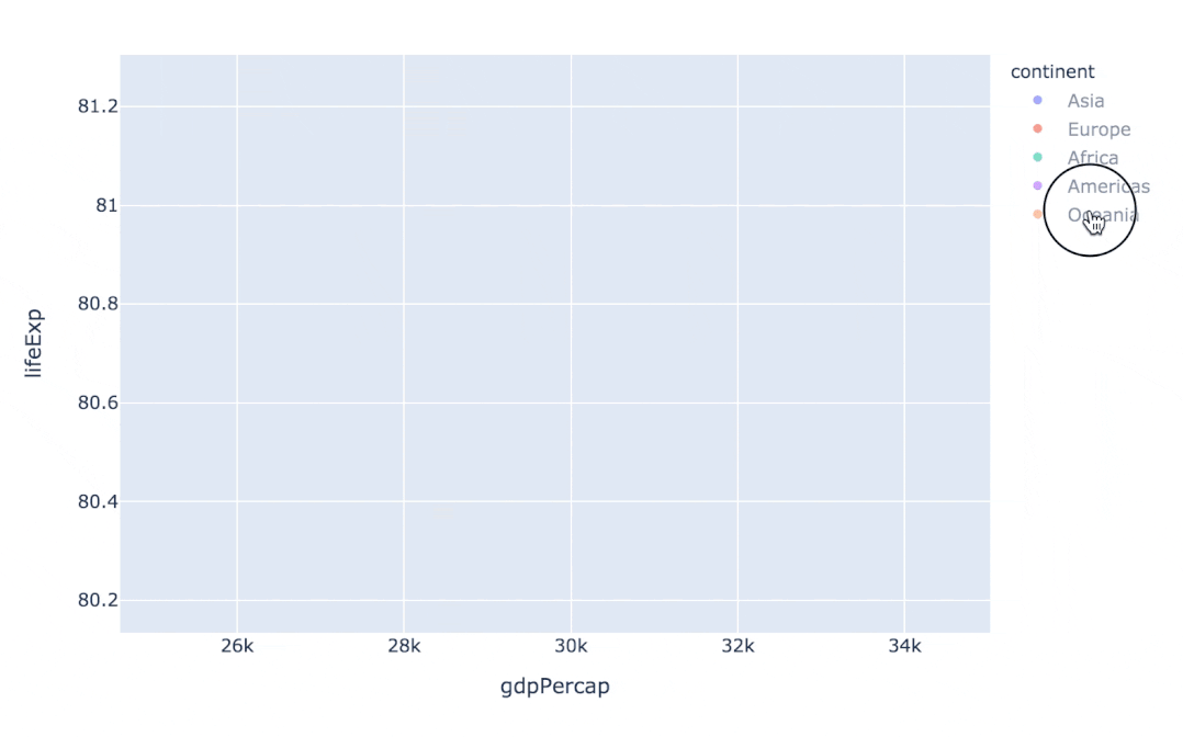
通過指定facet_col、animation_frame參數(shù)還能將散點(diǎn)進(jìn)行分塊顯示:
px.scatter(
  gapminder   # 繪圖使用的數(shù)據(jù)
  ,x="gdpPercap" # 橫縱坐標(biāo)使用的數(shù)據(jù)
  ,y="lifeExp"  # 縱坐標(biāo)數(shù)據(jù)
  ,color="continent"  # 區(qū)分顏色的屬性
  ,size="pop"   # 區(qū)分圓的大小
  ,size_max=60  # 圓的最大值
  ,hover_name="country"  # 圖中可視化最上面的名字
  ,animation_frame="year"  # 橫軸滾動(dòng)欄的屬性year
  ,animation_group="country"  # 標(biāo)注的分組
  ,facet_col="continent"   # 按照國家country屬性進(jìn)行分格顯示
  ,log_x=True  # 橫坐標(biāo)表取對(duì)數(shù)
  ,range_x=[100,100000]  # 橫軸取值范圍
  ,range_y=[25,90]  # 縱軸范圍
  ,labels=dict(pop="Populations",  # 屬性名字的變化,更直觀
               gdpPercap="GDP per Capital",
               lifeExp="Life Expectancy")
)

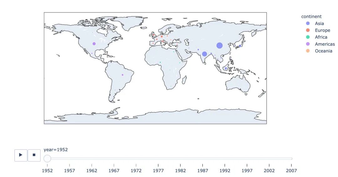
3.4 地理數(shù)據(jù)繪圖
在實(shí)際的工作中,我們可能會(huì)接觸到中國地圖甚至是全球地圖,使用px也能制作:
px.choropleth(
  gapminder,  # 數(shù)據(jù)集
  locations="iso_alpha",  # 配合顏色color顯示
  color="lifeExp", # 顏色的字段選擇
  hover_name="country",  # 懸停字段名字
  animation_frame="year",  # 注釋
  color_continuous_scale=px.colors.sequential.Plasma,  # 顏色變化
  projection="natural earth"  # 全球地圖
             )
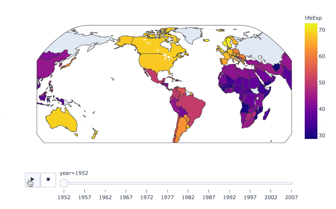
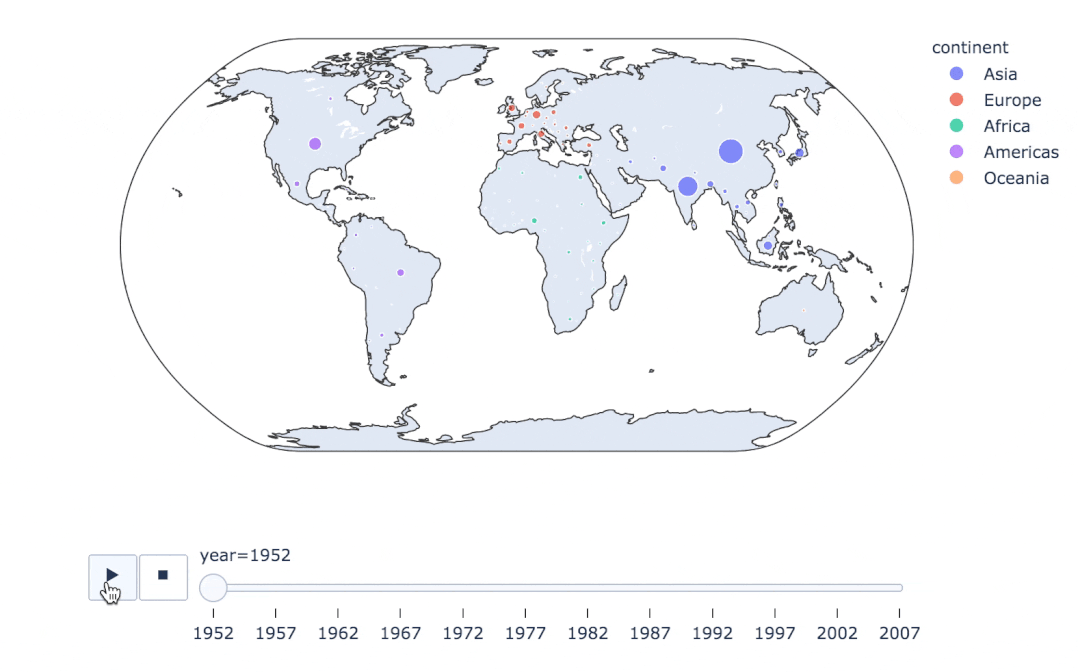
fig = px.scatter_geo(
  gapminder,   # 數(shù)據(jù)
  locations="iso_alpha",  # 配合顏色color顯示
  color="continent", # 顏色
  hover_name="country", # 懸停數(shù)據(jù)
  size="pop",  # 大小
  animation_frame="year",  # 數(shù)據(jù)幀的選擇
  projection="natural earth"  # 全球地圖
                    )

fig.show()
  px.scatter_geo(gapminder, # 數(shù)據(jù)集
  locations="iso_alpha",  # 配和color顯示顏色
  color="continent",  # 顏色的字段顯示
  hover_name="country",  # 懸停數(shù)據(jù)
  size="pop",  # 大小
  animation_frame="year"  # 數(shù)據(jù)聯(lián)動(dòng)變化的選擇
  #,projection="natural earth"   # 去掉projection參數(shù)
)
使用line_geo來制圖:
fig = px.line_geo(
  gapminder2007,  # 數(shù)據(jù)集
  locations="iso_alpha",  # 配合和color顯示數(shù)據(jù)
  color="continent",  # 顏色
  projection="orthographic")   # 球形的地圖
fig.show()

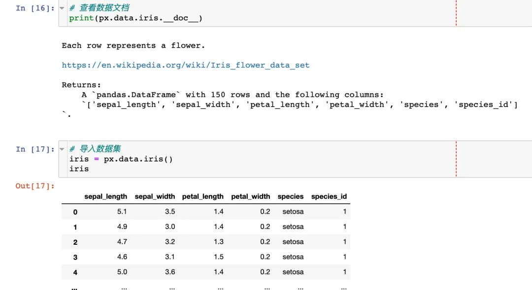
3.5 使用內(nèi)置iris數(shù)據(jù)
我們先看看怎么使用px來查看內(nèi)置數(shù)據(jù)的文檔:
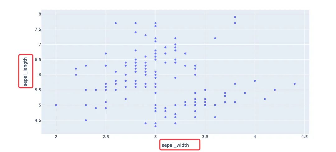
選擇兩個(gè)屬性制圖
選擇兩個(gè)屬性作為橫縱坐標(biāo)來繪制散點(diǎn)圖
fig = px.scatter(
  iris,  # 數(shù)據(jù)集
  x="sepal_width",  # 橫坐標(biāo)
  y="sepal_length"  # 縱坐標(biāo)
                )
fig.show()
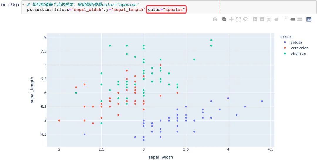
通過color參數(shù)來顯示不同的顏色:
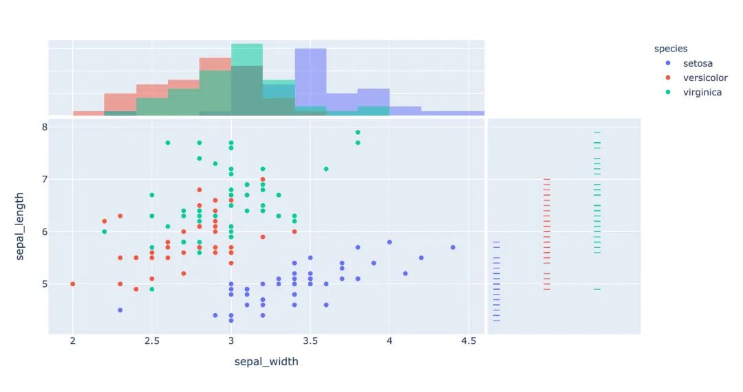
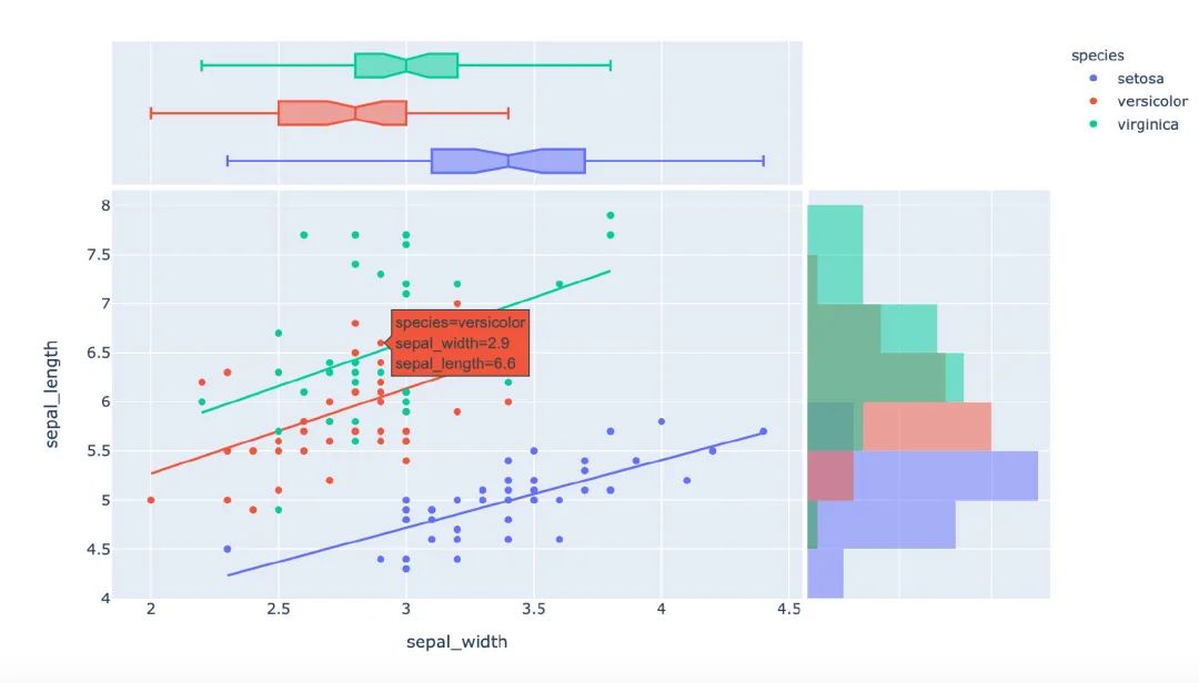
3.6 聯(lián)合分布圖
我們一個(gè)圖形中能夠?qū)⑸Ⅻc(diǎn)圖和直方圖組合在一起顯示:
px.scatter(
  iris,  # 數(shù)據(jù)集
  x="sepal_width", # 橫坐標(biāo)
  y="sepal_length",  # 縱坐標(biāo)
  color="species",  # 顏色
  marginal_x="histogram",  # 橫坐標(biāo)直方圖
  marginal_y="rug"   # 細(xì)條圖
)
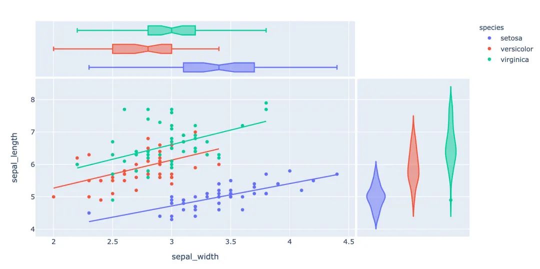
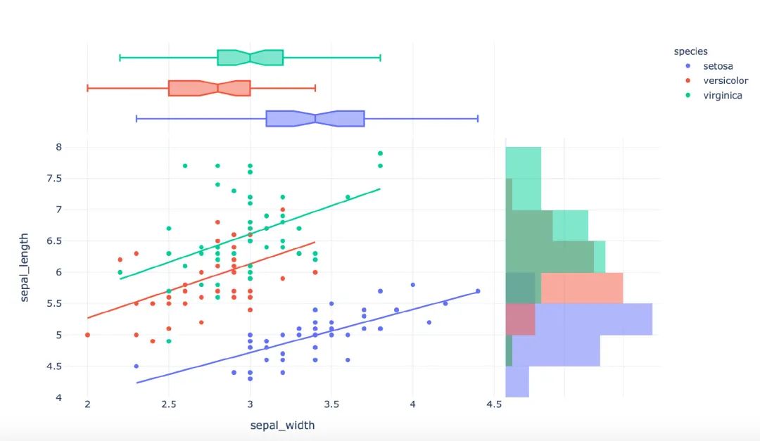
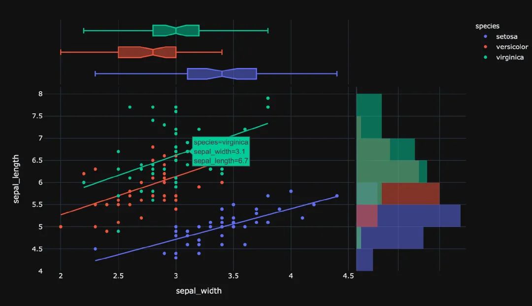
3.7 小提琴圖
小提琴圖能夠很好的顯示數(shù)據(jù)的分布和誤差情況,一行代碼利用也能顯示小提琴圖:
px.scatter(
  iris,  # 數(shù)據(jù)集
  x="sepal_width",  # 橫坐標(biāo)
  y="sepal_length",  # 縱坐標(biāo)
  color="species",  # 顏色
  marginal_y="violin",  # 縱坐標(biāo)小提琴圖
  marginal_x="box",  # 橫坐標(biāo)箱型圖
  trendline="ols"  # 趨勢線
)
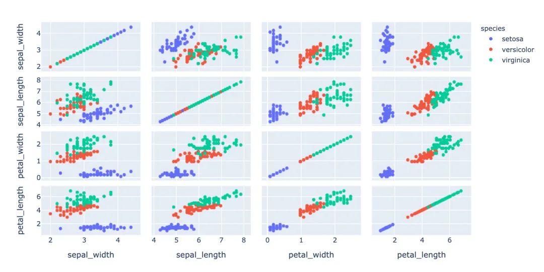
3.8 散點(diǎn)矩陣圖
px.scatter_matrix(
  iris,  # 數(shù)據(jù)
  dimensions=["sepal_width","sepal_length","petal_width","petal_length"],  # 維度選擇
  color="species")  # 顏色
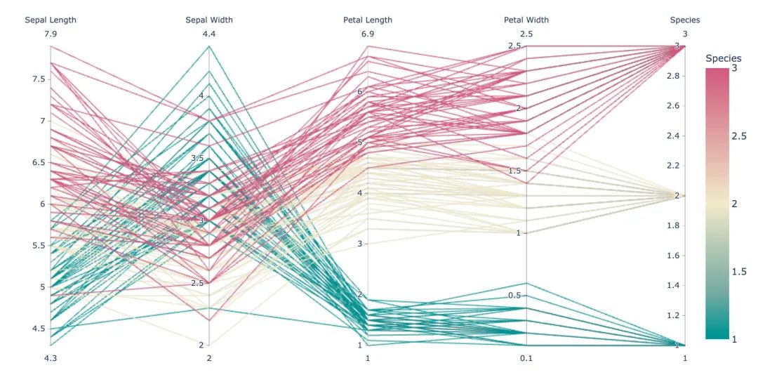
3.9 平行坐標(biāo)圖
px.parallel_coordinates(
  iris,   # 數(shù)據(jù)集
  color="species_id",  # 顏色
  labels={"species_id":"Species",  # 各種標(biāo)簽值
          "sepal_width":"Sepal Width",
          "sepal_length":"Sepal Length",
          "petal_length":"Petal Length",
          "petal_width":"Petal Width"},
  color_continuous_scale=px.colors.diverging.Tealrose,
  color_continuous_midpoint=2)
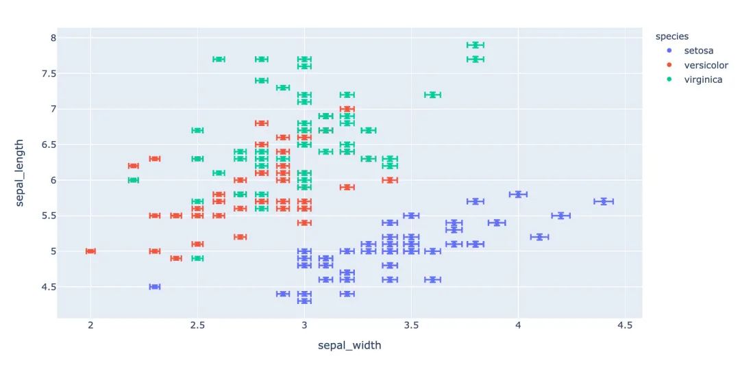
3.10 箱體誤差圖
# 對(duì)當(dāng)前值加上下兩個(gè)誤差值
iris["e"] = iris["sepal_width"] / 100
px.scatter(
  iris,  # 繪圖數(shù)據(jù)集
  x="sepal_width",  # 橫坐標(biāo)
  y="sepal_length",  # 縱坐標(biāo)
  color="species",  # 顏色值
  error_x="e",  # 橫軸誤差
  error_y="e"  # 縱軸誤差
          )
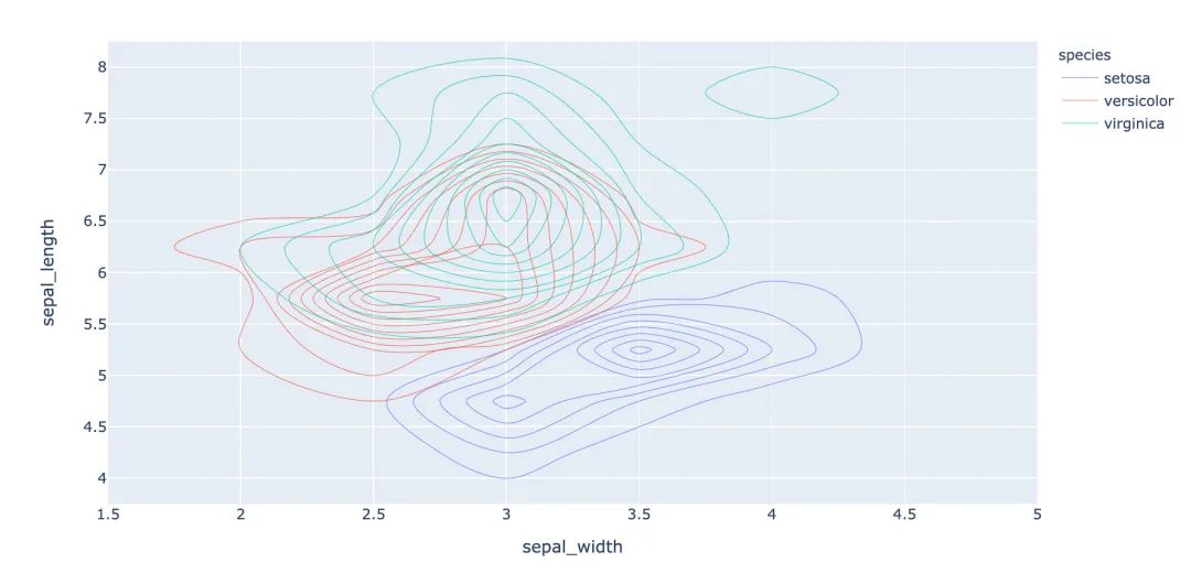
3.11 等高線圖
等高線圖反映數(shù)據(jù)的密度情況:
px.density_contour(
  iris,  # 繪圖數(shù)據(jù)集
  x="sepal_width",  # 橫坐標(biāo)
  y="sepal_length",  # 縱坐標(biāo)值
  color="species"  # 顏色
)
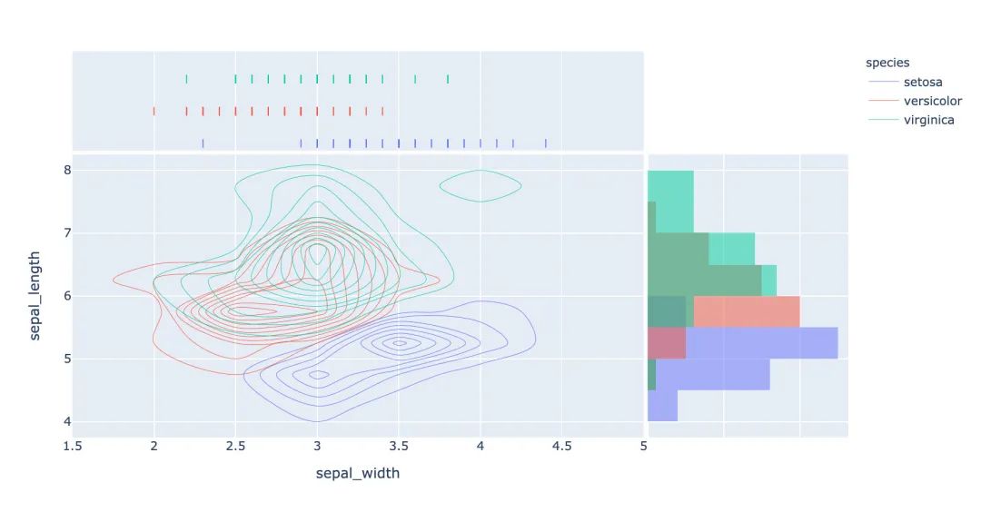
等高線圖和直方圖的倆和使用:
px.density_contour(
  iris, # 數(shù)據(jù)集
  x="sepal_width",  # 橫坐標(biāo)值
  y="sepal_length",  # 縱坐標(biāo)值
  color="species",  # 顏色
  marginal_x="rug",  # 橫軸為線條圖
  marginal_y="histogram"   # 縱軸為直方圖
                  )
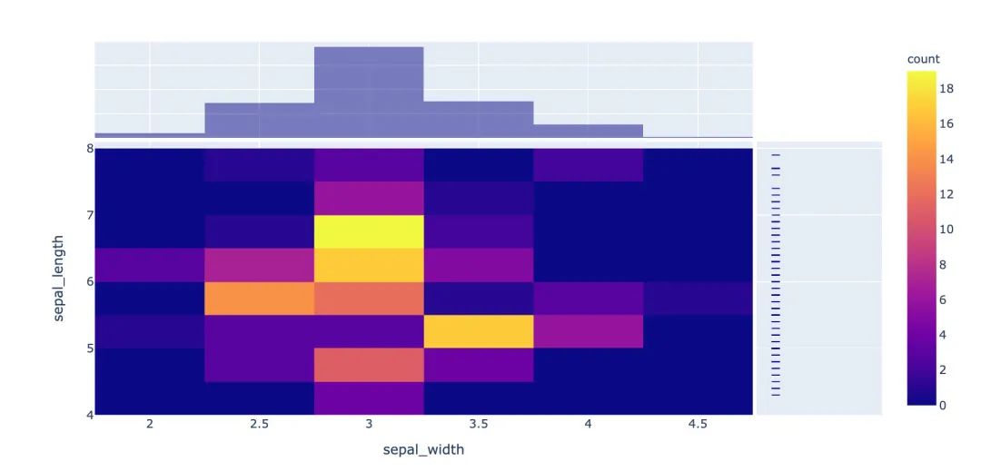
3.12 密度熱力圖
px.density_heatmap(
  iris,  # 數(shù)據(jù)集
  x="sepal_width",   # 橫坐標(biāo)值
  y="sepal_length",  # 縱坐標(biāo)值
  marginal_y="rug",  # 縱坐標(biāo)值為線型圖
  marginal_x="histogram"  # 直方圖
                  )
3.13 并行類別圖
在接下來的圖形中我們使用的小費(fèi)tips實(shí)例,首先是導(dǎo)入數(shù)據(jù):
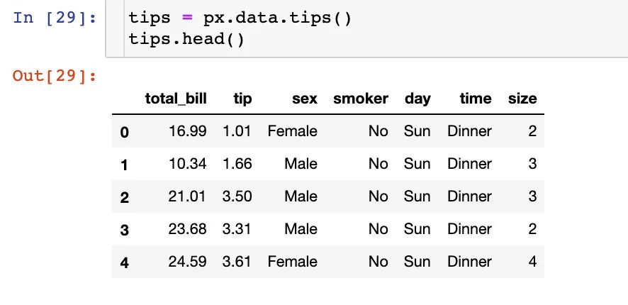
fig = px.parallel_categories(
  tips,  # 數(shù)據(jù)集
  color="size",  # 顏色
  color_continuous_scale=px.colors.sequential.Inferno)  # 顏色變化取值
fig.show()
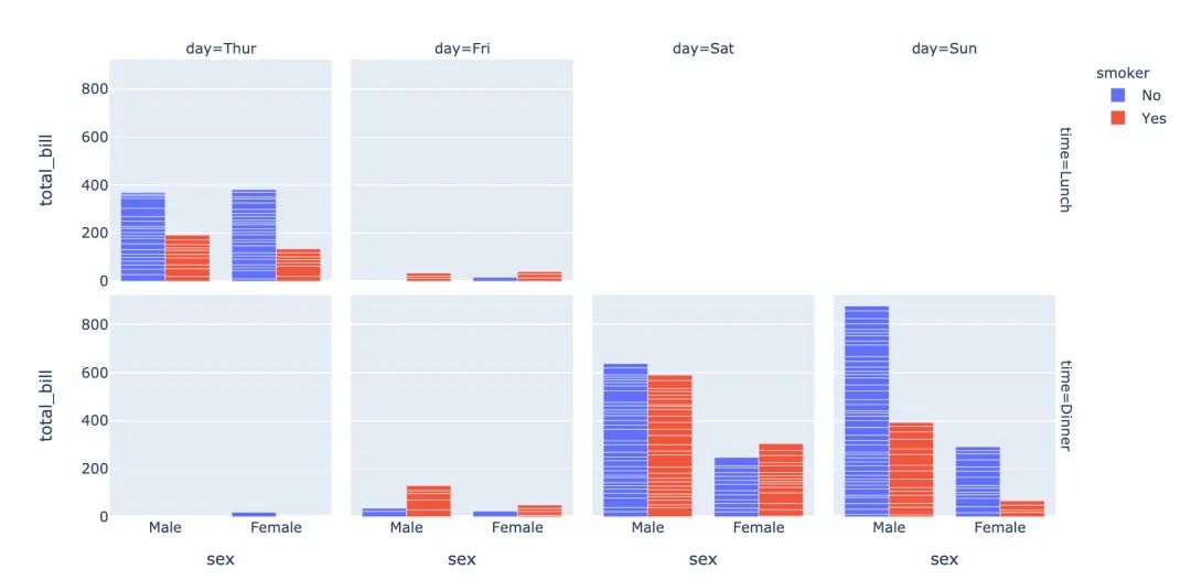
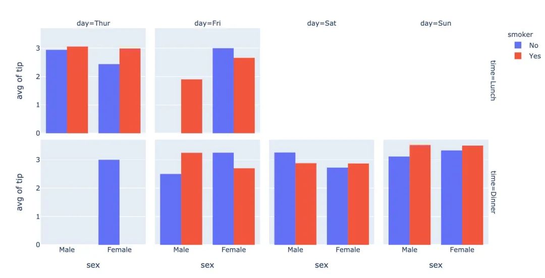
3.14 柱狀圖
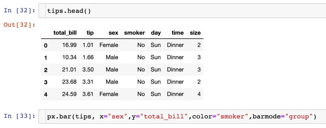
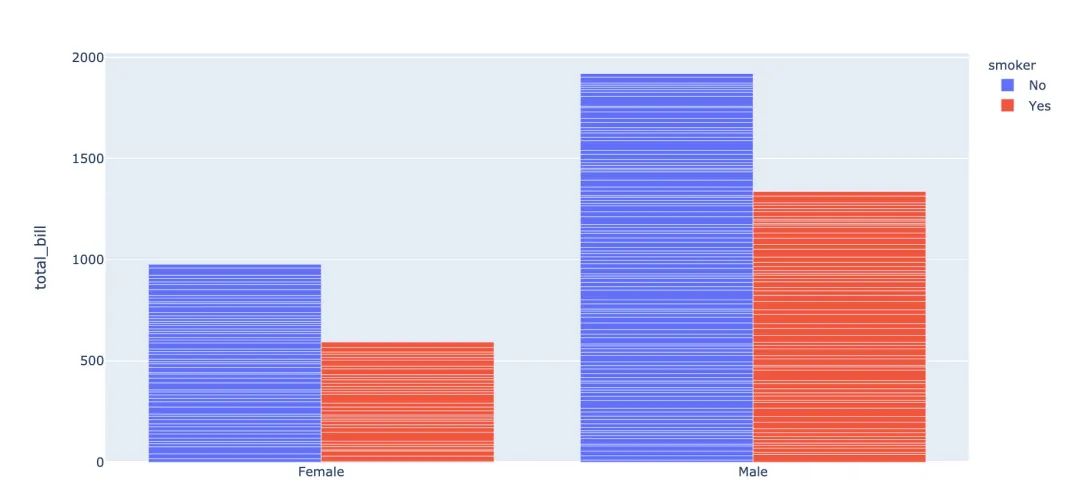
fig = px.bar(
  tips,  # 數(shù)據(jù)集
  x="sex",  # 橫軸
  y="total_bill",  # 縱軸
  color="smoker",  # 顏色參數(shù)取值
  barmode="group",  # 柱狀圖模式取值
  facet_row="time",  # 行取值
  facet_col="day",  # 列元素取值
  category_orders={
    "day": ["Thur","Fri","Sat","Sun"],  # 分類順序
    "time":["Lunch", "Dinner"]})
fig.show()
3.15 直方圖
fig = px.histogram(
  tips,  # 繪圖數(shù)據(jù)集
  x="sex",  # 橫軸為性別
  y="tip",  # 縱軸為費(fèi)用
  histfunc="avg",  # 直方圖顯示的函數(shù)
  color="smoker",  # 顏色
  barmode="group",  # 柱狀圖模式
  facet_row="time",  # 行取值
  facet_col="day",   # 列取值
  category_orders={  # 分類順序
    "day":["Thur","Fri","Sat","Sun"],
    "time":["Lunch","Dinner"]}
)

fig.show()
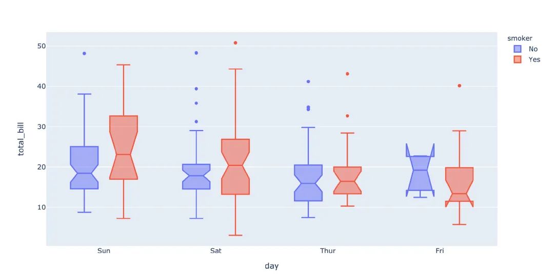
3.16 箱型圖
箱型圖也是現(xiàn)實(shí)數(shù)據(jù)的誤差和分布情況:
# notched=True顯示連接處的錐形部分
px.box(tips,  # 數(shù)據(jù)集
       x="day",  # 橫軸數(shù)據(jù)
       y="total_bill",  # 縱軸數(shù)據(jù)
       color="smoker",  # 顏色
       notched=True)  # 連接處的錐形部分顯示出來
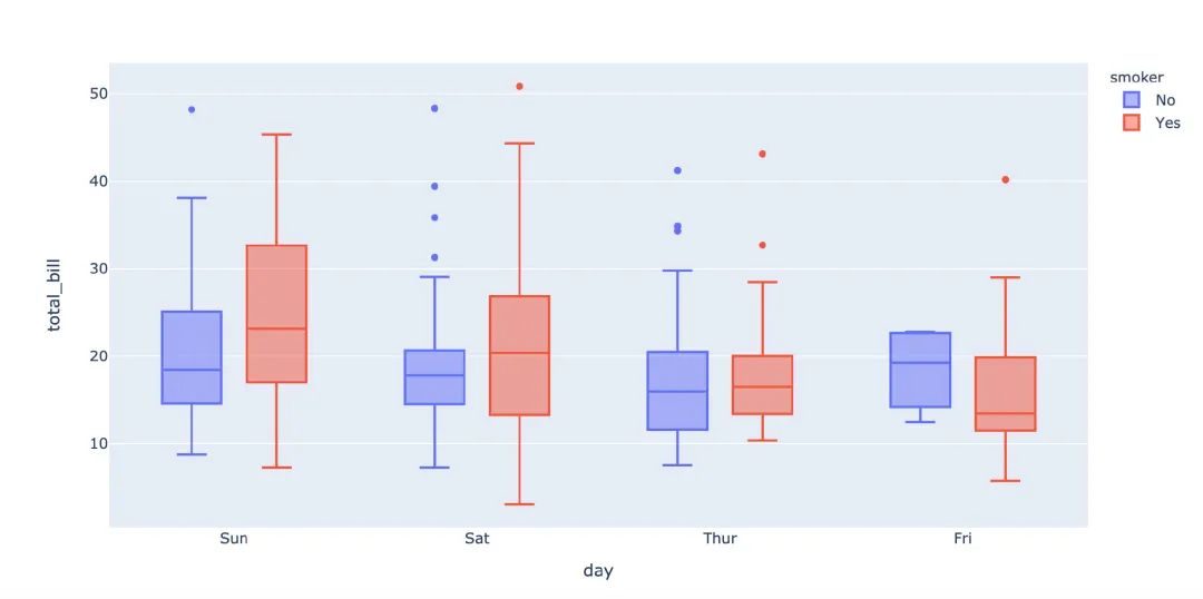
px.box(
  tips,  # 數(shù)據(jù)集
  x="day",  # 橫軸
 y="total_bill",  # 縱軸
 color="smoker",  # 顏色
#         notched=True   # 隱藏參數(shù)
      )
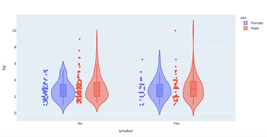
再來畫一次小提琴圖:
px.violin(
    tips,   # 數(shù)據(jù)集
    x="smoker",  # 橫軸坐標(biāo)
    y="tip",  # 縱軸坐標(biāo)
    color="sex",   # 顏色參數(shù)取值
    box=True,   # box是顯示內(nèi)部的箱體
    points="all",  # 同時(shí)顯示數(shù)值點(diǎn)
    hover_data=tips.columns)  # 結(jié)果中顯示全部數(shù)據(jù)
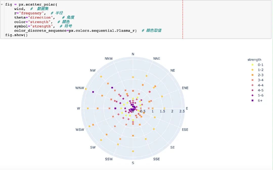
3.17 極坐標(biāo)圖
在這里我們使用的是內(nèi)置的wind數(shù)據(jù):
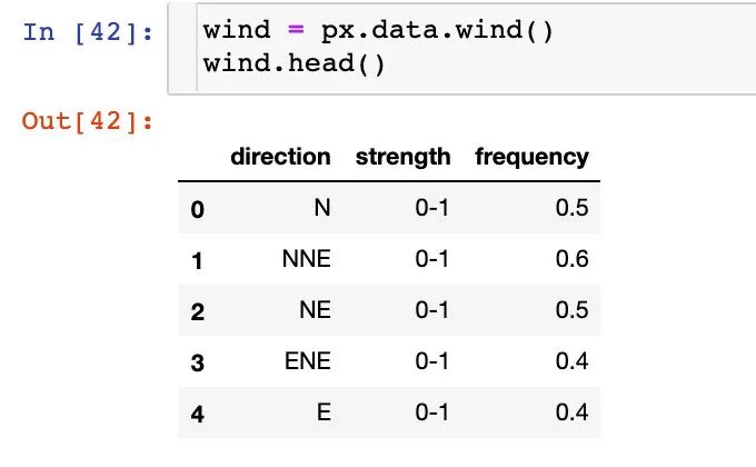
散點(diǎn)極坐標(biāo)圖
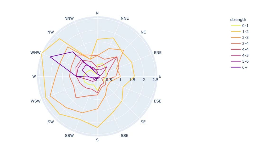
線性極坐標(biāo)圖
fig = px.line_polar(
    wind,  # 數(shù)據(jù)集
    r="frequency",  # 半徑
    theta="direction",  # 角度
    color="strength",  # 顏色
    line_close=True,  # 線性閉合
    color_discrete_sequence=px.colors.sequential.Plasma_r)  # 顏色變化
fig.show()
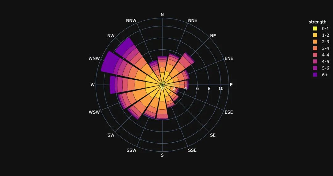
柱狀極坐標(biāo)圖
fig = px.bar_polar(
    wind,   # 數(shù)據(jù)集
    r="frequency",   # 半徑
    theta="direction",  # 角度
    color="strength",  # 顏色
    template="plotly_dark",  # 主題
    color_discrete_sequence=px.colors.sequential.Plasma_r)  # 顏色變化
fig.show()
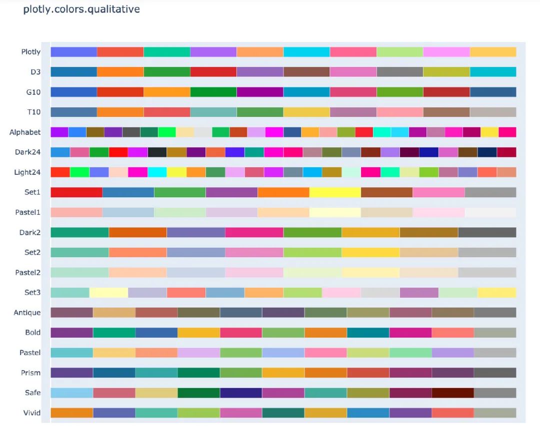
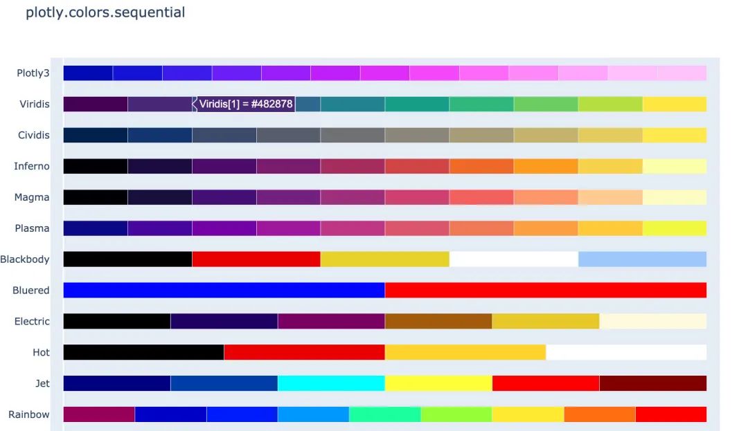
4. 顏色面板
在px中有很多的顏色可以供選擇,提供了一個(gè)顏色面板:
px.colors.qualitative.swatches()
px.colors.sequential.swatches()
5. 主題
px中存在3種主題:
plotly plotly_white plotly_dark
px.scatter(
    iris,  # 數(shù)據(jù)集
    x="sepal_width",  # 橫坐標(biāo)值
    y="sepal_length",  # 縱坐標(biāo)取值
    color="species",  # 顏色
    marginal_x="box",  # 橫坐標(biāo)為箱型圖
    marginal_y="histogram",  # 縱坐標(biāo)為直方圖
    height=600,  # 高度
    trendline="ols",  # 顯示趨勢線
    template="plotly")  # 主題
px.scatter(
    iris,  # 數(shù)據(jù)集
    x="sepal_width",  # 橫坐標(biāo)值
    y="sepal_length",  # 縱坐標(biāo)取值
    color="species",  # 顏色
    marginal_x="box",  # 橫坐標(biāo)為箱型圖
    marginal_y="histogram",  # 縱坐標(biāo)為直方圖
    height=600,  # 高度
    trendline="ols",  # 顯示趨勢線
    template="plotly_white")  # 主題
px.scatter(
    iris,  # 數(shù)據(jù)集
    x="sepal_width",  # 橫坐標(biāo)值
    y="sepal_length",  # 縱坐標(biāo)取值
    color="species",  # 顏色
    marginal_x="box",  # 橫坐標(biāo)為箱型圖
    marginal_y="histogram",  # 縱坐標(biāo)為直方圖
    height=600,  # 高度
    trendline="ols",  # 顯示趨勢線
    template="plotly_dark")  # 主題
6. 總結(jié)一下
本文中利用大量的篇幅講解了如何通過plotly_express來繪制:柱狀圖、線型圖、散點(diǎn)圖、小提琴圖、極坐標(biāo)圖等各種常見的圖形。通過觀察上面Plotly_express繪制圖形過程,我們不難發(fā)現(xiàn)它有三個(gè)主要的優(yōu)點(diǎn):
快速出圖,少量的代碼就能滿足多數(shù)的制圖要求。基本上都是幾個(gè)參數(shù)的設(shè)置我們就能快速出圖 圖形漂亮,繪制出來的可視化圖形顏色亮麗,也有很多的顏色供選擇。 圖形是動(dòng)態(tài)可視化的。文章中圖形都是截圖,如果是在 Jupyter notebook中都是動(dòng)態(tài)圖形
希望通過本文的講解能夠幫助堵住快速入門plotly_express可視化神器。
------------------- End -------------------
往期精彩文章推薦:
Python自帶爬蟲庫urllib使用大全
一篇文章教會(huì)你使用Python定時(shí)抓取微博評(píng)論
一篇文章教會(huì)你使用Python圖片格式轉(zhuǎn)換器并識(shí)別圖片中的文字

歡迎大家點(diǎn)贊,留言,轉(zhuǎn)發(fā),轉(zhuǎn)載,感謝大家的相伴與支持
想加入Python學(xué)習(xí)群請(qǐng)?jiān)诤笈_(tái)回復(fù)【入群】
萬水千山總是情,點(diǎn)個(gè)【在看】行不行
/今日留言主題/
隨便說一兩句吧~~