
介紹一款高級可視化神器
高級可視化神器Plotly_Express快速入門
Plotly_Express是新一代的高級可視化神器,它是plotly.py的高級封裝,內(nèi)置了大量實用、現(xiàn)代的繪圖模板。
使用者只需要調(diào)用簡單的API函數(shù),便可快速地生成漂亮的動態(tài)可視化圖表;同時其內(nèi)置了很多的數(shù)據(jù)集,方便自行調(diào)用,快速模擬作圖。

安裝
用pip install plotly_express 命令可以安裝plotly_express
pip install plotly_express
內(nèi)置數(shù)據(jù)集
先導(dǎo)入相關(guān)庫,進行查看數(shù)據(jù)集:
import pandas as pd
import numpy as np
import plotly_express as px  # 或 import plotly.express as px
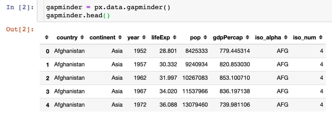
GDP數(shù)據(jù)
記錄的是不同國家歷年GDP收入與人均壽命,包含的字段:
國家country 洲continent 年份year 平均壽命lifeExp 人口數(shù)量pop GDPgdpPercap 國家簡稱iso_alpha 國家編號iso_num
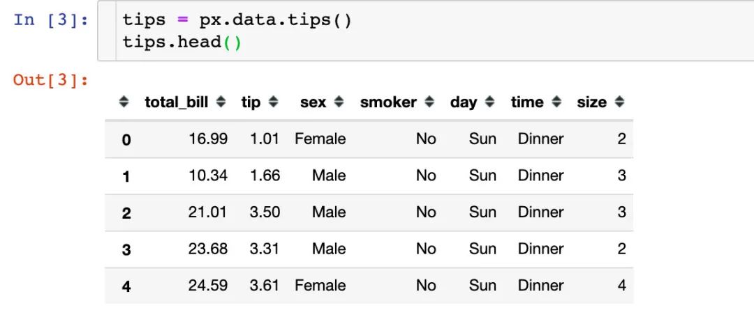
餐廳流水數(shù)據(jù)
餐廳的訂單流水數(shù)據(jù),包含字段:
總賬單費用bill 小費tip 顧客性別sex 顧客是否抽煙smoker 就餐日期day 就餐時間time 就餐人數(shù)size
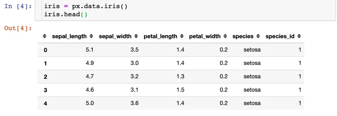
鳶尾花數(shù)據(jù)集
著名的鳶尾花數(shù)據(jù)集,包含字段:
萼片長sepal_length 萼片寬sepal_width 花瓣長petal_length 花瓣寬petal_width 花的種類species 種類所屬編號species_id
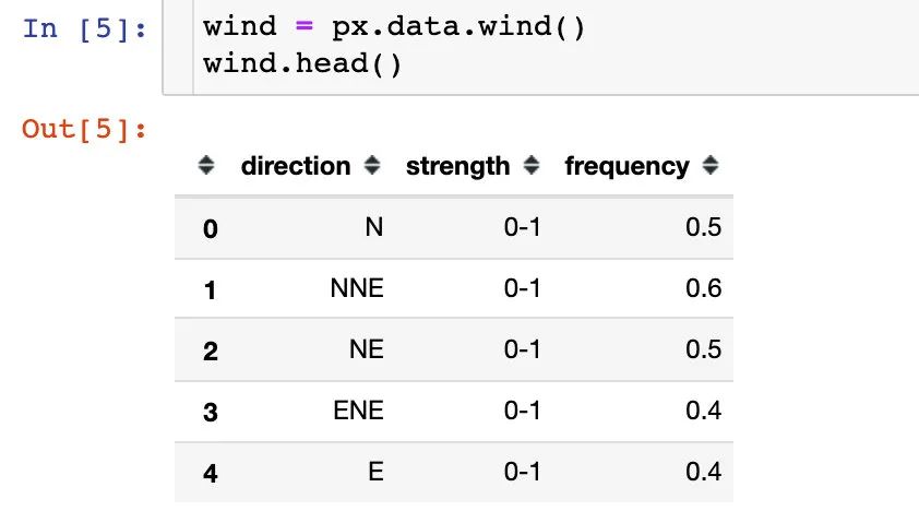
風力數(shù)據(jù)
一份關(guān)于風力等級的數(shù)據(jù):
方向direction 強度strength 頻率frequency
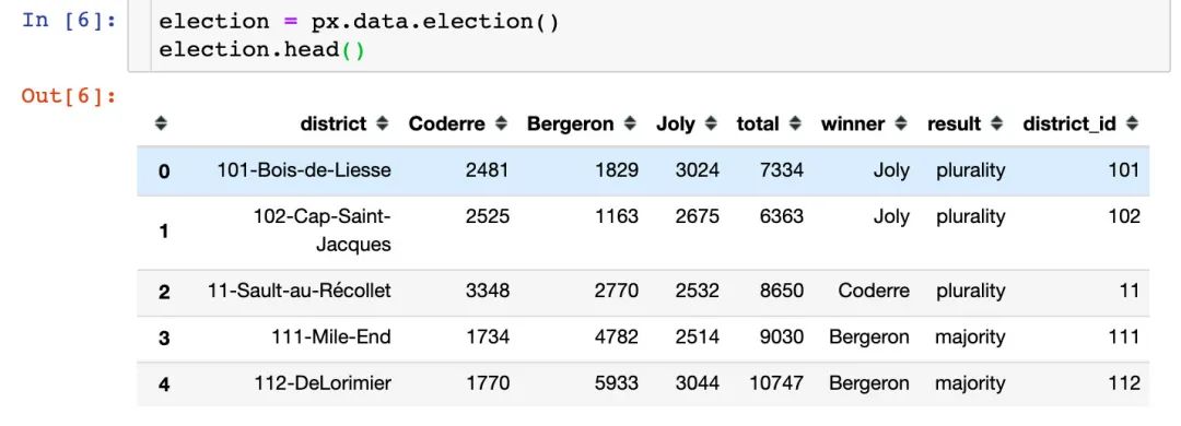
選舉投票結(jié)果
該數(shù)據(jù)集記錄的是2013年蒙特利爾市長選舉投票結(jié)果,包含的主要字段:
區(qū)域district Coderre票數(shù) Bergeron票數(shù) Joly票數(shù) 總票數(shù)total 勝者winner 結(jié)果result 區(qū)編號district_id
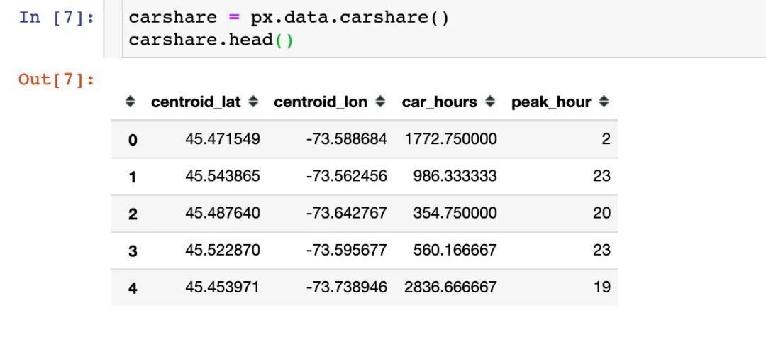
汽車共享可用性數(shù)據(jù)
該數(shù)據(jù)記錄的是蒙特利爾一個區(qū)域中心附近的汽車共享服務(wù)的可用性,包含的字段:
緯度centroid_lat 經(jīng)度centroid_lon 汽車小時數(shù)car_hours 高峰小時peak_hour
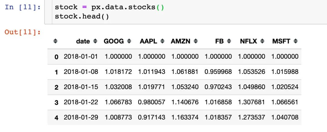
股票數(shù)據(jù)
內(nèi)置的一份股票數(shù)據(jù),包含字段:
日期date 6個公司名稱:GOOG、AAPL、AMZN、FB、NFLX、MSFT
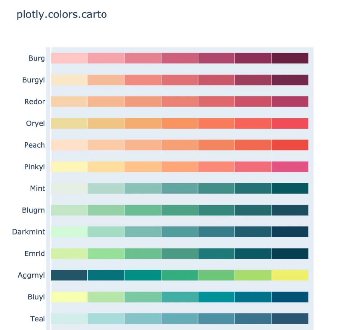
內(nèi)置顏色面板
plotly_express還內(nèi)置了很多顏色面板,顏色任你選擇,下面是各個主題下的部分截圖:
卡通片主題
px.colors.carto.swatches()
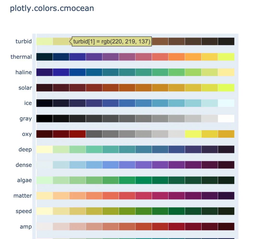
CMOcean系列
px.colors.cmocean.swatches()
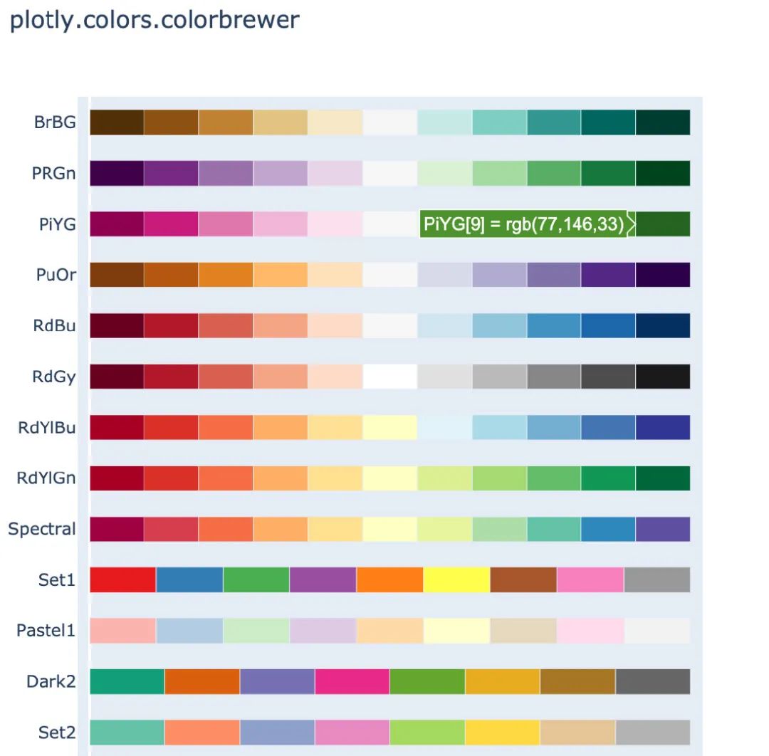
ColorBrewer2系列
px.colors.colorbrewer.swatches()
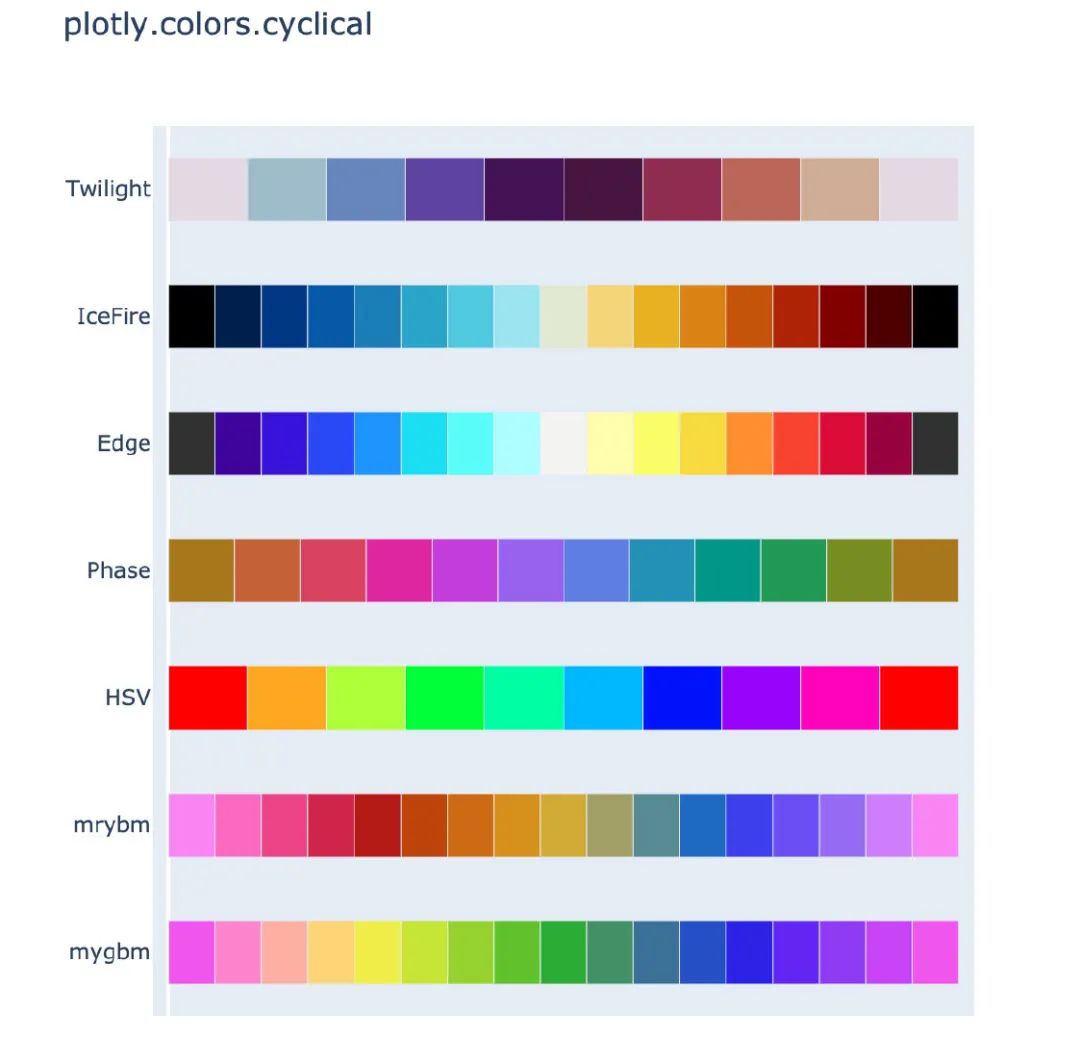
周期性色調(diào)
適用于具有自然周期結(jié)構(gòu)的連續(xù)數(shù)據(jù)
px.colors.cyclical.swatches()
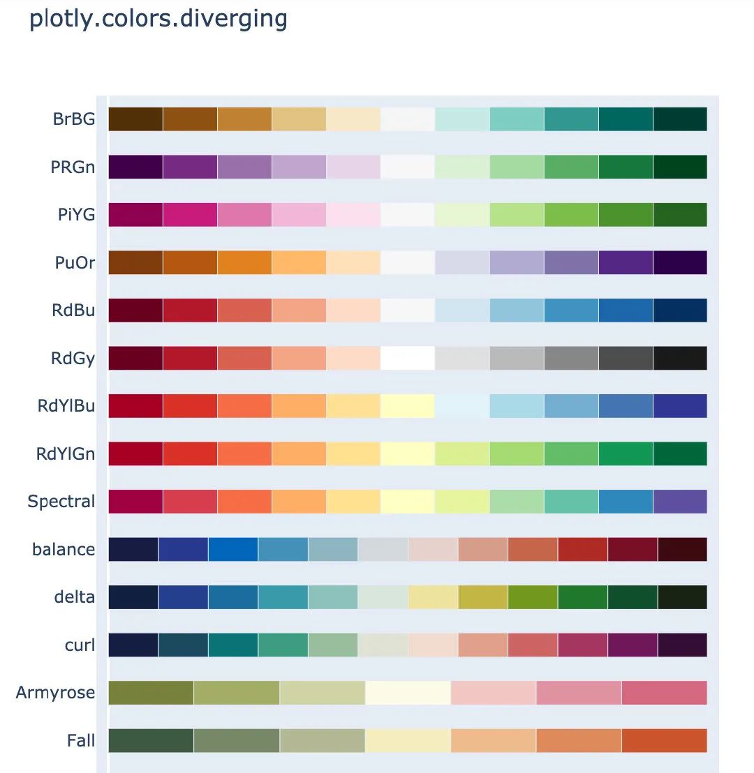
分散色標
適用于具有自然中點的連續(xù)數(shù)據(jù)
px.colors.diverging.swatches()
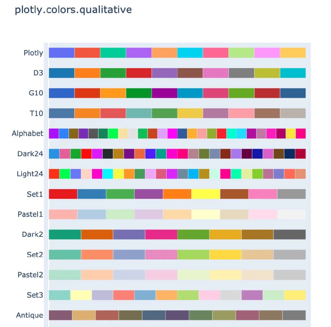
定性色標系列
適用于沒有自然順序的數(shù)據(jù)
px.colors.qualitative.swatches()
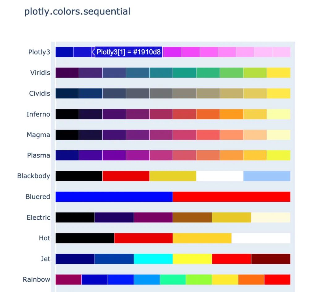
順序色標系列
漸變的顏色系列,適用于大多數(shù)連續(xù)數(shù)據(jù)
px.colors.sequential.swatches()
作圖
下面介紹使用Plotly_express繪制常見的圖形,所有的圖形在jupyter notebook中都是動態(tài)可視化的,本文中采用截圖展示。
柱狀圖
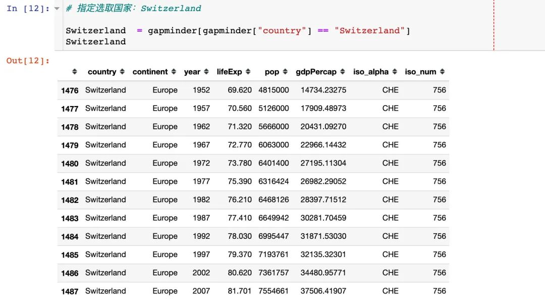
# 指定選取國家:Switzerland

Switzerland  = gapminder[gapminder["country"] == "Switzerland"]
Switzerland   # 數(shù)據(jù)顯示如下
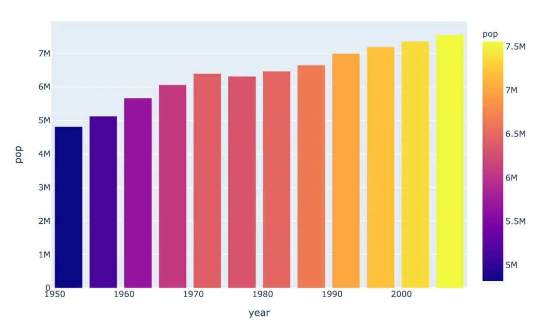
px.bar(Switzerland,  # 上面指定的數(shù)據(jù)
       x="year",  # 橫坐標
       y="pop",  # 縱坐標
       color="pop")  # 顏色取值
具體結(jié)果如下:
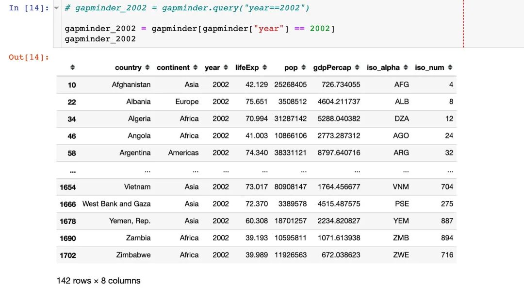
散點圖
先選取繪圖需要的數(shù)據(jù):
# 寫法1
# gapminder_2002 = gapminder.query("year==2002")

# 寫法2
gapminder_2002 = gapminder[gapminder["year"] == 2002]
gapminder_2002
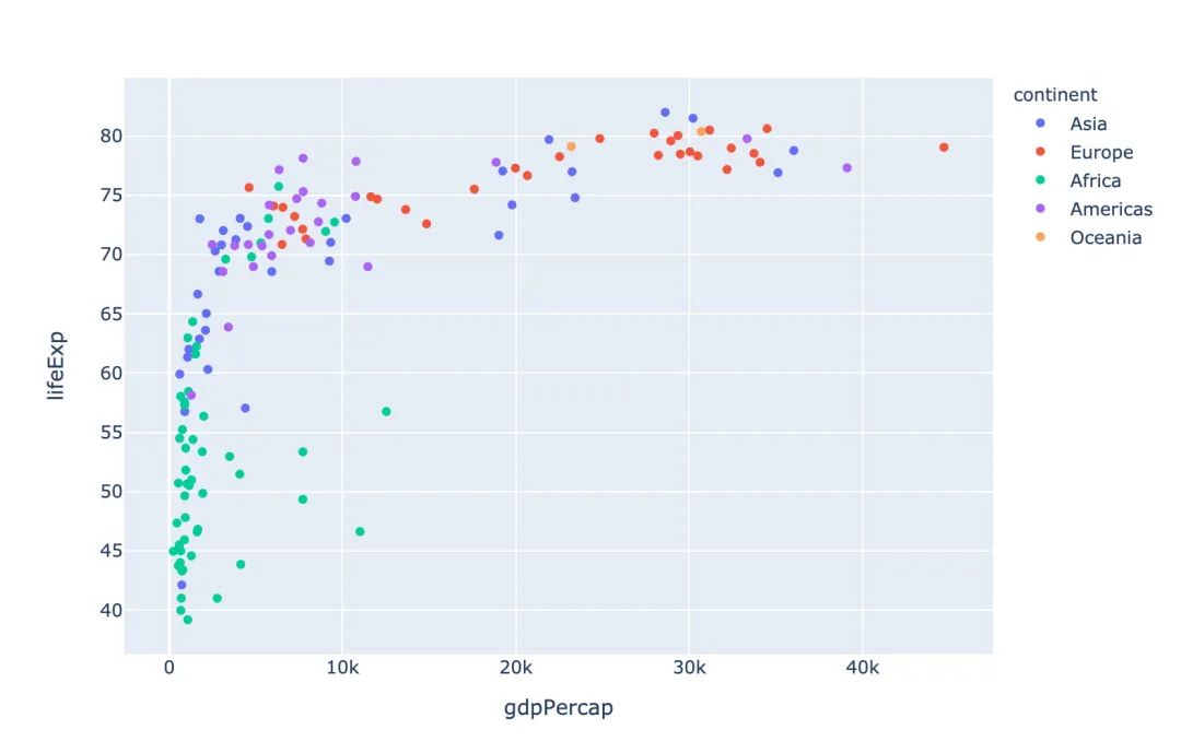
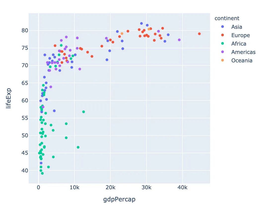
px.scatter(gapminder_2002,   # 傳入的數(shù)據(jù)集
           x="gdpPercap",  # 橫坐標是人均GDP
           y="lifeExp",  # 縱坐標是平均壽命
           color="continent"  # 顏色取值:根據(jù)洲的值來取
          )
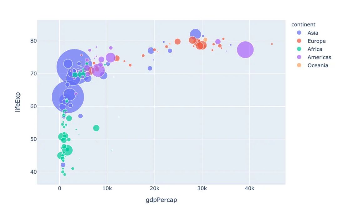
冒泡散點圖
px.scatter(gapminder_2002   # 繪圖DataFrame數(shù)據(jù)集
           ,x="gdpPercap"  # 橫坐標
           ,y="lifeExp"  # 縱坐標
           ,color="continent"  # 區(qū)分顏色
           ,size="pop"   # 區(qū)分圓的大小
           ,size_max=60  # 散點大小
          )
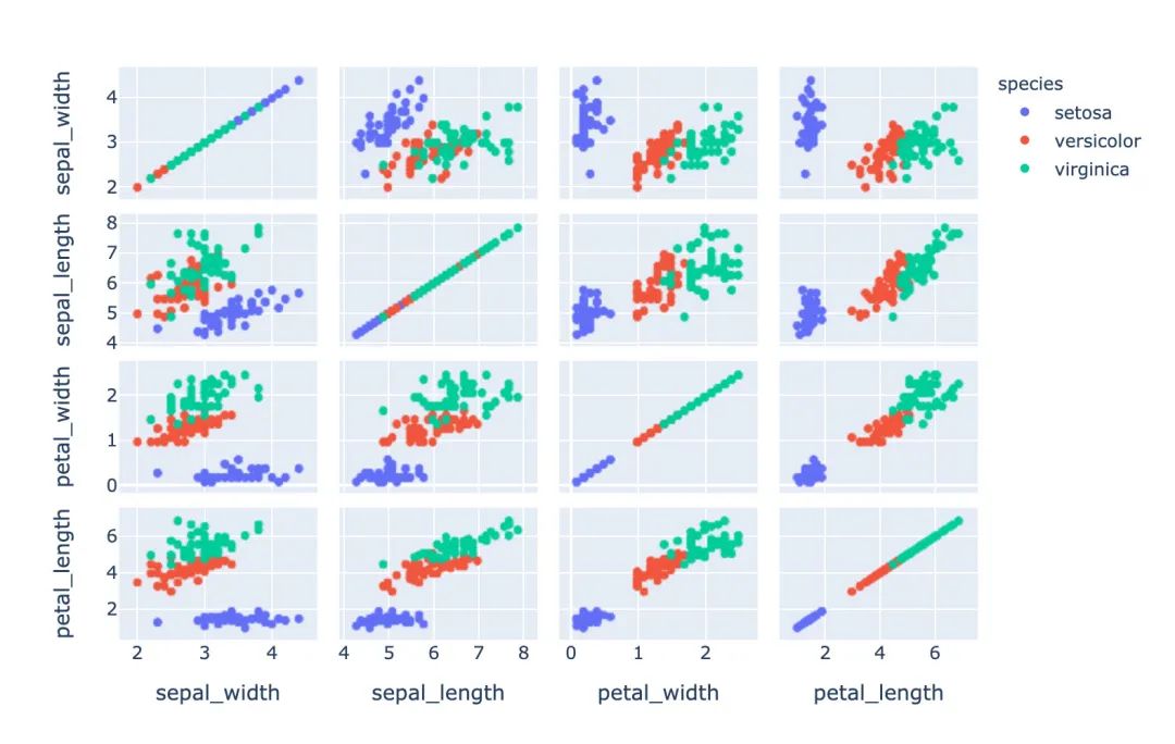
散點矩陣圖
px.scatter_matrix(iris,  # 傳入繪圖數(shù)據(jù)
                  dimensions=["sepal_width","sepal_length","petal_width","petal_length"],  # 維度設(shè)置
                  color="species")  # 顏色取值
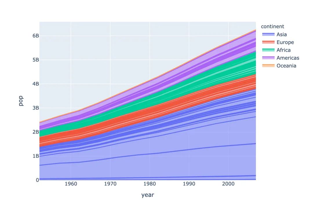
面積圖
# area 圖
px.area(gapminder,   # 繪圖的數(shù)據(jù)集
        x="year",   # 橫軸數(shù)據(jù)
        y="pop",  # 縱軸數(shù)據(jù)
        color="continent",  # 顏色取值
        line_group="country")  # 線型分組
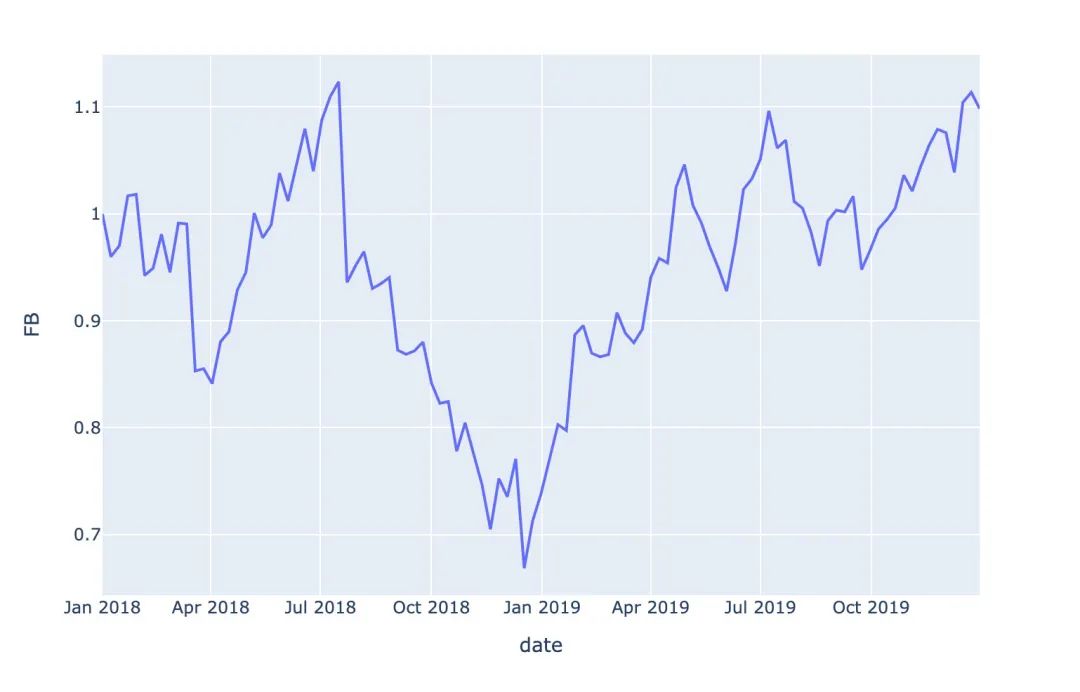
股票趨勢圖
# FB公司股票趨勢圖
px.line(stock, x='date', y="FB")
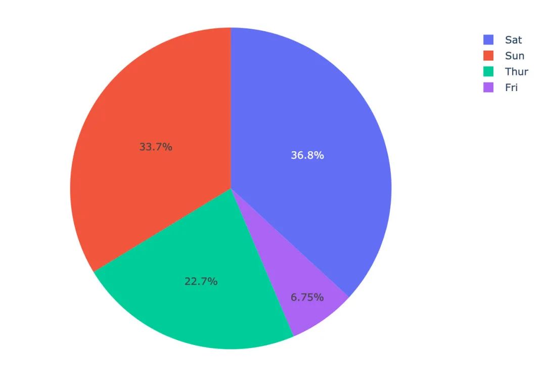
餅圖
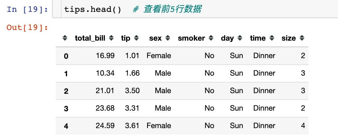
1、我們使用小費tips數(shù)據(jù),查看前5行數(shù)據(jù):
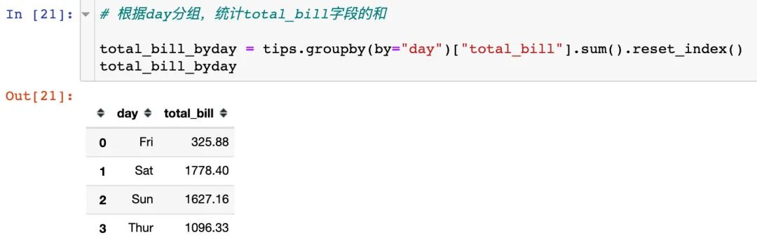
2、根據(jù)day分組,統(tǒng)計total_bill字段的和
3、繪制餅圖,自動顯示每個day的占比
px.pie(total_bill_byday, # 繪圖數(shù)據(jù)
       names="day",  # 每個組的名字
       values="total_bill"  # 組的取值
      )
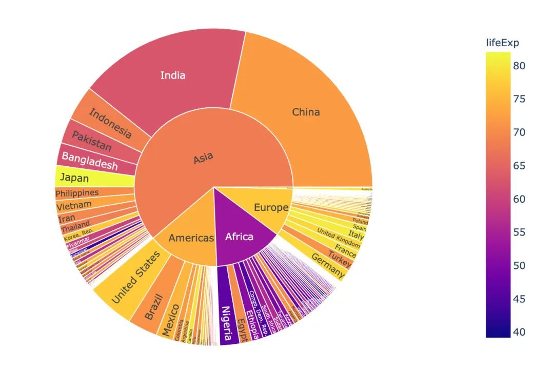
旭日圖
# 選取2002年數(shù)據(jù)
gapminder_2002 = gapminder[gapminder["year"] == 2002]

px.sunburst(gapminder_2002,   # 繪圖數(shù)據(jù)
            path=['continent', 'country'],  # 指定路徑:從洲到國家
            values='pop', # 數(shù)據(jù)大小:人口數(shù)
            color='lifeExp',  # 顏色
            hover_data=['iso_alpha'] # 顯示數(shù)據(jù)
           )
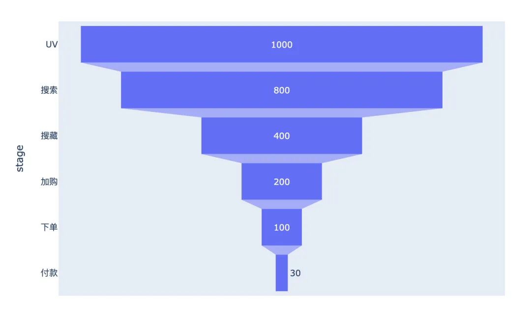
漏斗圖
漏斗圖形在互聯(lián)網(wǎng)的電商、用戶分群等領(lǐng)域使用的比較廣泛,自行模擬一個電商UV-付款轉(zhuǎn)化的數(shù)據(jù)繪圖:
data = dict(   # 創(chuàng)建原始數(shù)據(jù)
    number = [1000, 800, 400, 200, 100, 30],
    stage = ["UV", "搜索", "搜藏", "加購", "下單", "付款"]
)

# 傳入數(shù)據(jù)和數(shù)軸
px.funnel(data,
          x="number",
          y="stage")
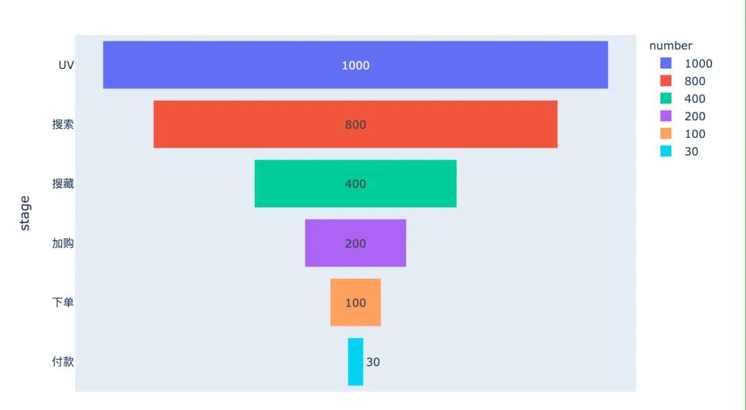
加入一個顏色參數(shù)color,改變每個階段的顏色:
data = dict(   # 創(chuàng)建原始數(shù)據(jù)
    number = [1000, 800, 400, 200, 100, 30],
    stage = ["UV", "搜索", "搜藏", "加購", "下單", "付款"]
)

# 傳入數(shù)據(jù)和數(shù)軸
px.funnel(data,
          x="number",
          y="stage",
          color="number"  # 顏色設(shè)置
         )
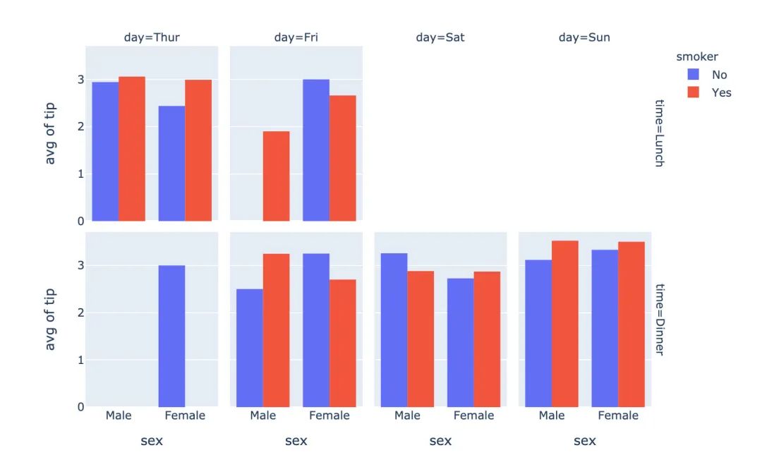
直方圖
px.histogram(
    tips,  # 繪圖數(shù)據(jù)
    x="sex",  # 指定兩個數(shù)軸
    y="tip",
    histfunc="avg",  # 直方圖函數(shù):均值
    color="smoker",  # 顏色取值
    barmode="group",  # 柱狀圖模式
    facet_row="time",  # 橫縱縱軸的字段設(shè)置
    facet_col="day",
    category_orders={"day":["Thur","Fri","Sat","Sun"],  # 分類
                     "time":["Lunch","Dinner"]})
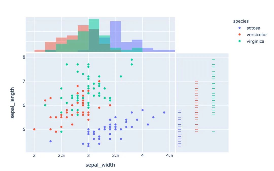
聯(lián)合分布圖
多種圖形的組合顯示:
px.scatter(
    iris,
    x="sepal_width",
    y="sepal_length",
    color="species",
    marginal_x="histogram",
    marginal_y="rug")
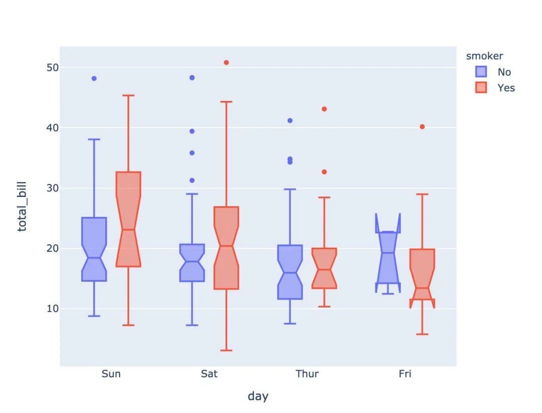
箱型圖
# notched=True顯示連接處的錐形部分
px.box(tips,  # 數(shù)據(jù)集
       x="day",  # 橫軸數(shù)據(jù)
       y="total_bill",  # 縱軸數(shù)據(jù)
       color="smoker",  # 顏色
       notched=True)  # 連接處的錐形部分顯示出來
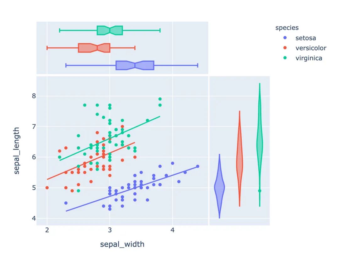
小提琴圖
px.scatter(iris,  # 傳入數(shù)據(jù)
           x="sepal_width",  # 設(shè)置XY軸
           y="sepal_length",
           color="species",  # 顏色取值
           marginal_y="violin",  # xy兩表圖形的設(shè)置:小提琴圖和箱型圖
           marginal_x="box",
           trendline="ols")  # 趨勢線設(shè)置
等高線圖
px.density_contour(iris,  # 數(shù)據(jù)集
                   x="sepal_width",  # xy軸
                   y="sepal_length",
                   color="species"  # 顏色取值
                  )
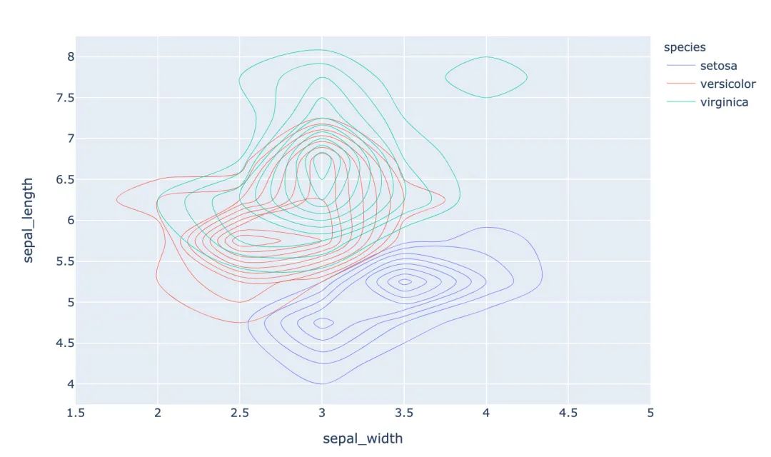
還可以繪制密度等值線圖;
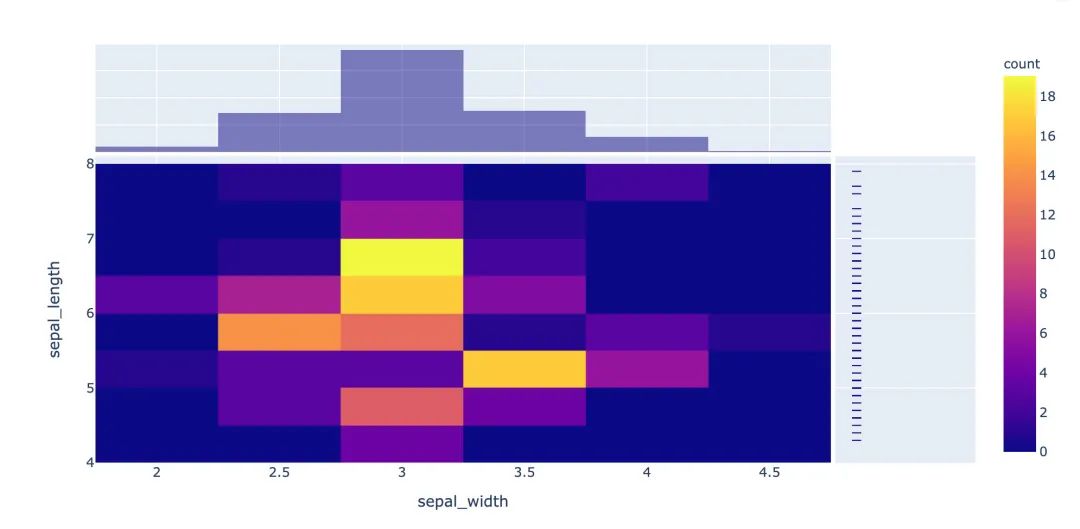
px.density_heatmap(iris,   # 傳入數(shù)據(jù)
                   x="sepal_width",  # 兩個軸的數(shù)據(jù)設(shè)置
                   y="sepal_length",
                   marginal_y="rug",  # 邊緣圖形設(shè)置
                   marginal_x="histogram"   # 在密度圖的基礎(chǔ)上,指定另外兩種圖形
                  )
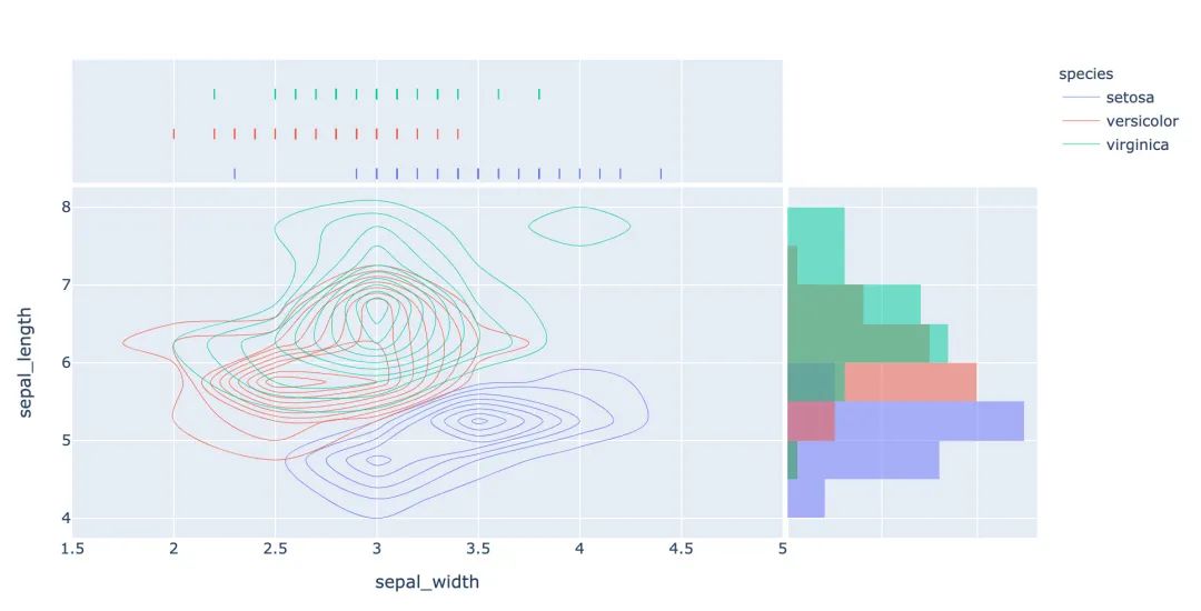
密度熱力圖
數(shù)據(jù)的設(shè)置和密度等值圖相同,只是選擇的圖形種類不同:
px.density_heatmap(   # 密度熱力圖
  iris,
  x="sepal_width",
  y="sepal_length",
  marginal_y="rug",
  marginal_x="histogram"
)
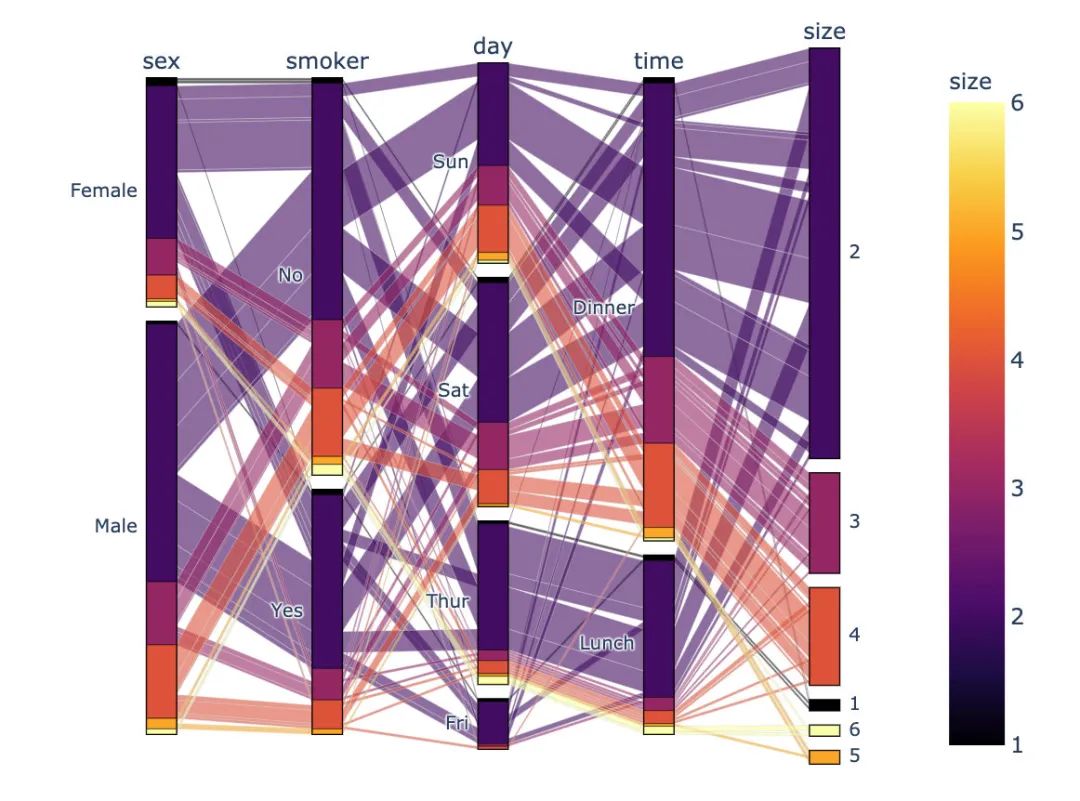
并行分類圖
px.parallel_categories(
    tips,  # 傳入數(shù)據(jù)
    color="size",  # 顏色取值
    color_continuous_scale=px.colors.sequential.Inferno # 顏色變化趨勢
)
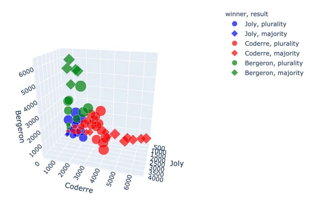
3D散點圖
使用的是選舉結(jié)果數(shù)據(jù)集:
px.scatter_3d(
    election,  # 傳入數(shù)據(jù)集
    x="Joly",  # 指定XYZ坐標軸的數(shù)據(jù)
    y="Coderre",
    z="Bergeron",
    color="winner",  # 顏色取值
    size="total",   # 大小取值
    hover_name="district_id",  # 指定顏色種類、大小和顯示名稱
    symbol="result",  # 右邊的圓形和菱形
    color_discrete_map={"Joly":"blue",
                        "Bergeron":"green",
                        "Coderre":"red"}   # 改變默認顏色
)
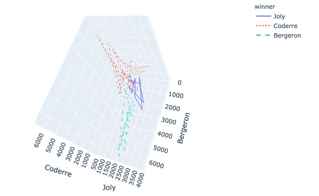
3D線型圖
px.line_3d(
  election,  # 繪圖數(shù)據(jù)集
  x="Joly",  # 3個坐標軸
  y="Coderre",
  z="Bergeron",
  color="winner",  # 顏色和線型設(shè)置
  line_dash="winner"
)
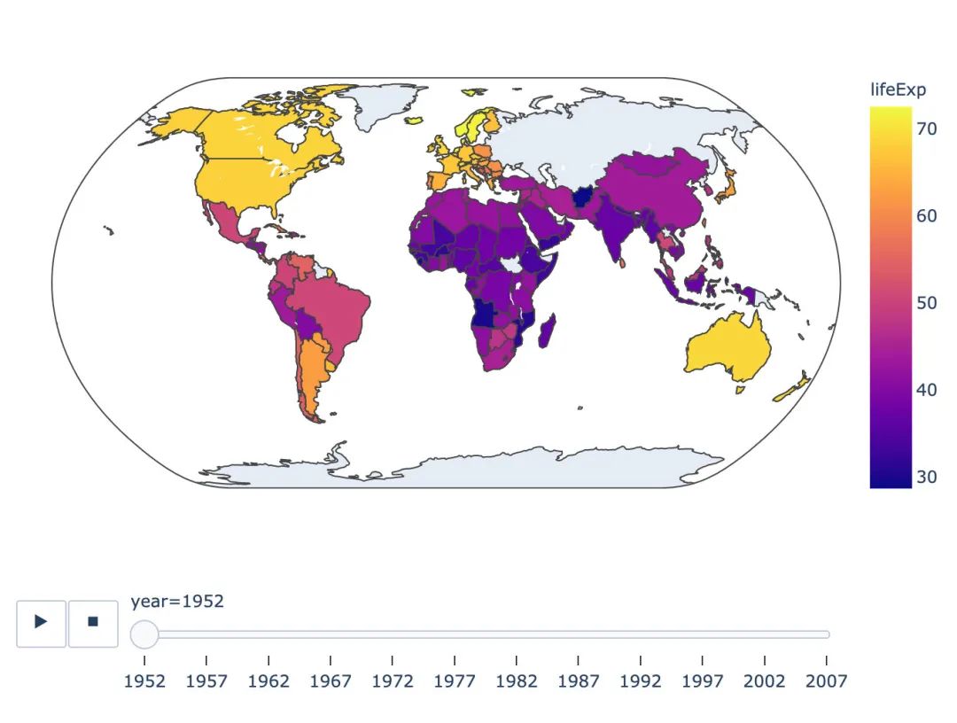
基于地圖的圖形
基于choropleth分布的地圖:
px.choropleth(
  gapminder,  # 數(shù)據(jù)
  locations="iso_alpha",  # 簡稱
  color="lifeExp",  # 顏色取值
  hover_name="country",  # 懸停數(shù)據(jù)
  animation_frame="year",  # 播放按鈕設(shè)置
  color_continuous_scale=px.colors.sequential.Plasma,  # 顏色變化取值
  projection="natural earth"  # 使用的地圖設(shè)置
)
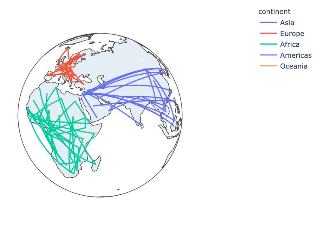
基于line_geo線型地圖:
px.line_geo(
  gapminder_2002,
  locations="iso_alpha",
  color="continent",
  projection="orthographic")
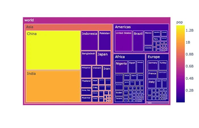
矩陣式樹狀結(jié)構(gòu)圖
矩陣式樹狀結(jié)構(gòu)圖是一種用于分層數(shù)據(jù)的復(fù)雜、基于區(qū)域的數(shù)據(jù)展示圖形:
# 選取2002年數(shù)據(jù)
gapminder_2002 = gapminder[gapminder["year"] == 2002]

px.treemap(
    gapminder_2002, # 數(shù)據(jù)
    path=[px.Constant('world'), 'continent', 'country'],   # 繪圖路徑:world---continent---country
    values='pop',  # 數(shù)據(jù)取值
    color='pop',   # 顏色取值
    hover_data=['iso_alpha'])  # 顯示數(shù)據(jù):國家簡稱
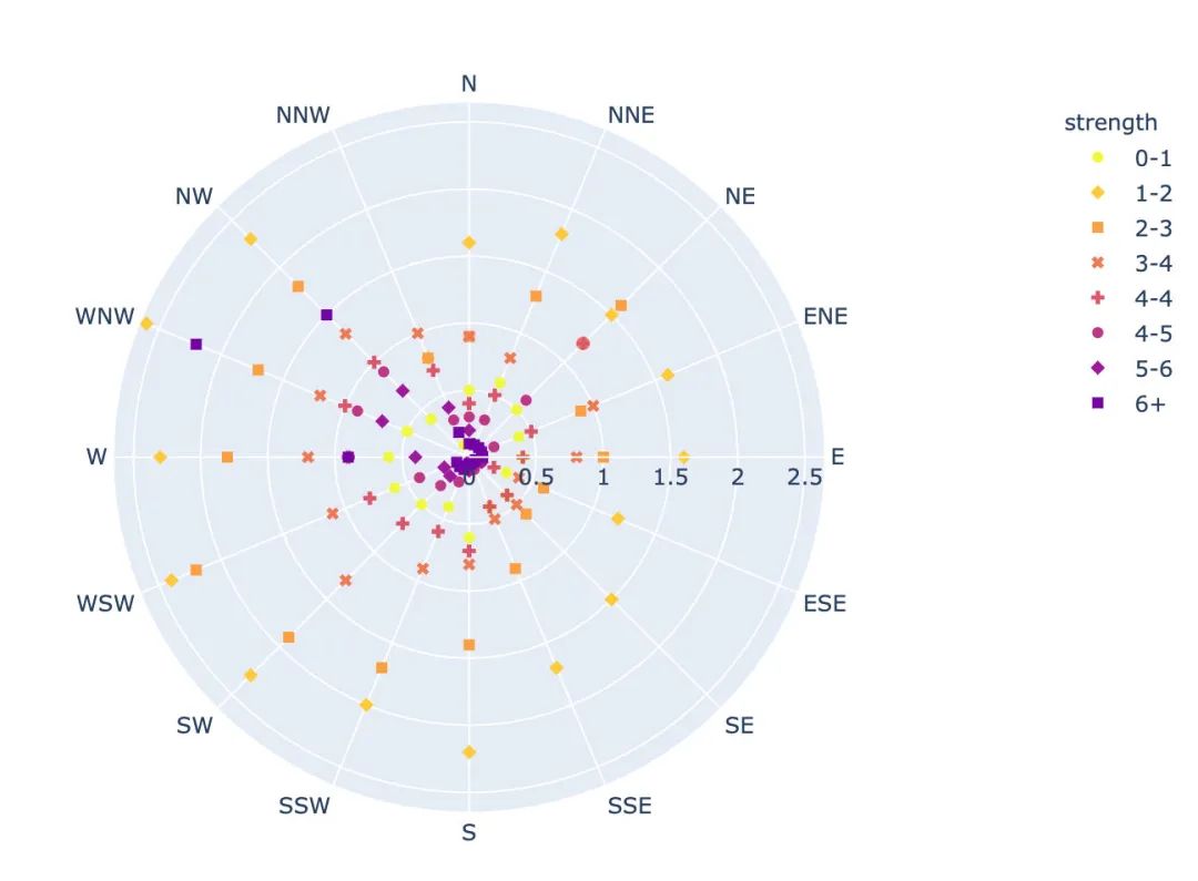
散點極坐標圖
px.scatter_polar(  # 散點極坐標
    wind,  #  數(shù)據(jù)集
    r="frequency",  # 半徑
    theta="direction",   # 角度
    color="strength",  # 顏色
    symbol="strength",  # 符號
    color_discrete_sequence=px.colors.sequential.Plasma_r)  # 顏色
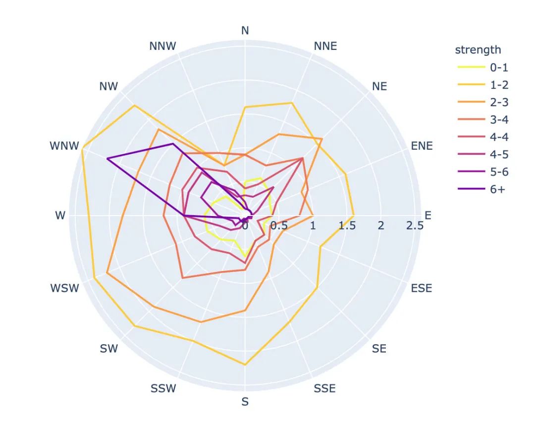
線性極坐標圖
px.line_polar(  # 線性極坐標
    wind,  # 數(shù)據(jù)集
    r="frequency",  # 半徑
    theta="direction",  # 角度
    color="strength",  # 顏色
    line_close=True,  # 線性閉合
    color_discrete_sequence=px.colors.sequential.Plasma_r)  # 顏色
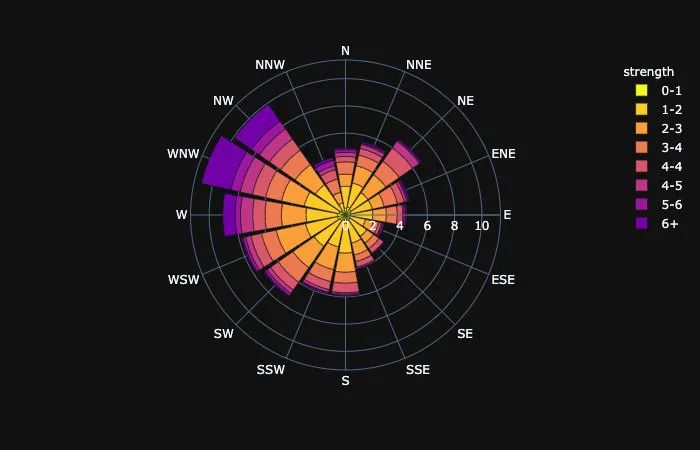
柱狀極坐標圖
px.bar_polar(   # 柱狀圖極坐標圖
    wind,   # 數(shù)據(jù)集
    r="frequency",   # 半徑
    theta="direction",  # 角度
    color="strength",  # 顏色
    template="plotly_dark",  # 主題
    color_discrete_sequence=px.colors.sequential.Plasma_r)  # 顏色
內(nèi)置主題
Plotly_Express內(nèi)置了3種主題可供選擇:
plotly plotly_white plotly_dark
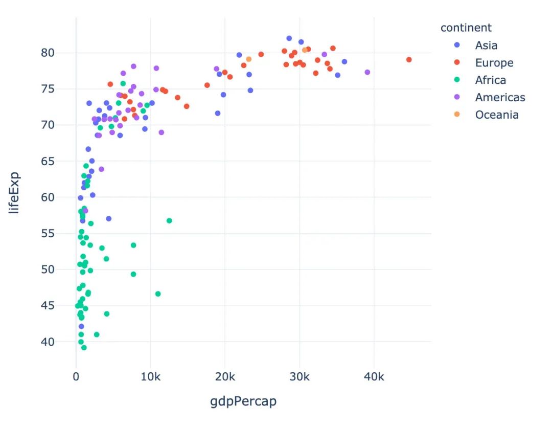
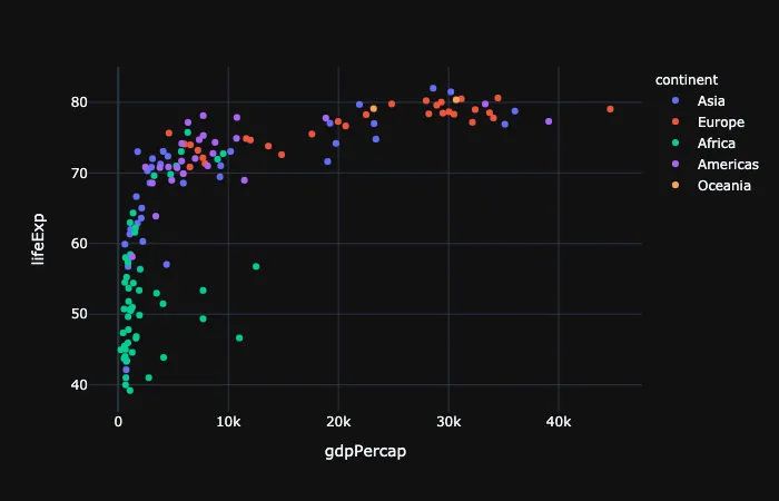
px.scatter(gapminder_2002,   # 傳入的數(shù)據(jù)集
           x="gdpPercap",  # 橫坐標是人均GDP
           y="lifeExp",  # 縱坐標是平均壽命
           color="continent",  # 顏色取值:根據(jù)洲的值來取

           template="plotly"  # 分別主題設(shè)置為:plotly、plotly_dark
          )
總結(jié)
本文詳細介紹了一個新的高級可視化庫Plotly_Express,從其簡介、安裝、內(nèi)置的顏色面板、主題到各種圖形的繪制。
這個庫最大的特點:代碼量非常少,圖形種類全,基本上一行代碼就能繪制出非常精美的動態(tài)可視化圖形。以后會介紹更多關(guān)于plotly_express的使用文章,特別是plotly和dash的結(jié)合,更是無比強大。敬請期待!
