<kbd id="afajh"><form id="afajh"></form></kbd>
<strong id="afajh"><dl id="afajh"></dl></strong>
    <del id="afajh"><form id="afajh"></form></del>
        1. <th id="afajh"><progress id="afajh"></progress></th>
          <b id="afajh"><abbr id="afajh"></abbr></b>
          <th id="afajh"><progress id="afajh"></progress></th>

          【動畫消消樂|CSS】076.單span標簽實現(xiàn)自定義簡易過渡動畫
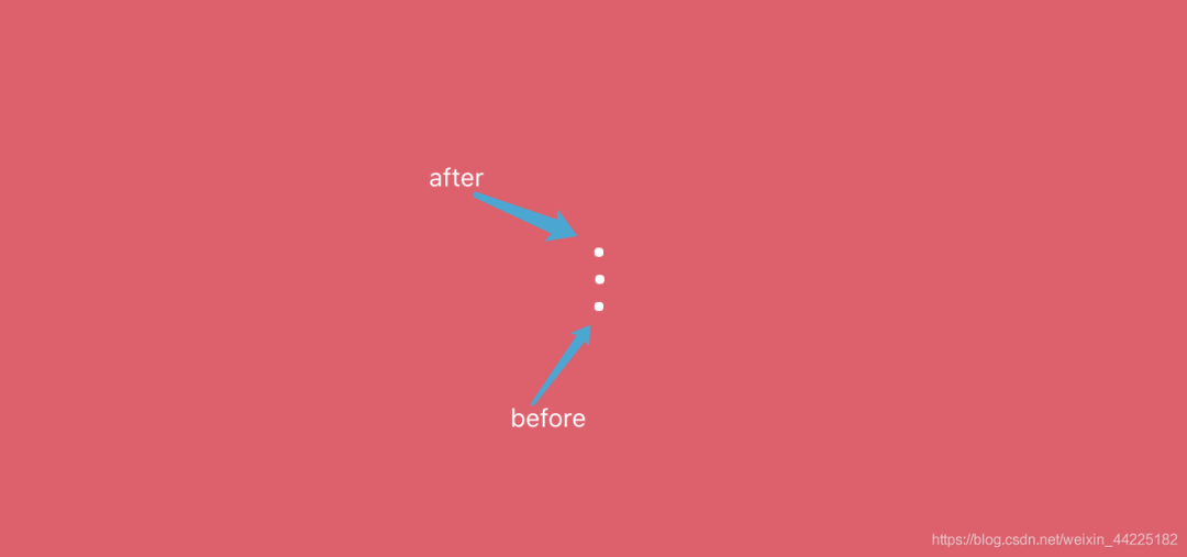
          共 4610字,需瀏覽 10分鐘

           ·

          2021-07-21 20:32

          效果展示

          Demo代碼

          HTML

          <!DOCTYPE html>
          <html lang="en">
          <head>
              <meta charset="UTF-8">
              <meta http-equiv="X-UA-Compatible" content="IE=edge">
              <meta name="viewport" content="width=device-width, initial-scale=1.0">
              <link rel="stylesheet" href="style.css">
              <title>Document</title>
          </head>
          <body>
              <section><span></span></section>
          </body>
          </html>

          CSS

          htmlbody {
            margin0;
            height100%;
          }

          body {
            display: flex;
            justify-content: center;
            align-items: center;
            background#ed556a;
          }

          section {
            width650px;
            height300px;
            padding10px;
            position: relative;
            display: flex;
            align-items: center;
            justify-content: center;
            border2px solid white;
          }

          span {
            width5px;
            height5px;
            display: inline-block;
            position: relative;
            border-radius4px;
            background: white;
            animation: loading 1s 0s linear infinite alternate;
          }

          span::beforespan::after {
            content'';
            width5px;
            height5px;
            border-radius4px;
            background: white;
            position: absolute;
            left50%;
            transformtranslateX(-50%);
            top15px;
            animation: loading 1s 0.6s linear infinite alternate;
          }

          span::after {
            top: -15px;
            animation-delay0.9s;
          }

          @keyframes loading {
            0% {
              width5px;
            }
            100% {
              width48px;
            }
          }

          原理詳解

          步驟1

          使用span標簽 設置為

          • 相對定位
          • 寬度、高度均為5px
          • 背景色:白色
          • border-radius: 4px;
           span {
           width5px;
           height5px;
           position: relative;
           border-radius4px;
           background: white;
            }

          效果圖如下

          步驟2

          使用span::before、span::after偽元素

          同時設置為

          • 絕對定位
          • 寬度、高度均為5px
          • 背景色:白色
          • border-radius: 4px;
            span::beforespan::after {
           content'';
           width5px;
           height5px;
           border-radius4px;
           background: white;
           position: absolute;
           
           /* 重點 */
           left50%;
           transformtranslateX(-50%);
           top15px;
            }

          效果圖如下

          特別注意,這里絕對位置關系為

           left: 50%;
           transformtranslateX(-50%);
           top: 15px;

          具體這樣設置的原因后面說明一下

          步驟3

          分離before和after

          使after位于span之上

          與after形成關于span對稱

            span::after {
           top: -15px;
            }

          效果圖如下

          步驟4

          為span添加動畫

          動畫很簡單

          只是span的寬度屬性隨著時間而變化

          • 初始狀態(tài):寬度為5px
          • 末尾狀態(tài):寬度為48px
            @keyframes loading {
           0% {
             width5px;
           }
           100% {
             width48px;
           }
            }  
            span {
           animation: loading 1s 0s linear infinite alternate;
            }

          效果圖如下

          步驟5

          對span::after、span::before使用同樣的動畫

          為了實現(xiàn)不同步的效果

          分別設置不同的動畫開始延時時間即可

           span::beforespan::after {
           animation: loading 1s 0.6s linear infinite alternate;
            }
              
            span::after {
           animation-delay0.9s;
            }

          效果圖如下

          疑難解釋

          關鍵代碼為

           left: 50%;
           transformtranslateX(-50%);
           top: 15px;

          這三句代碼的意思是:

          • after、before位于span下方15px
          • 再向左移動 相當于span自身50%寬度的距離
          • 再向右移動 相當于span::after/before自身50%寬度的距離

          如果只是

           left: 50%;
           top: 15px;

          效果圖如下

          為什么會出現(xiàn)這種效果呢?

          首先span是海轟事先設置一直位于整個容器正中的,如果只有left: 50%;,說明before、after在橫軸方向一直是相對于span最左端移動了相對于span自身50%的距離,無論span寬度怎么變化,它的50%一直都是在中間,所以before、after最左端相當于固定了

          而使用 就可以實現(xiàn)span和span::after/before的中心處于同一直線上

           left: 50%;
           transformtranslateX(-50%);
           top: 15px;

          只需要記住:

          • left: 50%;是向左移動相當于span50%寬度的距離
          • transform: translateX(-50%);是指向右移動相當于自身50%寬度的距離
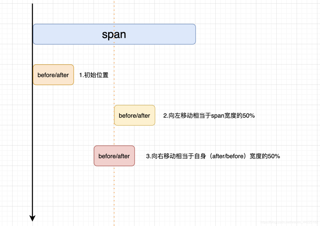
          可以發(fā)現(xiàn)

          通過使用

           left: 50%;
           transformtranslateX(-50%);

          可以使得span和span::after/before中心處于同一條直線上(始終處于 動畫運行時也始終保持 因為設置的是百分比)

          結語

          希望對您有所幫助

          如有錯誤歡迎小伙伴指正~

          我是 海轟?(?ˊ?ˋ)?

          如果您覺得寫得可以的話

          請點個贊吧

          謝謝支持 ??

          瀏覽 22
          點贊
          評論
          收藏
          分享

          手機掃一掃分享

          分享
          舉報
          評論
          圖片
          表情
          推薦
          點贊
          評論
          收藏
          分享

          手機掃一掃分享

          分享
          舉報
          <kbd id="afajh"><form id="afajh"></form></kbd>
          <strong id="afajh"><dl id="afajh"></dl></strong>
            <del id="afajh"><form id="afajh"></form></del>
                1. <th id="afajh"><progress id="afajh"></progress></th>
                  <b id="afajh"><abbr id="afajh"></abbr></b>
                  <th id="afajh"><progress id="afajh"></progress></th>
                  欧美成人一区免费视频 | a 天堂| 毛片在线观看网站 | 精品一区入口 | 欧美成人色 |